Well, we're nearly done with the year—and what a year it has been so far. But with Q4 looming, it's not over yet! Despite all the immediate concerns, pretty soon we'll need to start casting the gaze deeper into 2021.
So as has become tradition, it's time for a timely progress check on the "10 Charts to Watch in 2020." In the original article, published in January, I shared what I thought would be the 10 most important charts to watch for multi-asset investors in the year ahead (and beyond).
In this article I have updated those 10 charts, and provided some updated comments.
With all that's gone on, some of my initial thoughts and expectations from the original article got set slightly off track in some cases, and went wildly wrong in others. So this is quite a good exercise to go through in terms of the ever present "where to from here?" question.
[Note: I have included the original comments from back at the start of the year, so you can quickly compare what I'm thinking now vs what I said back then]
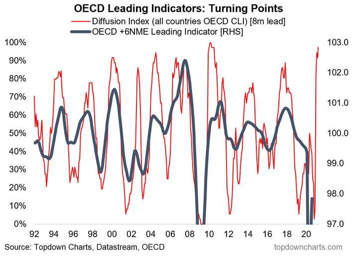
1. Global Economy: This somewhat unusual leading indicator of leading indicators chart is basically pointing to a V-shaped recovery headed into 2021. And at least for now we have actually started to see the global OECD composite leading economic indicator (which in practice tends to be more of a coincident indicator) turning up. I guess it is worth noting the exception/cautionary in that chart, namely 2002 —where an initial rebound was short lived, and in fairness there remains a lot of uncertainty around the virus and (geo)politics and all the rest of it. But as the shock passes and stimulus works its way through, an economic rebound and eventual boom is a case of "when," not if.
"Global Economy -- a turning point in the global economic cycle: 2019 basically saw a global manufacturing and export recession. Yes Recession. But looking forward, I have a growing list of leading indicators pointing to a recovery in 2020, and the below is one of them. The diffusion index of OECD leading indicators has made a clear turnaround after reaching a decade low. I will be watching for a turn up in the main global indicator (and for the diffusion index to continue to edge higher/stay higher)."
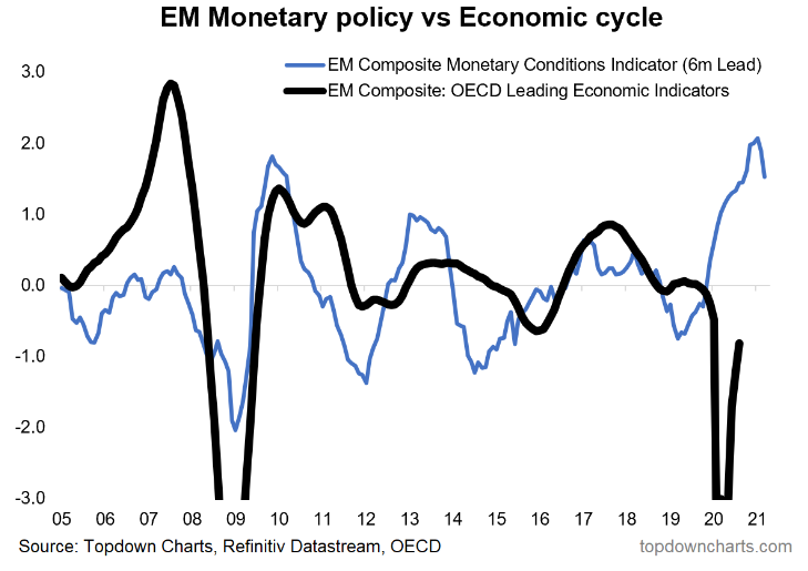
2. Emerging Markets: Speaking of stimulus, while it has very much been a global effort, one particular standout to me is this chart of Emerging Market monetary conditions. This composite indicator shows EM central banks have been aggressive in easing policy—and interestingly enough it's EM ex-China that have been doing a lot of the heavy lifting. Probably the only cautionary on this chart is that the incremental easing has begun to taper, but it's a long cry off tightening, and it transmits to growth and asset prices with a lag. But overall I would say it's an unequivocally positive datapoint for EM.
"Emerging Markets: a big part of the 2020 recovery thesis is the global monetary policy pivot. Not many have noticed, but EM central banks have been particularly aggressive in easing policy (and by the way, they have the most traditional policy ammunition available). Given some of the cycle indicators have already begun to stabilize for EM I have a strong degree of confidence that we will see a cyclical upturn across emerging economies in the coming months and quarters."
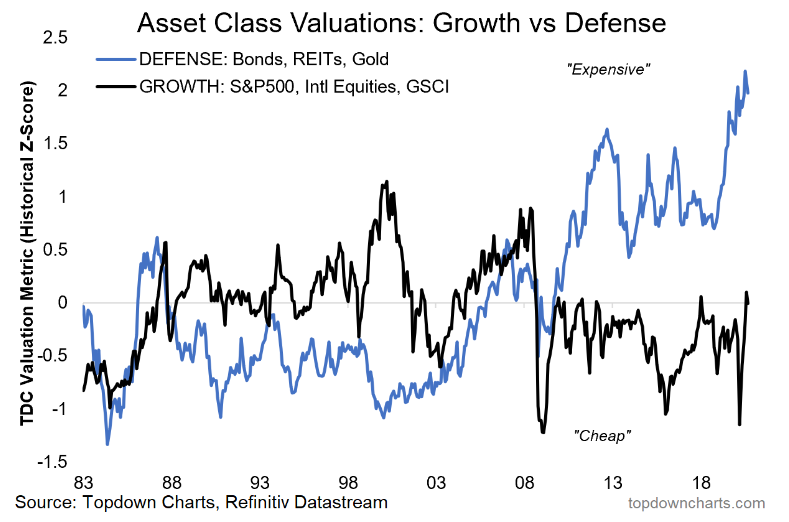
3. Growth Assets vs Defensive Assets: This is one of my all time favorite charts, and it really helps in giving a bird's eye view of the multi-asset landscape and in framing the risk vs reward opportunity set...Defensive assets (bonds, REITs, gold) are extremely expensive—perhaps no surprise, given the still substantial demand for safe assets and global surge in central bank asset purchase programs. What's interesting though is while growth asset valuations (S&P 500, International Equities, commodities) have rebounded sharply, it's still yet to reach extremes. Makes me wonder if we'll get to a point in the near future where both growth and defensive assets are extreme expensive (in that case I guess you could argue that cash would be undervalued!).
"Growth Assets vs Defensive Assets: this chart says it all in terms of where investors have been positioned, and it tells you that defensive assets may not necessarily be “safe” given such expensive valuations. Indeed, a global economic rebound could well make defensive assets a source of risk, rather than a hedge of risk."
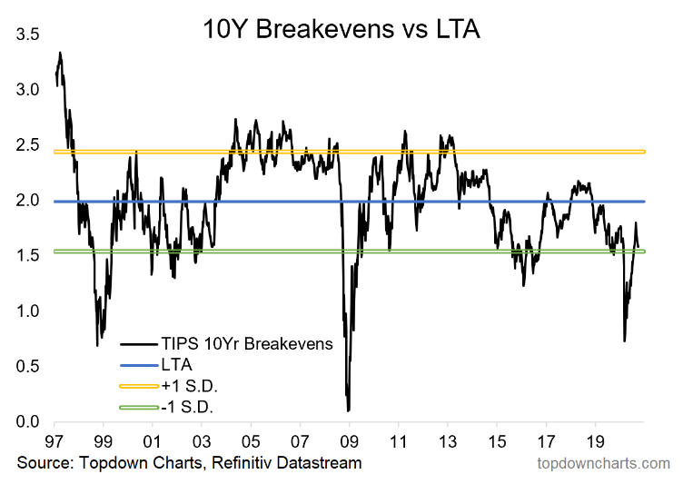
4. TIPS breakevens: In terms of valuations, TIPS breakevens (aka market-based inflation expectations) continue to trade at historically cheap levels—albeit MUCH less so than back in the dark depths of March. Although it is a contentious issue and nearly everyone seems to have a strong opinion on it, I see the path of least resistance as skyward for inflation. Part of that is to do with the substantial stimulus efforts, a likely "once bitten, twice shy" approach by policy makers in the wake of the 2018 policy mistake, and my views on commodities (but more on commodities in chart 7).
"TIPS breakevens look cheap, and should rebound if we get better growth. This will also tend to put upward pressure on bond yields (i.e. nominal yield = real yield + inflation expectations). This is closely tied in with the commodities picture [chart 7]."
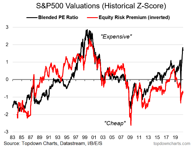
5. US Equity Valuations: Are US equities cheap or expensive? The answer depends on who you ask, what indicator you look at, whether its absolute or relative, and indeed even what sector and style you look at... but even then there is debate. This chart unfortunately will only add to the unsettle-able debate. On the one hand the blended PE ratio (which does include the distorted signals from the trailing and forward PE) shows valuations at extreme expensive levels. On the other hand, on an equity risk premium basis [shown inverted here] they're still materially cheap. While I haven't shown it, the US is also extremely expensive vs EM and DM ex-US, and within US there are some clear relative value standouts (but more on that in chart 9). All that said, let me put it this way: no one is buying/holding US equities at this point because they're cheap.
"US Equity Valuations: the downside of likely higher bond yields is that all else equal it will squeeze the ERP (equity risk premium), which in contrast to absolute valuations, still looks cheap/attractive. Indeed, you can argue it's quite rational to be bullish equities even as absolute valuations are historically high if the equity risk premium provides enough of a cushion."
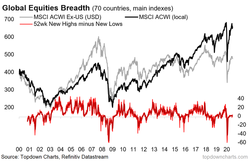
6. Global Equities: One thing I notice every Monday as I put the Global Cross Asset Market Monitor together is that while the US market is happily charging on to new all-time highs, the rest of the world looks much less convincing. Firstly in the chart below check out the gray line —it's still quite far off the pre-crash levels, and really is just chopping around resistance. Then look at the country breadth indicator (i.e. 52-week NH-NL across 70 countries). It's not weak by any means - indeed, it made a big bounceback. But it's yet to take off in a way that would exhibit the kind of broad-based strength that one would like to see in raising conviction that a global cyclical bull market is underway. So it's a case of keeping a close eye on the global equity breadth indicators—they tend to provide advance warning (or confirmation) ahead of any of the more standard indicators.
"Global Equities: it looks like we’re in a new cyclical bull market (based on a fairly familiar and reliable global equity market breadth signal). This chart and a few other global equity market breadth indicators helped pick the big breakout late last year. It's quite likely that if the new cyclical bull market does get derailed somehow, that we see early warning signs show up in this chart. So this will be a key one to watch for risk asset allocations."
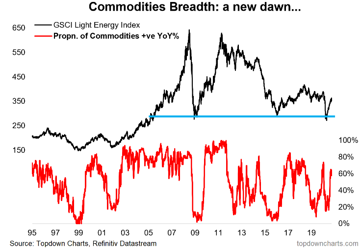
7. Commodities: As mentioned, I'm optimistic on commodity prices, and while I have a broader case, let's start with the technicals... again looking at market breadth indicators (this time for the commodity markets). Much like global equities, commodity market breadth crashed to washed-out/oversold levels, and has since turned up sharply as strength has broadened out across commodities. I can make a case for most individual/groups of commodities, and certainly at the aggregate level I see a few things that look bullish such as cheap valuations, weak capex, a likely global growth rebound, and a prospective weaker US dollar in the months and years to come. So it's one of the key assets I'm watching.
"Commodities (at an asset class level) have also seen a familiar market breadth pattern emerge, which points to a cyclical bull market (lines up with relatively light positioning, cheap valuations, and a prospective better macro backdrop). The outlook across the individual commodities that make up this index is a bit more nuanced, but the aggregate/asset class view looks fairly straightforward based on the sum of evidence from our indicator set."
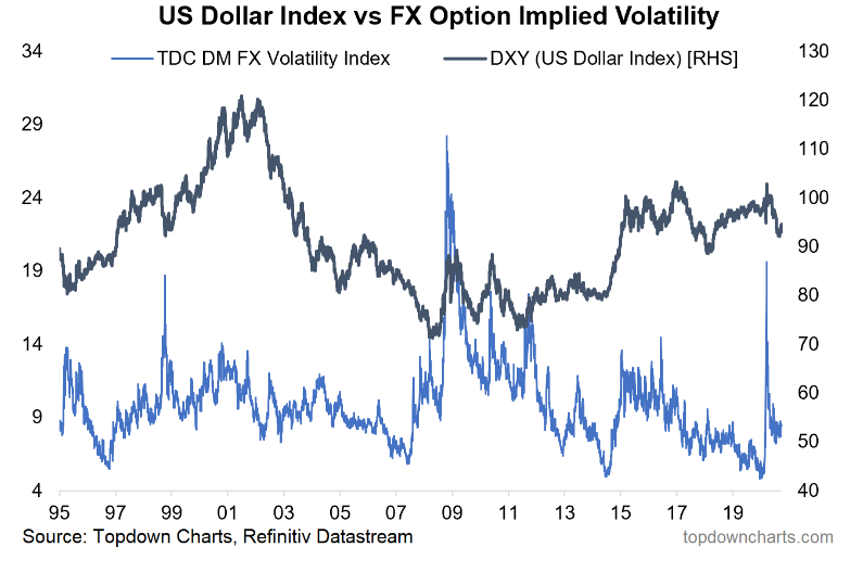
8. FX Volatility: Well, up until the last couple of weeks, the FX volatility explosion had indeed looked like a turning point. In my view the current rebound in the USD is simply a technical rally as a result of the massive flip in positioning and sentiment from previously crowded long/bullish to now increasingly crowded short/bearish—as well as some clear oversold signals in the technical indicators, a bounce off support, and a turn in seasonality. Once this rebound is done I expect a return to more prolonged but drawn-out decline.
"FX Volatility: one key piece of the puzzle for commodities is the US dollar, and while I continue to maintain a bearish bias there, one thing I am very mindful of is the crunch in FX volatility. Typically crunches in volatility like this tend to be resolved in a violent fashion: that is, it could be a harbinger of a large/rapid move (agnostic of direction). So, will 2020 bring a return of volatility for the US dollar?"
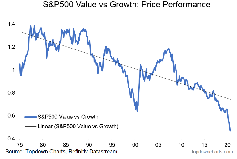
9. Value vs Growth: It's important not to lose perspective on this one. While the internet is filling up with (albeit hilarious) memes on value investing and successive pronouncements of the death of value, the point to remember is that these things go in cycles. And by the way, even if you were to argue compellingly that the trendline in this chart will persist for evermore into the future, there will still be a cycle around that. From my studies, the key ingredients for a turn in the cycle are basically: relative value and macro catalysts... and technicals—ideally you do want to see it turn before going all-in. That said, historical perspective provides some analogs or examples that when it does get moving it can be sharp and substantial (I guess 2020 showed us another example of that...!).
"Value vs Growth: the investment strategy graveyard is littered with failed calls for a turnaround in the performance of value vs growth stocks. But I think we could be close to the much-awaited and much-forecast turning point. Relative value between the two cohorts is at the lowest point in 20 years, and in terms of macro catalysts, my expectations for higher bond yields, better growth, and higher commodity prices will help the sectors that are slightly over-represented in value vs growth. So don't forget about value."
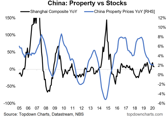
10. China: Chinese equities had a couple of false starts this year, including a particularly meteoric surge in July which brought back memories of the 2015 bubble. I've said it before—this is one of those markets that's either ON or OFF. In terms of how it relates to the property market, you tend to see a rotation effect in China across various assets as the marginal speculative investment dollar chases the next hot asset. With many global investors shunning Chinese equities due to concerns about policy and politics, it could become an underdog outperformer... particularly as China looks set to embark on a new economic policy regime (the somewhat cryptically-coined and still relatively detail-light "dual circulation" strategy—more on that in a post soon).
"China: last but not least, this chart shows Chinese property price growth vs China A-shares. It’s a useful chart for China watchers and global investors in general, but it’s of particular interest now because property price growth is rolling over, and that could be good news for China A-shares. Because the marginal speculative investment dollar in China is basically trapped in the country, you tend to see this succession of chasing one hot asset after another. Thus, we could start to see a rotation effect between property and stocks in China, and that (along with cheap valuations, easier monetary policy, better global growth, and a trade deal/truce) could drive a potentially explosive new bull market in China A-shares."
Key Takeaways:
- Expect stimulus to drive a sharper than expected recovery in growth.
- Expect emerging markets in particular to start surprising to the upside heading into 2021 as substantial monetary easing works its way through the system.
- Inflation risks, though dismissed by some, still look severely underpriced.
- Defensive assets have become extremely expensive (and therefore risky?)
- US equity valuations are both very expensive (vs history) and very cheap (vs bonds).
- Global equities look to be in a new bull market, but confirmation is still pending (ex-US).
- Commodities are set up for a new dawn, and already initial strength is broadening out.
- The US dollar looks to have undergone a turning point (recent rebound notwithstanding).
- Value vs Growth underperformance has become extreme, but still awaiting a turning point.
- Despite all the politics and indeed geopolitics, Chinese equities could become an underdog outperformer as new economic policies emerge.
