Do you know what the total returns are in various asset classes?
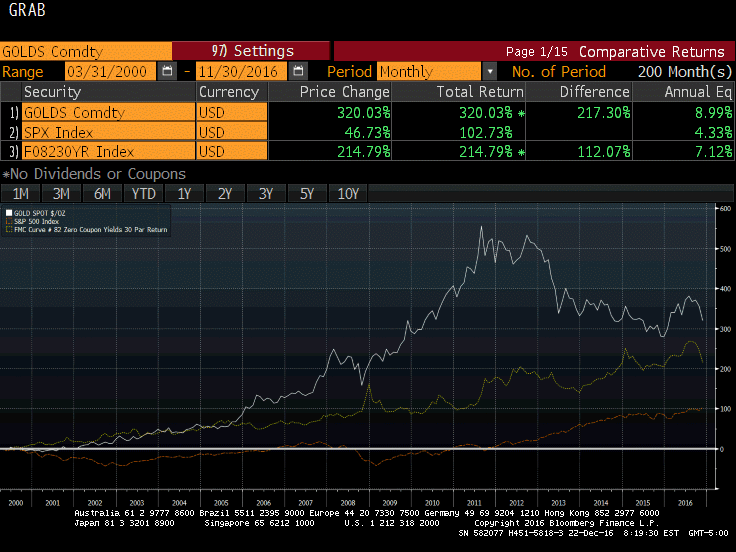
Reader Michael pinged me with an interesting chart of Gold vs. the S&P 500 vs. 30-year treasury bonds.
Let’s take a look.

Michael writes …
Every once in a while I look at total returns indifferent asset classes. The chart (from Bloomberg) calculates the total returns for gold, the S&P 500, and the 30 year treasury bond since March of 2000.
I use that date because it was the peak in the stock market prior to the beginning of severe monetary measures to perpetuate a system that hasn’t worked very well. Of course monetary measures went from severe to beyond extreme as we await the next crisis for which Trump’s “cash for crumblers” infrastructure program may be needed to quell.
Time Frame
To arrive at that comparison, Michael picked the top of the stock market in 2000. The chart would look much different from the bottom in March of 2009.
Here’s a question to ponder: Are we closer to a top in equities than a bottom?
