Those that follow my personal account on Twitter will be familiar with my weekly S&P 500 #ChartStorm in which I pick out 10 charts on the S&P 500 to tweet. Typically I'll pick a couple of themes and hammer them home with the charts, but sometimes it's just a selection of charts that will add to your perspective and help inform your own view – whether its bearish, bullish, or something else!
The purpose of this note is to add some extra context beyond the 140 characters of Twitter. It's worth noting that the aim of the #ChartStorm isn't necessarily to arrive at a certain view but to highlight charts and themes worth paying attention to.
So here's the another S&P 500 #ChartStorm write-up!
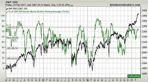
1. Market breadth: First up is a look at 50dma breadth for the S&P 500 which shows a couple of interesting things. First is the soundbite: 1 in 4 companies are trading below their 50 day moving average – so what that tells you is despite the strong market there's still just over 25% or a quarter of the market that's not really making much headway. The other key point is the bearish divergence – market keeps going up but breadth is unable to crack higher. On both fronts it says watch out for that 25%...
Bottom line: Still seeing bearish divergence for the S&P 500.
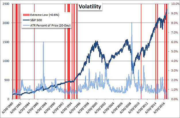
2. More (less) volatility: This chart shows the ATR or Average True Range for the market. As highlighted in previous editions we are seeing quite low volatility as the graph shows whenever volatility is this extremely low... no strong conclusion can be made about the outlook...! Matter of fact, looking at those red lines they're all very different macro/market environments.
Bottom line: Volatility is low as defined by trading range.
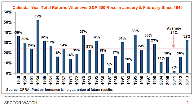
3. The January and February effect: This chart shows that of the 27 times when market returns in January and February were positive (e.g. like this year... although there are technically still 2 trading days left in February!!!), those that saw positive returns for the year numbered 27 (i.e. 27/27). The only qualm I have with this analysis is that it is looking at total returns – which to be fair is good practice as most investors receive total returns (i.e. price + dividends), but you can't really say that market went up e.g. in 2011 when it was mostly dividends. Either way, it's historically speaking a good omen – but then again the pessimist might come along and say we're overdue for a bad number.
Bottom line: Out of 27 times where January + February were positive, the full year was also positive 27 of those times.
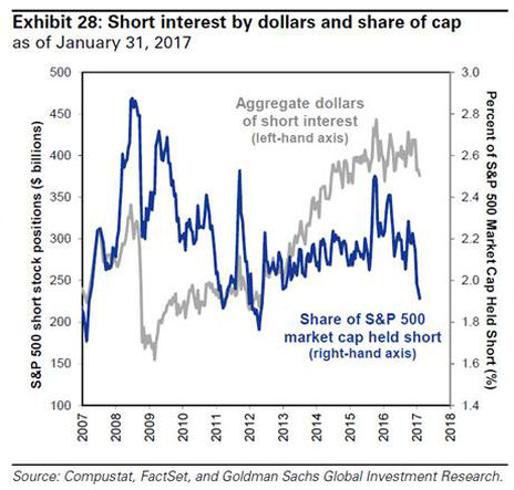
4. Short interest: This chart from GS, shared by Driehaus Capital, shows short interest for the S&P 500 and the key point is that in absolute terms short interest is at the bottom end of the range, and in relative to market cap terms it is at multi-year lows. One interpretation is to call it dry powder for the bears. That is, when short interest is low it can more easily go higher – whereas when it's high it's easier for it to come down in the event of short-squeezes.
Bottom line: Short interest is at the lower end of the range.
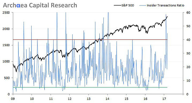
5. Insider transactions ratio: The next chart shows insider transactions activity against the market. The key point is that the indicator will often, but not always, spike around a short-term market top. Either way it shows that lately there have been a lot of insiders cashing their chips. But hey, maybe they're just raising cash to buy a boat?
Bottom line: Insider sales activity remains elevated.
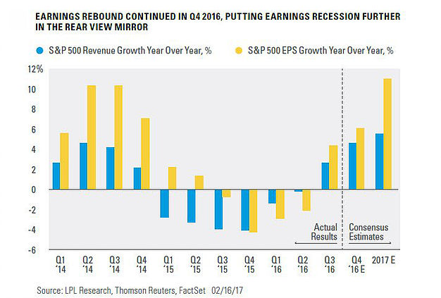
6. Earnings rebound: As Ryan Detrick of LPL Research shows, there has been a significant turnaround in sales and earnings for the S&P 500, and this has really been a major factor behind the market strength over the past year. And a key point is they don't yet show any signs of slowing down. This has always been a key important factor for the market to sustainably go higher. If earnings can improve enough it can have the impact of whittling valuations back down to more reasonable levels...
Bottom line: The earnings rebound has been a key factor for the recent good performance of the stock market.
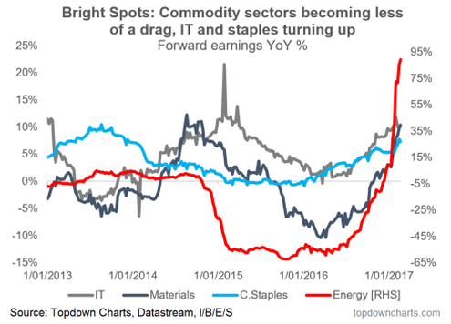
7. Earnings recovery – sector focus: This chart from Topdown Charts shows a sector view of annual changes in forward earnings. I chose to focus on some of the sectors that saw a particular slump in 2016, including slowdown in tech earnings, slow growth in staples, and the collapse in the commodity sectors of energy and materials. With the rebound in commodity prices and the global synchronized growth upturn, there has been a surge in earnings growth across these sectors.
Bottom line: Some of the major sectors that saw earnings headwinds are now facing a much improved outlook.
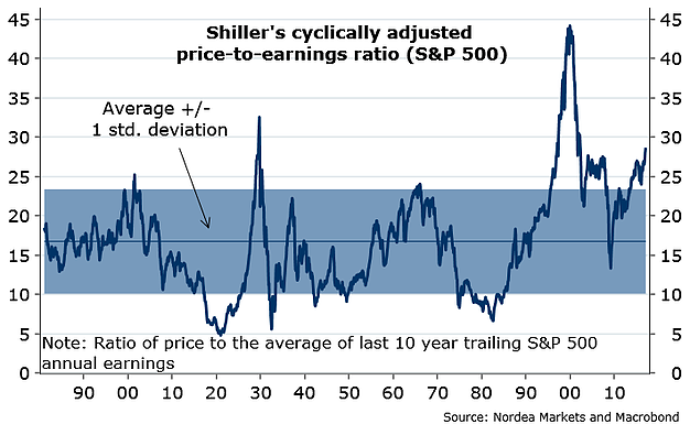
8. That's the E so where's the PE? Moving on to the coalescence of P and E (or what we call valuation), in particular in this case the Shiller PE ratio or the CAPE (cyclically adjusted Price to Earnings ratio) you can see it's pretty high, in fact as high as it's been since the dot-com boom. This one will raise all sorts of debate, but it will mostly add fodder for the bears.
Bottom line: The CAPE shows an increasingly expensive market.
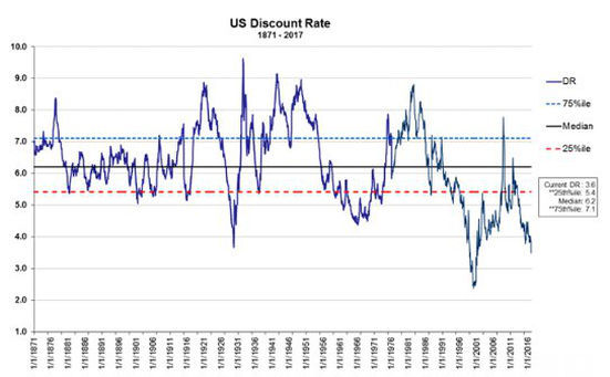
9. The discount rate: This graph from the Credit Suisse HOLT group shows the market implied discount rate for the US – it's very similar in shape, analysis, and conclusion to the previous chart of longer term stock market valuation. The bottom line is it's basically another way of thinking about valuations and it shows an expensive market.
Bottom line: Using the market implied discount rate method, the market yet again looks very expensive.
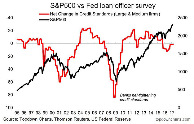
10. Bear market warning indicator: This chart shows a major bear market indicator (the SLOOS or Senior Loan Officer Opinion Survey by the US Federal Reserve). Basically when the indicator heads down on the chart it means banks are tightening up their belts and that's either a sign of bad times or even a driver of bad times ahead. At this point the indicator is ever so slightly south of neutral after flashing an orange light last year.
Bottom line: Major bear market indicator is neutral for now.
So where does all this leave us?
This week there was a mix of bearish and bullish charts...
1. Bullish
The chart showing years with a positive January+February were positive for the full year 27/27 times is a good sign. Likewise, the recovery in earnings, particularly in the IT, staples, and commodity sectors where the earnings outlook has seen a dramatic turnaround. Meanwhile the ATR volatility chart gave mixed signals, which is sometimes a good thing!
2. Bearish
On the bearish side of things, there was the ongoing bearish divergence in the breadth chart, the short interest chart, the insider sales ratio, and the expensive looking valuation metrics (shiller P/E and the US market implied discount rate). Finally, the bear market indicator from the Fed SLOOS is also technically on the bearish side, but more or less at neutral levels.
Summary
This week featured quite a mix of charts from technicals through to fundamentals; market timing indicators, earnings trends, and longer term valuation gauges. Overall it's yet another week of seeing both bullish and bearish signs. The bearish signs were a mix of longer term (on the valuation front) as well as shorter term (on the timing indicators and technicals front). On the bullish side one was an interesting market statistic, while the others – earnings, a key and vital market driver. At the end of the day earnings matter and if earnings can live up to expectations implied by enhusiatic valuation levels then maybe everything will turn out alright in the end...
