Every investor makes trading decisions based on what happened in the past. There is no other way.
What interests us is the future though. After all, what happens in the future ultimately determines investment success.
But will patterns that worked in the past continue to work in the future?
That is the question I want to examine, namely: to what extent do seasonal patterns change over time? Seasonality is only useful and profitable if stable patterns actually exist.
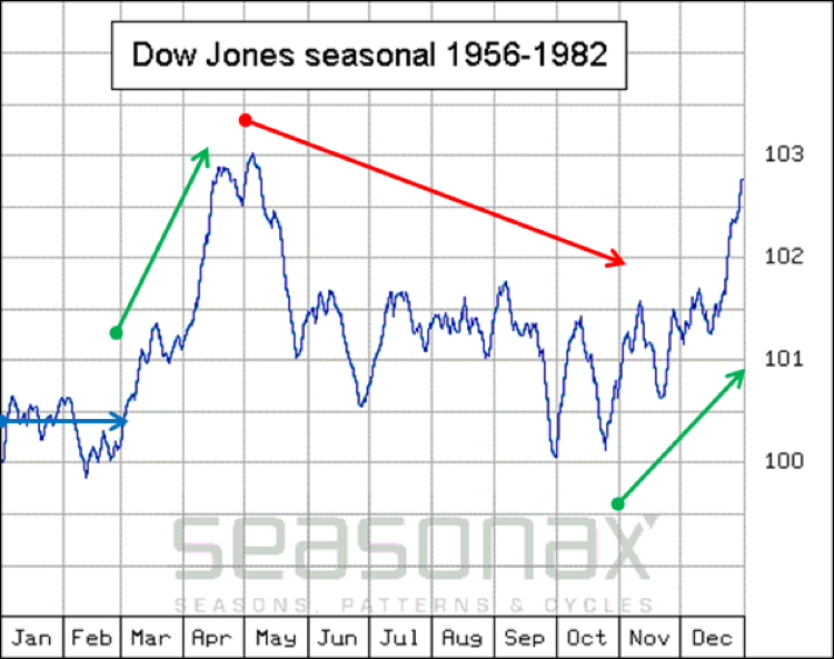
The first chart shows the seasonal pattern of the Dow Jones Industrial Average from 1956 to 1982. The horizontal axis depicts the time of the year, the vertical axis the average return in the course of a year in the time period under examination.

The DJIA was characterized by four distinct seasonal trends Source: Seasonax
As the chart illustrates, the DJIA typically moved sideways in the first two months of the year (blue arrow), followed by a rally until May (green arrow). Then the “sell in May and go away” effect set in, i.e., the typical period of weakness over the summer months commenced (red arrow). Subsequently, the market tended to move up again in an autumn rally (second green arrow).
These four trends dominated the seasonal pattern of the US stock market from 1956 to 1982.
But what developments could be observed in the seasonal pattern thereafter? Did these four distinct trends remain operative?
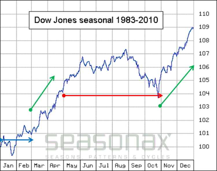
The next chart shows the seasonal pattern that prevailed in the DJIA from 1983 to 2010.

By and large the same four trends continued to be operative. Source: Seasonax
I have marked the four trends again: the sideways move in the first two months (blue arrow), the subsequent rally (green arrow), the summer doldrums (red arrow) and the autumn rally into year-end (second green arrow).
All Four Seasonal Trends Continued.
Many parallels to the previous chart are evident. The four distinct seasonal trends persisted.
However, there are differences as well. For instance, while the summer season continued to be unattractive for stock market investments in the 1983 to 2010 time period (red arrow), the DJIA no longer declined, but moved sideways.
The background: In the time period examined in the first chart, the market was generally weak or trending sideways. On average the DJIA only rose only by around three percent annually (see right hand scale).
That changed significantly in the time period from 1983 to 2010 examined in the second chart. The average annual gain in the DJIA increased to approximately nine percent (right hand scale).
Generating such a gain (which was after all three times larger!) takes time. There is a larger number of days with a positive return, which the seasonal chart reflects as well.
Seasonality Can Assist You with Investment Decisions.
As readers are surely aware, there is no fool-proof investment method that always works. The two different long term time periods in the DJIA discussed above do show though that seasonal trends can be very persistent. They are therefore a statistically useful tool for investors.
