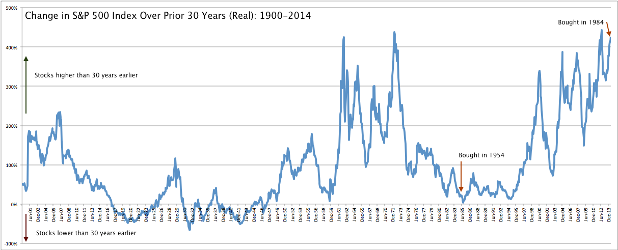
Imagine if you had invested in the S&P 500 in 1984 and held through the tech bubble and crash and then through the financial crisis and its recovery. How would you have done over those 30 years? As it turns out, very well. On a real basis (meaning, inflation-adjusted), your holdings would have appreciated by over 400%. A $100,000 investment in 1984 would now be worth more than $500,000.
Now, imagine that you had made that same investment only 30 years earlier, in 1954. You probably imagine that you did even better. The economy was booming in the post-war/baby-booming 1950s and 1960s and was well into a new bull market by 1984. As it turns out, you barely broke even. Your $100,000 investment was worth about $120,000 a full 30 years later.
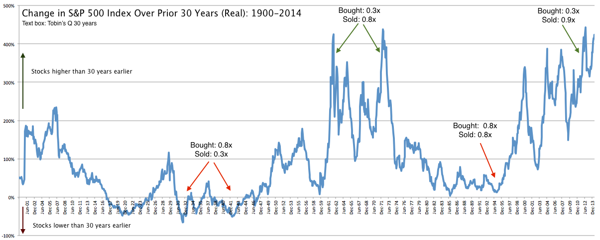
The chart below looks at the appreciation in the S&P over a rolling 30 year basis since 1900. The line at 1984 shows the appreciation of an investment made 30 years earlier, in 1954. The end of the line to the far right, at 2014, shows the appreciation if you had bought 30 years earlier, in 1984.
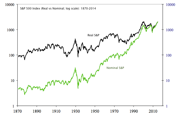
That stocks aren't always higher 30 years later is decidedly not what investors have frequently read about the value of 'buy and hold' investing. Much of the misunderstanding has to do with inflation. Inflation averaged 5% in the 1940s, 7% in the 1970s, nearly 6% in the 1980s and 2-3% in most other decades. A $100 becomes over $320 30 years later by virtue of just 4% inflation alone.
Below is a comparison of the S&P in both nominal and real terms. Note in particular the steep ascent of the index in nominal terms from the 1970s until 2000. Inflation can be one of the biggest contributors to equity performance over long periods of time.
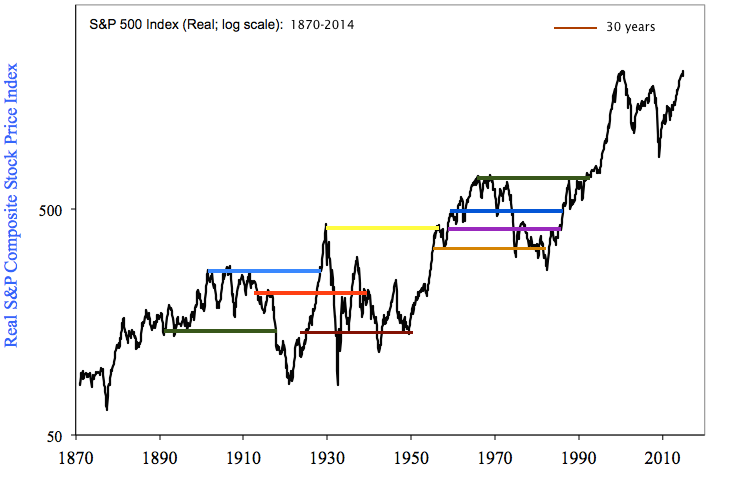
Looking at just the real S&P, in the chart below we have added lines that span a period of 30 years. Is the index generally higher 30 years later? Yes. But there have been long periods of time where the real value of the index has been flat or negative for 30 years or longer. The S&P was still below its 1929 peak in 1985; that's a 56 year time span.
This is even more true on shorter time frames. In the chart below, the blue lines span 20 years and the red lines span 10 years. It's not hard to find any number of instances where the index was lower 10 years or even 20 years later. The real S&P is lower now than it was in August 2000, over 14 years ago. Near the 2009 low, it was lower than it had been in mid-1995, over 13 years earlier.
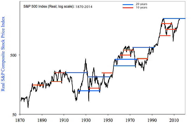
Clearly, the longer the time frame, the more frequently the index will be higher. Since 1900, the index is higher 30 years later about 85% of the time. That drops to about 70% on a 10 year time span. The greater success of longer time frames accounts for the mantra that investors should 'buy and hold' for 30 years.
But even then, as we have seen, the index is not always higher. What accounts for the difference in these investments? Obviously, earnings growth is very important, but less than you might suspect. To take two examples, "cyclical earnings" growth accounts for about half the appreciation in price over the past 30 years. Near the tech bubble high, cyclical earnings accounted for about 40% of the appreciation in price over the prior 30 years.
That leaves valuation as the other important driver of price appreciation. Hold onto your hat: buying when the index has been relatively cheap and holding until it is relatively expensive makes an enormous difference to your return. Over a 30 year period, cyclical earnings rarely increase by more than 200%. Valuations, on the other hand, have quite often tripled and periodically quadrupled. This is the mass psychology of investors, as they swing from despondency to euphoria.
Returning to the chart of rolling 30 year appreciation in the S&P, we have overlaid a valuation metric called Tobin's Q (which is like a PE except it uses a more stable balance sheet calculation in place of more volatile earnings in the denominator). Generalizing, the periods of enormous appreciation in the index have occurred when investors bought for a 1/3 of what stocks could be sold for 30 years later. The low appreciation in the index from the 1950s to the 1980s came as result of valuations remaining the same. In the 1930s and 1940s, negative returns resulted from valuations having fallen by 60%.
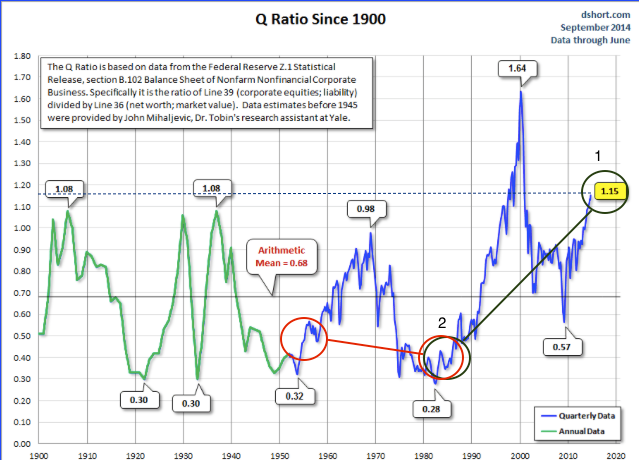
This is perhaps more easily seen on a chart of Tobin's Q itself. Today's investors with a 30 year time horizon bought in 1984 when valuations were less than 0.4x; now they are valued at 1.15x (green circles). Long term investors in 1984, on the other hand, had the ill fortune of valuations having fallen to more or less the same level as they had been 30 years earlier, in 1954 (red circles; chart from Doug Short).
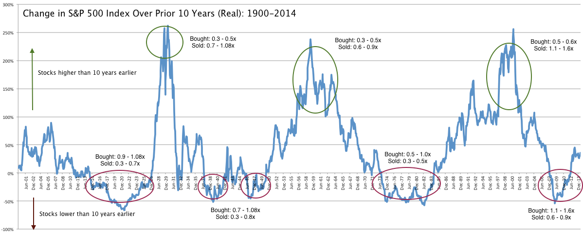
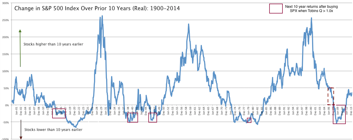
On shorter time frames, valuation changes can be dramatic, and returns become, therefore, more volatile. Below is a chart showing rolling 10 year appreciation in the index. Investors in 2008-12 had the bad fortune of having bought when valuations were 2-3x times higher (in 1998-2002). But investors at the height of the tech bubble owed their good fortune to valuations having increased 2-3x since the late 1980s and early 1990s. Wild oscillations in valuations, and therefore in price appreciation, has been the case, repeatedly, throughout the past 100 years.
Which brings us to today. Investors with a long time horizon are buying the S&P with Tobin's Q at 1.15x. How will they fare?
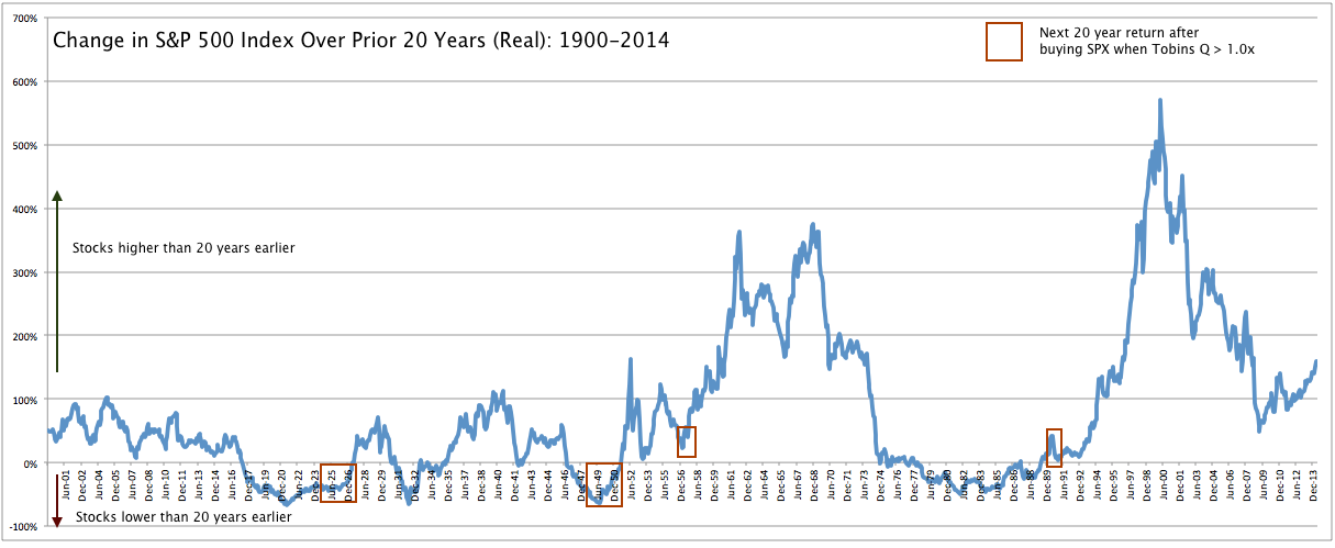
Let's look at the rolling 20 year appreciation in the S&P for those instances when investors had bought when the Q ratio was over 1.0x (red boxes). Since the tech bubble was within the past 20 years, there are only 4 instances: in two, appreciation was negative and in the other two, it averaged about 2% per annum (versus an historical average of about 6.2% for the S&P since 1900).
Over a 10 year time span, appreciation was negative in all cases except for at the end of 2003-07 bull market, when valuations were near 0.9x.
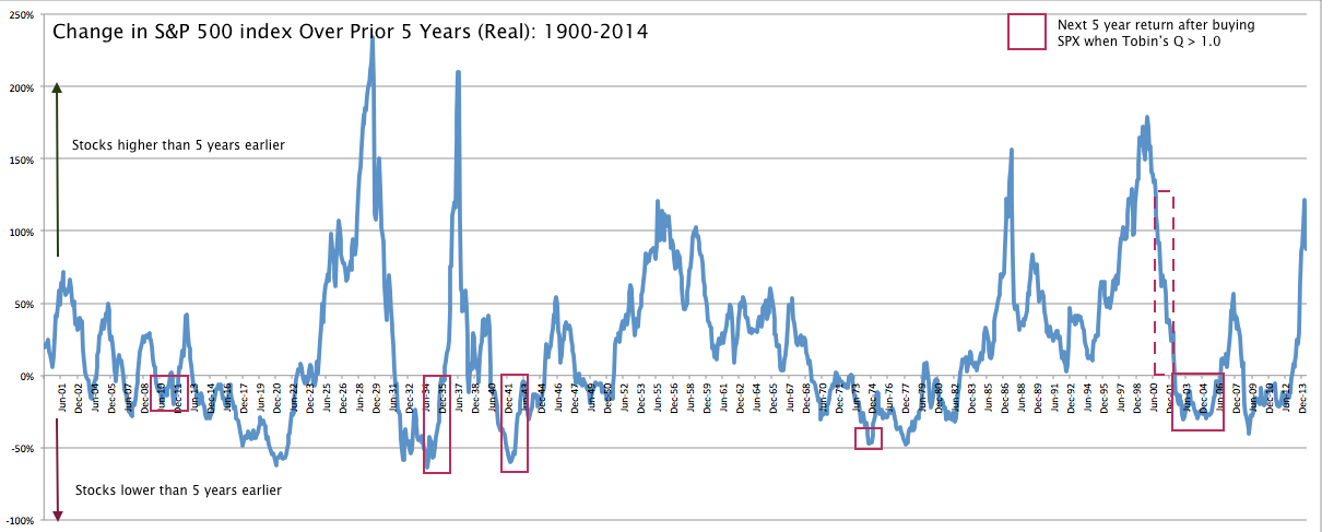
Over a 5 year time span, appreciation was negative in all cases except for 2000-01, when valuations were coming down from the tech bubble highs of 1.6x.
We have used Tobin's Q in these examples because its correlation with future returns is among the highest of the various ways of valuing equities, but we could also use Market Cap/GDP (chart) or Shiller's PE10 (chart). The conclusion is the same in any case. The Fed Model, which compares valuation (or rather, earnings yield) relative to interest rates, has a much poorer correlation with future returns (more on this here).
'Buy and hold' investing over a 30 year period has a high probability of success; the likelihood that the index will appreciate gets lower the shorter the time horizon. Nevertheless, investors have favorable odds of making money in equities; even over a 5 year time frame, equities are higher more than 60% of the time.
None of the analysis above says anything about how much equities will likely appreciate over the next year or two. A combination of euphoric investor psychology and global economic expansion could well push prices much higher.
But history tells us two things: one, equities aren't always higher 5, 10, 20 or even 30 years later; and two, buying when valuations are relatively high has a poor track record of producing great returns in the future. If nothing else, this suggests the annual appreciation in price from today will likely be not much better than low single digits over the long term.
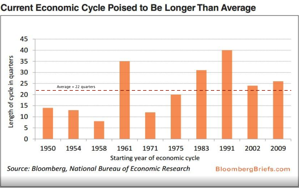
What could change this outlook for the better? First, valuations could remain high, even though the only real precedent for this is the tech bubble. For more than 100 years, high valuations have most often alternated with lower valuations. Second, corporate sales growth, margins and returns on investment could continue to expand. The current economic cycle is already among the longest but this cycle differs from others in the post-war era; it's not unreasonable to expect a longer period of expansion (a post on this is here).
We should note that in our analysis, we have only looked at the appreciation of the index and not counted dividends. The current dividend yield is 1.9%. We don't think that this changes the conclusions at all. Money is not free; investors can choose other investments than equities. And investing in equities involves risk for which investors require compensation. Since the late 1950s, the dividend yield has been less than 10 year treasury yields. In other words, the 'risk-free' cost of capital has been more than the return from just dividends. If we included dividends as well as the cost of capital, the total return since the late 1950s would be less than we have presented above. If current 10 year treasury yields (now 2.3%) begin to move higher, the negative spread with dividends widens further.

