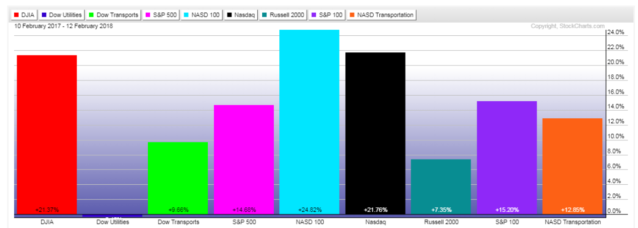
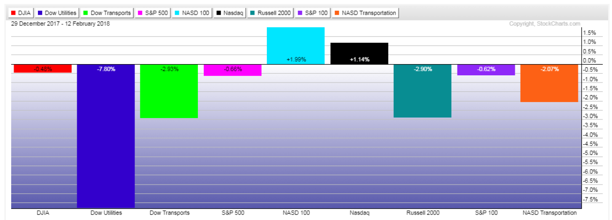
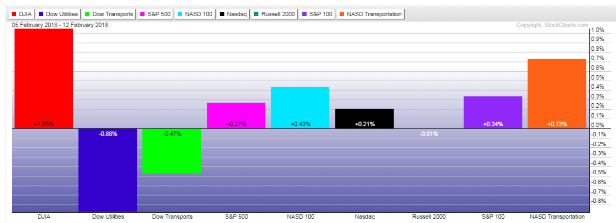
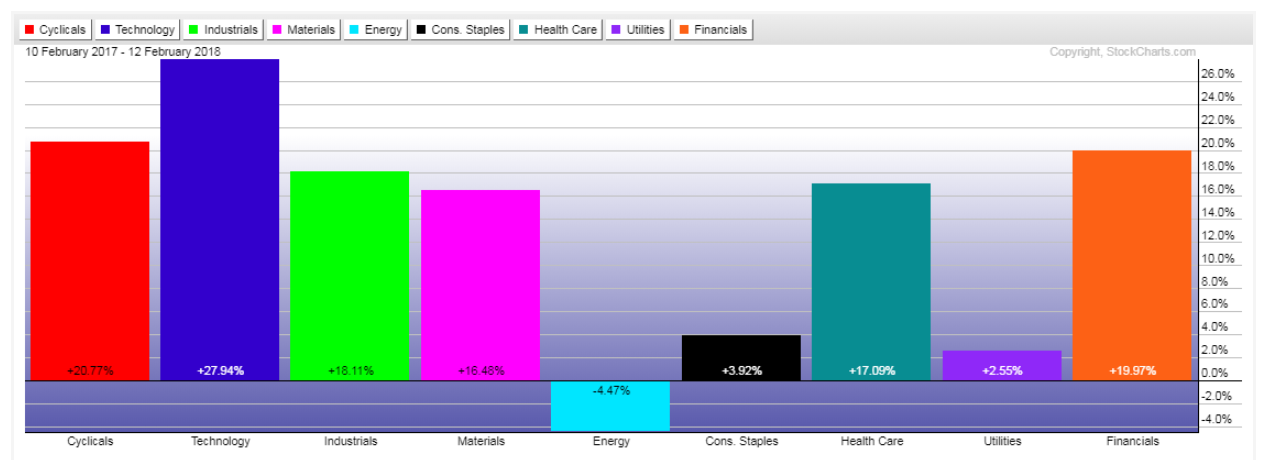
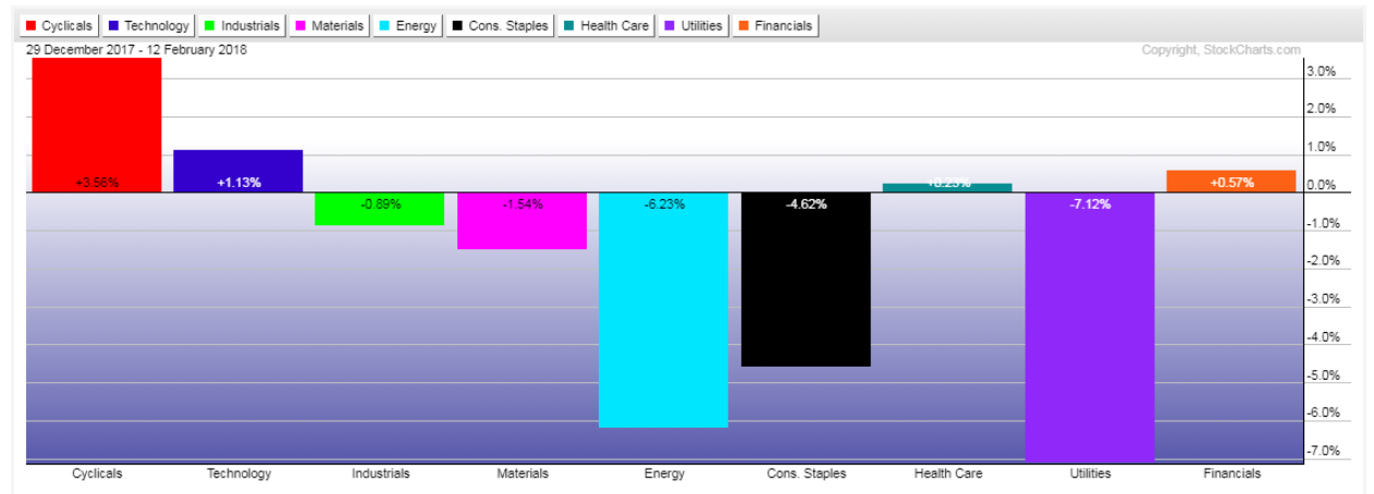
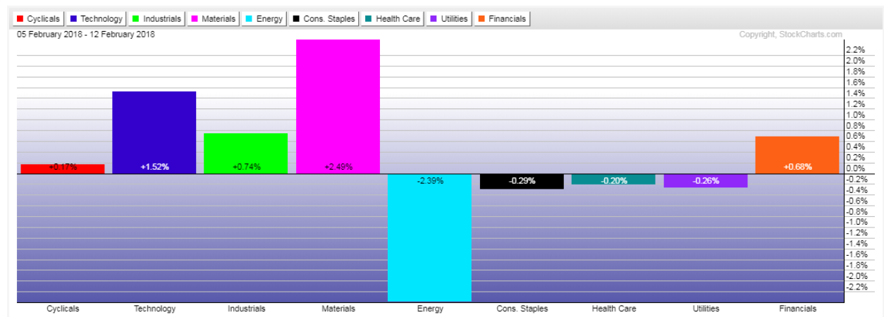
Depicted on the following graphs are percentages gained/lost in Major Indices and Major Sectors over a longer term (1 year), a medium term (year-to-date), and a short term (the past week).
They are presented, simply, to illustrate where they are relative to those three timeframes.
My only comments are as follows:
- Major Indices: Utilities, Small Caps and Transports continue to underperform, and I'd monitor Small Caps, in particular, as I outlined in yesterday's article, for further signs of weakness and an indicator of further equity risk-off activity.
- Major Sectors: Energy, Consumer Staples, Health Care and Utilities continue to underperform, but I'd keep an eye on Financials for any evidence of further weakening, as I recently described here.
Finally, the "volatility gauges" mentioned in this post may also offer clues on equity direction, as well as index/sector and risk on/off preference in the weeks ahead. I referred to Technology in that article, and it's especially worth monitoring, inasmuch as a marked weakening of that sector could have quite a negative impact on equities as a whole. 