With U.S. stocks wilting in the fourth quarter, the S&P 500 Index (SPX) recently made a "death cross," as many financial media outlets have mentioned. Specifically, the broad-market barometer's 50-day moving average just edged south of the 200-day moving average, typically viewed as a bearish technical indicator. While we recently took a look at individual stocks making death crosses, below is a look at what Wall Street might expect if this ominous-sounding chart pattern comes to fruition.
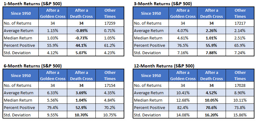
There have been 34 death crosses since 1950, per Schaeffer's Senior Quantitative Analyst Rocky White. On the surface, it's clear why the chart pattern is typically considered a bearish signal. A month after death crosses, the S&P 500 was down 0.89%, on average, and higher less than half the time. That's compared to an average anytime one-month gain of 0.71%, with a win rate of 61.2%.
Six and 12 months after a death cross, the index averaged weaker-than-usual returns of 3.69% and 4.52%, respectively. Plus, six months out, the SPX was higher just over half the time, compared to 70.2% anytime.
"Golden crosses" -- when the 50-day moving average moves back above the 200-day -- meanwhile, have been bullish indicators. The S&P 500's average returns after these signals have been higher than usual, and the index has been positive a year later 82.4% of the time.

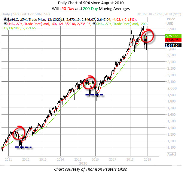
However, when zooming in, you'll find that the most recent death crosses have not been proverbial death sentences for the S&P 500, though they did mark short-term bottoms. The last time the SPX made a death cross was in January 2016, shortly before the February 2016 doldrums. Prior to that, you'd have to go back to August 2015, just after the "flash crash," which was the first signal since August 2011, when stocks fell on a U.S. credit rating downgrade by Standard & Poor's.

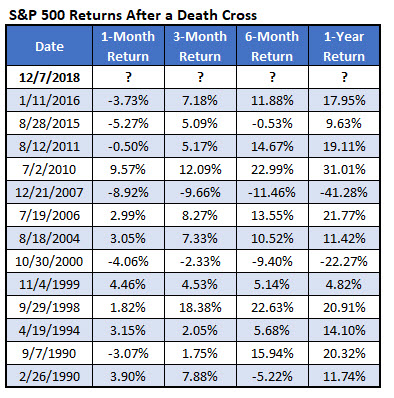
As you can see in the chart below, five of the last seven death crosses have preceded double-digit percentage gains for the S&P 500 over the subsequent six months. And six of the last seven death crosses preceded positive one-year returns. The exception was the December 2007 death cross, which occurred around the time of the financial crisis.

In conclusion, if recent history is any indicator, the 2018 death cross could mean the S&P is flirting with a near-term bottom. As Schaeffer's Senior V.P. of Research Todd Salamone recently noted, traders should watch the SPX's trajectory around the 2,600 and 2,800 levels for clues to which way Wall Street's pendulum might ultimately swing.
