If you knew (or thought) a bear market in stocks was just around the corner, would you prefer to be invested in 100% stocks or 100% bonds? Since the S&P 500 lost over 50% in the last two bear markets (2000-2002 and 2007-2009), the answer is easy. Therefore, we can learn something about the market’s tolerance for risk by monitoring the ratio of stocks to bonds.
Dot-Com Yellow Flag
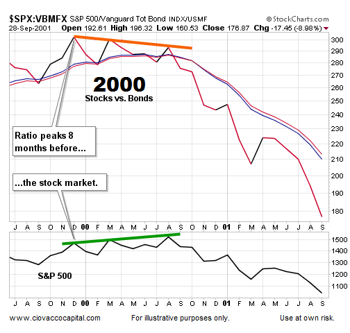
Since the aggregate bond ETF (ARCA:AGG) was not trading in 1999, we will use the highly correlated Vanguard Total Bond Market Fund (VBMFX) for this exercise. The chart below shows the performance of the S&P 500 relative to a diversified basket of bonds. Since some investors became concerned about the sustainability of the dot-com bubble in late 1999, the demand for stocks started to wane relative to bonds, which was indicative of increasing concern about stocks and the economy (see slope of orange line below).

Financial Crisis Warning
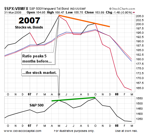
The same “risk-on vs. risk-off” logic can be applied to the stock market peak in October 2007. The ratio peaked 5 months before the S&P 500 (compare slope of orange and green lines below).

How Does The Same Ratio Look Today?
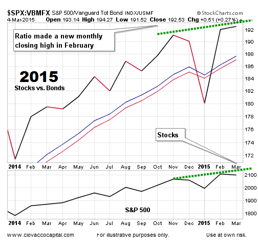
Rather than waving “be careful with risk” flags in 2015, the same stock/bond ratio posted a new monthly closing high in February. The blue and red moving averages also look much healthier in 2015 than they did in the higher-risk stages of 2000 and 2007.

Investment Implications – The Weight Of The Evidence
Do the charts above provide an “all clear” signal for stocks? No – the present day stock/bond ratio simply tells us the probability of a new bear market kicking off in the next several weeks is quite a bit lower than it was in March 2000 or October 2007. Since the ratio studied here is not foolproof, our market model uses a wide array of inputs. A February 27 video covers the concepts above, as well as other risk measures, in more detail.
