
What are and why could Eiffel-Tower Patterns be important to your investments/portfolio? If a rally creates a chart that looks like the left side of said tower, investors often end up experiencing the right side of the pattern too. True Eiffel towers -- on the right side -- decline to where the left side started. In other words, all gains are wiped out.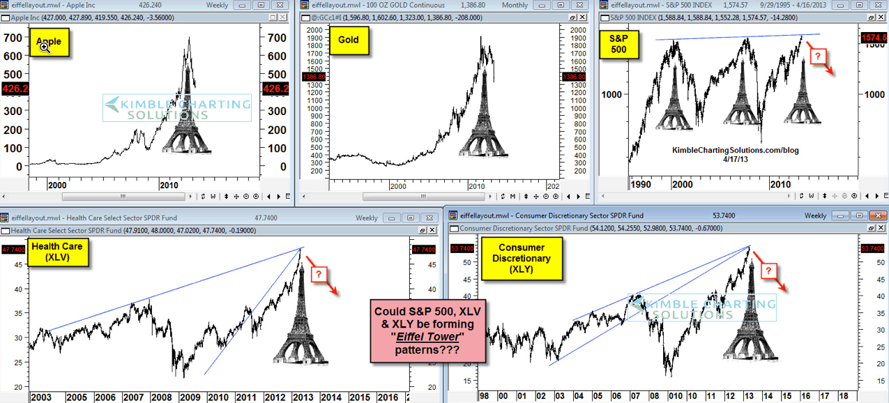
The four-pack below reflects completed Eiffel-Tower patterns in a variety of assets that took place over the last 17-years ... 'completed' meaning the decline wiped out the prior gains.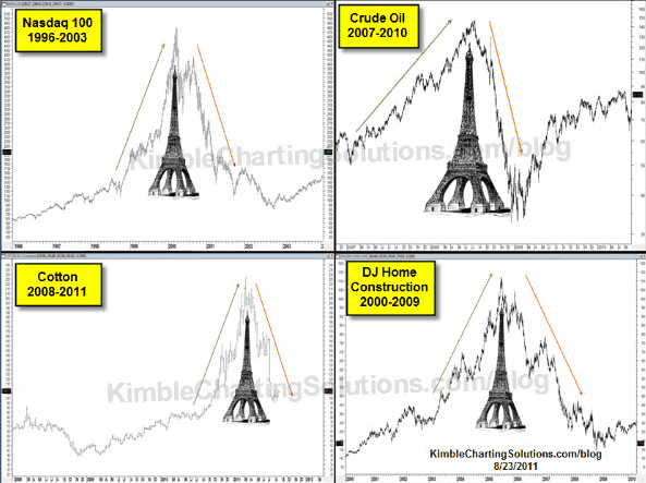
Buyers' Remorse
The Power of the Patterns showed that Apple (AAPL) may be forming this pattern at its peak (Apple Eiffel here) and that gold could be forming one as well, within 10-days of its peak in August of 2011 (Gold Eiffel here). In hindsight, does any investor wish they'd sold Apple at $650 or gold at $1,850?
Now the Power of the Pattern is reflecting in the five-pack (first chart above) that the S&P 500 (SPY), Health Care (XLV) and Consumer Discretionary (XLY) could be forming Eiffel-Tower patterns. We have no proof that these patterns are in place, yet the potential is there. The outcome of these patterns could have a big impact on portfolio construction.
Remember that when it comes to Eiffel-Tower patterns, it's not the odds of the pattern coming true that's key, it's the impact if it does.
- English (UK)
- English (India)
- English (Canada)
- English (Australia)
- English (South Africa)
- English (Philippines)
- English (Nigeria)
- Deutsch
- Español (España)
- Español (México)
- Français
- Italiano
- Nederlands
- Polski
- Português (Portugal)
- Português (Brasil)
- Русский
- Türkçe
- العربية
- Ελληνικά
- Svenska
- Suomi
- עברית
- 日本語
- 한국어
- 简体中文
- 繁體中文
- Bahasa Indonesia
- Bahasa Melayu
- ไทย
- Tiếng Việt
- हिंदी
What Do You Really Know About Eiffel-Tower Patterns?
Latest comments
Loading next article…
Install Our App
Risk Disclosure: Trading in financial instruments and/or cryptocurrencies involves high risks including the risk of losing some, or all, of your investment amount, and may not be suitable for all investors. Prices of cryptocurrencies are extremely volatile and may be affected by external factors such as financial, regulatory or political events. Trading on margin increases the financial risks.
Before deciding to trade in financial instrument or cryptocurrencies you should be fully informed of the risks and costs associated with trading the financial markets, carefully consider your investment objectives, level of experience, and risk appetite, and seek professional advice where needed.
Fusion Media would like to remind you that the data contained in this website is not necessarily real-time nor accurate. The data and prices on the website are not necessarily provided by any market or exchange, but may be provided by market makers, and so prices may not be accurate and may differ from the actual price at any given market, meaning prices are indicative and not appropriate for trading purposes. Fusion Media and any provider of the data contained in this website will not accept liability for any loss or damage as a result of your trading, or your reliance on the information contained within this website.
It is prohibited to use, store, reproduce, display, modify, transmit or distribute the data contained in this website without the explicit prior written permission of Fusion Media and/or the data provider. All intellectual property rights are reserved by the providers and/or the exchange providing the data contained in this website.
Fusion Media may be compensated by the advertisers that appear on the website, based on your interaction with the advertisements or advertisers.
© 2007-2025 - Fusion Media Limited. All Rights Reserved.