On Monday, the S&P 500 hit 2000 for the first time ever. This target was something I laid out very early this year following the Federal Reserve announcement in December that they would begin tapering the current Quantitative Easing (QE) program. To wit:
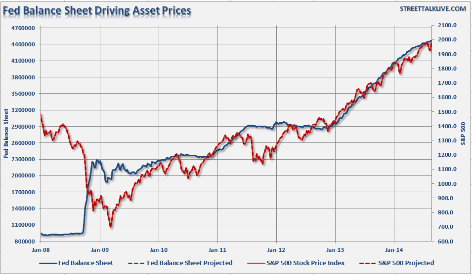
"This is something that I discussed previously. The chart below shows the historical correlation between increases in the Fed's balance sheet and the S&P 500. I have also projected the theoretical conclusion of the Fed's program by assuming a continued reduction in purchases of $10 billion at each of the future FOMC meetings."
If the current pace of reductions continues, it is reasonable to assume that the Fed will terminate the current QE program by the October meeting. If we assume the current correlation remains intact, it projects an advance of the S&P 500 to roughly 2000 by the end of the year. This would imply an 8% advance for the market for the entirety of 2014."
(Note: The chart has been updated to current balance sheet and market figures.)
Following last week's conclusion of the Jackson Hole Economic Symposium, Janet Yellen did indeed confirm that current round of Quantitative Easing will be completed by October. Via Bloomberg:
*YELLEN REITERATES ASSET BUYING TO BE COMPLETED IN OCTOBER
Next Stop 2100
Now that my target was achieved four months sooner than anticipated, and given that the Federal Reserve is on course to raise interest rates by mid-2015, the question is now "what next?
[For the record, no one really can forecast the future. These are just "best guesses" based on current data trends and are subject to exogenous shocks that change the underlying market dynamics.]
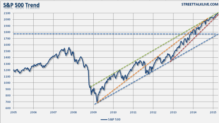
The chart below shows the current trend of the S&P 500 from the 2009 lows until present.
The orange dashed line shows the trend of the market from the 2009 lows through the initial market correction in 2010 following the end of the first round of QE. Very quickly, Bernanke figured out that the economy was far to weak too operate without support, and he quickly launched a second round of QE in September of 2011. However, the damage was done as the market broke the previous bullish trend line turning that previous support into permanent resistance.
The market was able to establish a new trend (blue dashed line) which became successful support during to declines in 2012 as the markets struggled with the demise of QE2. If you reference the first chart above, you will notice the Federal Reserve's balance sheet stagnating for several months along with the market.
At the end of 2012, the markets and the economy were faced the onset of the "dreaded fiscal cliff." Part of the debt ceiling negotiation in the summer of 2011 was the creation of the "Budget Control Act" which contained a trigger for automatic budget cuts, and tax increases, that would be triggered in January of 2013. Again, with the economy still running well below par, Bernanke acted quickly to provided enough liquidity to ensure financial and economic stability as the cuts and tax increases were enacted. The negative consequences of the "sequester" were much less than anticipated, and the deluge of $85 billion a month in liquidity ignited the markets into lift off establishing an accelerated trend higher (red dashed line.) Despite the successive push of liquidity into the markets, the S&P 500 has been unable to break above the overhead resistance of the longer term trend lines.
Based on this analysis, it is highly likely the markets will indeed drift higher within the current channel due solely to existing momentum. If this analysis is correct, it is likely that the markets could work their way towards 2100 by April of next year which would equate to an additional 5% gain from current levels.
However, this forecast is not without risks.
1) There is no guarantee that the economy is strong enough to survive without the ongoing support of the Federal Reserve. After an extremely dismal Q1, the economy experienced a snap-back in Q2. The question of sustainability of that growth has yet to be answered.
2) Farmer's Almanac, the 198-year-old publication that correctly predicted the past nasty winter while federal forecasters blew it, are predicting more of the same for the coming season. "Polar Vortex's" are already likely farming and will be impacting roughly three-fourths of the U.S. this winter. Considering Q1 took more than a 2% plunge, WITH the Federal Reserve pumping in billions of dollars, it begs the question of how bad it could get without support this winter?
3) As I pointed out recently, the Mid-Term elections could pose a threat.
"The markets like 'gridlock' in government as it eliminates the risk of adverse fiscal policies. However, there is a rising probability that conservative Republicans could gain control of the Senate while maintaining majority control of Congress. The impact of such an outcome could be negative for the markets as it increases the probabilities of drastic cuts in government spending, reductions/reform of entitlement programs, and potential repeal, or 'fix,' of the Affordable Care Act (ACA). While moves to a more fiscally responsible government would provide longer term benefits, such actions would likely trigger an economic recession and stock market correction."
4) Geo-political risks are still very prevalent and potentially getting worse.
5) The contraction of both the Eurozone and Japanese economies, along with the slow-down in China, is likely to weigh on the domestic economy and corporate profitability.
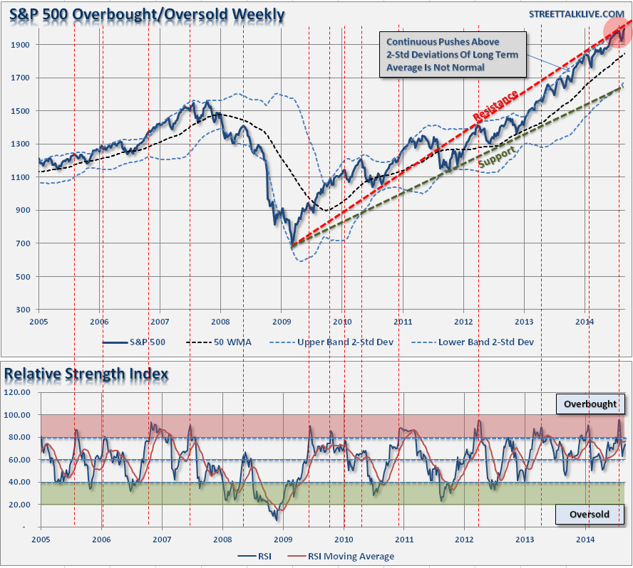
However, beyond those risks is the realization that the markets are very extended as the current bull run has leapt ahead unabated by a correction. The first chart below shows the S&P 500 on a weekly basis versus its 50-week moving average and bands representing 2-standard deviations from its mean.
The index is pushing the upper-limits of previous resistance levels which has typically led to at least a short-term correction. However, as seen in early 2012, as the Federal Reserve was winding down QE2, the correction was quite a bit larger than we have witnessed as of late. If we assume a similar pull-back following the end of QE3, a test of support at the 50-week moving average would be most likely at 1900 or a 5% decline.
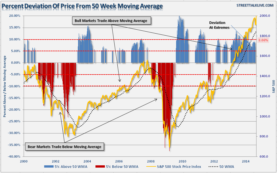
Furthermore, as I have discussed in the past, moving averages act much like gravity for stocks prices. The longer the duration of the moving average, the greater the "gravitational pull" on prices. The chart below shows the percentage deviation of the S&P 500 from its underlying 50-week moving average.
At over 8%, the recent correction at the end of July did little to correct the extension of the markets currently. Also, we are in one of the longer periods in recent history where the markets have consistently remained at more than 5% above its 50-week moving average. As you can see, deviations that are more than 5% above the longer-term moving average are not infinitely sustainable, 10% extensions are even more dangerous.
Following the very mild correction in July, it would not be surprising to see the markets push higher into the fall. However, the risk of a more significant correction has not been alleviated by any means and investors should be cognizant of the inherent risks.
Importantly, the current "bullish trend" remains intact, and therefore portfolios should remain invested currently. The rising levels of bullishness and complacency in the markets are sure warning signs that something "wicked this way comes," however, as I stated yesterday, "timing is everything." Despite the ongoing litany of articles that suggest that "buy and hold" is the only way to win the long term game, the reality is that participating in rising markets is only half the battle. What wins the long-term investing game is avoiding a bulk of the declines.
Pay attention, things are likely to get interesting from here.


