The economic calendar is loaded, especially with reports on housing. Despite this, the calendar and recent events will stimulate pundits to get out their crystal balls. I expect many to be asking:
Can the rally in stocks find fresh legs in 2018?
Last Week Recap
In the last edition of WTWA I observed that Santa might need a GPS to deliver on the typical year-end rally. The various sideshows – the Alabama election, the Fed meeting, the tax cut saga – played out and the market celebration continued.
The Story in One Chart
I always start my personal review of the week by looking at a great chart. Jill Mislinski’s weekly version of the S&P 500 is first-rate, pulling together several key points in a single look. She notes the new record for the market in addition to the daily moves. Friday’s rally was the key feature of the week. Her article also takes note of the big increase in volatility this week.
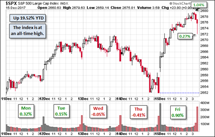
Despite the excitement of the record high and Friday’s trading, the weekly trading range was again less than one percent.
The News
Each week I break down events into good and bad. For our purposes, “good” has two components. The news must be market friendly and better than expectations. I avoid using my personal preferences in evaluating news – and you should, too!
The economic news continues to be strong. New Deal Democrat notes a small deterioration in his long-range indicators. Take a look, as I do every week, at his helpful list of high-frequency indicators as well as his summary. For those of us with a serious interest in the economy, it is an efficient way to see items you would otherwise miss.
The Good
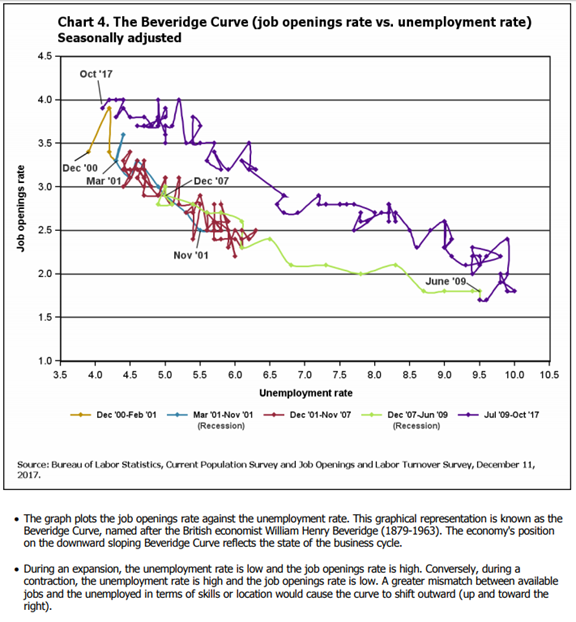
- Job openings told a positive story. The JOLTs report is widely misunderstood and most of the commentary is unhelpful. The most important elements are the quit rate and the labor market structure. Voluntary quits are at a rate of 3.2 million per month, better than before the recession. Structure of the labor market is best understood via the Beveridge Curve. Here is the BLS explanation.
- Inflation remained tame with both PPI and CPI core rates rising at or below expectations of 0.2%. There are many that view this as a sign of a weak economy, but that is not consistent with the rest of the data.
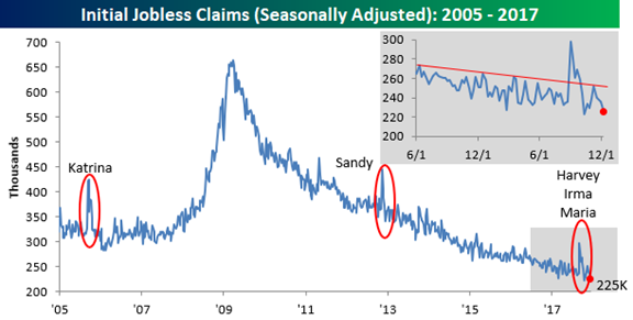
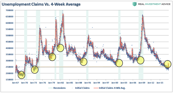
- Initial jobless claims made another new low. Bespoke’s chart combines both a long- and short-term look. You might wonder how someone could view this as bad news, but see below for the answer.
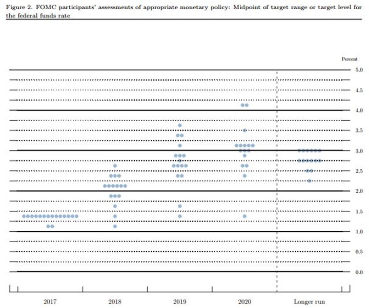
- The FOMC decision to raise short-term interest rates was not a surprise, and the markets took it in stride. This is despite the continuing plan for three more hikes next year, as illustrated by the Fed “Dot Plot.” Perhaps the calm is because few market observers have much confidence in the dot plot forecasts!
- Tax cut legislation neared passage. With several key Senators either getting concessions or dropping their demands, Senate passage seems nearly certain. With the loss of a Senate seat and some serious illnesses, the GOP has a strong incentive to move quickly. (I know that many readers oppose these changes. Please note my description of “good” as “market-friendly.” It is one perspective, and the one most important to us in our investing roles.
- Industrial production was up 0.2%, slightly less than expectations, but the prior month was revised upward from a gain of 0.9% to 1.2%. This is a noisy series. New Deal Democrat takes note of this case of “hard data” confirming prior survey data. Sometimes the surveys serve as solid leading indicators.
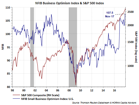
- Small business optimism reached a 34-year high. (HORAN) If the survey opinions lead to action, small business investment and hiring could take an increased role as an economic driver.
- Retail sales grew at a very strong pace, 0.8% versus expectations of 0.3%. The prior month was also revised higher, from 0.2% to 0.5%. This is very encouraging for a sector regarded as under pressure.
The Bad
Not much bad news last week. Feel free to add comments about anything I missed.
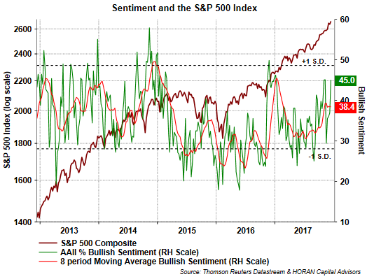
- Investor sentiment turns more bullish, a contrarian indicator. David Templeton (HORAN Capital Advisors) notes this as a story mostly about the decline in bearish sentiment.
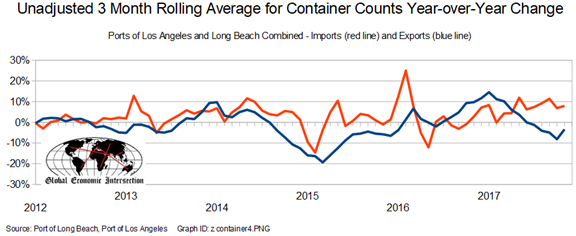
- Imports and exports, measured by sea container data, suggest an increasing trade deficit. Steven Hansen’s excellent regular update on this story provides, data, charts and analysis.
The Ugly
Student loans. Nearly 5 million students in default, double that of last year? Despite a strengthening economy? (WSJ). Student loans account for the largest asset of the U.S. government, $1.37 trillion. That includes only debt that is at the repayment stage. Mrs. OldProf (a former banker) sees this as a big problem. We need the contributions of graduates. Taking away their bank accounts and professional licenses does not help on that front. She notes that there are precedents for leniency as an incentive to take certain jobs or to work in certain locations. It is a very challenging issue.
Noteworthy
Wired has a great article on the increase in data collection and integration in China. Some will find it disturbing, but everyone should be interested. Imagine that you had a score, relevant for credit, and various other perks. It was influenced by whom you chose as friends. And so were their scores. Would it affect your choice of friends? Even George Orwell could not have imagined this! And how close are US methods?
The Week Ahead
We would all like to know the direction of the market in advance. Good luck with that! Second best is planning what to look for and how to react.
The Calendar
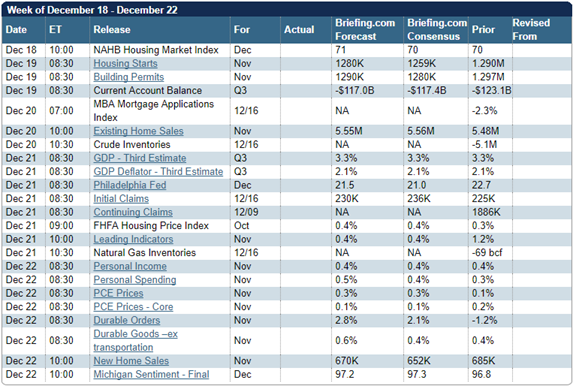
It is a big week for housing data. Starts, permits, existing sales, and new home sales are all released in the same week. Personal income and spending are also important. The PCE price index is the Fed’s preferred measure. And of course, with the FOMC decision behind us, FedSpeak can resume.
Briefing.com has a good U.S. economic calendar for the week (and many other good features which I monitor each day). Here are the main U.S. releases.
Next Week’s Theme
At a different time of the year, the combination of all the major housing reports in a single week (I can’t remember seeing this before) would be the obvious topic. If the news preceded a Fed meeting, the topic would be a slam dunk. Not so this year. The effect of the calendar can sometimes be dramatic. Much of the investment business for the year will be finished by Wednesday. Producers might even be challenged to find experienced pundits for interviews. The result:
The 2018 forecasting season is upon us!
Here is a simple (but not comprehensive) typology for 2018 forecasts, including some examples:
- Market forecasts
- Bearish change. This requires a negative view on the economy and corporate earnings. An example is this source, which argues that a recession is in the “not-so-distant future”. The argument includes many of the recession analysis mistakes, including describing the poor forecasting record of the National Bureau of Economic Research. The author seems blissfully unaware of the actual role of the NBER. It is too bad that those claiming to be experts on this topic are not required even to know the definition of a recession! The author then takes a chart of current good news, jobless claims (see Bespoke chart above) and guesses that this might be the best things will get. I am always amazed that perma-bear authors get away with arguing that good news is bad (as is, of course, bad news). A recession always starts with a business cycle peak. Calling the peak is quite a challenge. You could draw the little yellow circles at several points over the last five years! Why now?
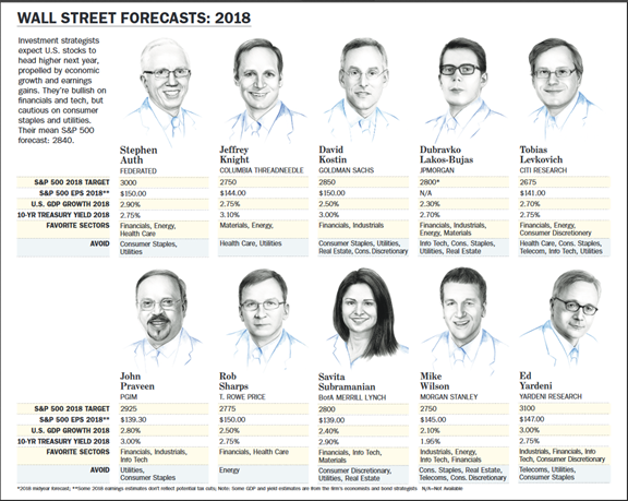
- Trending. This includes most of the Barron’s panel from last week. Here is the summary, but it is much more important to read the reasoning.
- Bullish change. Earnings expert Brian Gilmartin takes a skeptical look at the landscape and still finds that earnings are moving higher, and so are the changes in estimates.
- Economic forecasts
- World economy. How about India?
- US economy.
- Specific sectors or themes. The IEA has an excellent publication on the World Energy Outlook. It includes a specific analysis of China and the sharp change in energy policy. For example, China’s energy mix is becoming more diversified, with greater emphasis on solar. Demand for the average household will double by 2040.
- Political forecasts – power shifts around the world. These are often speculative, but might be worth reading.
- Pseudo forecasts – research which seems to invite a conclusion, but leaves responsibility to the reader. This encompasses most of the objective stock research that supposedly does not do any forecasting. If someone writes, and supports with data, that on 27 of 36 similar situations stocks move higher, how should that be interpreted?
- Forecast objectors – those who see no value in the process. This position has gained popularity in the past year. The proponents believe that their behavior should not adapt to any expectations about future events. This has become the most prevalent viewpoint in the investment blogosphere. The leading proponents apparently have no modelers or economists as part of their team. Their brief and repeated criticisms of models, surveys, and other research methods is very basic. The topics repeatedly mentioned are those covered in the first week of any serious course. The criticisms might be more persuasive if the critics had even minimal experience in the relevant subjects. It is usually accompanied by praise for low-cost index funds, passively invested. Barron’s asks when this “passive juggernaut” might end. Here is a key observation:
“The Vanguard juggernaut will roll on until we see a very good correction of some length, if not a bear market,” predicts Dan Wiener of Adviser Investments, who, with his colleague Jeffrey DeMaso, has been thinking about big events that fund investors might face in 2018. What happens then “could be a complete reversal from the experience” of the past several years.
As usual, I’ll have more in the Final Thought.
Quant Corner
We follow some regular featured sources and the best other quant news from the week.
Risk Analysis
I have a rule for my investment clients. Think first about your risk. Only then should you consider possible rewards. I monitor many quantitative reports and highlight the best methods in this weekly update.
The Indicator Snapshot
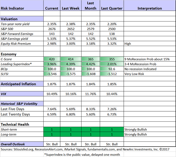
Recession odds remain low and many economic indicators are improving.
The Featured Sources:
Bob Dieli: Business cycle analysis via the “C Score.
RecessionAlert: Strong quantitative indicators for both economic and market analysis.
Brian Gilmartin: All things earnings, for the overall market as well as many individual companies.
Georg Vrba: Business cycle indicator and market timing tools.
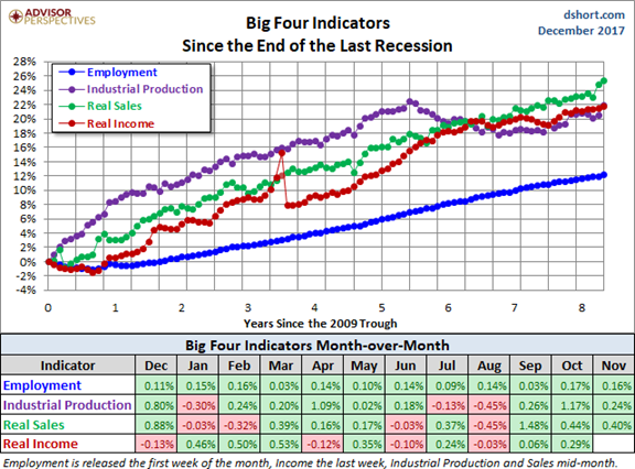
Doug Short: Regular updating of an array of indicators. Great charts and analysis. Let’s take another look at the regular update (via Jill Mislinski) of the Big Four indicators most influential in recession dating. The recent strength in these indicators is clear from the chart.
Insight for Traders
Our discussion of trading ideas has moved to the weekly Stock Exchange post. The coverage is bigger and better than ever. We combine links to trading articles, topical themes, and ideas from our trading models. This week’s post discusses how to put your trading in the right perspective. Check it out to learn a great trading trick from Charles Kirk. Model performance updates are published, and of course, there are updated ratings lists for Felix and Oscar, this week featuring the DJIA. Blue Harbinger has taken the lead role on this post, using information from me and from the models. He is doing a great job.
