For Thrasher Analytics subscribers I share my Volatility Risk Trigger (VRT) model that I use to gain better insight into the potential for the Volatility Index to spike higher. A piece of my model is based on the topic I covered in my Charles Dow award-winning paper, Forecasting a Volatility Tsunami, which looked at the daily dispersion within the VIX.
As I covered in my paper, the Volatility Index has historically seen above-average spikes higher once its daily dispersion (measured by standard deviation) has fallen to a very low-level, which it currently has done.
Because the VIX can make large intra-week moves, weekly charts are rarely shared of the ‘fear index’. However, something I’ve been watching closely lately has been the dispersion of activity for the VIX on a weekly time-frame. In fact, as of this morning it’s nearing a level that’s only been hit a handful of times since the inception of the VIX.
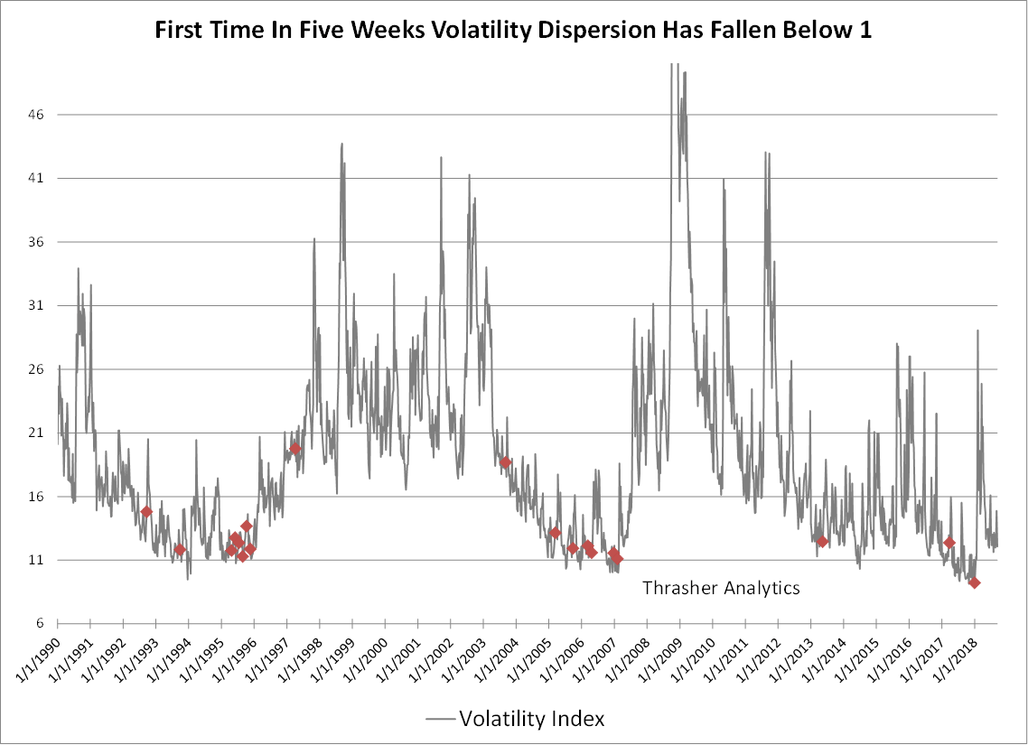
The chart below shows when the weekly dispersion of the VIX has fallen below 1 for the first time in five weeks, a level that as of today we’re very close to breaking under. What immediately stands out to me is that this narrowing in weekly dispersion was one of the early warning signs before the massive spike in February. That’s not to say we will see a repeat of the February spike but it does lend itself to the idea that complacency has flooded the volatility market as it did earlier this year. Before January, we didn’t see weekly dispersion narrow like this outside of 2017 and 2013 and before then we’d have to go back to 2007 when the VIX put in an ultimate low before the GFC.

While narrow dispersion, in my opinion, is not enough to warrant significant action to be taken, when paired with other analysis and pieces of data it can provide excellent insight into what’s developing in the volatility and equity markets. The letter I sent to Thrasher Analytics subscribers on Sunday laid out several other key levels and chart I’m watching right now.
