Those that follow my personal account on Twitter will be familiar with my weekly S&P 500 #ChartStorm in which I pick out 10 charts on the S&P500 to tweet. Typically I'll pick a couple of themes and hammer them home with the charts, but sometimes it's just a selection of charts that will add to your perspective and help inform your own view - whether its bearish, bullish, or something else!
The purpose of this note is to add some extra context beyond the 280 characters of Twitter. It's worth noting that the aim of the #ChartStorm isn't necessarily to arrive at a certain view but to highlight charts and themes worth paying attention to.
So here's the another S&P 500 #ChartStorm write-up!
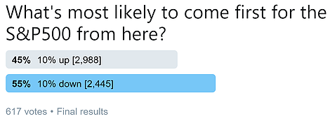
1. Investor Survey: First up is a survey I conducted on Twitter earlier in the week, it asks respondents "what is most likely to come FIRST for the S&P500 from here?" up 10% or down 10% (with the closing levels in brackets). Interestingly there was a slight majority in the down-10% camp. This lines up with the thesis or idea that the S&P500 might make another shot lower before heading higher, or indeed just the plain bearish view that the cycle-top is in now. I would highlight that often time the consensus ends up being wrong, so maybe there is some contrarian information in that...
Bottom line: A slight consensus sees the market more likely to head down 10%.
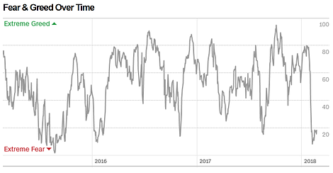
2. Fear and Greed Index: On a similar line, the CNN Money Fear and Greed Index remains deep in fear mode. There are a few factors pushing it down into extreme fear. When I think about investor sentiment measures like this I often say that they have momentum information through the range, and contrarian information at extremes. All else equal I would say this is a contrarian bullish signal.
Bottom line: The Fear and Greed Index is in extreme fear mode, a potential contrarian bullish signal.
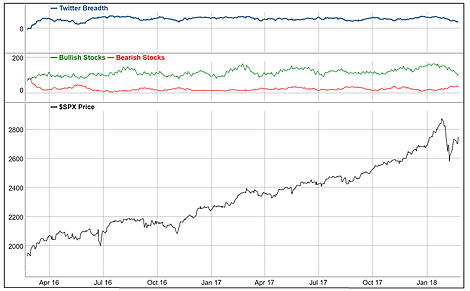
3. Twitter Breadth: Keeping with the sentiment topic, this is a unique indicator from Trade Followers which tracks the frequency/proportion of bearish vs bullish tweets on stocks. You can see a clear trend (down) in bullishness and (up) in bearishness. This has left twitter breadth trending down, and while it is yet to crossover into net-bearish it is interesting how the mood is steadily shifting. Sometimes the crowd can be right, so you don't dismiss this sort of information out of hand, but it does add to the sense of bearishness and fearishness.
Bottom line: Twitter stock market sentiment breadth is becoming steadily less bullish.
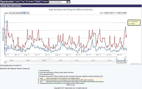
4. Insider Transactions: Again, keeping with the sentiment theme, this chart shows insider transactions activity. The standout on the chart for me is the surge in sales. I wonder (and I am only speculating) whether this surge in sales is because the insiders know something (e.g. deterioration in conditions) or simply because they are sitting on handsome gains after a rocking year in 2017 and got spooked by the correction and are now taking those gains off the table. Taken at face value, it represents another measure of sentiment and it looks negative/bearish.
Bottom line: Insider sales activity has picked up recently.
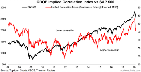
5. Implied Correlations: Somewhat related to sentiment is the Implied Correlation Index (a sort of cousin to the CBOE VIX in that it is also derived from option pricing). The implied correlation index has spiked (it is shown inverted) in a way that it usually does around a short-term market bottom. There are a few reasons to think this e.g. correlations converge towards 1 in a panic (indiscriminate selling, passive selling, etc). So as far as contrarian signals go, it's another one potentially to add to the list along with the previous 4 charts.
Bottom line: Implied correlations are spiking, which may be a contrarian buy signal.
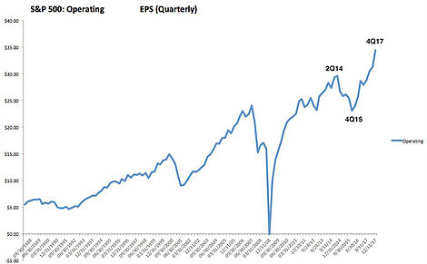
6. S&P500 Operating Earnings: The next few charts focus on earnings, first one is by Urban Carmel and shows the path of S&P500 operating EPS (earnings per share). What stands out to me on this chart is the decisive recovery since the earnings recession in 2015. On that note it's worth comparing and contrasting the 2015/16 corrections and the current stockmarket correction - back then earnings were on the decline, whereas now they are on the up and up particularly with the extra shot from the tax reforms. That is important.
Bottom line: Earnings have made a solid recovery since the earnings recession in 2015.
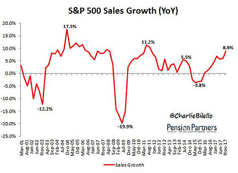
7. S&P500 Sales Growth: This graph from Charlie Bilello shows the path of S&P500 sales growth, again shaking off the earnings recession of 2015, and putting in a solid pace of growth even after the passing through of base-effects. This is a particularly encouraging sign to see sales growth running at a solid pace, and in all fairness it reflects my views on the global economic backdrop (i.e. synchronized global economic upturn).
Bottom line: Sales growth is running at a solid pace.
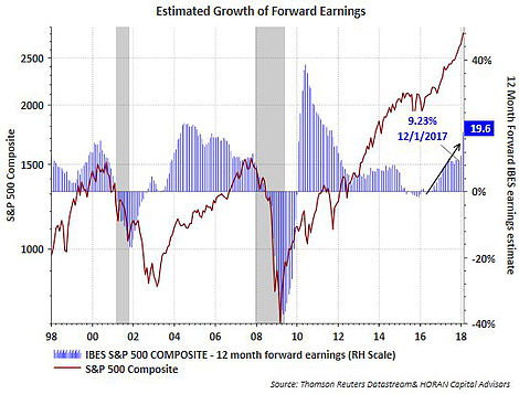
8. Forward Earnings Growth: Rounding out the earnings picture, this chart from HORAN Capital Advisers shows a stark transition from forward earnings expanding at a 9.2% YoY pace in December 2017 vs a 19.6% YoY pace in January. Just goes to show the impact of the tax cuts on the earnings outlook - yet also builds on the solid existing momentum in earnings thanks to the weaker US dollar, stable commodity prices, and solid domestic economy within the backdrop of a strong global economy. So all up the earnings picture looks good at this point.
Bottom line: Forward earnings growth has seen substantial acceleration thanks to tax cuts.
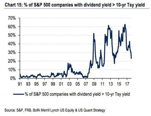
9. Dividend Yields vs Bond Yields: This chart from BAML, shared by Mo Hossain on Twitter, shows the breadth of S&P500 components where dividend yields exceed the 10-year Treasury yield. The picture that it presents across time, particularly in the post-2009 era is interesting enough by itself, but the dive down in this indicator is also informative. It looks like the chart is only updated through to the latter part of 2017, so I would say based on the only minor adjustment that I have seem in S&P500 dividend yields (separate piece of analysis) and the surge in treasury yields that this indicator will have moved a lot lower since. The pre-2008 period tells you that you don't necessarily need to see a positive spread here for stocks to go up, but it seems reasonable to expect less support for stocks if there is a lower or negative spread, all else equal.
Bottom line: The gap between dividend yield and bond yield is shrinking across S&P500 components.
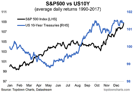
10. Bond and Stock Seasonality: The final chart shows a snapshot of seasonality for both stocks and bonds, and interestingly enough the tendency is for stocks to do well and bonds to do poorly around this time of the year. This tendency holds through to around May-June, there the old "sell in May" saying starts to kick in. I always make sure to point out that seasonality is only one factor, but when it aligns with a number of other factors it can become all the more meaningful. Certainly something to keep in mind.
Bottom line: Historical seasonal tendency is for stocks to do well and bonds to do poorly in the first half of the year.
So where does all this leave us?
This week there are probably 3 main areas of interest:
1. Bearish/'Fearish' sentiment
Whether it was the outlook survey, the fear and greed index, twitter sentiment breadth, insider sales, or the implied correlation index, the overall message is there is still substantial fear and bearishness out there.
2. Solid earnings backdrop
The trend in trailing earnings, sales growth, and forward earnings growth speaks to a solid earnings backdrop, which is a contrasting feature to some of the previous notable post-2009 corrections.
3. Bond yields
The gap between dividend yields and bond yields is narrowing, and if seasonality is anything to go off (and it is my base case to expect) higher bond yields yet may still be on the way.
Summary
Tying it all together we have an apparent backdrop of still substantially bearish and fearful investor sentiment, and you might argue that given the surge in bond yields and shrinking dividend vs bond yield gap partly justifies this. Yet at the same time the earnings backdrop still looks solid. So even if the correction does take more time to play out, my view would be that the bull market will most likely resume. In the mean time keep watching the charts.
