1. S&P 500 Levels and Checks
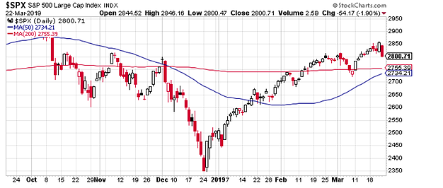
First up is a check in on the market. Despite a very dovish pivot by the Fed, the market sold off late in the week, but still managed to close just above that fabled 2800 level. Fans of moving averages will also notice something interesting in this chart (aside from the 200 DMA commencing a slight upwards slope).
The 50-day moving average is getting ever closer to breaking above the 200 day moving average, also known as a "gold cross" - a very slow moving signal which is designed to tell whether a market is in an uptrend or downtrend. By its nature it shows up late, and many dismiss the indicator, but it is still something to keep an eye out for.
Bottom line: The S&P 500 managed to only just hold the 2800 level.
2. S&P 500 Bearish Breadth Divergence
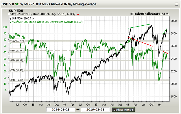
This chart showed up last week too, but I also highlight how the short-term bearish breadth divergence signal currently playing out almost seems to echo the larger bearish breadth divergence pattern which preceded the correction late last year.
Early signs are that this short term bearish breadth divergence (higher highs on price vs lower highs on the indicator) is resolving to the downside, and it lines up with a few other tactical/short-term indicators (e.g. put/call, VIX, etc) which likewise seem to point to more water going under the bridge short-term as some post-Fed indigestion seems to promulgate.
Bottom line: Short-term bearish breadth divergence looks to be resolving to the downside.
3. Fed Announcements vs the Market
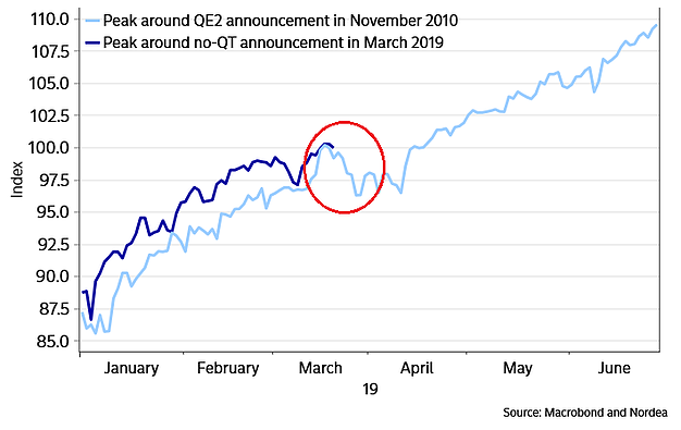
Another short-term chart, this one by Martin Enlund of Nordea Markets, showing an interesting side-by-side comparison of trading action around the announcement of QE2 vs the announcement to cease/taper QT1 (quantitative tightening part 1).
In my opinion, ending quantitative tightening would be an easing measure. From a flows standpoint, it means more purchases of treasuries - particularly given the twist (ABS to treasuries).
Bottom line: When the Fed announced QE2 markets likewise experience indigestion before heading higher; the same could end up true for ceasing QT1.
4. The "Sweet Spot" Indicator
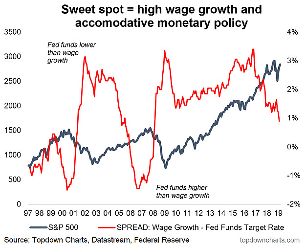
This is one of my own wacky indicators, I call it the Fed Sweet Spot Indicator. This indicator simply subtracts the Fed funds rate from the Atlanta Fed wage growth tracker: the higher the reading the more supportive it is for stocks, and vice versa.
The logic is that higher readings reflect both the stimulus effect from lower (relative) rates and in so far as higher readings reflect higher wage growth also imply a confidence/flows effect. The key point is this indicator has been steadily falling (both as a result of higher interest rates and wavering wage growth in recent months).
Bottom line: The Fed Sweet Spot Indicator is steadily leaving (left?) the sweet spot...
5. Labor Cost Mentions
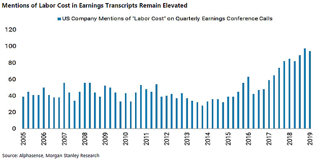
This unique chart shows the number of mentions of "Labor Cost" in quarterly earnings calls by S&P 500 companies. Interestingly there has been a steady rise over the past couple years as the US labor market has really tightened up. The downside of this is the possibility it also implicitly reflects profit margin pressures.
Bottom line: S&P 500 companies seem to be more concerned about wage pressures lately.
6. Yield Curve vs Stockmarket
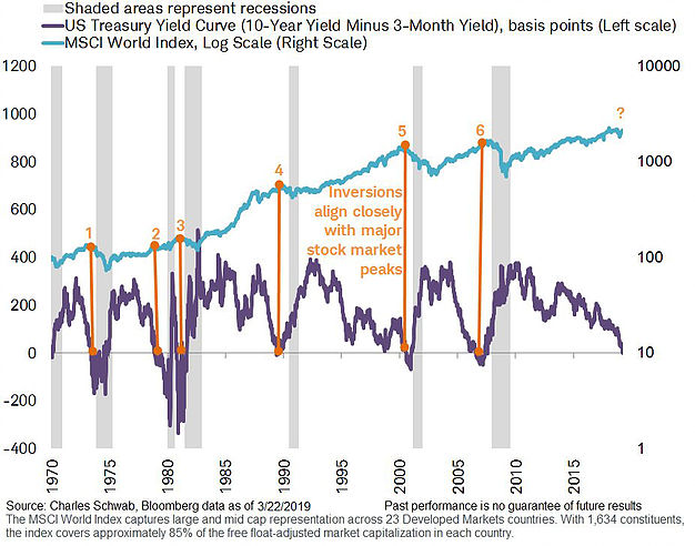
This rather timely chart from Jeffrey Kleintop of Charles Schwab (NYSE:SCHW) shows the US Treasury yield curve (in this case the 10-year minus 3-month yield) against the MSCI World (global stocks). It also shows recessions shaded in grey.
The key takeaway from this chart (also --- by the way, in case you missed it (!), the US yield curve under the above definition inverted last week) is that almost always (the exception being example no. 2) a US yield curve inversion occurs within some proximity of a major market top.
Bottom line: The yield curve may be signaling a major market top is near.
7. US Bond Yield vs Manufacturing PMIs
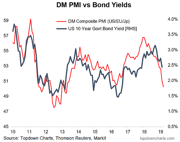
Speaking of bond yields, here's another of my own charts and this one is telling us we may need to get used to an inverted curve and indeed lower yields at the long end. This chart shows the composite manufacturing PMI for developed markets (with the latest data point being from the just-released March flash PMI results) against the US 10 year yield.
There's every possibility that the relationship between these two series breaks down or that the current reading is the worst to come to this mini-cycle, but in the short term, it's probably best not to fight it (although my view = bonds are still expensive).
Bottom line: US 10 year treasury bond yields may be headed even lower.
8. Buyback Blackouts
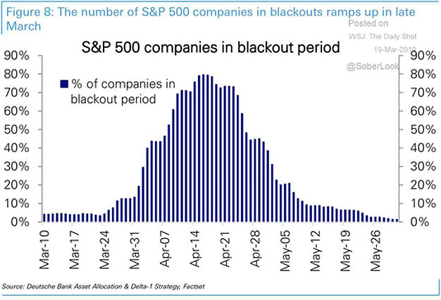
This useful chart maps out the progression of the buyback blackouts across earnings reporting season. Basically there is a wall of blackouts that will prevent corporate buyback flow, and this will create a vulnerable period for the market (particularly given some of the other short term issues ruminating their way through the market right now). Late April/May fares much better though (something to remember should the sell off worsen).
Bottom line: Buyback black outs will remove a flows tailwind from the market in the coming weeks.
9. US Stockmarket Leverage
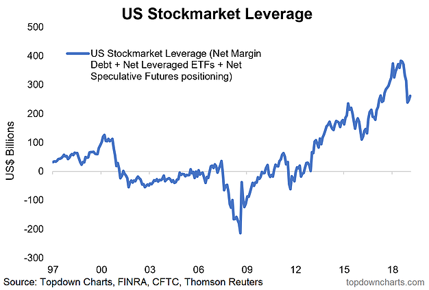
This chart shows an aggregated view of the quantum of leveraged stock market bets. The figure now totals just over $250B (down from about $400B at the peak). So there has been some de-leveraging, yet both in absolute terms and as a % of market cap leveraged bets are still sizable indeed.
I often think of this indicator similar to how you think of valuations - it's not exactly a timing indicator, but just as when valuations are high, risk is high... when leveraged bets are high, risk is likewise high. And, well, leveraged bets are still high.
Bottom line: After some deleveraging, leveraged stockmarket bets remain historically high.
10. Commodities vs Stocks
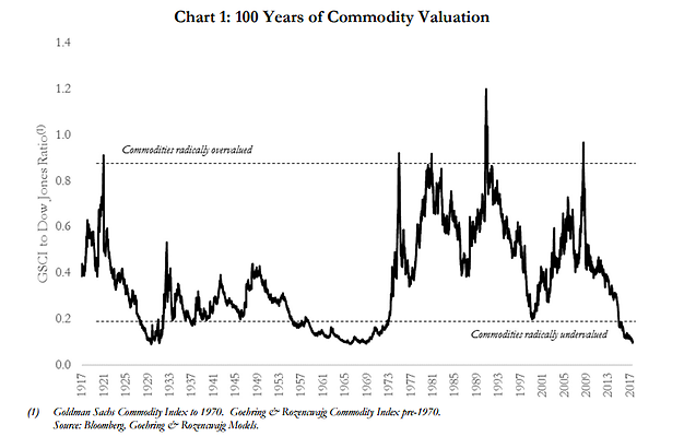
Final chart of this week's S&P500 ChartStorm takes a long term look at commodities vs stocks. A similar chart has been doing the rounds (GSCI total return index vs the S&P 500 index), and many have used it to argue a bullish case for commodities (often times it's with specific reference to gold).
In the long run, theoretically, stocks should outperform commodities. Stocks enjoy growth in earnings and dividend income, yet commodities are more a product of (sometimes multi-decade) demand/supply cycles. This cyclicality aspect does appear to play out in the chart below, but as a timing indicator it comes up wanting (similar to longer-term views of valuation for stocks).
Still, I must admit I am intrigued by this chart, particularly given the extreme low reading (and my bullish bias on commodities more recently as a few things are falling into place there).
Bottom line: Commodities are trading at about a 50-year low vs stocks.
Key takeaways on the outlook
Though arguably the dovish pivot by the Fed is a new piece of bullish information for the market, and the holding of the 2800 level is a good sign, it may not be enough to offset concerns about the economic outlook as the yield curve inverts. With bearish breadth divergence playing through, the QE2 analog, and buyback blackouts in mind, the short-term outlook features downside risk. With all the hallmarks of a late-cycle regime, the late-cycle lamentations are set to continue.
