Welcome to the Weekly S&P500 #ChartStorm — a selection of 10 charts which I hand pick from around the web and post on Twitter.
The charts focus on the S&P 500 (US equities); and the various forces and factors that influence the outlook—with the aim of bringing insight and perspective.
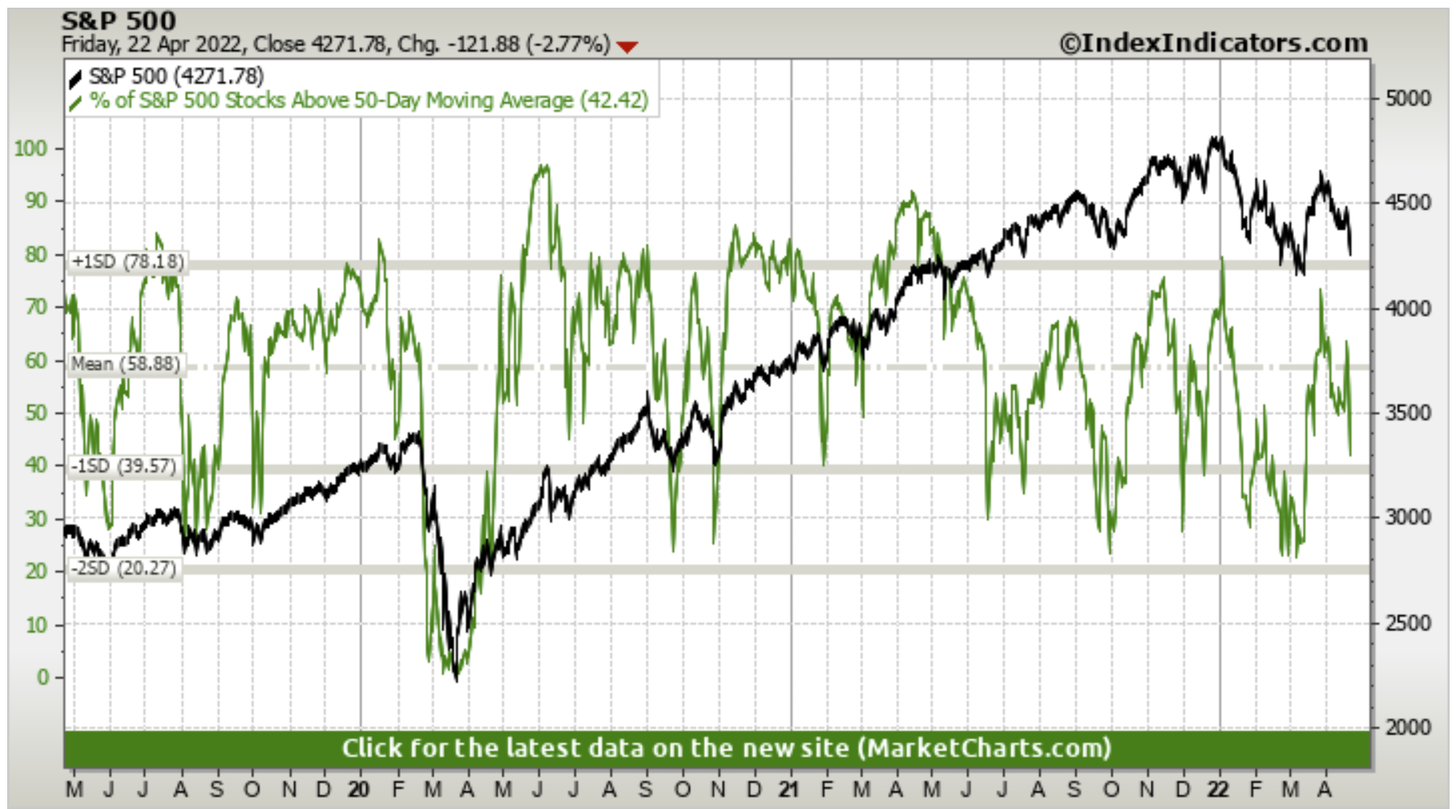
1. Selling Starts Again: Looks like another wave of selling is underway. First glance at this chart I would say look for 50dma breadth to fall
Source: @MarketCharts
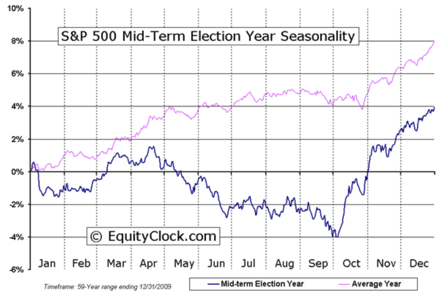
2. Mid-Term Election Year Seasonality Update: Season's Greetings…
Source: @EquityClock via @HumbleStudent
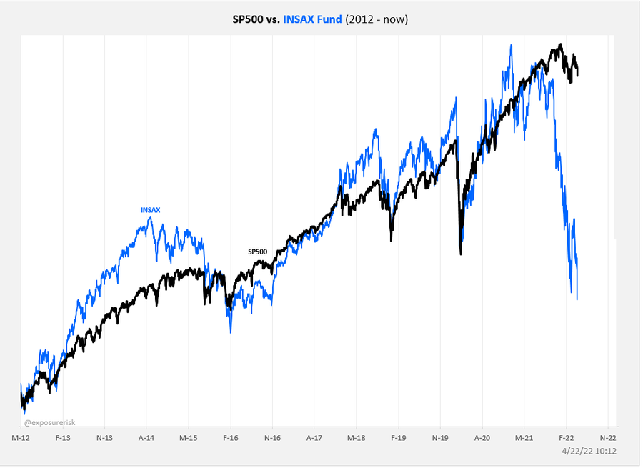
3. Insider Buying Fund: The social/saas/tech-heavy insider buying fund, INSAX, is continuing its plunge (crash?). Doesn’t look like a good omen for the rest of the market...
Source: @exposurerisk
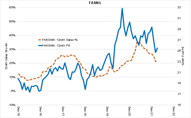
4. FAANG: FAANG going ex-growth? I guess it’s a good reminder that a bunch of techy growth stocks basically got a one-off boost to growth from the pandemic and valuations rose to levels consistent with/requiring ongoing strong growth. Priced for perfection means anything less than perfection will mean imperfect price action.
Source: @EquitOrr
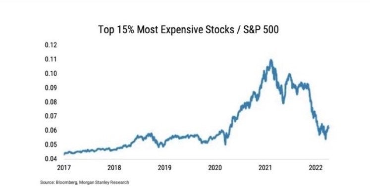
5. The Most Expensive Stocks: "Valuations Don't Matter" they told us…
Source: @MacroAlf
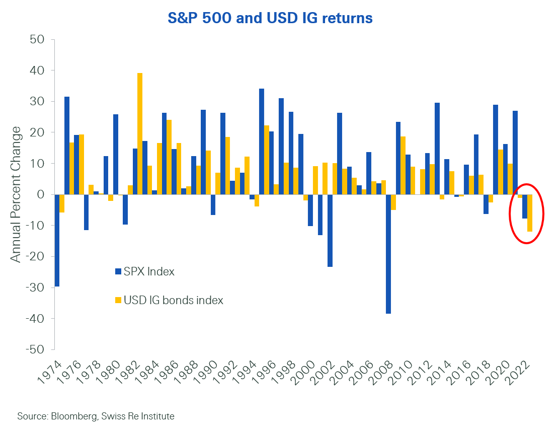
6. Diworsification: Seems like the old hot areas of the market "Search for Yield" and "Growth at Any Price" are both getting butchered at the same time...
Source: @patrick_saner
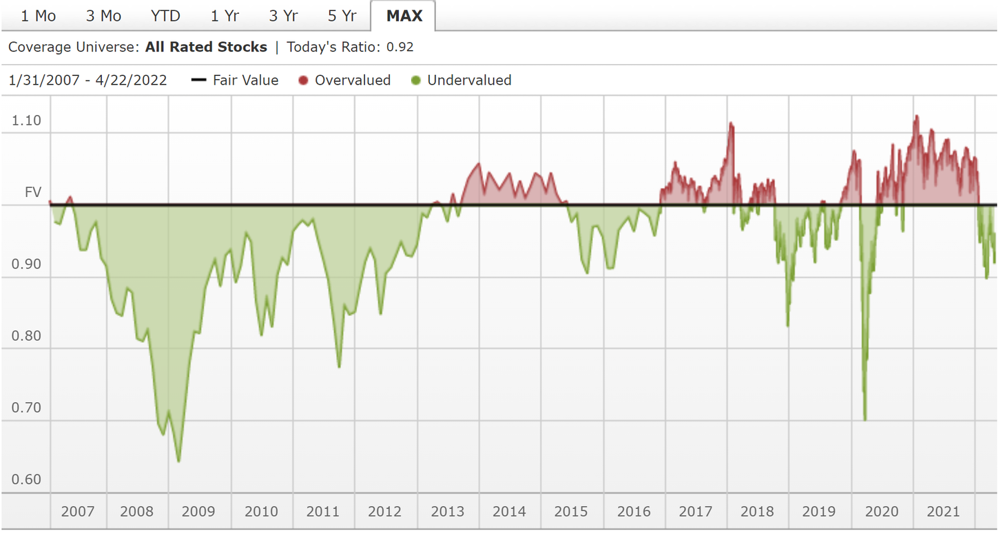
7. Price vs Fair Value: The Morningstar median price vs fair value estimate for all the stocks they have ratings on is starting to look cheap (…but perhaps not cheap enough yet?)
Source: Morningstar Market Fair Value
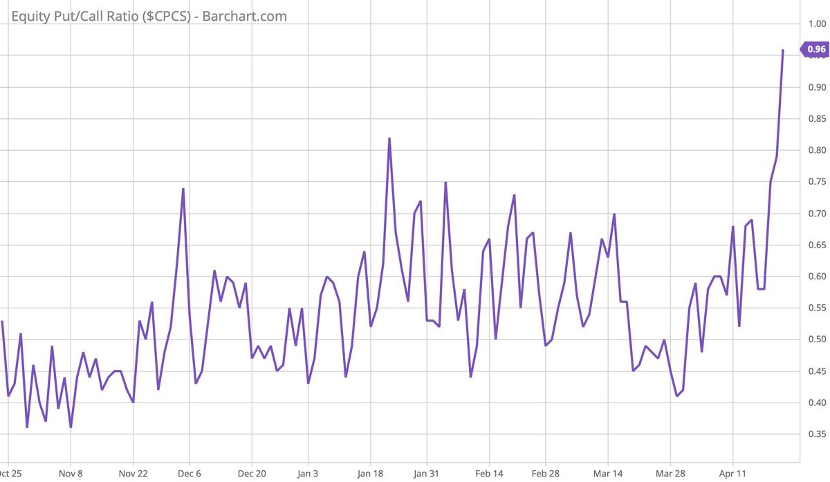
8. Put/Call Ratio: Putty-call starting to show some signs of panic (…or perhaps greater greed on bearish option bets?).
Source: @ayeshatariq
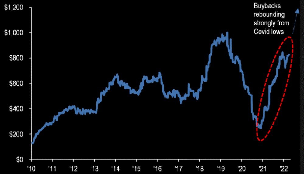
9. Buybacks Bidding Bigger: JPMorgan Chase (NYSE:JPM) expecting $1T buybacks this year. Could be a source of buying demand against the bearish backdrop. Albeit, one element: the cost of corporate debt is going up, so there may be less raising of debt to fund buybacks.
Source: @MaverickBogdan
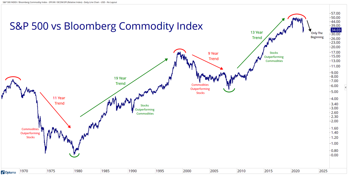
10. Stocks vs Commodities: They say “the trend is your friend.“ Maybe we should listen to what our friend is trying to tell us in this chart!
Source: @granthawkridge
oh… that’s right, almost forgot!
BONUS CHART >>
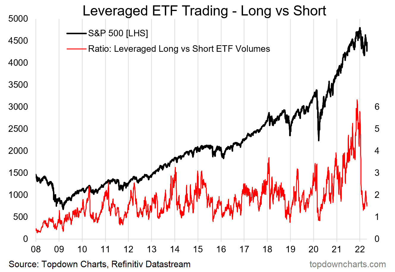
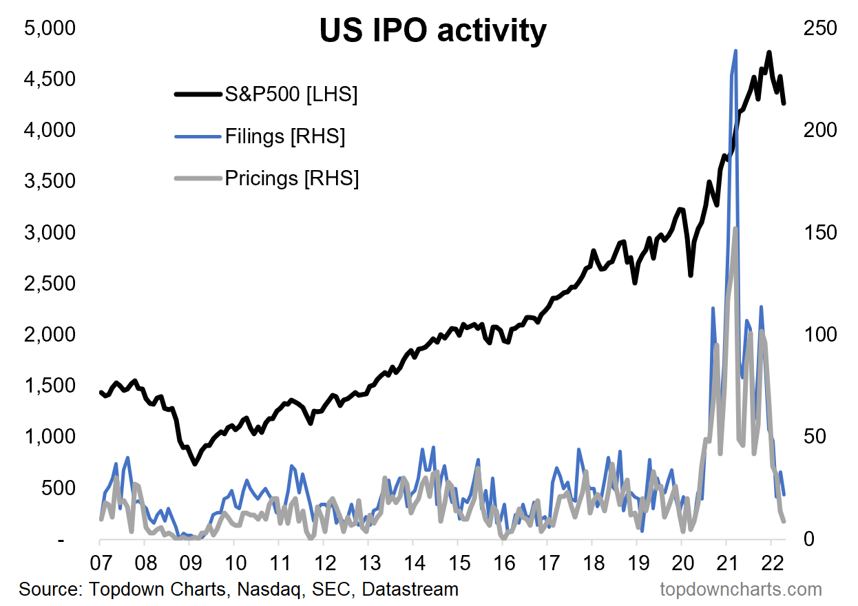
Bullish Speculation Evaporation: here’s an interesting pair of charts which arguably show the rapid evaporation of bullish speculation as the mood of the market has changed and the liquidity tides go out.
First one shows the ratio of trading in leveraged long vs short US equity ETFs. Basically you had this record pace of bullish bets, culminating in a frenzied peak, which almost overnight just evaporated.
The second chart looks at IPO activity (which includes SPACs in the count). Similarly, there was this frenzied almost desperate scramble to soak up all the liquidity sloshing around in the system with traditional IPOs and the newer SPAC craze. Again, at the turn of the year the taps turned off.
Maybe these are healthy signs: to see some of the excesses of the pandemic policy party coming out of the market.
Some might even wonder if this is the start of an “all clear“ signal.
But I think we are actually in a different macro regime now, where the liquidity tides will continue to recede for some time. Thus it likely also means a change in market regime, with the sudden departure of all this previous bullish greed.
Not a friendly environment for those who got their market training over the past 2 years. What do they say? "past performance is no guarantee of future results…"

