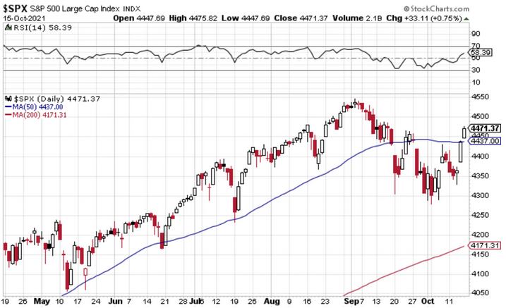
1. The Levels
As I noted on Twitter with regards to the S&P 500 daily price chart:
- Price back above the 50 day moving average ✓
- Back above the 4450 level ✓
- RSI back above 50 ✓
- (And therefore) odds of more upside? Probably better than 50/50 ✓
For a while there the price action was looking very messy and distinctly unconvincing. But these latest developments are quite promising, albeit we do need to see all of those milestones hold...
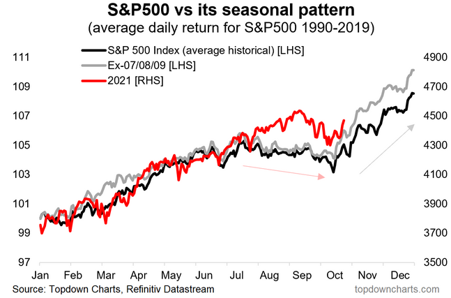
2. Seasonality Update
Like clockwork, just as the worst of the seasonal headwinds ended, and the Q4/Year-End/Santa Claus rally comes into play, the market starts to turnaround. But I would again highlight (as mentioned a couple of weeks ago), the dispersion of returns in October can be particularly wide-ranging, and while Nov/Dec tend to be positive on average, they’re “only” positive about 70% of the time historically (in other words, exceptions do exist!). Factor seasonality in, let it help build your investment thesis, but don’t let it be the only thing!
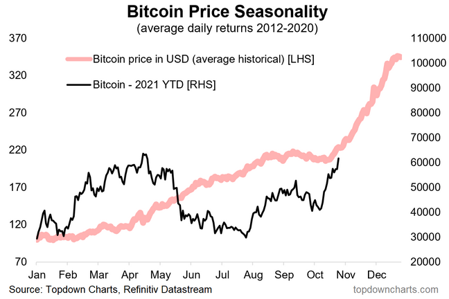
3. Bitcoin Seasonality
Speaking of seasonality, as I updated the chart above, this one caught my eye. Now I will say I don’t really cover crypto currencies in much detail at all, but I do know market patterns when I see them. Also, unlike the previous chart, this one has obviously a shorter history. That all said, there seems to be a Q4 ramp in crypto-currencies too…perhaps it is just all risk assets!
4. Bitcoin vs Stocks
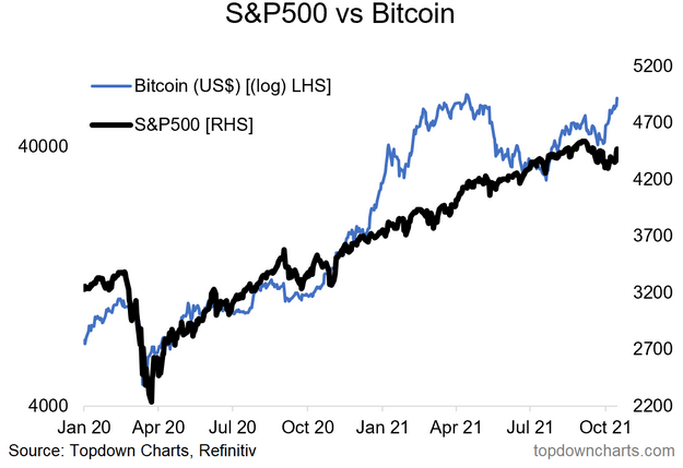
Now obviously we are dealing with two entirely different scales when it comes to Crypto vs Stocks…in this case both figuratively and literally! The key point with this chart is that the two assets walk a somewhat familiar path—and are both heavily influenced by speculative appetite and monetary conditions. It’s an open question as to whether the two are self-reinforcing, but they at least dance to similar music, so in that respect if we see a breakout in Bitcoin, then stocks probably join in the fun too.
5. Sales Beats
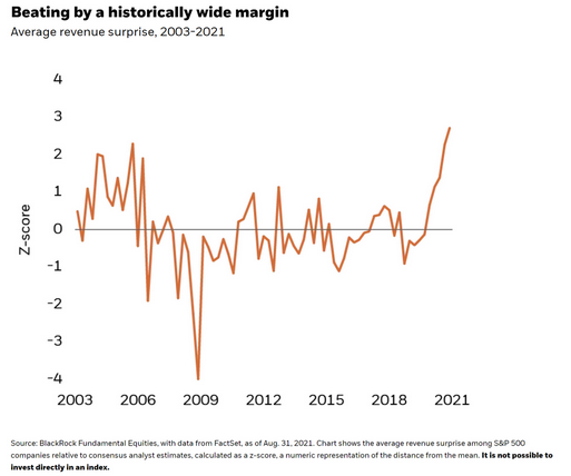
This interesting chart from BlackRock shows the degree to which actual revenues are exceeding analyst expectations. As you can see, sales are outperforming vs expectations like never before. This is an important macro development, particularly in the context of rising inflation
As the authors note:
“This suggests to us that even as inflation has been driving an increase in input costs, companies have the pricing power to offset it. They have been able to raise prices and push higher costs on to the end consumer, a reflection of pent-up demand and consumer willingness to pay.“
6. Consumer Discretionaries Vs. Staples
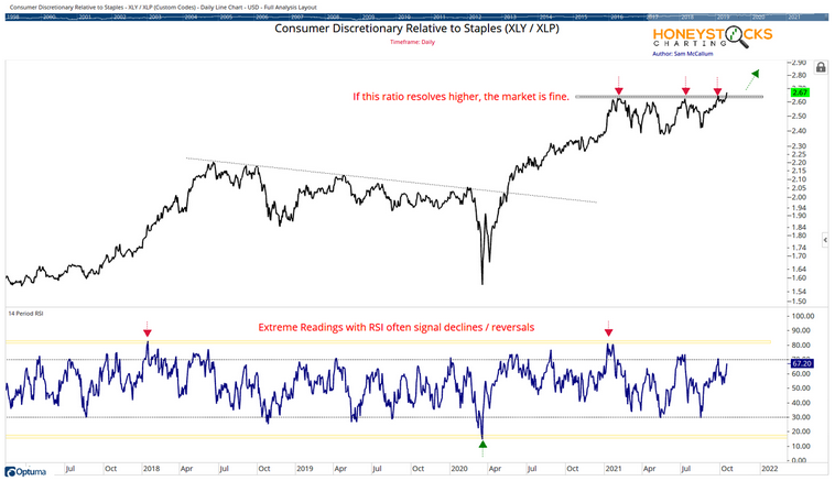
I thought this was an interesting one because of the way the relative performance line of discretionaries vs staples had been locked in a multi-month trading range, but as of last week appear to be in the process of resolving to the upside. To the extent that this reflects improved risk appetite/macro, this development likely reinforces the upward bias going into Q4.
7. Bottom-Up Price Targets For The S&P 500
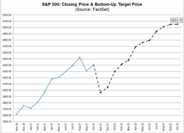
We’ve all seen the top-down estimates, so here’s a look at how the bottoms-up outlook is tracking. As FactSet note:
“The bottom-up target price is calculated by aggregating the median target price estimates (based on company-level estimates submitted by industry analysts) for all the companies in the index“.
Basically they’re picking 10-15% up in 2022 (which compares to just under 20% YTD in 2021).
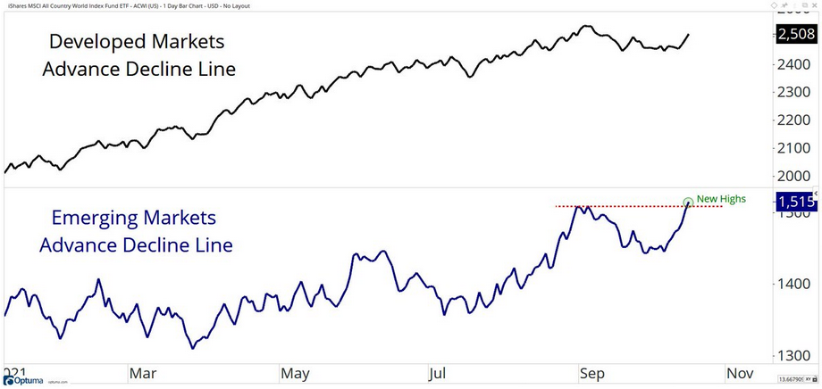
8. Advance Emerging Markets
This chart provides a timely look at the advance/decline line for emerging market equities. I think this is a fairly positive sign given that EM equities have come under quite a bit of pressure lately.
9. EM Risk To DM Equities
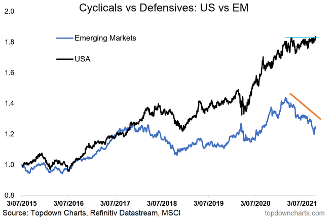
Indeed, the risk is that the said weakness in EM spills over to developed market equities. So the above chart is promising, but so too is this one. The EM cyclicals vs defensives relative performance line has bounced from where support might logically be found, and the US cyclicals vs defensives line looks to be resolving to the upside. So perhaps a bullish resolution to what was otherwise a bearish divergence.
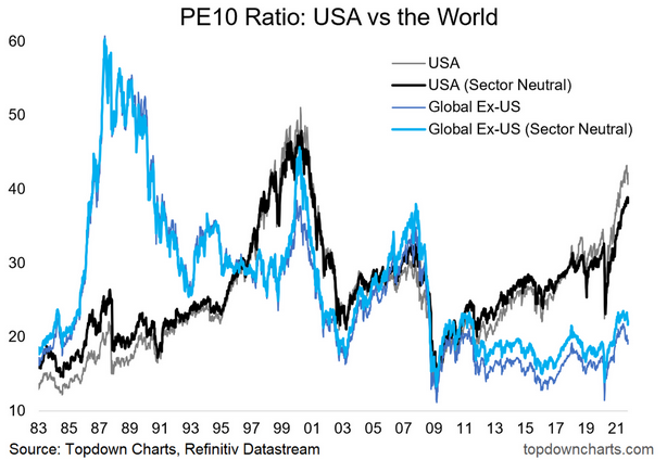
10. Global Equity Valuations
Last but not least is a look at how PE10 (price vs trailing 10yr average earnings) ratios are tracking for US vs rest of the world. It also shows how it looks if you adjust for sector skews (doesn’t change the conclusion). The conclusion is: US looks very expensive vs its own history and vs the rest of the world.
Will this chart matter this year? Probably not. Next year? Maybe. Next 5-10 years? Almost certainly. In other words, valuations take on greater importance with greater timeframe (patience), but also greater extremes. So definitely interesting, and definitely important insight for longer-term investors.
