Those that follow my personal account on Twitter will be familiar with my weekly S&P 500 #ChartStorm in which I pick out 10 charts on the S&P 500 to tweet. Typically I'll pick a couple of themes and hammer them home with the charts, but sometimes it's just a selection of charts that will add to your perspective and help inform your own view - whether it's bearish, bullish, or something else!
The purpose of this note is to add some extra context beyond the 140 characters of Twitter. It's worth noting that the aim of the #ChartStorm isn't necessarily to arrive at a certain view but to highlight charts and themes worth paying attention to.
So here's the another S&P 500 #ChartStorm write-up!
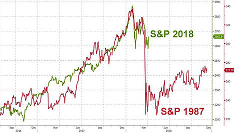
1. An Unfortunate Analog: Analog charts are often interesting and always dubious, but there is obviously merit in looking at historical scenarios and drawing parallels and lessons. In this case the chart, shared by Lance Roberts, and originally featured on Zero Hedge, shows an apparent similarity between today's market and the 1987 episode. I can't give an assurance either way on this one, other than saying here it is and make your own mind up.
Bottom line: According to some analysts there are some similarities between now and 1987.
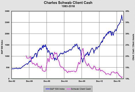
2. Cash Holdings: This good chart shared by Tiho Brkan shows the cash balances of clients at Charles Schwab (NYSE:SCHW). It mirrors what we've previously shown of AAII portfolio allocation surveys and the implied money market mutual fund allocations as a percentage of total mutual fund assets. In other words, there are numerous sources saying retail has a very low cash allocation. When you think about high valuations across asset classes, it makes you think maybe cash is not as bad as people seem to be implying that it is!
Bottom line: Cash allocations are around all time lows.
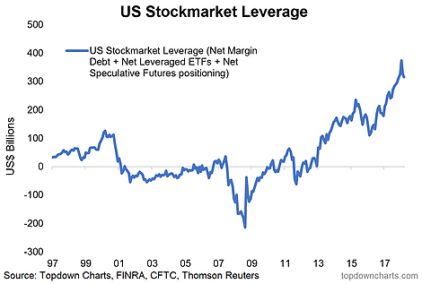
3. Stockmarket Leverage: Nice follow-on from the previous chart, this one shows stockmarket leverage... so not only are cash allocations low, but it looks like punters are even leveraging up. It's certainly not something you see at the bottom! All up there has been about $400B in leverage added over the past 5 years.
Bottom line: Investors have leveraged up.
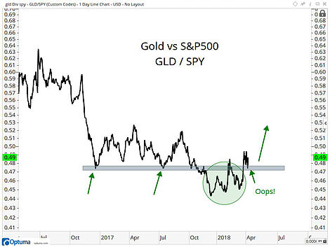
4. Gold vs S&P 500: From chart-master JC Parets of All Star Charts, this one shows the ratio of SPDR Gold Shares ETF (NYSE:GLD) and SPDR S&P 500 ETF (NYSE:SPY) and seems to imply a rise in the ratio. For clarity a rise in the ratio would be spurred by either or a combination of gold shooting higher (not my base case!), or by the S&P 500 headed lower. Time will tell, but for now there is an interesting range being played here by this pair.
Bottom line: The gold vs S&P 500 ratio may be about to head higher.
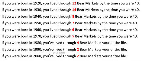
5. Have You Ever Seen A...: Not a chart but an interesting schematic (can't think of a better description), which shows how many bear markets you would have lived through if you were born on certain years. Hidden in this is a nod to the point that in the early 1900's economic volatility was a lot higher, whereas nowadays with countercyclical macroeconomic policy, more diversified economies and industries and a more integrated global economy, economic volatility is lower, and hence bear markets have become less common - but not extinct!
Bottom line: How many bear markets have you seen in your life?
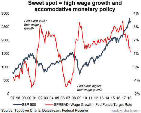
6. The Fed Sweet Spot: This interesting indicator puts the Fed Funds rate into context to yield insights as to how it interacts with business cycles and of course the market cycle. The so-called sweet spot is when wage growth is higher (the higher the better) relative to the level of the fed funds interest rate. Seems when it goes negative it triggers/signals the end of the cycle. We are headed in that direction, but not there yet.
Bottom line: We are leaving the Fed sweet spot.
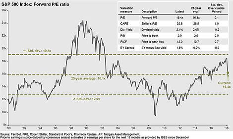
7. S&P 500 Forward P/E raio: Interesting chart here on valuations, shared by Urban Carmel, shows the forward PE (price by next 12 months earnings) falling back to the 25-year average. Might have to reassess that assertion that US stocks are expensive. Better to see would be a reversion below average for it to register as "cheap". Also note the valuations table inset within the chart.
Bottom line: The S&P 500 is no longer expensive on this view.
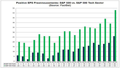
8. Earnings Guidance: With all the kerfuffle in the markets it's easy to lose sight of how good earnings are at the moment. Turns out more companies than usual are providing positive pre-announcements, according to FactSet. Perhaps surprising to some will be the path of the tech sector. Lot of hype in tech, but a lot of earnings too.
Bottom line: Just seen a record in positive earnings guidance for Q1.
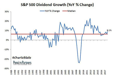
9. Dividend Growth: One thing that sometimes happens when profits grow is that companies pay more of those profits out to investors (not sarcasm, because they can just as easily do other things with said earnings e.g. pay down debt, do R&D, capex, M&A, buybacks, sit on it, etc). Anyway, it is positive to see dividend growth apparently accelerating, and it goes to show all is not doom and gloom.
Bottom line: Dividend growth is accelerating.
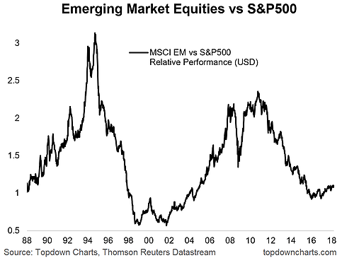
10. Emerging Markets Equities vs the S&P 500: As I talked about the other day, emerging markets appear to undergo long cycles of under/out performance against the S&P 500 and it looks like a new cycle is getting underway. One thing that would support this would be the big valuation gap (EM equities are still cheap relative to more richly priced US equities), and EM economies are earlier on in their economic cycle. Certainly food for thought.
Bottom line: EM equities' relative performance outlook is bright.
So where does all this leave us?
This week there's really two main categories the charts fit into:
1. Flagon Half Empty
In this camp obviously falls the first chart (the 1987 crash analog), the record low cash allocations chart, the extensive stockmarket leverage buildup, the gold vs SPY ratio, and I suppose also the bear market witnessing schematic.
2. Chalice Half Full
In this camp you've got the neutralization in valuations, record high positive earnings guidance, accelerating dividend growth, maybe the fed funds sweetspot since it's not quite in the negatives yet, and maybe also the EM relative chart, but that's more positive for EM.
Summary
It's a very interesting market environment at the moment. The market is in the middle of what is largely a sentiment driven selloff catalyzed by a stream of negative headlines - and what was a market that was receptive or vulnerable to a correction. In the mean time, you also have a number of positive undercurrents such as accelerating earnings. The thing about sentiment driven selloffs is that they are usually something to buy, but they are by nature liable or vulnerable to feeding on themselves, and so it could easily go further.
