In the weekly S&P 500 #ChartStorm, I pick out 10 charts on the S&P 500 to tweet. Typically I'll choose a couple of themes to explore with the charts, but sometimes it's just a selection of charts that will add to your perspective and help inform your own view - whether its bearish, bullish or something else.
The purpose of this note is to add some extra context and color. It's worth noting that the aim of the #ChartStorm isn't necessarily to arrive at a certain view but to highlight charts and themes worth paying attention to. But inevitably if you keep an eye on the charts they tend to help tell the story, as you will see below.
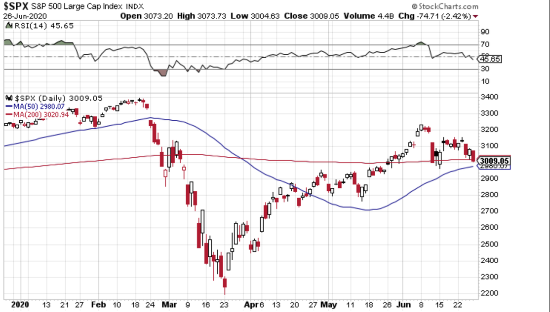
1. S&P 500 closed below its 200-day moving average
Ok, only by about 12 points, but that still counts. It was an ugly close to the week as stocks finished on the lows. Increasing COVID-19 cases across southern and western states as well as in emerging markets has traders worried.
Keeping things in perspective though, the old range-high during April and May is still below the current price level. There appears to be good confluence of support near 2980-3000: the prior June lows, the aforementioned range highs, and the 200dma and 50dma. This could be the bears’ opportunity to rear ‘re-test’ narratives once again. Or will the bulls hold the line in the face of economic and political risks in the coming months?
Also, keep an eye on the RSI (14) – it is at the weakest reading in nearly 3-months. Not exactly how the bulls want to end the first half of the year. Seasonally, the period around the 4th of July holiday in the US (to be observed on Friday) is bullish, but this year is anything but usual. During a stock market advance, the RSI tends to range between 40-90 per famed technician Constance Brown. A few more closes in the red could breach that range rule of thumb.
Bottom line: They say nothing good happens below the 200dma, and for just the second time in the last month, we settled below it. But we are back in the battle zone. The holiday-shortened week could be an interesting one...
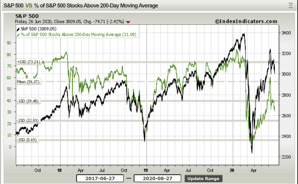
2. Under the surface, about a third of stocks are still above their respective 200 dma's...diligently holding the line
Looking back, following the December 2018 low, the S&P 500 quickly advanced during the first quarter of 2019. The percentage of stocks above their 200dma pulled back to just 50%. Keeping things in context, that may have been due to the market’s longer-term uptrend. Today’s market features more stocks that may be susceptible to broader downtrends in place. This makes sense since IT remains very strong (a rather top-heavy market) and energy stocks have bounced the most – but even with a nearly 60% recovery, most energy names are still in downtrends.
Bottom line: It’s always good to check under the surface, and many market leaders from the 2009-2020 advance are leading once again. The drawback is many stocks are back below their 200dma as the S&P 500 eases back from its rebound highs.
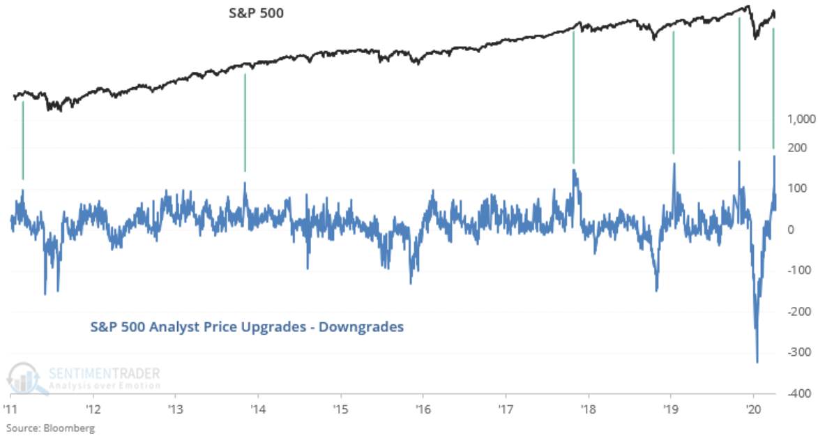
3. Analysts are throwing in the towel and upgrading their price targets en masse. You know what that means...
We’ve seen similar spikes before. Starting in spring 2011, shortly before a nearly 20% drawdown in the S&P 500, analysts boosted price targets similar to what has occurred recently. Of course, that did not pan out well as large-cap US stocks nearly had a technical bear market and small caps, as well as foreign stocks, were hit much harder over the ensuing months.
It’s not all bad news though. After the 2013 run-up, analysts reviewed their stance, and upgraded many stocks – the market generally continued higher. Though international stocks pretty much went through a small bear market from the summer of 2014 to early 2016.
More recently, late 2017 saw a spike – again after another huge 12-month rally in equities.
Early 2019’s rebound from the December 2018 low turned analysts bullish, and the market went on to climb higher in the next year. Fresh in our minds.
Bottom line: Wall Street analysts suffer from conservatism bias for a variety or reasons (like many of us). In behavioral finance parlance, conservatism bias means we are slow to update our views once we have new information. We stick to our priors for too long. More practically, their actions can be seen as an interesting contrarian indicator – and the bulls usually don’t want to see optimism from that crowd as it indicates that (to use a Wall Street cliché) the easy money has been made.
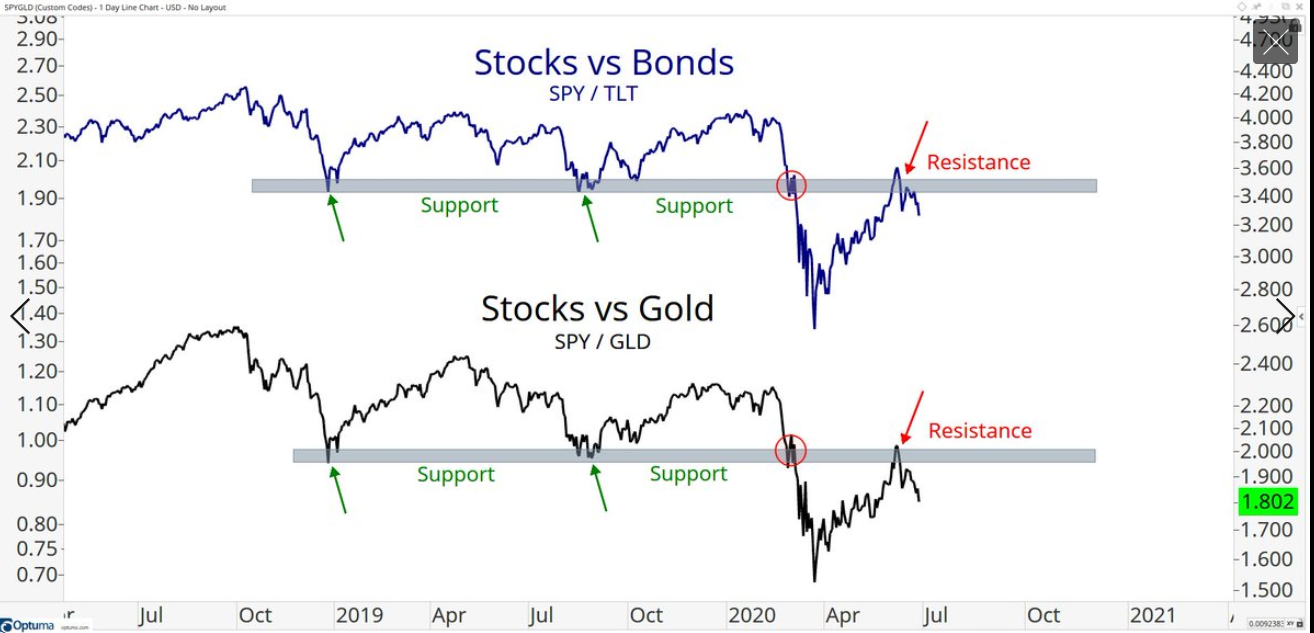
4. When you put it that way it almost seems too clear...
Relative to TLT, SPY is near a critical level. Stocks held support during late 2018 and mid-2019 but then dropped hard relative to the ‘long bond’ during March 2020. And now we are back to ‘the scene of the crime’, and SPY has backed away from resistance, perhaps not surprisingly. Old support, once broken, become new resistance. The “polarity” principle. Ok, enough chart school. How about versus gold? The same pattern. Enough said.
Bottom line: Sticking with the theme of looking under the hood, a great technical tool is a relative strength using ratio charts. S&P 500 traders should keep an eye on these two charts to see if the pullbacks continue. It doesn’t mean everything can’t rally together – we have certainly experienced that many times in the 11 years, but active portfolio managers want to be where the best action is.
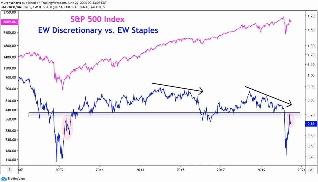
5. Similarly, discretionaries vs staples have hit a glass ceiling
Consumer Discretionary is naturally riskier than Consumer Staples, so when discretionary is underperforming staples, it usually implies the broader S&P 500 is on the defensive. A cool twist on this look is the equal-weight methodology, as opposed to traditional cap-weighting – so we get a better sense of what is happening for smaller consumer stocks. Dare I say it’s another good ‘look under the hood’? (Automobiles are within Consumer Discretionary, by the way!)
Bottom line: EW discretionary vs. EQ staples is struggling at prior support (which broke earlier this year – another ‘scene of the crime’ kind of chart). The sharp advance off the March 23 low has finally encountered apparent significant resistance. Equity bulls want to see risky consumer companies shine – when blue chips like P&G, Coca-Cola (NYSE:KO), Walmart (NYSE:WMT) and Kroger (NYSE:KR) are the stocks with the best momentum, it often suggests a bearish market sentiment.
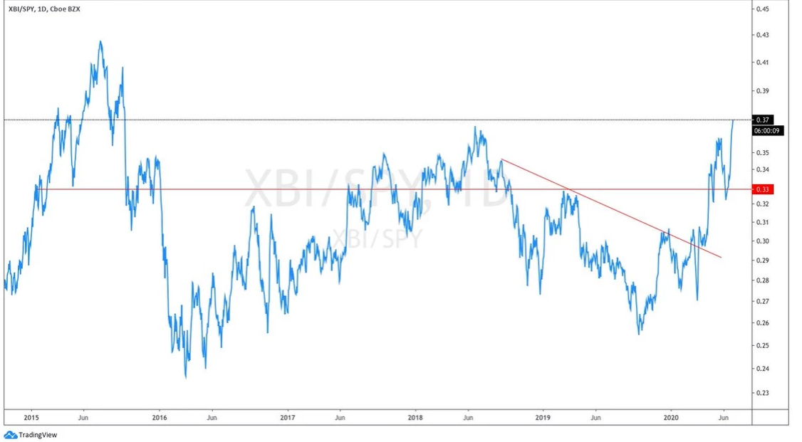
6. Sticking with sectors... Biotech looks interesting
Biotech is often seen as a speculative space within the more defensive Health Care sector, so this is a positive signal for those rooting for higher stock market prices. 2018-early 2020 was a period of weakness for biotech, but the industry broke its relative downtrend line earlier this year, then confirmed the move with a breakout above the mid-2018 peak.
Bigger picture, and more thematically, Biotech could well be the next dot-com. A number of research breakthroughs and technological advancements are coming together, and paradoxically, the pandemic could easily be the key catalyst that drives human capital and financial capital into what could be a booming sector in the coming years.
Bottom line: I think we all hope biotech continues to do well – forget about technicals & charts. If medical advances can be made in the near-term to help alleviate the pandemic, we’d all be happier campers. But for portfolio managers, XBI exhibits healthy relative strength.
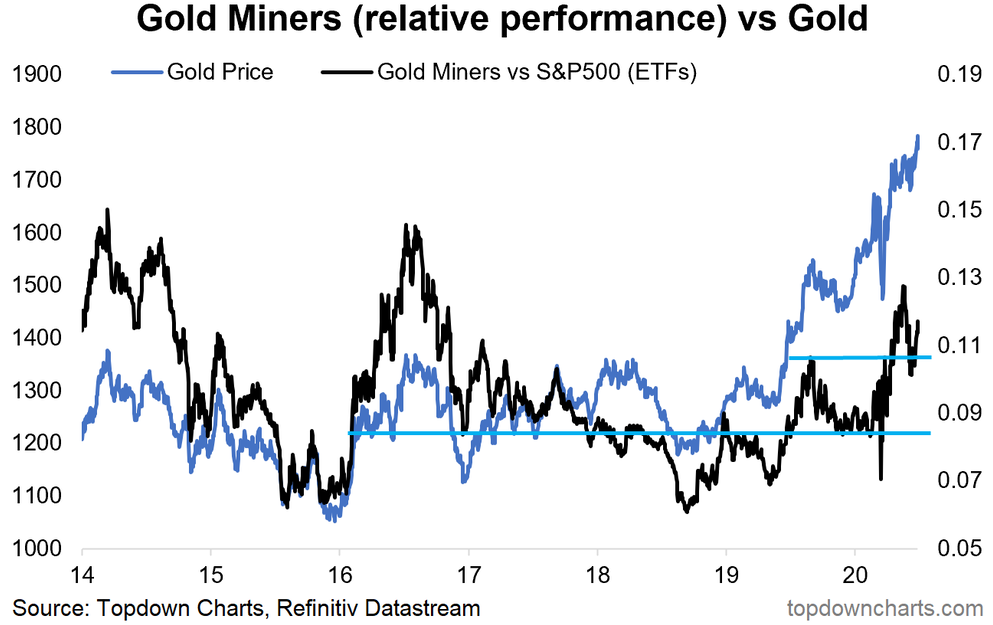
7. Gold Miners are outperforming SPY too
Doing a little prospecting on the chart, gold miners have been stair-stepping higher for the last two years – climbing sharply versus SPY, then falling hard at times. This industry is not for the faint of heart. A huge washout came during March when the main Gold Miners ETF (NYSE:GDX), fell to $16 after peaking three weeks earlier at $32. Volatility was extreme. Here we are now at $35 – in the middle of a recent $31-38 range. Interestingly, GDX bottomed way back in January 2016 at $12.
Bottom line: The precious metals equities space may have emerged from the dead. Queue the Undertaker WWE gif. The gold and gold-miners markets had their time in the sun from the early 2000s to Q3 2011 – it was actually a remarkable 10-year stretch. All good things come to an end though, and gold suffered during the great bull market of the last 11 years. The tide turned in 2018 though, and a technical washout for Gold Miners earlier this year may have been a blessing in disguise for the gold bugs.
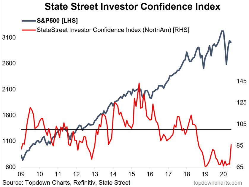
8. State Street Investor Confidence Index picked up quite a bit in June
For background, the SSIC Index analyzes buying and selling patterns of institutional money – the more buying they do, the higher the reading. 100 is considered neutral, so while the indicator rose a whopping 21.3 points to 94.3 during June, money has still been moving away from stocks.
The index has registered below 100 since August 2018 – the longest stretch since at least 2009. The market choppiness of the last two years has kept institutional investors cautious along with concerns about high valuations, yield curve recession signals, trade wars, and late-cycle lamentations ...which were all ultimately replaced with the pandemic panic.
Bottom line: Institutional investor confidence has been soft for many months – particularly this year as every month in 2020 has clocked-in under 80 – until June’s 94.3. A VIX above 30 and an election on the way may keep the mood somewhat sour though.
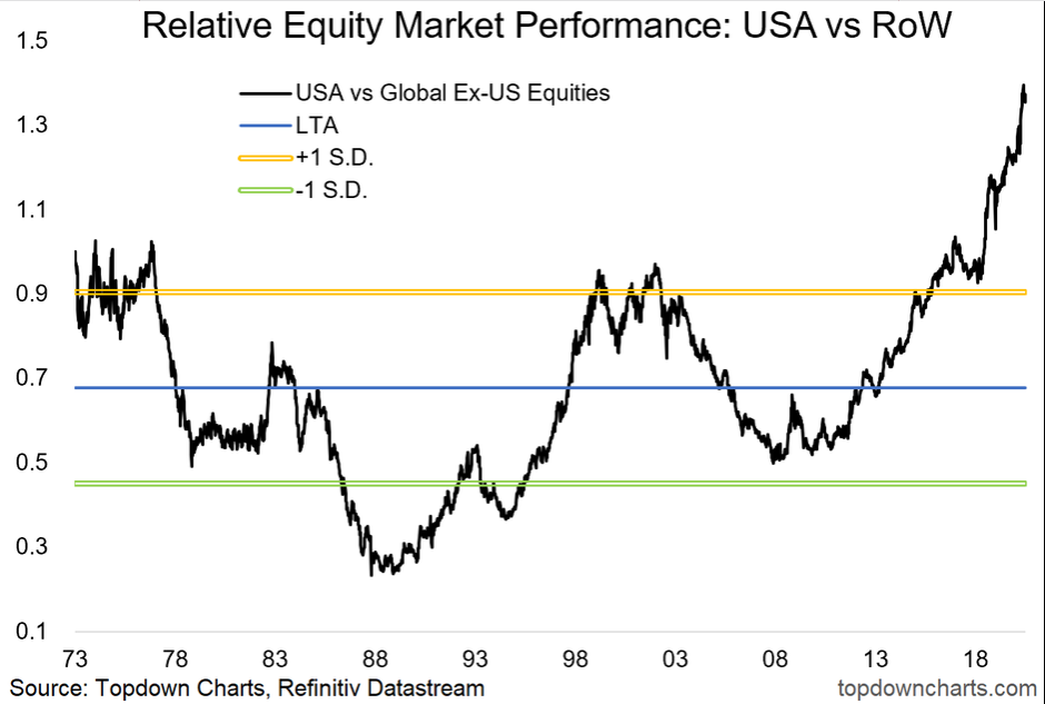
9. US equities comfortably and consistently outperformed global equities over the past decade
Looking back, the US market did very well relative to international equities during the 1970s and of course during the 1990s. Foreign stocks provided excellent returns both on a (1) nominal basis during 2001-2007 and (2) relative to the S&P 500 as the US Dollar dropped, commodities crushed it, and emerging markets went nearly parabolic. The 2008-2011 timeframe was a mixed bag as the S&P 500 based-out vs. RoW. Then came the mega-cap tech-led US bull market – the rest is history.
USA vs. RoW tends to be mean-reverting over long timeframes. Famous-last-words, perhaps, but we believe returns for domestic large caps will be very soft over the coming 5-10 year stretch while opportunities are abundant overseas. Looking very near-term (for grins), the last 5 weeks have actually been the second-best such stretch for global ex-USA stocks versus US equities since 2011.
Bottom line: Relative to the rest of the world, US stocks have been stalwarts. But after 10 years of outperformance, that leaves the S&P 500 richly valued on its own and when simply comparing total returns to other regions.
10. The last time the rest of the world was this consistently cheap vs US equities...
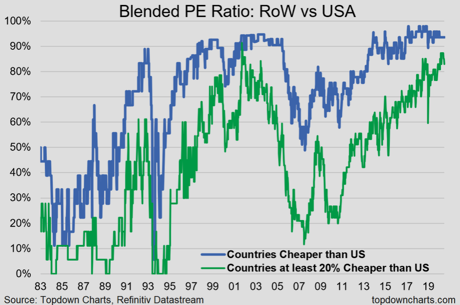
The last time this happened coincided with the peak in the previous big cycle of US vs global equities relative outperformance.
Bottom line: The Rest of World index is cheap on a price-relative basis versus USA stocks (chart 9 above) and when analyzing valuation metrics (chart 10 below). Prudent global investors will take these figures into consideration when allocating capital. Our extensive work in this space suggests certain geographies offer excellent opportunities.
1. Taking it tactical
We focused this week’s chart storm on gazing under the surface. Relative to the S&P 500, long-term bonds with high duration risk appear more attractive, physical gold is outperforming, and biotech broke-out. Within the gold space specifically, the Gold Mining index is heating up. Portfolio managers can use ratio charts and relative strength to help identify which specific areas of the global stock market are best to allocate capital. We provide in-depth research and actionable ideas to take advantage of these key intramarket movements.
2. Breadth and sentiment
The S&P 500 has pulled back to nearly ‘correction’ levels from the 3233 rebound high on June 8. The drawdown leaves many stocks below their 200dma. The bulls want to see further participation on up-moves so that more stocks can break to new uptrends. Until we see that market-action, sentiment may be soft among institutional money managers, as measured by State Street (NYSE:STT). While the big money is pessimistic, though much less so now versus earlier this year, Wall Street sell-side analysts have been scurrying to increase their price targets for S&P 500 components – is that a sign of over-optimism about a recovery or simply due to playing catch-up to the S&P’s rally over the last two+ months?
3. USA vs. RoW
US stocks continue to dominate the Rest of World equity index – both in terms of total return performance and on valuations. USA markets are by most reasonable measures very expensive while international equities are historically inexpensive. Is the tide turning? So far, June 2020 has been one of the best months for global ex-US stocks versus the US market since 2009. One month doesn’t make a long-term trend, but it would be a start.
Summary
To spell it out, the short-term risk of a further correction looks elevated, given the sum of the charts. To be sure, there is a key resistance area around 2980, and bears will have their work cut-out trying to break that. In the immediate term, it’s a holiday-shortened week for US traders as Friday is Independence Day observance – typically a bullish time of year from late June through mid-July. Volume can be light and volatility can actually increase at times this week if history holds true, but this year is anything from normal. As the first half of the year wraps-up, investors need to be forward-looking in terms of what lies in store for the back-half of 2020. Will the story be one of recovery and hope or heightened risk as we approach election season?
