Those that follow my personal account on Twitter will be familiar with my weekly S&P 500 #ChartStorm in which I pick out 10 charts on the S&P 500 to tweet. Typically I'll pick a couple of themes and hammer them home with the charts, but sometimes it's just a selection of charts that will add to your perspective and help inform your own view—whether its bearish, bullish, or something else.
The purpose of this note is to add some extra context beyond the 140 characters of Twitter. It's worth noting that the aim of the #ChartStorm isn't necessarily to arrive at a certain view but to highlight charts and themes worth paying attention to.
So here's the another S&P 500 #ChartStorm write-up:
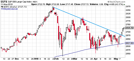
1. Upside Breakout: First up is our old favorite, the 2 lines chart (the short term down trend line, and the 200-day moving average), but this time featuring what looks like a fairly compelling upside breakout. The next big test of course will come (firstly that the breakout actually holds) at around 2800. But the fact that it has broken to the upside and not the downside is a promising sign.
Bottom line: The S&P 500 has broken out of its short term down trend line.
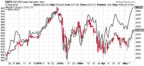
2. Small Caps Leading: I also wanted to show this chart because I feel it is quite important and a logical follow up to the previous chart, it shows the S&P 600 in the black line (which is basically the small cap version of the predominantly large cap S&P500 index). The key point is that small caps are leading the charge. What's also interesting there is how well small cap stocks held up throughout the correction. I believe this reflects underlying strength in US corporate fundamentals.
Bottom line: Small cap stocks have been relatively resilient through the correction.
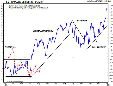
3. Seasonal Cycle: On the topic of upside movement, the next chart shows (from Ned Davis Research, shared by Heritage Capital Research) an interesting picture of the cyclical/seasonal tendencies of the S&P 500 (the blue line combines the annual seasonal cycle, the 4-year presidential cycle, and the 10-year decennial cycle signals). According to the cycle composite there is usually a bout of strength around this time of the year. So it will be interesting and telling to see whether the S&P 500 goes along with the story here.
Bottom line: The composite cycle signal points to short-term upside for the S&P 500.
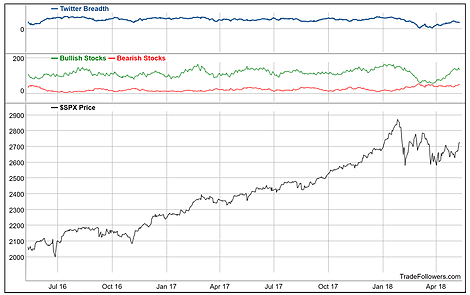
4. Twitter Breadth: Staying with the bullish theme, this one from Trade Followers shows a unique indicator called Twitter Breadth, which tracks bullish/bearish tweets on stocks and shows the overall tone of Tweets. Interestingly the bullish tweet count has been rising through the second part of the correction. So it lines up, in my view, with the thinking around the first two charts.
Bottom line: Twitter breadth has become more bullish through the correction.
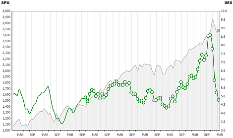
5. Investor Movement Index: Another interesting sort of alternative data type of chart is the TD Ameritrade Investor Movement Index, which dropped further in April. The index tracks activity of TD Ameritrade clients (retail investor activity). It represents a complete unwinding of the extreme optimism seen around late last year. So whereas this indicator used to be a barrier to higher stocks—hard to go up when everyone is already fully invested—it is now back down to 2015/16 correction levels.
Bottom line: The TD IMX has seen a full reset from extreme optimism.
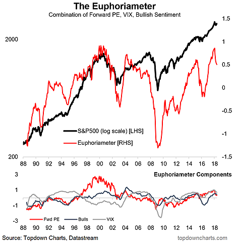
6. The Euphoriameter: On a similar note, my own indicator - the Euphoriameter - has likewise undergone a substantial reset. Notably, much of the reset in this indicator has been driven by a reduction in forward PE valuations. What's also worth noting is how the reset has only been relatively minor compared to the deeper reset during the 2015/16 correction - although that was a different market/macro environment where earnings were in recession, so arguably that period should have seen a deeper reset as the fundamentals came into question.
Bottom line: The stock market Euphoriameter has undergone a material reset.
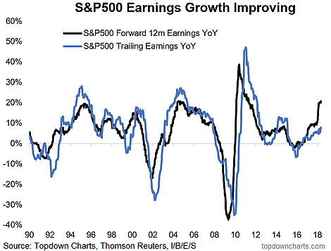
7. Earnings Outlook: On the topic of earnings and macro fundamentals, the next chart shows the year over year change in trailing earnings and consensus estimate next 12 month earnings. You can see clearly the contrast between 2015/16 and the current period where earnings were in recession then, and accelerating now. To be fair, stocks can certainly fall while earnings are rising (driven by other factors such as external shocks and sentiment, or in anticipation of weaker future earnings), but for now it is a bullish sign.
Bottom line: S&P500 aggregate earnings growth continues to accelerate.
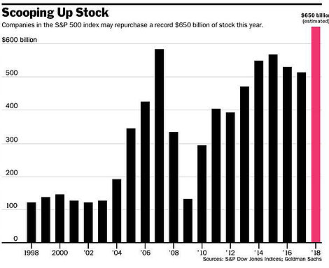
8. Corporate Buybacks: Now this chart from Barron's could be considered bullish or bearish depending on where you sit and how you frame the argument. On the one hand, buybacks increase the demand for stocks (as corporations put buying flow through the market) and reduces the supply of outstanding shares. On the other hand, looking at that chart, and it is a small sample period, buybacks also made a record high in 2007. In other words, you often see booming buyback activity around the top of the market, so it could actually be a late cycle signal and thus bearish.
Bottom line: Corporate buybacks are set to make a record high this year.
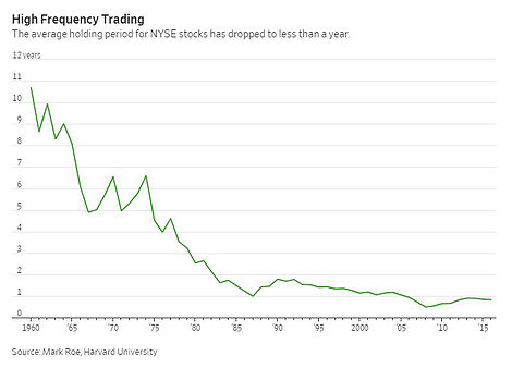
9. Average Holding Period: File this one in the interesting category—the graph shows the average holding period for NYSE stocks. There was a big transition from long-term investing in the 1960's and 70's to short term investing from the 1980's onward. Since then the average holding period has fluctuated around 1 year, sometimes less. We can talk about short-termism, we could also talk about the breakthroughs in access and reduced cost of trading that have enabled an army of day traders to enter the market, and we could also talk about high frequency trading. If nothing else, it provides something to think about, particularly with regards to your own investment philosophy.
Bottom line: Average holding period has dropped from around 10 years to around 1 year.
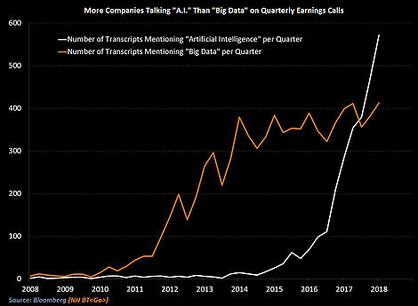
10. The Rise of The Buzzwords: Last one shows the progression of the relentless hum of buzzwords in corporate earnings calls. Specifically it shows how mentions of "big data" (remember that?) have leveled off while mentions of "Artificial Intelligence" has surged. I could say something about artificial intelligence vs natural stupidity, but I won't. In fairness, AI is an important emerging area and will no doubt have an enormous disruptive and transformative impact on the way we do business (among other things). Just another step in the path of technological progress and creative destruction.
Bottom line: Mentions of AI during earnings calls is on the rise.
So where does all this leave us?
This week there are about 3 key themes...
1. Breakouts and Bullishness
On breakouts and bullishness there's the long awaited breakout in the S&P500, which we show seems to be driven by small cap stocks, then there's the uptick in bullish tweets, positive cycle composite, impending record buybacks, and solid earnings growth.
2. Big Resets
On big resets, there's the major reset in the TD IMX back to 2015/16 levels, and the less major reset in the Euphoriameter—which was mostly driven by a reset in forward PE valuations.
3. Bold Changes
On bold changes there's the transition from long term investing to short term trading, and the takeover of artificial intelligence (at least in earnings call chatter)—depending on your perspective AI might be long term bearish!
Summary
This week the context of an upside breakout for the S&P500 which is driven by strength in small caps sets the tone for an overall bullish short-term outlook. As we progress later through the business/market cycle, and as monetary policy goes through the normalization process, it's quite likely that we will see more skittishness, and more selloffs and corrections. So overall, in the absence of any clear and pressing red flags, it all seems short-term bullish, but within the context of confidence that volatility is going to stay high from here.
