Those that follow my personal account on Twitter will be familiar with my weekly S&P 500 #ChartStorm in which I pick out 10 charts on the S&P 500 to tweet. Typically I'll pick a couple of themes and hammer them home with the charts, but sometimes it's just a selection of charts that will add to your perspective and help inform your own view—whether its bearish, bullish, or something else!
The purpose of this note is to add some extra context beyond the 140 characters of Twitter. It's worth noting that the aim of the #ChartStorm isn't necessarily to arrive at a certain view but to highlight charts and themes worth paying attention to.
So here's the another S&P 500 #ChartStorm write-up!
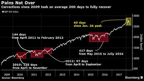
1. Recovery Process: Well with the first chart, if you're in the camp that says this is a bear market then you might as well move on to the next chart. What it shows is basically that the recovery process out of a decent correction the likes of which we are currently going through can take some time. Over the period shown in the chart the recovery process can take anywhere between 97-417 days... or an average of 200 days (vs 60 odd days at the moment). So as I noted previously, there could be a bit more water to go under the bridge on this one.
Bottom line: Over the past decade it's taken an average 200 days to recover from a correction.
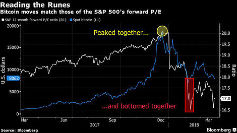
2. Bitcoin and the Stockmarket: Curious pattern here pointed out by Bloomberg Crypto. Seems to show some interlinkages or parallels between the markets as Bitcoin and the S&P 500 peaked around the same time, and made the initial bottom around the same time also. It's certainly food for thought, especially for those who are in the camp that say this is like dot-com because rather than the dot-com mania playing out in the stock market it has played out in the crypto markets. And in fairness, there was certainly some hectic mania over there.
Bottom line: Bitcoin and the S&P 500 peaked and bottomed around the same time.
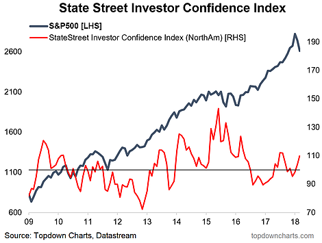
3. Institutional Investor Confidence: I thought this chart was really interesting, it shows the State Street institutional investor confidence index - which is derived off data from their global custodian business (has about $30 trillion under administration), and basically appears to show institutional investors "buying the dip". They don't have a perfect record, but it is an interesting piece of information to add to the mix that the big guys are buying and certainly not showing any signs on panic on this measure.
Bottom line: It seems institutional investors are buying the dip.
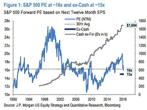
4. Stock Market Valuations: Quite an appropriate chart to follow up with is a look at the forward PE ratio. This chart from JP Morgan shows a fairly sizable reset in the PE ratio (thanks to the fall in stock prices and the surge in forward earnings due to tax cuts among other things). Intriguingly the chart also shows cash holdings, which when you think about the "war chest" factor says maybe things could get interesting if these companies decided to deploy some of that cash. Also, you can see that they have calculated the PE excluding cash (important in a low rate environment) which reveals an even cheaper PE ratio.
Bottom line: Forward PE ratios have seen a notable reset.
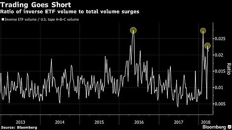
5. Inverse ETFs: This chart shows basically demand for inverse ETFs (standardized against the rest of the market). This indicator has spiked to levels last seen during the 2016 correction (actually during the later stages of that correction - at that time it was a serious contrarian buy indicator). Basically this reflects increased bearishness and fear in the markets, and while sometimes fear and bearishness can be truly justified, at other times all it does is create opportunities for the more level-headed and helps create the conditions whereby the market can surge back onwards and upwards.
Bottom line: Heightened demand for inverse ETFs reflects increased bearishness and fear.
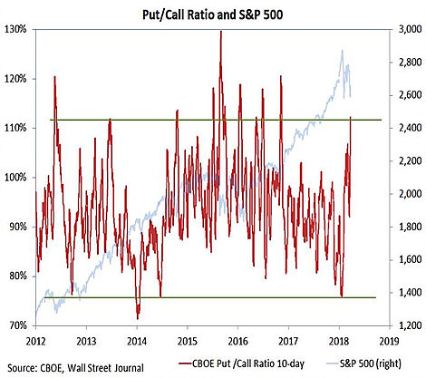
6. Put Call Ratio: On a very similar line is the Put/Call ratio chart from Willie Delwiche, and it likewise shows a surge in demand for puts vs calls (note puts = protection against a fall in the market, whereas calls profit from rising prices). This indicator is a fairly well established sentiment gauge and as with the previous chart can serve as a contrarian indicator and help foster the conditions for those on the bear/short side of the market to contribute to a snap-back in prices if they are caught wrong-footed.
Bottom line: The put/call ratio is in panic mode.
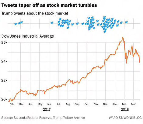
7. Trump Tweets: I suppose you might call this one a sentiment indicator also. As Josh Brown points out, Trump was a vocal advocate of the stock market on Twitter late last year, but has since gone quiet. Maybe he is just too busy with other things like a potential North Korea peace deal, trade non-wars, and infrastructure spending plans. Either way, it is an interesting chart, and fits well with the others we've talked through today.
Bottom line: Trump stock market tweets have tapered off with the market tumble.
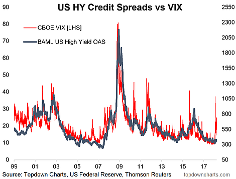
8. The VIX and Credit: This is a chart that I keep on thinking about (US junk bond spreads to Treasuries and the CBOE VIX). There's a couple of ways to look at it, for one, you might argue that the gap between the VIX and credit spreads represents a sentiment thing, i.e. the VIX has gone up as stock market investors have moved into a largely sentiment and news/noise headline-driven panic... yet credit markets have barely batted an eyelid as back in the real world things haven't really changed. The other view would be that the stock market is "right" and HY credit spreads are "wrong". My view is that credit spreads have likely bottomed, so I would lean toward the latter argument, but then again it might take a while before things get moving in credit markets.
Bottom line: There is a material divergence between equity risk and credit risk pricing.
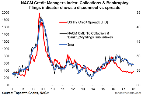
9. Credit Spreads and the CMI: For those not aware, the NACM (National Association of Credit Managers) put together an index called the CMI (Credit Managers' Index) - very similar to the way in which the ISM does the PMI. This provides a monthly insight into credit conditions, and since we're on the topic of credit markets, it's a good opportunity to take a look at another divergence. Now the gap in this chart (which you might interpret as saying that credit spreads should be higher) has begun to close by the CMI "catching down", but there's probably some scope for credit spreads to "catch up". One to keep an eye on!
Bottom line: Credit spreads may have some catching up to do.
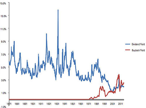
10. Dividend Yield and Buyback Yield: This very interesting chart was shared by Ben Carlson of Ritholtz Wealth Management, and shows the path of the dividend yield and the "buyback yield". If you think about buybacks as basically a form of dividend, you can see how the overall yield is basically in line with historical norms. Lately it seems as though buybacks are attracting some negative political attention, but if you think about buybacks as a dividend equivalent it's a non-issue... or it's as much of an issue as paying dividends is.
Bottom line: When thinking about the dividend yield don't forget the "buyback yield".
So where does all this leave us?
This week there were about 3 main themes...
1. The Correction
We saw how Bitcoin and the S&P 500 seemed to both peak and trough around the same time. We also saw how the average correction of the past decade took 200 days to fully recover, yet it seems institutional investors are already buying the dip as valuations have seen at least a partial reset.
2. Sentiment
On sentiment we explored a couple of indicators such as the put/call ratio, inverse ETF volumes, the VIX, and even tweets, which all showed a stark turnaround from optimism/complacency earlier on, to now panic, bearishness, and fear.
2. Credit Markets
Speaking of the VIX, we saw two key divergences in credit spreads, and how these divergences have the possibility to play out in a benign, or decisively less-than-benign fashion.
Summary
This week the collection of charts present a really interesting synopsis or prognosis of the correction. The mix of sentiment, valuation, and correction recovery process charts presents a picture of a market that is undergoing a normal corrective process where previous extreme optimism has flipped over to panic. Looking at these charts and characterizing it as a sentiment-driven correction would leave one feeling bullish from a contrarian standpoint. Yet the credit market charts towards the end highlighted the still two-way risk setup in the markets. It seems trite to leave you with a statement like "watch this space", but that's basically what we need to do at this point...
