The S&P 500 ChartStorm is a selection of 10 charts which I hand pick from around the web and post on Twitter.The purpose of this post is to add extra color and commentary around the charts.
The charts focus on the S&P 500 (US equities); and the various forces and factors that influence the outlook—with the aim of bringing insight and perspective.
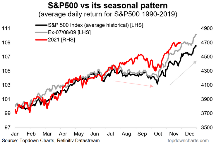
1. S&P 500 Seasonality Chart: It’s everyone’s favorite chart updated again (maybe for the last time this year?). The S&P 500 has been sticking to the seasonality script through most of this year… makes me think about Murphy’s Law tho—maybe the market will start to improvise and go off-script? Either way, the next few weeks seasonally look like sideways action.
Source: @topdowncharts
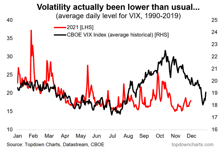
2. Volatility Seasonality: A twist on the previous chart—same concept, but this time with implied volatility. I find it interesting to note that the VIX has actually been a bit lower than usual for this time of the year (and trending up short-term…). One last VIX spike before year-end?
Source: @topdowncharts
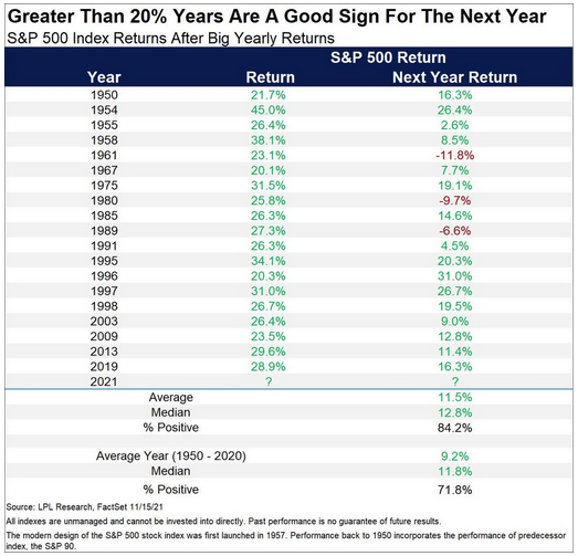
3. Stockmarket Statistics: What happens after the market goes up a “crazy overheated” 20%+ over the course of a year?
More Gains.
Historically most of the time if the market closed up 20%+ for the year, the next year was also positive (84% of the time). As of writing, the market is up some 27% YTD (albeit, this year ain't over yet!).
Source: @RyanDetrick
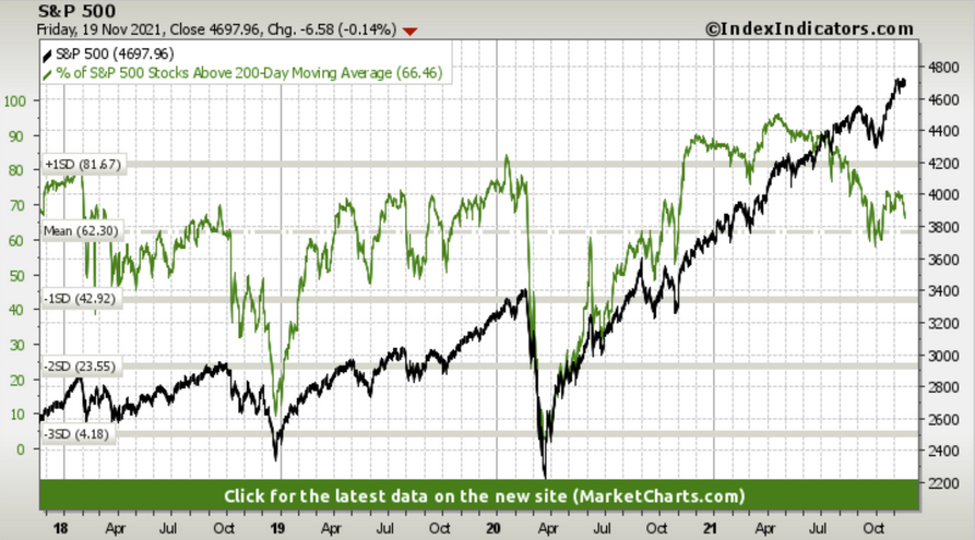
4. Bad Breadth? Fully 1/3rd of stocks are in a downtrend. (defined as trading below their respective 200dma)
Will this bearish divergence be a problem?
Source: Index Indicators
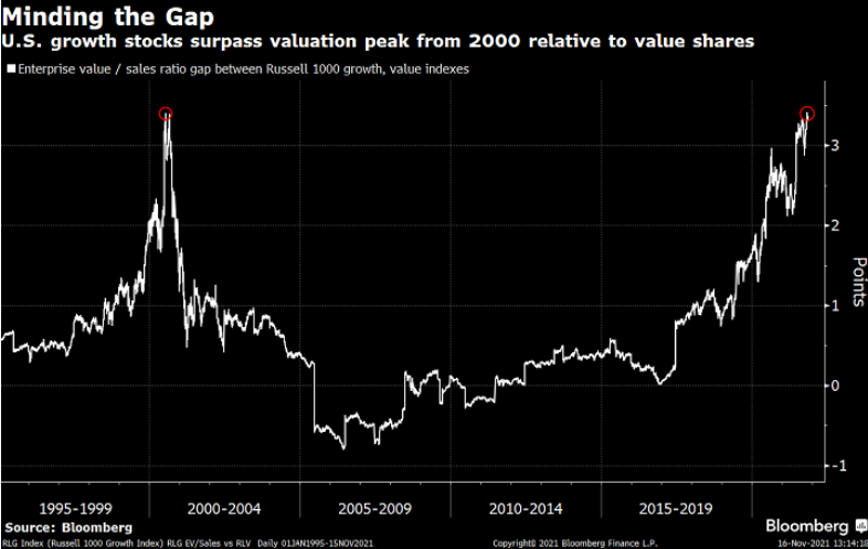
5. GAARP vs GAAAP: On this metric, growth stocks are the most expensive ever vs value stocks. So it begs the question… Growth at a reasonable price? or Growth at *any* price? (but then again, who defines what "reasonable" is in a market like this!)
Source: @TheOneDave
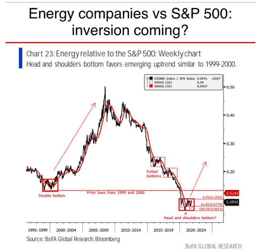
6. Low Energy: Energy stocks are attempting to turn the corner vs the rest of the market, but face high hurdles from the raging tech bull market, rise of ESG investing and regulatory/political hurdles, not to mention commodity market volatility.
What comes down must go up? (or something else?)
Source: @dissectmarkets
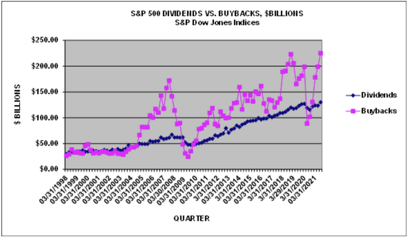
7. Buybacks Back: New all-time high for buybacks in Q3 (with 95% reported). Always makes me wonder these trends — you see the majority of buybacks occurring near market peaks… i.e. when valuations are extreme expensive. The opposite of value investing: buy more when its expensive, buy less when it’s cheap—seems like upside-down logic to me, but then again I am a simple man.
Source: @hsilverb
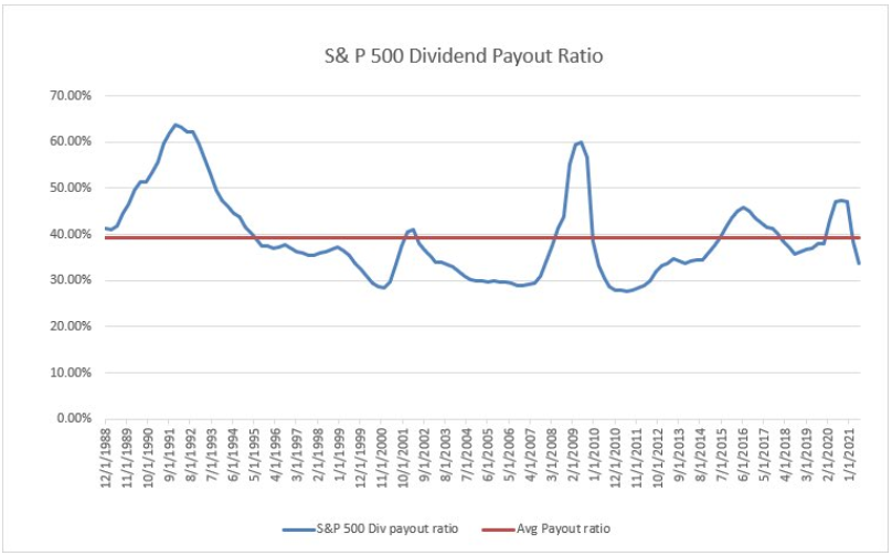
8. Payout Ratio: As an interesting follow-on to the ATH in buybacks/dividends, it’s interesting to note that the dividend payout ratio is actually below average...
Scope to return more cash to investors?
Source: @ChrisDagnes
9. Buffett Indicator: Looks like this indicator has reached a permanently higher plateau! (kidding of course—echoing the famous last words of Irving Fisher back in 1929) Interesting stat to note: to make this indicator as cheap as where it got to during the financial crisis lows the market would need to fall over 70%. Definitely not a prediction, but interesting nonetheless. I would say I have multiple quibbles with this indicator, I think CAPE and ERP are better valuation metrics, but that’s a topic for another day.
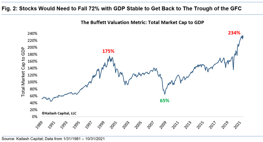
Source: @KailashConcepts
10. Buffett the Compounder: Speaking of Buffett, a lesson in compounding.
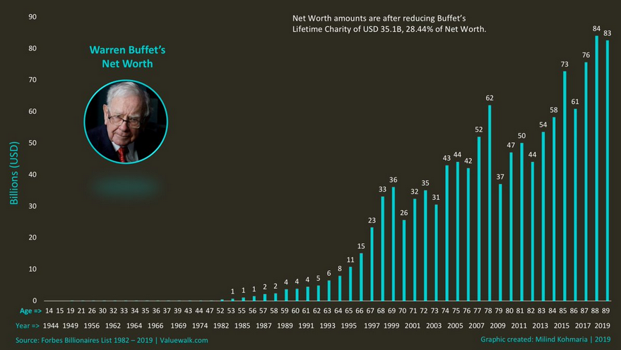
Source: @DividendGrowth
Thanks for following, I appreciate your interest!
