Those that follow my personal account on Twitter will be familiar with my weekly S&P 500 #ChartStorm in which I pick out 10 charts on the S&P 500 to tweet. Typically I'll pick a couple of themes and hammer them home with the charts, but sometimes it's just a selection of charts that will add to your perspective and help inform your own view - whether its bearish, bullish, or something else!
The purpose of this note is to add some extra context beyond the 140 characters of Twitter. It's worth noting that the aim of the #ChartStorm isn't necessarily to arrive at a certain view but to highlight charts and themes worth paying attention to.
So here's the another S&P 500 #ChartStorm write-up!
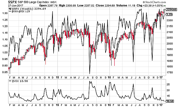
1. VIX and VIX futures curve: The first one this week shows a weekly chart of the CBOE VIX and the VIX futures curve indicator (VIX vs VXV). There's a couple of standouts: 1. The VIX is very low; 2. The VIX futures curve indicator is at the top end of the range. On both counts this has been something that usually doesn't last long and that usually gets resolved through a short-term correction or selloff. It's difficult to say when downside risks may materialize, these indicators offer better and faster signals during a correction/market bottom than a top, but it's one of a few charts in this week's edition that suggest caution.
Bottom line: The VIX and VIX futures curve are at complacent levels.
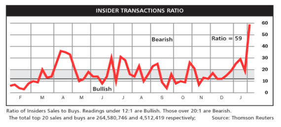
2. Insider transactions ratio: The insider transactions ratio, put together by Barron's, has spiked to extreme bearish levels. The theory is that insiders, knowing best about the value vs price of their companies, tend to buy at the bottom and sell at the top - so when there's more selling than usual e.g. now, it's taken as a bearish sign, a sign that insiders are cashing their chips.
Bottom line: The insider transactions ratio is at extremely bearish levels.
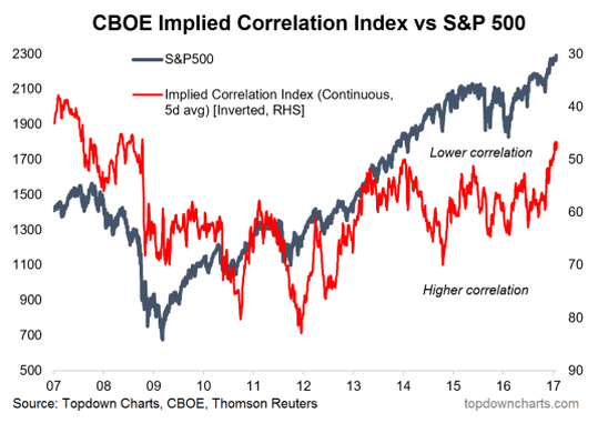
3. Implied correlations: The CBOE Implied Correlation Index is a market based estimate of the average correlation of stocks in the S&P500. While I won't go into the details of the indicator, I will note that the present level and recent movement of the indicator appears to be flagging downside risks if history is anything to go by. The chart shows whenever implied correlations drop e.g. now, there's usually at least a small short-term selloff or a larger correction.
Bottom line: The CBOE implied correlation index is implying a risk-off correction or selloff.
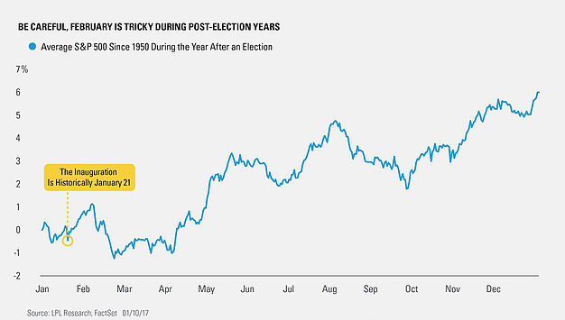
4. Seasonality in post-election years: This graph shows the average seasonal pattern of the S&P500 during the year after an election (since 1950). The chart shows on average, you see gains after the inauguration, but then a stumble comes in February - presumably as the initial excitement wears off. It's only later in April that the usual positive seasonality kicks in.
Bottom line: The historical pattern is that post-inauguration gains fizzle out in February.
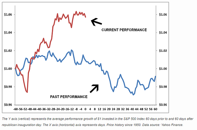
5. Seasonality for Republication inauguration: Taking the above chart further, this chart from Klocke Capital shows the historical return patterns around inauguration date, but specifically for Republican presidents (albeit some have argued that Trump is more a quasi-independent than a Republican). Anyway the key point is that the historical tendency has been for a bumpy patch following Republican inaugurations.
Bottom line: The historical pattern has been for poor performance immediately following Republican inaugurations.
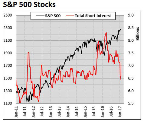
6. Short interest: Todd Salamone of Schaeffer's Research shows total short interest for S&P500 stocks has plunged. It looks like the classic short-covering rally and if nothing else it means there is little to no fuel left for stocks from short-covering related buying. Spikes in short interest often portend a market bottom, but slumps in short-interest don't necessarily give a reliable signal of a market top.
Bottom line: Short interest has dropped significantly and the resultant short-covering has helped the market surge higher.
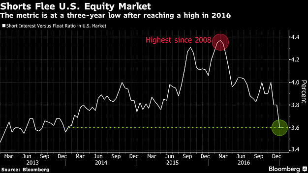
7. Standardized short interest: This chart from Bloomberg shows a standardized metric for short-interest which compares short interest vs the float (important because short interest will often trend up over time as the number of stock on issue trends up). The chart shows this short interest indicator reaching the lowest point since early 2014. Again it shows the big shift in markets and the extent to which short-covering has helped fuel the rally.
Bottom line: Short interest has fallen significantly.
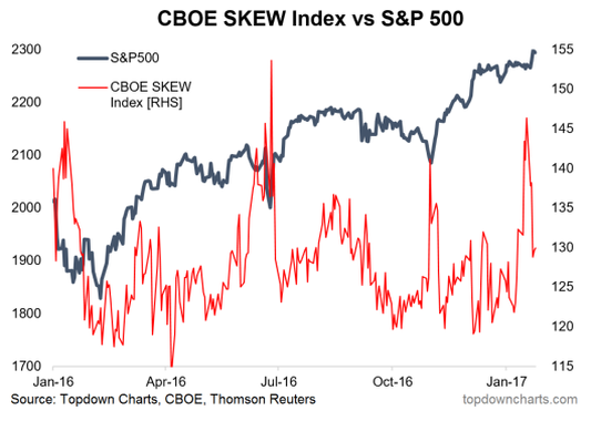
8. The Skew: The CBOE SKEW Index basically gives an indication of demand for tail risk hedging. The longer explanation is that it uses option pricing to determine the implied skew of return distributions: 100 suggests a normal distribution, while higher levels suggest increasingly "fat tails" i.e. big outliers or "tail risk". So you can more or less say that high readings imply option traders are expecting big moves. As a market timing signal it's track record is mixed, in fact it often spikes at a market bottom (giving a contrarian bullish signal). But looking further into the past it can often give bearish warnings when the market is near a high and it begins to spike. So perhaps another risk flag to add to the list.
Bottom line: The SKEW index (a measure of tail risk hedging demand) spiked recently.
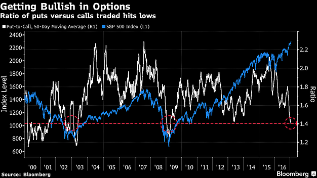
9. Put/Call Ratio: This chart, again from Bloomberg, shows the S&P500 against the put/call ratio for that index (measures whether more puts (bearish bets) or more calls (bullish bets) are being used). The current readings show relatively few puts being used vs calls (which makes sense, bullish traders are probably using call options to get exposure in an otherwise risky market while the low VIX basically says options are cheap right now). In terms of the signal, it's been at the current level on 4 notable occasions: 1. at the dot com bubble peak; 2. at the 03 market bottom; 3. at the 09 bottom; and 4. in 2013 as the QE surge got underway. So you could say that it's bullish most of the time, except when you're at a market high - so some people might draw parallels between now and 2000.
Bottom line: The put/call ratio shows optimism in the form of less puts vs more calls being used.
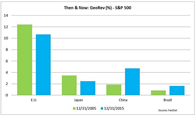
10. Geographic sources of revenue: The final chart is from FactSet and it shows the change over 10 years in the most significant offshore sources of revenue for S&P500 companies. While China has made big strides as an increasingly important source of revenue, it still lags significantly behind Europe. It's interesting to note where the revenues are coming from, particularly when you have Trump-talk raising fears of a trade war with China that could potentially jeopardize China sales. But while it's certainly an issue, from a revenue standpoint it's material, but not huge. By the same token, the better growth we've seen in Europe is probably helping things.
Bottom line: China has become a more important source of offshore revenue, but Europe still leads.
So where does all this leave us?
This week there's probably only 2 categories of interest:
1. Bearish
A lot of the charts this week are bearish e.g. a spike in insider selling, complacent VIX and VIX futures curve levels, negative seasonality for post-inauguration period returns, a shake-out of short interest, the fall in implied correlations, and potentially also bearish is the SKEW spike and the put/call ratio run down. So there is a body of evidence to suggest near term caution is warranted.
2. Not bearish
Not many on this list - the put/call ratio chart could be seen as bullish, likewise the SKEW spike, and the geographical revenue chart is not bearish in that it shows still sizable revenues from Europe, which is doing better now.
Summary
This week featured a long list of charts that could easily be read as bearish on the short term direction of the market. While there were a couple of charts that could go either way, the weight of evidence says that the short-term outlook for markets is that there is an increasing probability of a selloff or correction. Time will tell. Good luck and be careful out there.
