Once again on Friday, the bulls were able to ride aboard the 'Buy the Dip Express' to close out last week up 0.54% on the S&P 500 although the Small Caps didn’t fare as well, down 0.76%. On Thursday we saw a bit of panic selling with down-volume outpacing up-volume on the NYSE nearly 6-to-1. Buyers came back in force on Friday with advancing volume accounting for 82% of trading volume on the NYSE and advancing issues made up 79%.
I mentioned on Twitter (here and here) last week that an intermediate-term cycle would be peaking on Wednesday. Typically we see larger shifts in trend after this cycle rolls over, so while Thursday’s selling wasn’t a huge surprise I would be slightly surprised if that was the extent of it. But of course we follow price not force it, so respect must be shown.
Trend
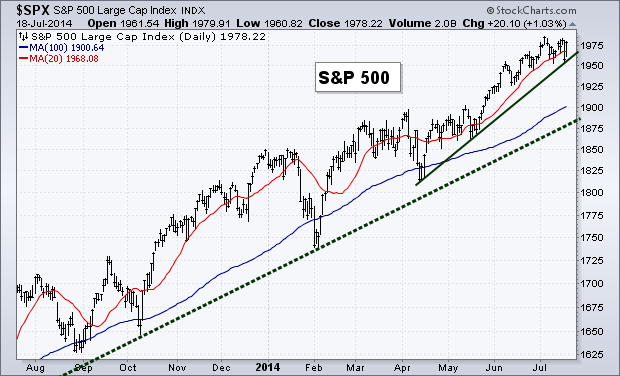
Last week’s small drop in the S&P 500 saw our short-term trend line get tested and held. This keeps the overall trend intact with the bulls in control.
Breadth
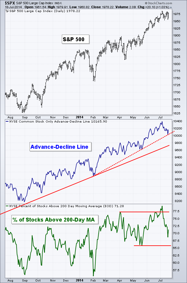
Like the chart above, we saw the short-term trend line for the Advance-Decline Line get tested as well. As the S&P has consolidated between 1990 and 1950 the A-D Line has weakened. The trend is still positive for this measure of breadth, but it appears a few more holes were poked in it compared to the price movement of the equity market.
Yield Curve
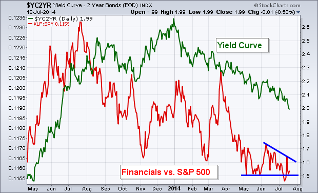
One of the important charts that hasn’t been getting much attention lately is the drop in the Yield Curve. The movement in the Yield Curve can have a large impact on the health of the Financial sector (Financial Select Sector SPDR Fund (ARCA:XLF)). When yields begin to drop like they have been in 2014, it makes it much harder for the Financials to perform well. Last week the Yield Curve hit a new 2014 low while the relative performance of XLF against SPY held above its May low. If the Yield Curve continues to weaken, I’ll be watching to see if Financials continue their under-performance versus the overall market and decline past that May low.
Treasury Bonds
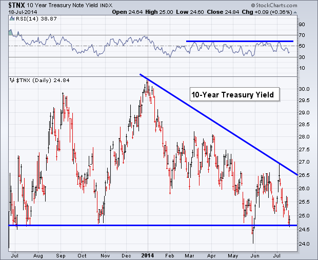
While on the topic of Yield, I wanted to show the chart of the U.S. 10-Year Treasury (TNX). Three weeks ago I showed this chart and the importance of the resistance level in the Relative Strength Index (RSI). Since then we saw yields rise and the RSI indicator hit resistance, sending bond prices higher and yield lower. The 10-year Yield is now back down to prior support, just under 2.5%. As I’ve been saying for almost the whole year, bond yields are in their own little bear market and while nearly every major bank’s economist is calling for yields to rise, price continues to disagree.
Momentum
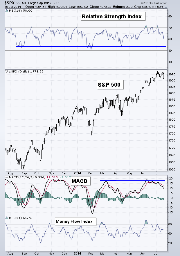
Last week we saw a nice bounce in the Relative Strength Index (RSI) on the 50 level as price rose on Friday. Momentum continues to sit firmly in the bulls favor as each dip keeps getting bought and selling pressure in the momentum indicators remains muted. However, we did not see a rise in the MACD, which in my opinion is less important than the bounce in the RSI.
High Yield vs. Corporate Bonds
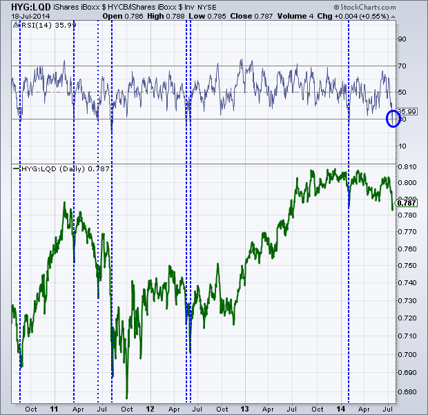
While I wrote above how the 10-year Treasury Yield was testing support and how momentum was favoring the bond bulls. We could be about to see some mean-reversion in the ratio between the iShares High Yield ETF (ARCA:HYG) and the iShares Investment Grade Bonds ETF (ARCA:LQD). The selling that took place on Thursday sent the RSI indicator under 30, which has previously preceded a short-term shift that favors LQD over HYG.
I’ve put dotted blue lines on the chart below to show past instances of momentum being oversold for this pair going back to late-2010. Some of the bounces have been minimal like in early 2011 and earlier this year while others have shown to mark the start to a new trend in relative strength between these two debt ETFs like in late-2010 and 2012.
Relative Sector Rotation
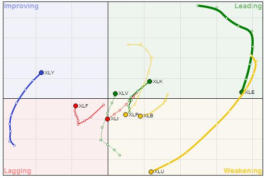
Recently StockCharts.com added the Relative Rotation Graphs to their arsenal of data. These types of charts are really interesting and I’ll be showing them on the blog every couple of weeks.
On the Y-axis (vertical) we have momentum and on the X-axis (horizontal) we have relative strength. Based on the research by Julius de Kempenaer, assets move from a Leading stance where both momentum and relative strength are strong to Weakening, where momentum has weakened by relative strength is still strong, followed by Lagging, when momentum and relative strength are both weak, followed by Improving, when momentum is strong and relative strength is weak. So we typically see assets move in a counter-clockwise circle.
First I want to look at the major sectors. The Energy Sector (SPDR Energy Select Sector Fund (ARCA:XLE)) has spent the last 8 weeks (the time period of the ‘tail’) going from the top of Leading towards the bottom as its momentum has begun to weaken. We’ve seen a large shift in Utilities (SPDR Select Sector - Utilities (NYSE:XLU)) as it has fallen hard into the Weakening portion. Some sectors to keep an eye on are Health Care (SPDR - Health Care (ARCA:XLV)), Technology (SPDR Select Sector - Technology (NYSE:XLK)), and Consumer Discretionary (SPDR Consumer Discretionary Select Sector (ARCA:XLY)) which has been trying to dig itself out of a deep hole but has been making some nice ground into the Improving camp.
Relative Country Rotation
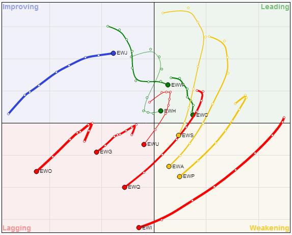
This next chart is the same as the above except we are now looking at Country-specific ETFs. Canada (iShares MSCI Canada (NYSE:EWC)), Mexico (iShares MSCI Mexico (ARCA:EWW)), and Hong Kong (iShares MSCI Hong Kong (ARCA:EWH)) all are currently in the Leading category. While Japan (iShares MSCI Japan (NYSE:EWJ)) has made a great improvement over the last eight weeks. Italy (iShares MSCI Italy Capped Fund (ARCA:EWI)) has seen its momentum and relative performance weaken significantly, going from Leading to Lagging over the last two months.
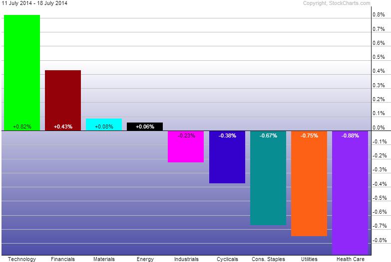
Last Week’s Sector Performance
While I think the Relative Rotation Graphs are a great tool, I still think it’s important to know how the sectors are performing. Technology (SPDR Select Sector - Technology (NYSE:XLK)) was the star last week followed surprisingly by Financials (Financial Select Sector SPDR Fund (ARCA:XLF)). Even though Volatility spiked over 30% on Thursday, the three defensive sectors were our weakest sectors for the week, with Health Care (XLV) the biggest under-performer.
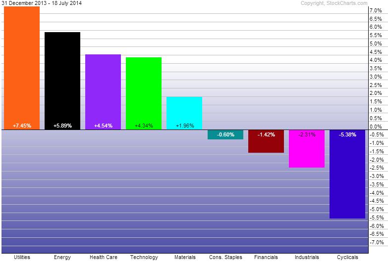
Year-to-Date Sector Performance
With the recent weakness in Energy over the last two weeks, Utilities have regained the top spot for 2014. Consumer Discretionary still remains the worst performing sector YTD. Although, as the RRG shows above, it has been improving and may be a sector to keep a watch out for if price can keep strengthening.
Disclaimer: Do not construe anything written in this post or this blog in its entirety as a recommendation, research, or an offer to buy or sell any securities. Everything in this post is meant for educational and entertainment purposes only. I or my affiliates may hold positions in securities mentioned in the blog. Please see my Disclosure page for full disclaimer.

