Those who follow my personal account on Twitter will be familiar with my weekly S&P 500 #ChartStorm in which I pick out 10 charts on the S&P 500 to tweet. Typically I'll pick a couple of themes to explore with the charts, but sometimes it's just a selection of charts that will add to your perspective and help inform your own view - whether its bearish, bullish, or something else!
The purpose of this note is to add some extra context and color. It's worth noting that the aim of the #ChartStorm isn't necessarily to arrive at a certain view but to highlight charts and themes worth paying attention to. But inevitably if you keep an eye on the charts they tend to help tell the story, as you will see below.
So here's another S&P 500 #ChartStorm write-up:
1. The S&P 500 Levels
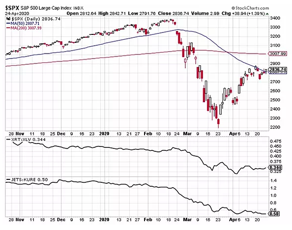
First up is a check on price. The index has traded rather sideways in a choppy fashion for the last week and a half, consolidating gains from the March 23 low. The 50-day moving average proves to be resistance in the near-term. The February low that was apparent support now appears to be adding to resistance. So there is a bit of confluence of supply at current levels. Still, the bulls are holding their own on this bounce, not allowing significant downside as emotions continue to run high. Things seemed bleak on Tuesday last week as the index settled at the low of the day, but marked the low of week.
A key indicator we are watching is relative performance of retail versus heath care. The S&P Retail ETF (NYSE:XRT) vs. Health Care Sector SPDR ETF (NYSE:XLV) ratio chart below fell off a cliff from late February through early April, and has seen only a minor bounce since. Bulls would like to see the chart breakout in some fashion to help give the recovery in the broader market some legs.
Further, one of our favorite ratio charts, global airlines versus China health care (JETS vs. KURE) is at the lows, even after stimulus news for US airlines. As a pandemic barometer indicator, this is one cause for concern.
Bottom line: The current consolidation in the S&P 500 appears to be constructive, and it has the hallmarks of a bull-flag pattern, but the bullish scenario needs some confirmation soon. Bull flags that get extended tend to resolve in a breakdown. Also complicating the outlook is the 200-day moving average is further above near the psychological 3,000 figure.
2. Cyclicals vs. Defensives
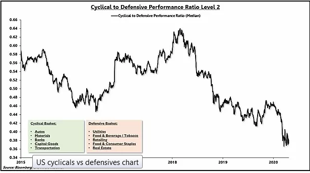
Arguably this chart shows the battle between stimulus and social distancing. Once again, despite the major rebound in the S&P 500 in the last month, the ratio of cyclical stocks to defensive equities hovers near the low. In normal circumstances this would represent a lack of confirmation. Investors are still sour on industries susceptible to weak consumer spending and those areas dependent on physical movement. Within defensives, it has been a mixed bag among food and beverage stocks, but the move defensive grocery store space remains a safe-haven.
Bottom line: Cyclicals vs Defensives is a powerful confirming indicator, and the below chart is not providing a signal that investors are bullish on a return to normalcy any time soon. Perhaps this chart can be included in the longer-duration “U-shaped” recovery fundamental narrative. Also see how the trend had been down in advance of COVID-19. So the bulls have a lot of work to do here to see a secular turn toward cyclical names.
3. Stocks, Bonds, Gold
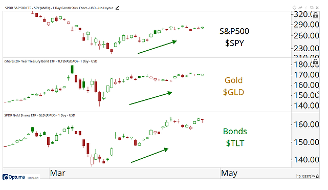
This one from our friend J.C. at Allstarcharts. A cascade of liquidity has helped propel most assets sharply higher in the last 5 weeks. We are big fans of intermarket analysis, and it’s always telling when everything moves together. Stocks have shot higher as we discussed, but so too has gold and long-term treasuries.
At times during the February-March collapse, precious metals and bonds were sold as a source of funds, but they have been bought-back in a fury. What happens in the next down-move for one of these assets? How will the others respond?
Typically these 3 markets are more inclined to march to their own beat e.g. a more constructive growth outlook would boost equities at the expense of treasuries. So in a way you could argue this is another corner of indecision in the market.
Bottom line: It’s possible all three asset classes can continue to be highly correlated for quite some time, but we will be on the lookout for relative weakness should it evolve.
4. Bloomberg Consumer Confidence vs. S&P 500
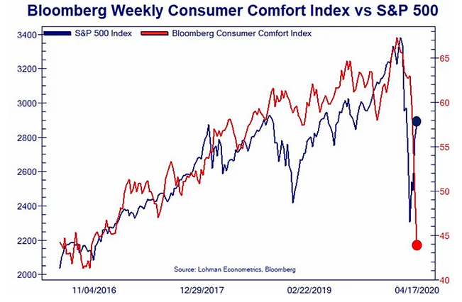
The next chart shows consumers haven’t felt this tentative since before the 2016 election, which is stunning given the highs recorded just two months ago as the S&P 500 was above 3,300. The current state of the American buyer contrasts the nadir from Q4 2018 which barely saw a hiccup in confidence as stocks fell about 20%.
The disconnect between equities and consumer comfort is staggering. It’s easy to point out that the stock market is a forward-looking, discounting mechanism while consumers are focused on the here-and-now and more impacted by recency. Jurrien Timmer notes that the S&P 500 bear market low tends to lead the end of recessions by 2-4 months, so it is certainly not uncommon to see stocks bottom on terrible news and consumer despondency.
Bottom line: Consumers are likely pinching-pennies as they did during the Great Financial Crisis as stay-at-home orders continue. Equities seem to be pricing-in a return to typical consumer buying behavior this summer, but who know how individuals will actually act. Low gas prices are not the trick. It will take time for the damage down to the psyche among individuals to get back to the way things were. Until then, we’ll keep enjoying our Zoom meetings.
5. FOMO on the Rise
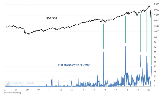
Troy Bombardia provides this look of the S&P 500 with news stories mentioning “FOMO”. Large cap growth continues to charge ahead. Same old story. There has been a spike lately in stories mentioning the Fear Of Missing Out, “FOMO”.
In the past, these spikes have eventually led to market pullbacks. Will the same happen soon? Bulls want to see better participation among smaller issues and perhaps value stocks. Panic buying frenzies (driven by fear, in a sense) are not the healthiest forms of equity market rallies.
Bottom line: The S&P 500 hasn’t immediately declined during prior instances of “FOMO” news-mention spikes, but eventually the prior gains were given back. This relationship indicates that investors may have been buying in capitulation. Technicians want to see accumulation days and stronger breadth for sustained rallies.
6. Most Volatile Years
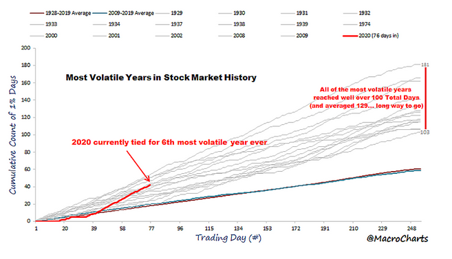
Here’s a great look from @MacroCharts displaying a take on realized volatility. 2020 is tracking as the 6th most volatile year ever. A great insight is on the right – while we have experienced more than 40 1%-days already, similar years went on to accumulate more than 100. There’s a long way to go according to history. It’s interesting to see similar years – the grouping is littered with Great Depression times and years this century. There are sharply positive and major negative return periods in analogous times.
History suggests when volatility turns up, it happens swiftly but then takes a while to return to low levels. Recall the VIX was in the 80s for many trading days during March, and just now pulled back below 40. It will probably spike again – perhaps not to 80-90%, but we certainly wouldn’t consider a move above 60% abnormal. Keep in mind a VIX of 40 still implies an expected monthly move of about 12% up or down.
Volatility has been steadily increasing for the past couple of years, even before the COVID-19 induced spike. The uptick in vol since 2018 was not dissimilar to how the VIX rose in advance of the March 2000 top. Maybe 2017 was the generational low – in volatility.
Bottom line: Expect more big market swings. Perhaps the first gut-check was the huge market collapse from late February to March 23, but the next will be a longer-duration roller coast ride. What is concerning for the longs is that among the comparable years when all-time highs were notched (like 2020), it took several years there-after to hit new highs.
7. Oil Hasn’t Been Cheaper (Obviously)
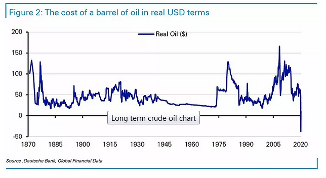
Holger Zschaepitz provides this incredible chart that can be framed on the walls of energy trading shops. We all know WTI reached negative $40 per barrel last week for various reasons – ultimately very little demand met extremely high storage.
While EIA data only goes back to the early 1980s, Deutsche Bank (DE:DBKGn) did a study to find oil prices since 1870. They put the price chart in real-terms. In 2020 dollars, 20 bucks was about the floor over the course of 150 years. Not anymore. Peak to trough from the July 2008 peak it fell $200 on an inflation-adjusted basis.
Oil volatility (OVX) went bananas and became a nearly useless indicator since implied volatility assumes prices are bound at zero – which obviously WTI is not. It spiked to about 500% and has retreated to 173% on Friday’s close. The prompt-month of WTI rolled from May to June and prices moved back into the $10s – what now seems normal, amazingly.
Bottom line: Volatility has shocked certain market arenas – energy among them. Experience is great sometimes, but never before has WTI done anything like this. Keep in mind US oil is physically-settled, so this basically allows for negative prices due to the costs of transport and storage.
8. Energy in the S&P 500
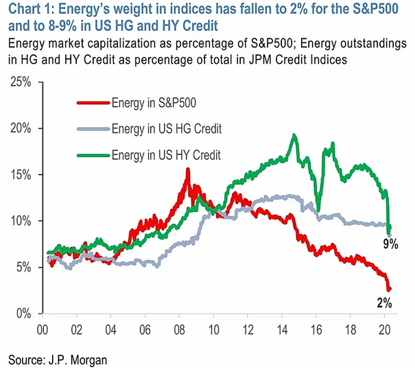
Energy was more than 15% of the S&P 500 market cap during 2008. Now the sector is about 2%. Year after year energy equities have sharply underperformed the rest of the market; it has left the sector among the smallest, comparable in size to materials and utilities. A strong rally in energy won’t do much for the overall stock market given that little position.
Oil stocks actually performed relatively well last week – energy was the only positive sector despite oil’s wild moves (which is probably a good sign). The red line is one of the great all-time examples of ‘don’t fight the trend’. Many bottom-pickers are now dead bodies of supply on the chart. That supply should mean resistance for future rallies.
Bottom line: A low inflation, low growth, tech-driven stock market rally since 2009 has left energy in the gutter.
9. Market Cap Weights
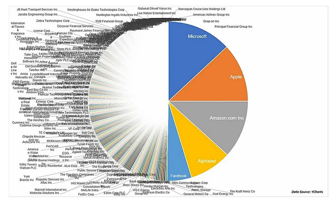
Michael Batnick at Ritholtz updated his popular tongue-in-cheek ‘chart crime’ displaying some company weights in the S&P 500. The 5 biggest names have a cumulative weight equal to the bottom 350. While the 5 market cap leaders are split between the Information Technology & Communications sectors, they are broadly in consumer tech game; the railroads of our time, in more ways than one.
Frustrating investors in more diversified portfolios, megacap technology has outperformed in the last 2 months as stock slid. More of the same seen during the bull market. The top 5 biggest companies’ weight in the S&P 500 has not been this high in decades.
What’s interesting about these firms is they have rather defensive balance sheets with high cash holdings and ultra-low interest rate debt in their capital structure. We’ll get an update on their positions this week in a busy week of corporate earnings reports.
10. Global Equities
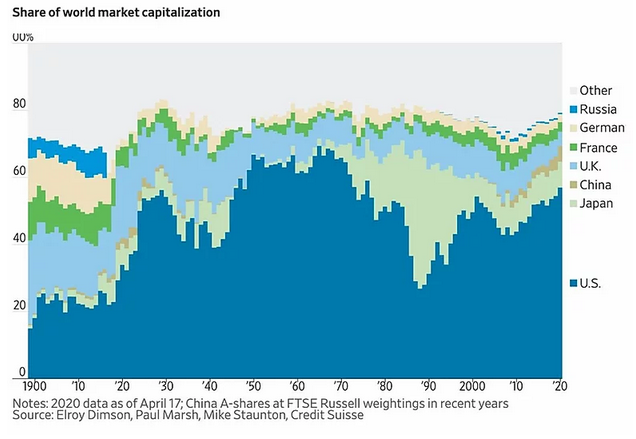
Adam Tooze provides this look at country contribution to global market cap. The US is not the only game in town, but it remains by far the biggest game. US share of global market cap surpassed the 2000 peak and has been creeping toward the range following WWII and before the 1970s-early 80s period of market volatility.
China continues to slowly rise, and we generally expect that trend to continue along with EM growing its share. Albeit more recently a confluence of structural and cyclical headwinds have delayed progress for both the relative performance and growth of EM market share.
One of the big standouts in recent history is the 1980s bubble in Japan. While Japan’s portion since declined from about 40% to under 10%, it has held steady in recent years. Global market cap declines have come mainly from the developed parts of Europe as a long list of problems have helped create an interesting valuation discount vs US equities.
Bottom line: The US might be the biggest game in town, but this rise has come at a cost in terms of more expensive valuations, this thus raises questions as to how sustainable this rise will end up.
So where does all this leave us?
1. Fear & greed
It has been more than a month since the Monday March 23 market low. Was it the ultimate bottom this cycle? We don’t know yet of course. But the 27% rally in the last 5 weeks has many investors on edge wondering if this is just a bull trap aka dead cat bounce (take your pick from the stock market clichés). Charts 1-6 added some color on this.
2. Volatility
The VIX retreated to under 40% last week, the lowest since early March. Which seems like ages ago. Certain sectors. and more granular industries, have seen unprecedented volatility, but the market has been able to take it in-stride during the last two weeks. Nevertheless, it has been a choppy range on the S&P 500 since the middle of the month.
3. Market mix
The fall of energy, the reassertion of US dominance in global equity markets, and the swelling of big-tech... these are some stark trends, and time will tell how long they can persist.
Summary
Tying it all together, can this market rally be trusted? History shows volatility can beget volatility through the end of the year. We have seen interesting moves from the March market low with stocks, bonds and gold all rallying as oil grapples with the poor near-term supply/demand balance. The Fed and Congress continue to provide market liquidity via immense monetary and fiscal stimulus. Notwithstanding, consumers are uneasy and investors are wary of cyclical stocks even after a significant chunk of the S&P 500’s drawdown have been retraced. The current consolidation in the S&P will breakout or breakdown from its consolidation soon. So in the short-run it's a case of staying nimble and tightening up risk management.
