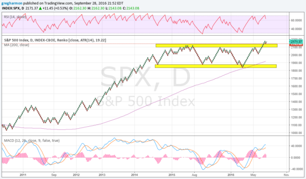
Renko charts are a bit of a hybrid from my vantage point between Candlestick charts and Point and Figure charts. From the short term perspective, against the daily candlesticks, a Renko chart smooths the change in price. A change is made by adding a green or red brick only when the price has moved outside of a preset range. The most common case is to use the 14 period Average True Range (ATR), a measure of volatility, for the brick size.
It is also similar to a Point and Figure chart in that it does not pay strict attention to time. It may take weeks for a new brick to print, but it still only prints one brick. This means the lower axis of the chart is not a fluid flow of time. This means the more volatile a timeframe the longer it will appear on a chart, like a Point and Figure chart that alternates a lot between X’s and O’s.

So reviewing the Renko chart above for the S&P 500 over the time since the 2011 correction can add some perspective. The chart above can do that. It shows the steady trend higher from the 2011 pullback to the high in 2015. It also shows how the chart morphed into a consolidation channel. That channel held, between about 1850 and 2100, for almost 2 years until July. The break above at that point came back and retested the breakout before reversing just this week.
Momentum indicators on this chart remain in bullish zones. The RSI has pulled back from an overbought condition, while the MACD is moving up. The Index is over its 200 brick moving average and that SMA is rising. There may be a further back and forth pullback in this Index, but the prospects for more upside look strong. And a print over 2182 will gather more money to the Index.
DISCLAIMER: The information in this blog post represents my own opinions and does not contain a recommendation for any particular security or investment. I or my affiliates may hold positions or other interests in securities mentioned in the Blog, please see my Disclaimer page for my full disclaimer.
