The past year brought once again exceptional returns to U.S. large cap stocks while most bond classes and global stocks had a lackluster year. With an average post WWII annual return of +10.1%, the S&P 500 posted back-to-back years of outsized performance, up +23.3% in 2024 after rising +24.2% in 2023. By comparison, the U.S. aggregate bond index was up +1.3% (total return) and the MSCI All-Country ex-U.S. only gained +2.2%. The dual narrative of U.S. economic strength relative to the rest of the world (“U.S. exceptionalism”) and the artificial intelligence (AI) trade, centered on the U.S. mega cap technology stocks, has fueled investor optimism for large cap U.S. stocks.
Recall that coming into 2024, most forecasters were pessimistic on equities with an imminent recession penciled in due to the Fed rate hike cycle and the inverted yield curve. As is usually the case, the majority was proven wrong, as economic growth in the U.S. remained steadfast, inflation eased back towards the Federal Reserve’s target, and the AI euphoria gripped investors. What we and most strategists missed was the extent of fiscal and monetary stimulus (in retrospect, the Fed Funds rate was not restrictive along side the Fed’s other liquidity programs) as well as the euphoria around AI and the tendency for markets to overshoot. The first chart below shows the Federal Reserve balance sheet as a percent of nominal GDP. Prior to the Great Financial Crisis (GFC), Fed assets (aka the money supply) had been about 6%-7% of the economy. This chart speaks volumes. The ratio reached 25% after the GFC. The Fed’s liquidity injections post-Covid sent the ratio to 35%, and currently the liquidity provided by the Fed is still near the highs post-GFC! Don’t listen to the Fed’s narrative on their “restrictive interest rate policy” – this chart reveals the Fed’s actual impact on financial markets. This is the source of the Fed asset price bubble.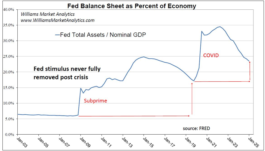
In addition to monetary stimulus, recession has been averted thus far also due to fiscal stimulus. We also charted below the U.S. fiscal government expenditures relative to nominal GDP. Two noteworthy points. First, since the GFC, government expenditures have been elevated relative to the past. Whereas government spending had historically been 20% of the economy, since the GFC government spending has been 23.9%. Second, in 2024, a non-recession year, the Biden administration had fiscal spending above 25% of GDP. This is a clear contributor, along with Federal Reserve liquidity, to the inflation problem and the buoyant financial asset prices.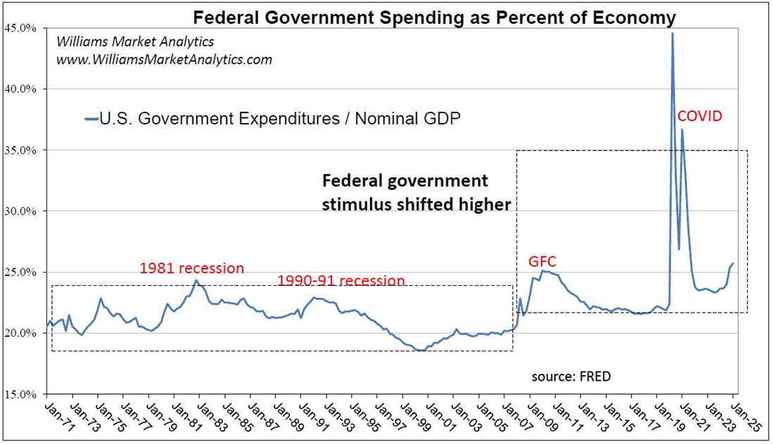
Interestingly, going into 2025, even as numerous valuation metrics are at or near highs last seen at the Tech Bubble, Wall Street strategists are forecasting, on average, a 6800 to 7000 S&P 500 price target for year-end 2025 – in other words a third straight annual return above the long-term mean. The bar chart below shows the S&P 500 annual returns. The mean return since 1930 is drawn with a black line at +10.1% and we highlight with the red circles the cases where the index had three consecutive years of above average returns. We count three cases: the 1940s, the late 1990s with the blowing of the Tech Bubble, and 2019-2021 driven by the Covid reopening trade.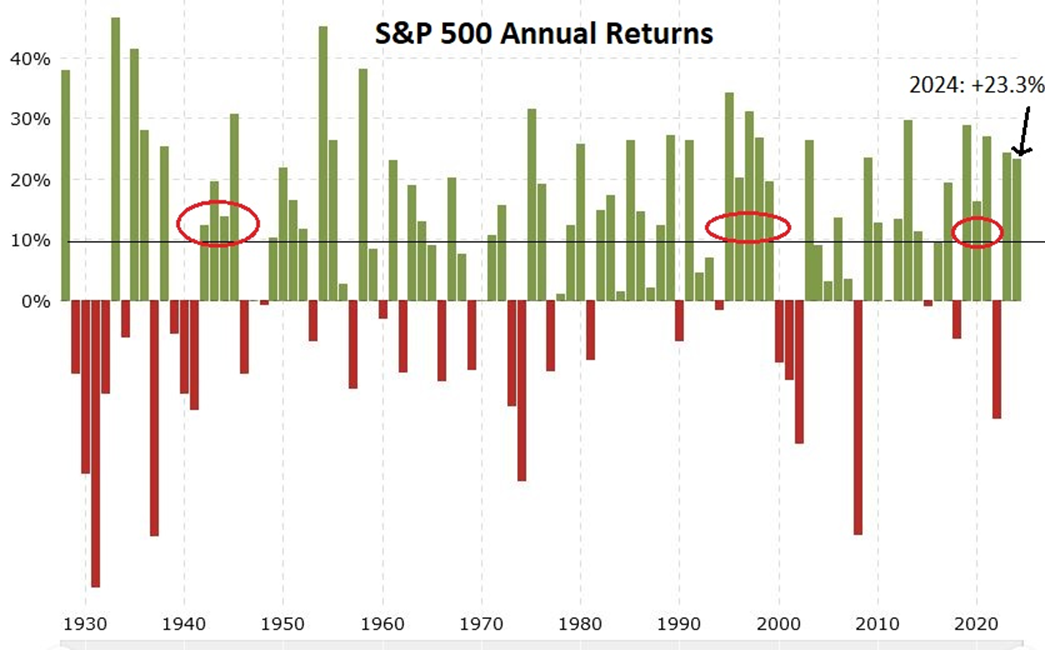
So while another big year for the S&P 500 is course possible, the historical odds of this outcome are relatively low.
Markets and the Economy
Since the short Covid recession, followed by the strong reopening trade (real GDP +5.80% in 2021), the economy has grown around the long-term trend, just above 2.0% over the past three years. The inflation battle has essentially been won, although the Fed has not gotten PCE inflation back to 2% (we believe that the Fed will move the goalposts to a 2% to 3% inflation target) and the threat of inflationary tariffs under Trump looms in 2025. Despite a rapid rise in the Fed Funds rate in 2022-23, the economy averted recession thanks to the aforementioned monetary and fiscal stimulus. At some point, the economy and the markets will have to pay the proverbial piper for the onslaught of debt and money printing – one reason that betting on U.S. exceptionalism leaves us leery.
Before presenting our outlook for each asset class, we share a few macroeconomic or growth-related concerns we have for the markets as we enter 2025. To begin, the Leading Economic Index (LEI) has been consistent with behavior seen during past recessions since the LEI peaked in 2021. The next chart traces the year-to-year change in the LEI (in green) against the year-to-year change in real GDP (in red). The gray shaded areas are recessions. Since at least 1980, when the y/y change in the LEI has dipped significantly negative, we have seen an economic recession.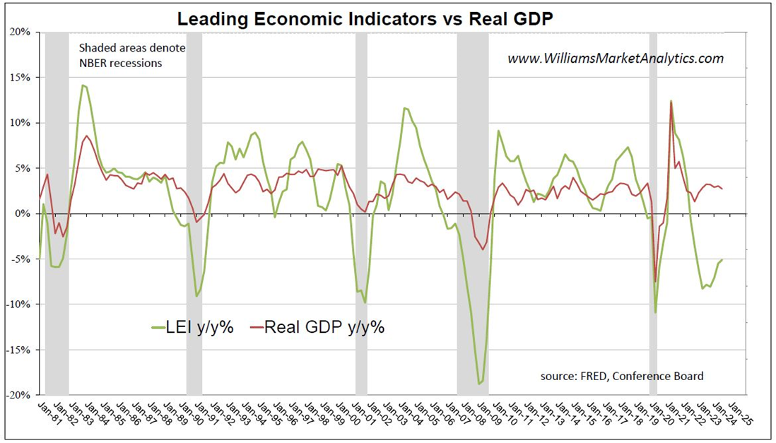
So why the decoupling this time between economic growth and the LEI? We offer two explanations. First, of the ten components of the LEI, the Conference Board includes three financial components: Credit Index, S&P 500 Stock Price, and Interest Rate Spread. Credit spreads are historically near the tightest levels on record while the S&P 500 is at all-time highs. Second, the amount of fiscal stimulus under the Biden Administration, even excluding the 2020-21 Covid spending, has exceeded levels of counter-cyclical fiscal spending seen in prior economic contractions. In other words, the government has engaged in record spending even as the economy remained in expansion. Any rational economist would admit that on-going, unlimited fiscal stimulus is not the miracle cure for ending the recessionary phase of the business cycle. Rather, the wasteful spending and growing debt burden is just setting up for a painful deflationary bust. U.S. investors, in particular, need to keep this in mind over the coming years.
Our next concerning chart is an old favorite, the 10-year/2-year Treasury yield inversion. Some say that the yield curve no longer matters or that the recessionary signal this time was false. We believe simply that the massive fiscal and monetary stimulus has pushed off the recession signaled by the yield curve inversion.
The track record of a yield curve inversion proceeding recessions is very strong, as shown in the chart above. We won’t join the “this time is different” crowd. We highlight in the chart the risk for markets -- the un-inversion of the yield curve. Given how deep the inversion was this cycle, we are just now seeing the 10/2 spread un-invert.
A final chart macro chart that seems worrying is the growth in the stock market versus the growth of the real economy. This is also referred to as the Buffet Indicator. While in the short term the economy and the stock market are two very separate beasts, over the longer term we expect to see a recoupling should the stock market diverge too far. Why? Over the long term, stock valuation is a function of firm earnings. And earnings tend to growth at the pace of the economy over time.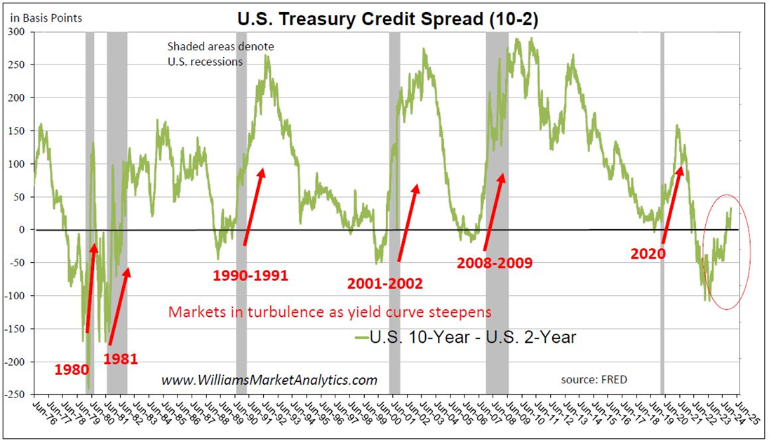
Using data from 1945, we calculated the pace of growth in the stock market relative to the growth rate of the economy. Using a long-term nominal GDP growth rate of 5%, we traced with the black dashed lines the long-term sustainable growth rate in stock market. During the Tech Bubble and the housing bubble, the stock market was expensive relative to trend economic growth. During the GFC, stocks were cheap relative to economic growth. Today, the stock market capitalization has nothing to do with economic growth and everything to do with decisions of policy makers.
In sum, many traditional market-based indicators are flashing red. U.S. equities have been the major beneficiary of policy stimulus which has kept U.S. economy in growth positive. We are in uncharted territory as there is no precedent for how much, or for how long, monetary and fiscal stimulus can ward off recession. As investors, we need to remain flexible in our investing given the interaction between liquidity dynamics, the risk of economic slowdown, and rich equity valuations, all within the context of a looming policy mistake by the central bank and/or a government debt crisis.
Equity Markets
In 2024, growth stocks led value stocks for the second year in a row. The overall market significantly lagged the Technology and AI plays. For the year just ended, the Nasdaq-100 gained another +24.9% (after +55% in 2023) compared to +9.5% for the Russell 1000 Equal-Weight, which neutralizes the impact of the mega cap stocks. Most strategists were cautious coming into 2024 given high valuations and elevated interest rates. Now as we enter 2025, the same strategists are globally bullish, despite high valuations and an un-inverting yield curve. Our take equities in 2025 is that U.S. stocks are overshooting, and the mega cap stocks are likely in a bubble. By its nature, how far bubbles inflate is unpredictable, so we will abstain judgement on the U.S. indexes in 2025, for now. Our hunch is that wherever the U.S. indexes end up in 2025, the path will be much less linear than in 2023 and 2024. Historically, the third year of a bull market is indeed fraught with volatility. Instead, we are looking outside the U.S. for countries with much more attractive relative valuations.
In this section we’ll look at a couple more metrics (in addition to the Buffet Indicator above) that leave us cautious on U.S. large caps. Then we’ll present a couple illustrations of the relative valuations that we find attractive abroad.
The bond versus stock decision is at the center of portfolio asset allocation. Traditionally, bonds and stocks have had negative correlations with bonds outperforming in risk-off markets and recessions. One popular allocation tool is the stock/bond ratio, which historically has been mean-reverting. Our chart below is dumbfounding, and again illustrates the impact of central bank expansionary policy and the presence of a likely bubble in U.S. large caps. While many strategists will dismiss the gravity of this chart or explain it away by “U.S. exceptionalism”, we believe that artificial markets will eventually self-correct, as the laws of financial physics will prevail over market manipulation.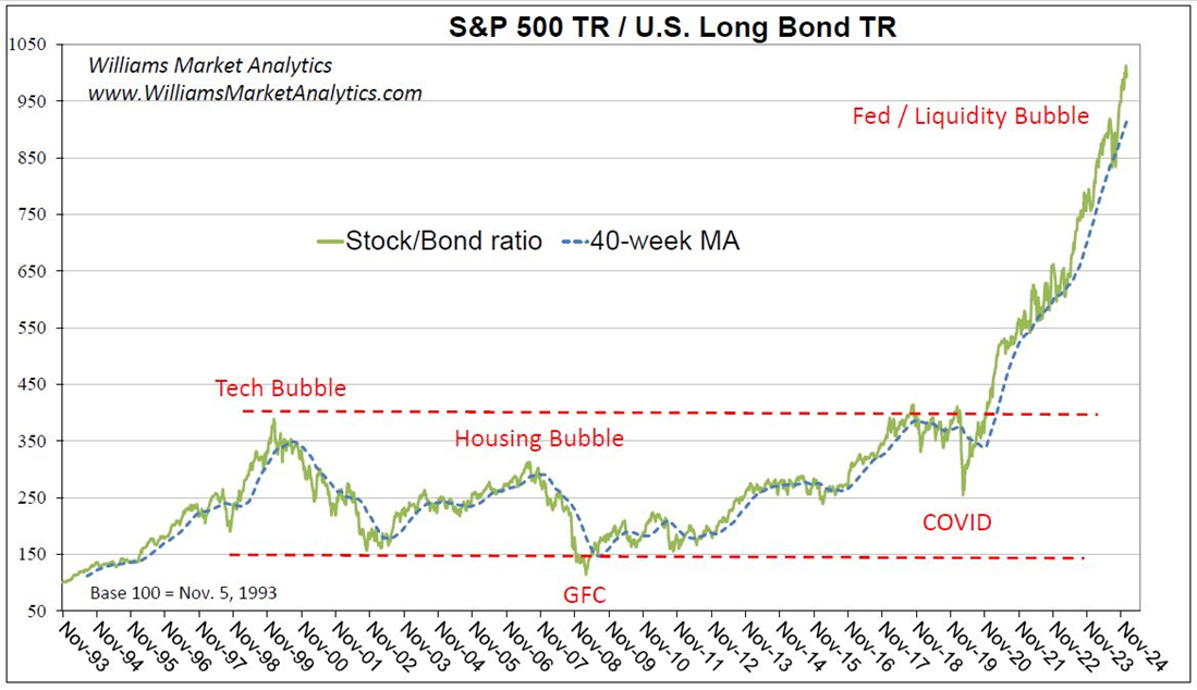
For another valuation look at U.S. equities, we plot the ubiquitous price/earnings ratio for the S&P 500. As we enter 2025, once again we believe that the denominator in the S&P 500 P/E ratio is too optimistic. According to Refinitiv, the mean forecast for S&P 500 earnings is $249, implying a 24x forward P/E using year-end 2024 closing prices. We know that analysts always start the year with over-optimistic forecasts and then revise down over the course of the year. We expect this to occur in 2025, which will reveal that equities are even more expensive at current prices than this chart suggests.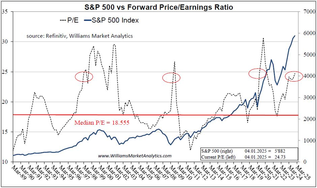
The current P/E for the S&P 500 is 24.73x, already well above the long-run median of 18.5x. Of course, valuation is not a timing indicator, as we saw in four prior instances (red circles on chart above) when the P/E climbed above 25x. Each case, however, coincided with a major market downturn in subsequent years. Our message is simply that stocks are clearly not cheap today and investors need to weigh carefully the risk/reward equation. Yes, the P/E may get back 30x with the S&P 500 reaching fantastic new highs in the interim. But as risk managers, we see this as a gamble, especially with attractive alternatives to U.S. large caps now available.
Another way of looking at the relative unattractiveness of U.S. equities is via the spread between bond yields and earnings yields of the S&P 500. Recall that the earnings yield is nominal earnings divided by nominal price, hence a real number (unaffected by inflation). Therefore, we compare earnings yield to the real bond yields (30-year TIPS) in the chart below.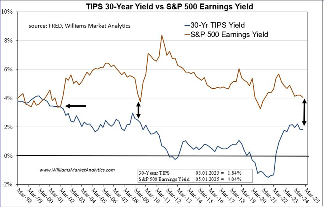
Notice that extra yield investors get for taking risk in stocks (the 30-year TIPS yield is risk-free) is at the third narrowest point since at least 1998. The prior two occasions when the yield spread was narrower: 1998-2002 and 2008-2009.
We’ll finish with a final concern investor need to be aware of regarding U.S. equities. The market cap of the largest 10 stocks in the S&P 500 is nearly 39%, far exceeding the Dot Com high and rivaling the concentration seen during the Great Depression. Everyone piling into the same 10 stocks, by definition, never ends well. Patient long-term investors coveting U.S. stocks should get a better entry point in the not-so-distant future.
We have been expecting a change in market leadership after the steep outperformance of U.S. large cap stocks. U.S. exceptionalism is a function of several things, including innovative American technology firms, U.S. economic growth that outpaces growth in rival developed nations, and especially the relative magnitude of the aforementioned U.S. stimulative fiscal and monetary policies. We know that one asset class cannot permanently outperform, no matter how strong the fundamental argument. In the end, stock performance is a function of company earnings, and earnings growth is subject to the law of large numbers.
Our next chart updates our MSCI All-Country World Index Ex-U.S. relative to the S&P 500 relative index. We denote with arrows the prior two watershed moments in the markets. The Tech Bubble ended nearly a decade of U.S. stock outperformance versus international stocks. The secular trend of outperformance in international stocks ended with the Financial Crisis. As readers can see, U.S. stocks have enjoyed an unprecedented stretch of now almost 15-years of outperformance.
We thought that Covid would be the watershed moment to turn this curve higher, and the U.S. policy error aftermath might still do this. But U.S. policy stimulus outstripped stimulus in other developed nations, allowing the U.S. outperformance to continue. While hard to set levels on a relative chart, we note that this relative price has formed lower higher since 2008. Taking out a prior high would be a “break-out” signal for technicians and increase the odds of a period in which international stocks outperform.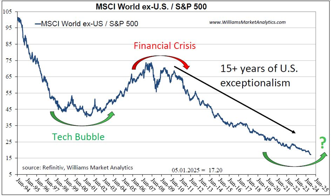
We next look at U.S. large caps versus the MSCI Emerging Markets Index. We have more data history for the EM index which helps demonstrate our thesis: relative asset outperformance moves in long cycles. Emerging markets stocks have done even worse this cycle compared to developed markets ex-US stocks.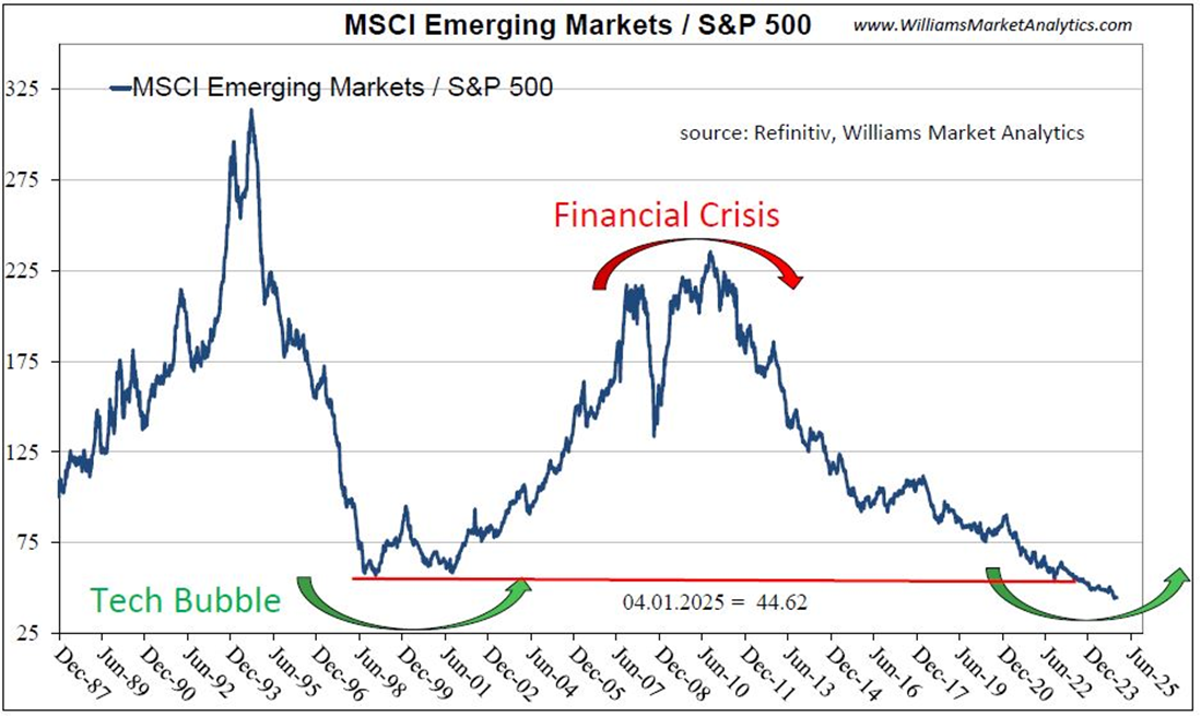
Recall that valuations were excessive for EM stocks in 2006 and there was a mini-euphoria around the BRICs trade. For those too young to remember, the investment community became infatuated with the Brazil, Russia, India, and China (BRICs) trade. The narrative was appealing. Economic growth in emerging nations would far outstrip growth in the stale, mature developed nations. Well, narratives run their course, and emerging market the GDP growth rates over the past decade were not too exceptional relative to the 2% U.S. growth.
Our message here is that narratives either get priced into stocks and or these narratives don’t play out to the extent hoped for. We recall hearing in 2006-07 that Chinese GDP growth would not fall below 8% y/y for at least a decade. The parallel with today’s narrative merits a mention. We hear how AI-related companies are on the cutting edge of this transformative technology. AI will become a larger and larger part of our daily lives, and these companies are positioned to have massive profits. Beware of narratives at extremes! Yes, AI will likely be transformational, like the internet in the late 1990’s. But like with EM stocks in 2006, once prices fully reflect a narrative, there is more room for disappointment than never-ending outsized gains.
As asset allocators, we need to weigh the risks going forward. Rational (LON:0FRJ), risk-averse investors need to think in term of risk-adjusted returns. If a basket of Palantir (NASDAQ:PLTR), Nvidia (NASDAQ:NVDA) and Meta (NASDAQ:META) stocks rises +50% in 2025 and an investment in the Emerging Markets dividend stocks is up +25% for the year, which investment is better? Without getting too quantitative, if the former basket experiences daily prices swings of +/- 4% and the latter basket +/-0.75%, you can infer that the risk-adjusted returns are superior for the EM dividend stocks.
We’ll be commenting on the EM segments of the markets that we like in the coming months (our Market Perspectives access is absolutely free). Our Dynamic Global Rotation Strategy, which takes a top-down approach, rotating into equity classes at the beginning of potential new up-cycles, will focus on the under-owned, under-valued EM markets. While this strategy may not outperform immediately, as risk managers we prefer an 8% dividend yield in undervalued blue-chip EM stocks compared to no current yield and all the volatility in overvalued U.S. technology stocks.
Conclusion
2024 proved to be yet another year of U.S. exceptionalism, although this exceptionalism has whittled down to a handful of mega cap tech stocks along with some financial stocks. We demonstrate in this report that U.S. equities are stretched by numerous measures, both absolute valuation metrics and relative to alternative assets. We believe bubble-like conditions have formed in the market-leading U.S. large cap stocks. We can’t predict a normalization of prices in 2025 but we strongly believe the risk/reward trade-off is not attractive in the S&P 500 or Nasdaq-100, especially given alternative investments available. High quality bonds (AAA corporates) are a viable alternative to equities today and we like diversifying into higher yielding, overseas equity classes. Commodities remain an attractive investment to long-term investors and offer a hedge should inflation re-accelerate. Finally, currency diversification and/or gold investments should be an objective of U.S. dollar-based investors as a hedge against the cumulative Fed policy mistakes and the looming U.S. federal debt crisis.
