Turning Points For The Week Of June 3-7
Summary
- The leading financial market indicators show growing bearishness.
- Industrial production internals are weaker than implied by the headline number.
- My recession probability is still at 20%.
The purpose of the Turning Points Newsletter is to look at the long-leading, leading, and coincidental economic indicators to determine if the economic trajectory has changed from expansion to contraction -- to see if the economy has reached a "Turning Point."
Conclusion: my recession probability in the next 6-12 months remains at 20%. The stock market sell-off combined with the more severe yield curve inversion indicates investment sentiment has turned more bearish. In addition, industrial production internals are worse than the headline number would indicate.
Leading Indicators
There's more or less a wash with most of the leading indicators. On the positive side are the 4-week moving average of initial unemployment claims (which are still near a multi-decade low) and commercial paper spreads (which are very low). On the negative side are hours for non-supervisory workers (which are at 5-year lows) and 1-unit building permits (which continue to decline). New orders for consumer and business durables are positive but moving lower.
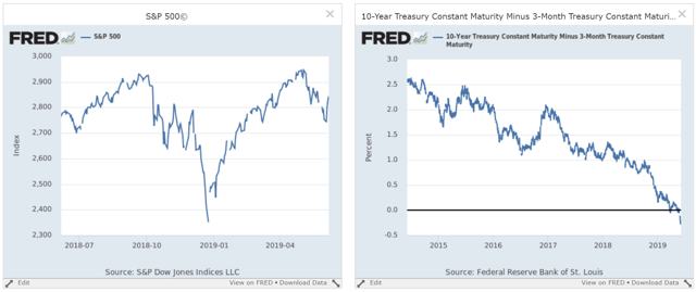
The financial markets -- which collectively quantify investor sentiment -- are the tie-breaker. Both the stock and bond markets have turned bearish. Let's start with the macro-charts of the S&P 500 and 10-Year/3-Month interest rate spread:
The stock markets (on the left) started to slide after the Trump administration said it would impose new tariffs on Chinese goods. Before this, however, there were technical issues with the market -- mainly, the underperformance of small-caps which indicated a diminished risk appetite on the part of traders (please see my daily Technically Speaking column for additional details). The bond market continues to rally, leading to a more pronounced yield-curve inversion (on the right). Several Fed governors added to the downward pressure on rates this week. Fed President Bullard publicly argued for a rate cut; Chairman Powell hinted at that possibility.
Here are two charts of the bond market internals that show the increasing severity of the inversion:
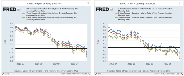
The left chart shows the spread between the 10/7/5-year and the 3-month t-bill. This week, this chart inverted to its most severe level of the last five years. The right chart shows the spread between the 7/5/3-year and the 1-year. These spreads have been underwater since the start of the year.
Leading indicator conclusion: the financial markets are sending a very clear message: traders and investors believe that growth will slow, leading them to sell equities and buy treasuries.
Coincidental Indicators
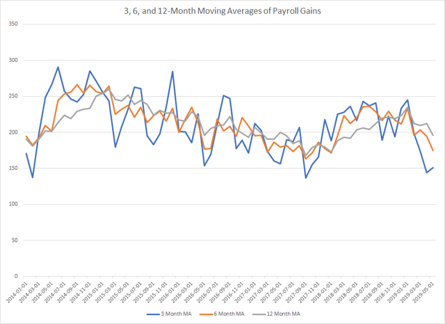
Friday's employment report was a disappointment, with a headline number of 75,000. But there's a great deal of noise in the monthly releases, so it's best to use moving averages:
Data from the St. Louis Fred; author's calculations.
The 3, 6, and 12-month numbers are 151,000, 175,000, and 196,000, respectively. Those are still decent numbers. However, downward revisions totaled 75,000 which is very large.
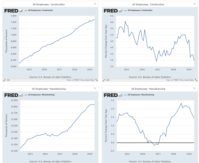
There are a few areas of the economy where job growth is concerning.
The Y/Y percentage change in construction jobs (upper right) is near a 5-year low while the pace of manufacturing job growth (bottom left) is slowing.
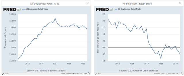
Retail job growth has been moving sideways for the last two years.
So -- should we be worried about the jobs market? Not yet. We've now had two months of weaker data, which isn't enough for a firm conclusion. Plus, initial unemployment claims are still very low, indicating a great deal of strength. We should, however, keep an eye on this important coincidental number, especially anecdotal and leading jobs markets indicators.
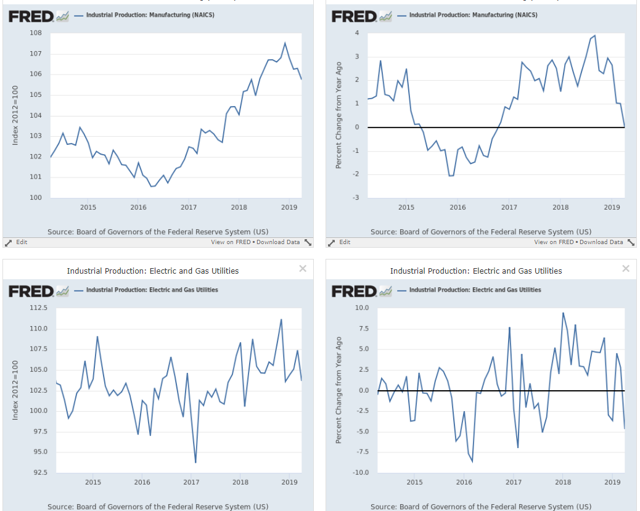
The headling industrial production number has been declining or stagnant for the last five months. The internals are actually a bit weaker. The Fed breaks the data down in two ways. The first is by "major industry groups," which has three categories: manufacturing, mining, and utilities. Of these, only mining is increasing:
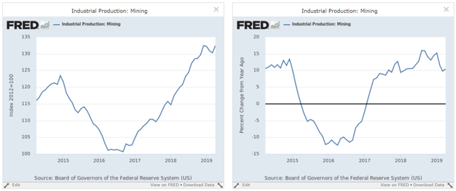
And with oil's price decline, expect this number to drop in the coming months.
The other two categories are either declining (manufacturing, top charts) or moving sideways (utilities, bottom charts)
The second way the Fed divides the industrial production data is along "Industrial Groups." Several of these are weaker, starting with consumer goods:
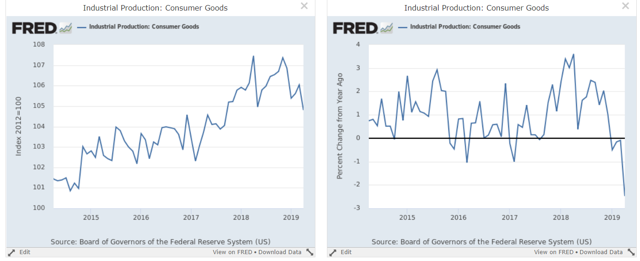
The right chart shows the absolute level, which has been moving sideways for the last year. The right shows that the year-over-year percentage change is now declining at the sharpest rate in 5 years.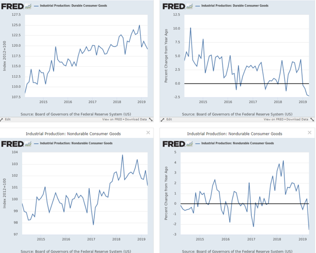
Orders for consumer durable goods (top charts) and consumer non-durable goods (bottom charts) are both declining on a Y/Y basis.
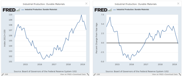
Consumer goods aren't the only market group contracting:
Durable materials production has dropped sharply (right chart). It is now declining on a Y/Y basis (right chart).
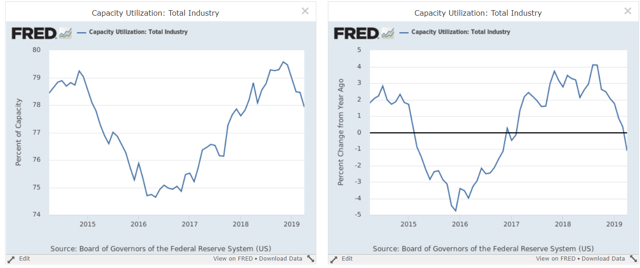
Finally, there is capacity utilization ...
... which has been declining for the last few months (left chart) and which is contracting on a Y/Y basis (right chart).
Coincidental numbers conclusion: underneath the surface, there's growing softness. Goods-creating jobs are seeing slower Y/Y growth, while retail's stall shows a softer consumer market. Industrial production is weaker, probably due to trade war issues.

