We close the books on 2017 with many records either set or broken by financial markets. Whether it’s the hundred (thousands in some cases) returns by cryptocurrencies, strong growth in every major OECD economy, record bullishness based on several surveys, economic growth surpassing economists expectations by a near record amount, every country-specific ETF finishing in the green with an average return of 28%, or the pure lack of volatility in just about any asset class. the S&P 500 put in its best annual return since 2003. Overall, 2017 was a great year for financial markets and many hope that strength progresses into 2018. Many traders and market commentators will be pointing to the strength in ’17 as a cause of concern in ’18, however, as Ryan Detrick, CMT has pointed out, when the Dow has been up over 25% (like it was in 2017), eight of the ten following years were also positive with an average gain of over 12%.
Equity Trend
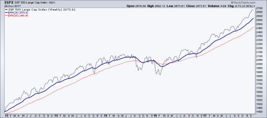
First and foremost before we get into any other chart I believe it’s important to acknowledge the overall trend is firmly bullish for the U.S. equity market. We continue to see higher highs and higher lows in price with intermediate and long-term moving averages also rising.
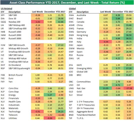
Asset Class Return in 2017
Bespoke put together a great table showcasing the returns of the major asset categories and groups in 2017. Below you can see the returns for countries, sectors, commodities, fixed income, and major currencies.
Overall Market Breadth
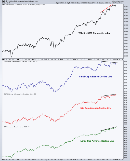
Looking at the Broad market via the Wilshire 5000 Composite, which is a good representation of the entire equity market, we have a continuation of higher highs. This trend has continued to be confirmed by the breadth measurements of mid and large cap advance-decline lines, with a slight negative divergence seen in small-caps . We saw something similar in October when stocks rallied and small caps adv-dec line took a little longer than everyone else to eventually make a new high. It’s good to see broad market participation in the up trend as we progress into a new year.
Long-Term Trend in Breadth Has Begun to Rollover
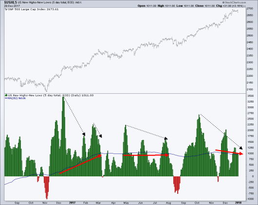
There are two ways that you can look at this type of breadth data, one is short-term which is looking for confirmation on each in the overall trend of the equity market. However, there’s another viewpoint that can be taken that I don’t believe very many traders use – and that’s the broad trend of breadth and its relation to equity trend. Most recently, we’ve had several bearish divergences in the five-day total of net new highs on the NYSE as shown by the black lines on the chart below. However, the 1-year trend of the net new highs had been either still rising (early-2017) or flat (mid-2017) as shown by the red arrows, which negated the short-term divergences as price continued higher. However, we’ve now seen a shift in the trend of breadth, as the 1-year Moving Average has begun to make a lower high.
In the last 10 years we’ve seen this happen three times. In 2011 the 1-year MA flat-lined before declining and diverging with price before the S&P 500 corrected. In 2014 the trend of breadth peaked and trended lower for the full year and into 2015 before several equity markets put in double-digit declines. Finally in 2007, like many breadth-related indicators, a bearish divergence in the breadth trend was set as the equity market peaked. So what can be gleaned from these past examples is the lack of efficient timing, 2011 and 2007 lasted just a few months before price rolled over however the down trend persisted for over a year before the 2015 correction. Bringing the focus back to today, the breadth trend is still very early in its directional change and is something to be viewed in conjunction with other pieces of price-related data, but nonetheless not to be ignored.
10-Year Treasury Yield
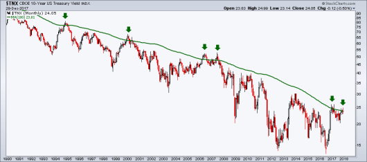
I recently tweeted that I believed we would see a shift in trend for the 10-year Treasury yield in the coming weeks. While I have several reasons for this believe, I’ll share a few of them here. First, we have yield sitting at resistance that’s defined the long-term down trend for the last 20+ years. What I’m referring to is the 100-month Moving Average, which has been ‘tagged’ five previous times, each occurrence sending yield lower. Also, note the size of the monthly candles over the last few months – we had a large monthly move off 2.1% in September but they’ve steadily tightened during the advance, with minimal upside progress made in November or December. If you are a fan of Fibonacci ratios (I’ll admit, I personally don’t use them very often) then you’ve probably noticed that the 10-yr is roughly at the 38.2% retracement from the 2014-2016 decline.
Commodities
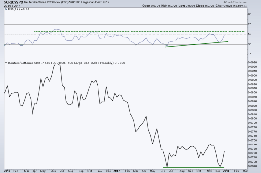
John Murphy, CMT shared a similar chart in his stockcharts.com note last week – looking at the ratio between the CRB Commodity Index and the S&P 500. Below is a weekly ratio of the two markets, John pointed out the near double bottom in December and June with a bullish divergence in momentum, which points to a favoring of commodities. Commodities have been under-performing stocks since 2011, and the Relative Strength Index (RSI) has been in a bearish range since 2012, as shown by the dotted green line. What I’ll be watching going forward is for the RSI to continue rising higher and breaking out from its range. That would add weight to the potential of a trend change in relative performance as commodities strength. I’d also like to see the ratio break above its prior November high. I’ve seen a few traders reference a belief that 2018 may be a good year for commodities, pointing to poor weather, supply, and price action.
Growth vs. Value
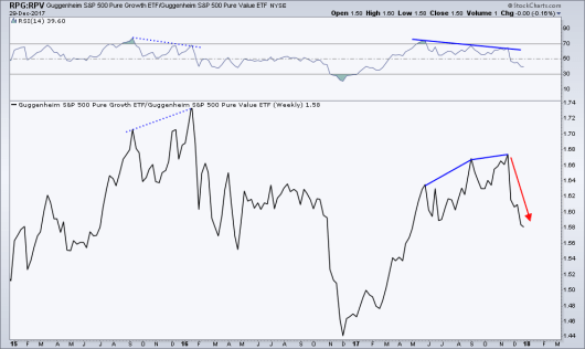
2017 was a great year for many growth-related stocks, with the lack of volatility in equities as a whole, momentum names did quite well. We can see this represented by the up trend in the ratio between the S&P 500 Pure Growth ETF (NYSE:RPG) vs. the S&P 500 Pure Value ETF (NYSE:RPV) up until the November weekly high. However, momentum began to diverge in September with a lower high and a second lower high in November which has been followed by a shift in relative performance that’s favored Value (RPV). We saw a similar divergence in momentum back in 2015 which led to Value leading Growth for much of 2016 before the ratio bottomed and we saw a trend change in ’17. With the weakness in Growth vs. Value, the ratio has broken below its prior Sept. and June lows. Will 2018 see a replay of 2016 in Value taking the lead over Growth? This is one chart I’ll be watching closely in coming weeks.
Strength Begets Strength
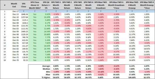
Steve Deppe posted this chart on Twitter, showing the markets forward return when the prior fourth quarter for the S&P 500 returned over five percent and was above its 1-year moving average. Steve otes that the market was higher in the first quarter 14 of the 17 occurrences.
A Record Setting Year
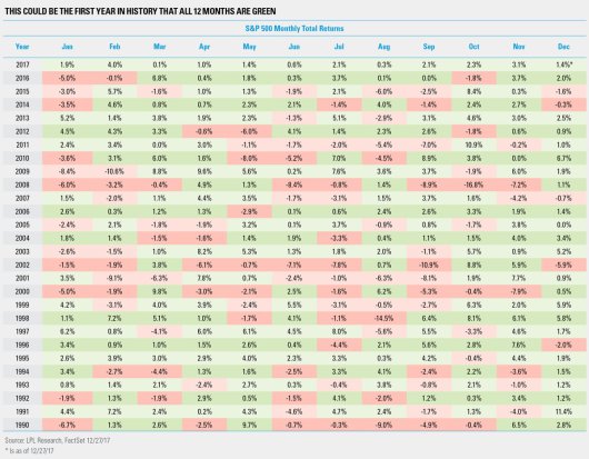
Many records were set or broken in 2017, one of which was the monthly strength of the S&P 500 (total return) being positive every month last year, the first time this has occurred in market history as noted by Ryan Detrick, CMT. The Dow also saw a string of advances, up nine months in a row which it hadn’t done since 1959.
A Lack of Drawdown in 2017
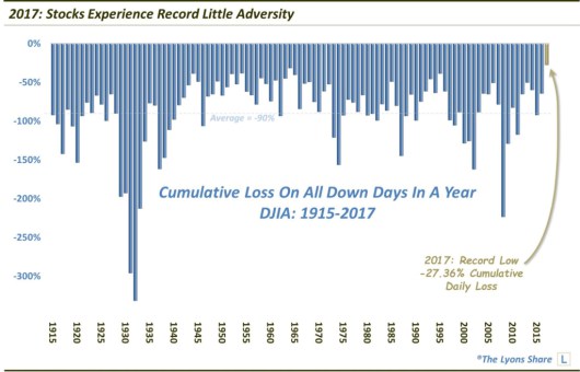
With strong monthly performance, we also had a lack of downside price action, specifically in the Dow. Dana Lyons ran the numbers and found that the cumulative annual drawdown was one of the lowest since the early 1900s, “As of December 27, the DJIA had lost a cumulative -27.36% on all of its down days throughout 2017. That shattered the prior record of -31.45% set in 1965 which, by the way, is the only other year that saw less than -38% in total losses.”
Record Low Volatility Across the Curve
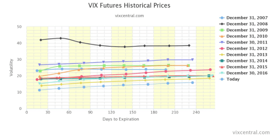
We closed out one of the least volatile years in history with the Volatility Index futures curve at its lowest level in the last 10 years, besting even 2007.
The Fed’s Balance Sheet
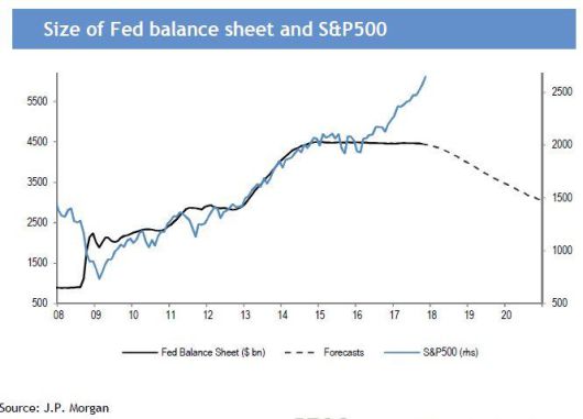
One chart that will likely get a lot of focus in 2018 is this one from Callum Thomas via Cam Hui, which shows the Federal Reserve’s balance sheet. What’s been called one of the greatest financial experiments in history, the Fed’s multi-year QE program will begin to be unwound this year. While the market showed its resilience and ability to rise without continued pumping by the central bank in 2016 and 2017, we now will begin to witness how the market will act once the flows begun to reverse as the Fed goes from buyer to seller.
Mid-Term Election Year
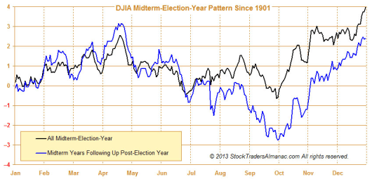
The Stock Trader’s Almanac discusses the market seasonal pattern surrounding the presidential cycle, specifically the mid-term election year, dubbing it “a bottom pickers paradise” due to 9 of the last 17 bear markets having bottomed in a mid-term election year. In fact, the STA notes the Dow has gained on average nearly 50% from its mid-term low to the following year’s high since 1914. The seasonal pattern for the Dow (and the other major indices look similar) has historically seen a high in April followed by a summer pullback with a rally into the year-end, as shown on the chart below. Looking at the past few mid-term election years, 2014 did not see a significant decline, 2010 had a 13% drop, no major weakness in 2006, and 2002 was a major bottom.
Many bears will point to the centennial pattern, with this year being the 8th year and looking at what happened in 2008. However, what they wont tell you is how the market rose 48% in 1928, or 34% in 1958, in fact the Dow has only been negative in a year ending in eight three times since 1928 (’48, ’78, and ’08) according to the STA.
As we start a new year I wish you all the best and I look forward to sharing, learning, and growing with you all as we tackle a new year and new challenges. Cheers!
Disclaimer: Do not construe anything written in this post or this blog in its entirety as a recommendation, research, or an offer to buy or sell any securities. Everything in this post is meant for educational and entertainment purposes only. I or my affiliates may hold positions in securities mentioned in the blog. Please see my Disclosure page for full disclaimer.
