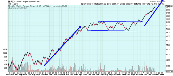
Sometimes simple is best. The S&P 500 is going higher. It seems that simple. Sure PE ratios are at a bazillion and GDP growth is rising towards inflationary levels, employment trends are doing this and the dollar is doing that. So what. Look at the S&P 500 chart. It is going higher. Can’t see that trend? Well then here is a simplified version.
This Renko chart shows the S&P 500 since the correction low in 2011. Renko is a bit like Point and Figure charting in that a new brick is only added when the price movement exceeds a certain amount, in this case the Average True Range. This wipes out a lot of the noise. It also makes the timeline along the bottom messy as a brick is not necessarily added every day.
This chart shows the rise out of that 2011 pullback into the consolidation that started in October 2014 and lasted until the election last fall. A 900 point run up into consolidation looks for a similar 900 point run out of it. That would put the S&P 500 at about 2900. That leaves 250 points to go still. This may not be as far or fast as bitcoin’s rise, but certainly less volatile. There you have it, easy peasy.
The information in this blog post represents my own opinions and does not contain a recommendation for any particular security or investment. I or my affiliates may hold positions or other interests in securities mentioned in the Blog, please see my Disclaimer page for my full disclaimer.

