Gold and silver are the two metals that are at the top of the heap. Most prized for their allure, they get all the attention. No one at a bar is standing around talking about palladium. The metals are used for jewelry and coins. But when it comes to comparing them it gets dicey. Gold is much more highly valued while silver has many more industrial uses.
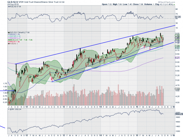
One thing that is not often talked about though is the relationship between the two metals. Below is a chart of the ratio of gold (NYSE:GLD) to silver (NYSE:SLV) over the last 4 years. Notice anything? It has been steadily going higher. Yes despite the fluctuations in each metal the ratio has been consistently rising.

So how do you buy gold and stay comfortable? Sell silver against it. But there is one other aspect of this chart that is interesting to stock market participants. Notice the panel at the bottom. It is the S&P 500 over that same period. There is a relationship between the gold-to-silver ratio and the S&P 500. As the ratio of metals rises the stock market rises too.
The metals ratio looks to be primed to start another move higher. It probed higher a few weeks ago but failed. The failure fell back to a higher low though. The start of an uptrend. Also notice the Bollinger Bands® starting to open higher. A new high in the gold-to-silver ratio bodes well for a reversal back higher in the S&P 500. Keep watching.
The information in this blog post represents my own opinions and does not contain a recommendation for any particular security or investment. I or my affiliates may hold positions or other interests in securities mentioned in the Blog, please see my Disclaimer page for my full disclaimer.
