Who is Kevin Hassett? Wolfe looks at the Trump ally tipped to become Fed Chair.
At the beginning of the month I described what I called “maximum bearishness for silver.” For the first time in at least 10 years, speculators flipped net bearish on silver. At the same time, speculators remained quite bullish on gold. I decided to initiate a pairs trade going long iShares Silver Trust (NYSE:SLV) calls and SPDR Gold Shares (NYSE:GLD) puts to play what I expected in due time to be a convergence between gold and silver positioning. Since then, SLV went exactly nowhere while GLD increased 1.8% – the exact opposite of what I wanted to see.
Yesterday, the Wall Street Journal published a piece called “Sliding Silver Sends Scary Signal” that pointed out the following additional extremes in silver:
- Gold costs 82 times more than silver, the largest ratio in two years.
- The inventory of silver stored in depositories approved by CME Group steadily increased from under 190M troy ounces a year ago to 251M troy ounces this month.
- Hedge funds and other speculators combined are the most net short or bearish since 2006 (CFTC data)
- Over $350M exited silver-backed ETFs in February – the largest monthly exodus since September, 2016 (Silver Institute and Thomson Reuters GFMS data).
Extremes tempt explanations and predictions. Given the surplus of negative headlines and bearish trading patterns in financial markets, it is easy to connect the dots from silver to dire scenarios. The WSJ pointed out that the gold/silver ratio was this high in early 2016 when fears of a Chinese economic slowdown drove a market sell-off. The ratio also reached current levels during the financial crisis in 2008.
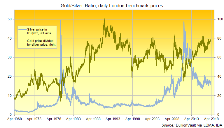
Yet, rather than panic over these correlations, I am looking at the potential bright side of this story. The current gold/silver ratio represented a peak twice in recent history. If history repeats, then the “mean reversion” I have been anticipating should be imminent. At a minimum, silver’s price should bottom here. Indeed a chart of the gold/silver ratio versus the price of silver provided by BullionVault shows how silver bottomed in 2008 and 2016 when the ratio hit the 80s. Moreover silver launched into a multi-year bull market after the ratio hit 80 in 2003. Before 2003, extremes in the ratio did not correlate well with movements in the price of silver.

Since 2003, an extreme gold/silver ratio has preceded significant bottoms for the price of silver.
That same chart indicates it is not easy to draw conclusions about the general health of financial markets based on the gold/silver ratio. The extreme in the gold/silver ratio actually preceded the onset of the financial crisis by several months. The extreme in early 2016, coincided with, but did not lead, the market sell-off that time. Most importantly, in 2003, the extreme coincided with a major bottom in the stock market which brought a multi-year bear market to an end.
In other words, the current extreme in the gold/silver ratio is likely significant, especially since the stock market is already in the middle of a sizable sell-off. However, the implications going forward are likely good for the price of silver and could just as easily suggest the worst is almost over for financial markets as the worst is just around the corner.
The end of the WSJ article says it all for me:
“‘It has little to do with market sentiment,’ said Nathan Thooft, senior managing director of global asset allocation at Manulife Asset Management. ‘I would be in the reversion camp of this being a buying opportunity for silver.'”

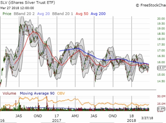
The iShares Silver Trust (SLV) is stuck in effectively a 2-year trading range. As the range slowly tightens is the spring to launch silver higher also winding tighter?
Be careful out there!
Disclosure: long GLD shares and puts, long SLV shares and calls
