Before we look at some charts, I want to talk about using sell/stops. I personally never use sell/stops as it shows the specialist, the market maker, where all the treasure is buried. They will then run the sell/stops, taking in that new inventory of stock, with the purpose of selling it higher. I’m between a rock and a hard spot regarding using sell/stops for our members as I know many need to know where to exit if things go wrong even if it’s a fake out before the breakout. As I’m watching the market very closely each day I personally don’t need them. I’ve stated this before: I may not elect to execute a sell/stop if it is hit because it’s for those that need it. If I do decide to execute a sell/stop I will always tell you for future reference.
If you remember, our sell/stop was hit this week on our Direxion Daily Gold Miners Bear 2X (NYSE:DUST) trade by about .15 cents or so and then the price action reversed back up. That was a perfect example of running the sell/stops and then reversing the move once the stops were hit. I wish there was a better way to do this, but it is what it is. It’s all part of the game.
Precious Metals
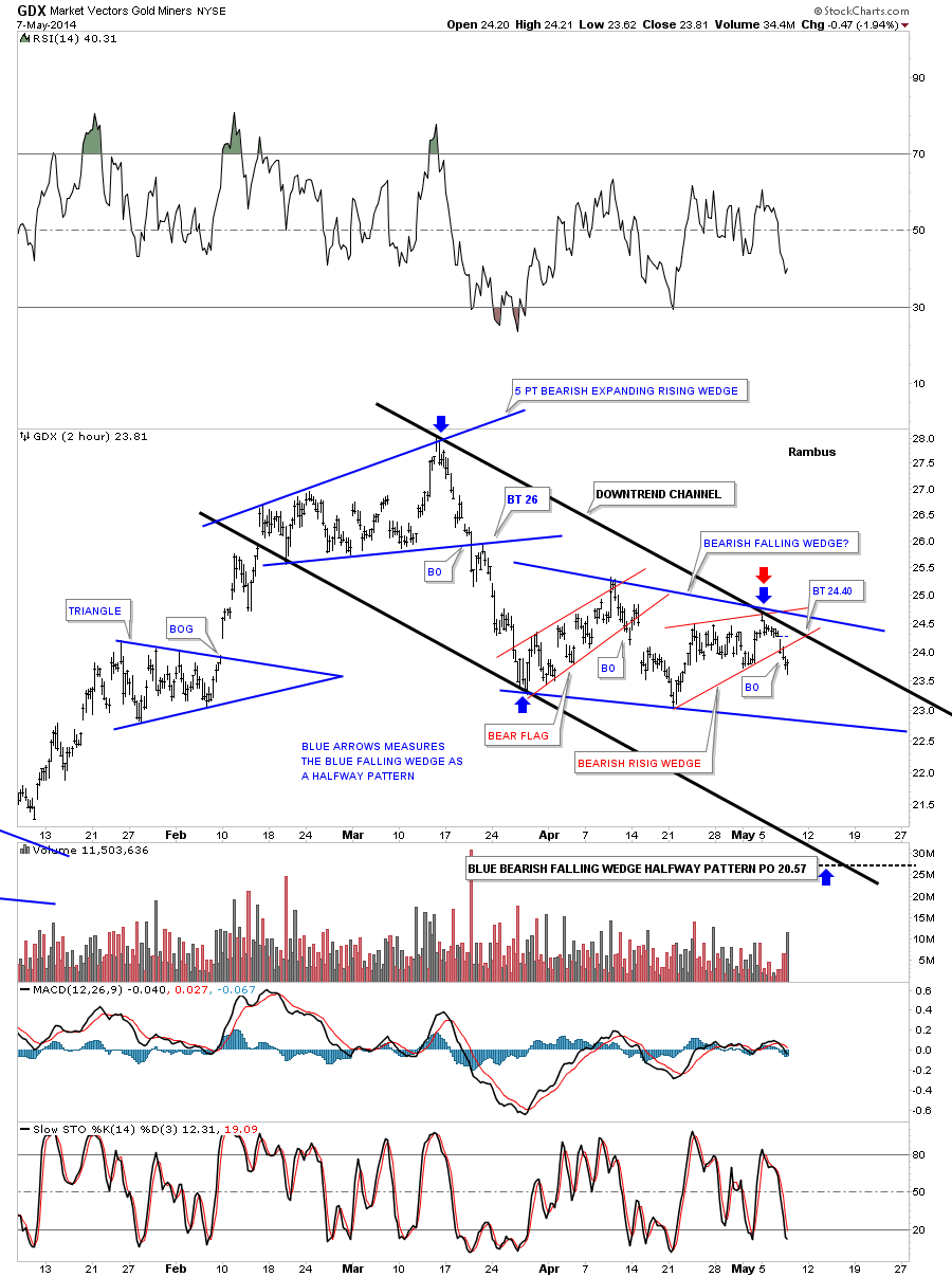
The first chart I would like to show you is the one I posted yesterday on the Market Vectors Gold Miners ETF (ARCA:GDX). So far, this downtrend has four separate chart patterns in it. The top is comprised of the blue 5pt bearish expanding rising wedge reversal pattern. The second pattern is the red bear flag. The third pattern is the red bearish rising wedge and the fourth and most important chart pattern is the potential blue bearish falling wedge, which should be a halfway pattern to the downside.
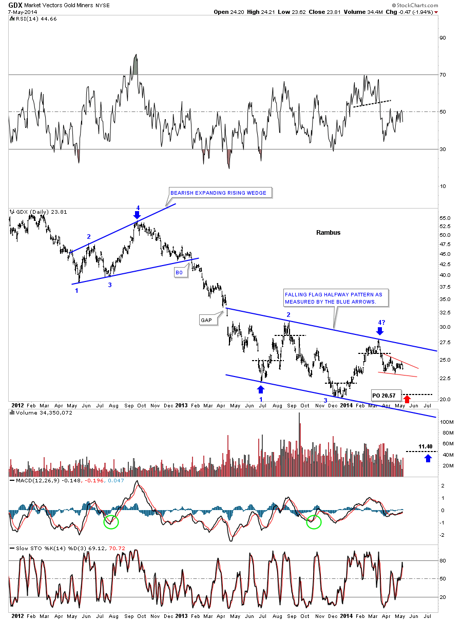
This longer term daily chart for the GDX shows how small the bearish falling wedge is on the chart below, in red. As you know, I’ve been looking at this possible 4th reversal point on the much bigger blue falling flag as the reversal point to get us back down to the bottom of the blue falling flag. The little red bearish falling wedge should get us down to the previous low at reversal point #3. At this moment this is our primary price objective.
Keep in mind that I’m also looking at the blue falling flag as a halfway pattern. Note the blue bearish expanding rising wedge at the top of the chart and the fourth reversal point. That 4th reversal point marked the beginning of that big impulse move down to reversal point #1 on our blue falling flag. If we have just put in the 4th reversal point, in the blue falling flag, then we should see a similar move that matched the first leg down out of the 4 point bearish expanding rising wedge down to the 11.40 area or so. This is the potential huge reward I’m looking at right now. I can tell it’s not going to be easy, as you are already finding out by this little consolidation area we’ve been in for several weeks now.
The price objective down to the 11.40 area is not a pipe dream. This is how markets work. They build a top or bottom and then have an impulse move followed by a consolidation pattern. We’ve been in our latest consolidation pattern for 10 months so far as it’s correcting that big impulse move down from that 4th reversal point in the blue bearish expanding rising wedge at the top of the chart.
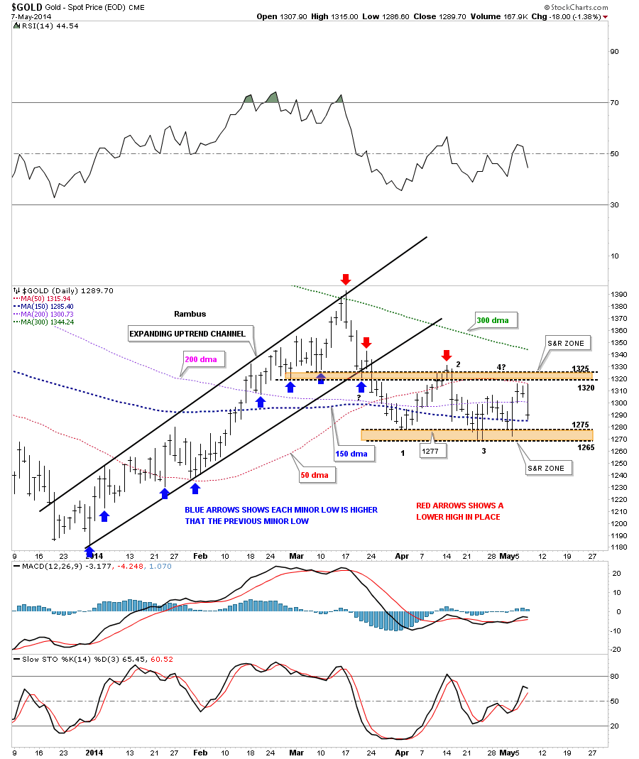
Let's now look at the daily chart for Gold which I’ve been showing, that shows how an uptrend and downtrend work. The blue arrows on the left side of the chart show a beautiful uptrend where each minor low is higher than the previous low. Since the top was put, top red arrow, just the opposite has been happening.
As you can see, gold has been creating lower lows down to the current price action at the 1265 area. Gold has made three attempts to break below the 1265 area that would then confirm a new low which would also confirm the continuation of the downtrend channel. You can see how violent the price action is becoming between the upper and lower brown shaded support and resistance zones.
The bulls and the bears are fighting it out for control of the trend. How long this battle goes on is anyone’s guess but the sideways trading range, rectangle, is trying to finish up its fourth reversal point that we have to see at a minimum to create a consolidation pattern. Now that we have more information we just need to follow the price action for more clues as to when a breakout may occur. It could happen today, or next week, or when it's just good and ready to show its hand. There is no doubt we’ll be on top of it when it's ready to move.
Large-Cap Tech
I will be spending more time covering this sector and others in the General Markets as it appears
a clear trend is developing. As most readers know, I have never met a trend I didn’t like.
Let us turn our attention to a few big cap tech stocks, recent darlings that aren’t looking very hot anymore.
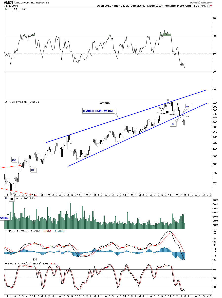
The first chart is a weekly look at Amazon (NASDAQ:AMZN) that is showing a very well-defined H&S top complete with a breakout and backtest.
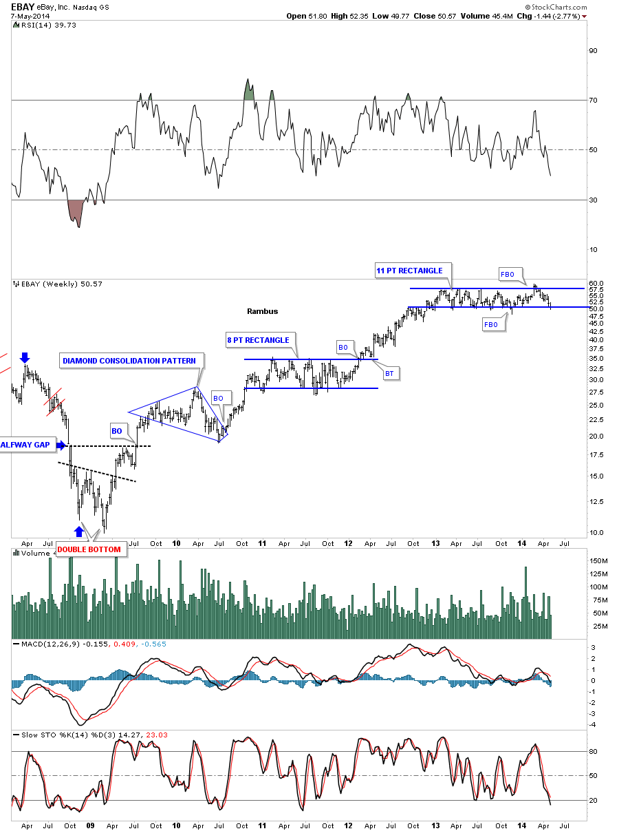
eBay (NASDAQ:EBAY) has been chopping out an 11 point blue rectangle for well over a year now. You can see it had a symmetry false breakout from the bottom rail and then one through the top rail that may have been the exhaustion move where it finally ran out of gas. Remember, an even number of reversal points equals a consolidation pattern and an odd number of reversal points equals a reversal pattern. As you can see, EBAY is strongly testing the bottom rail right now. A solid break will create a very large top reversal pattern.
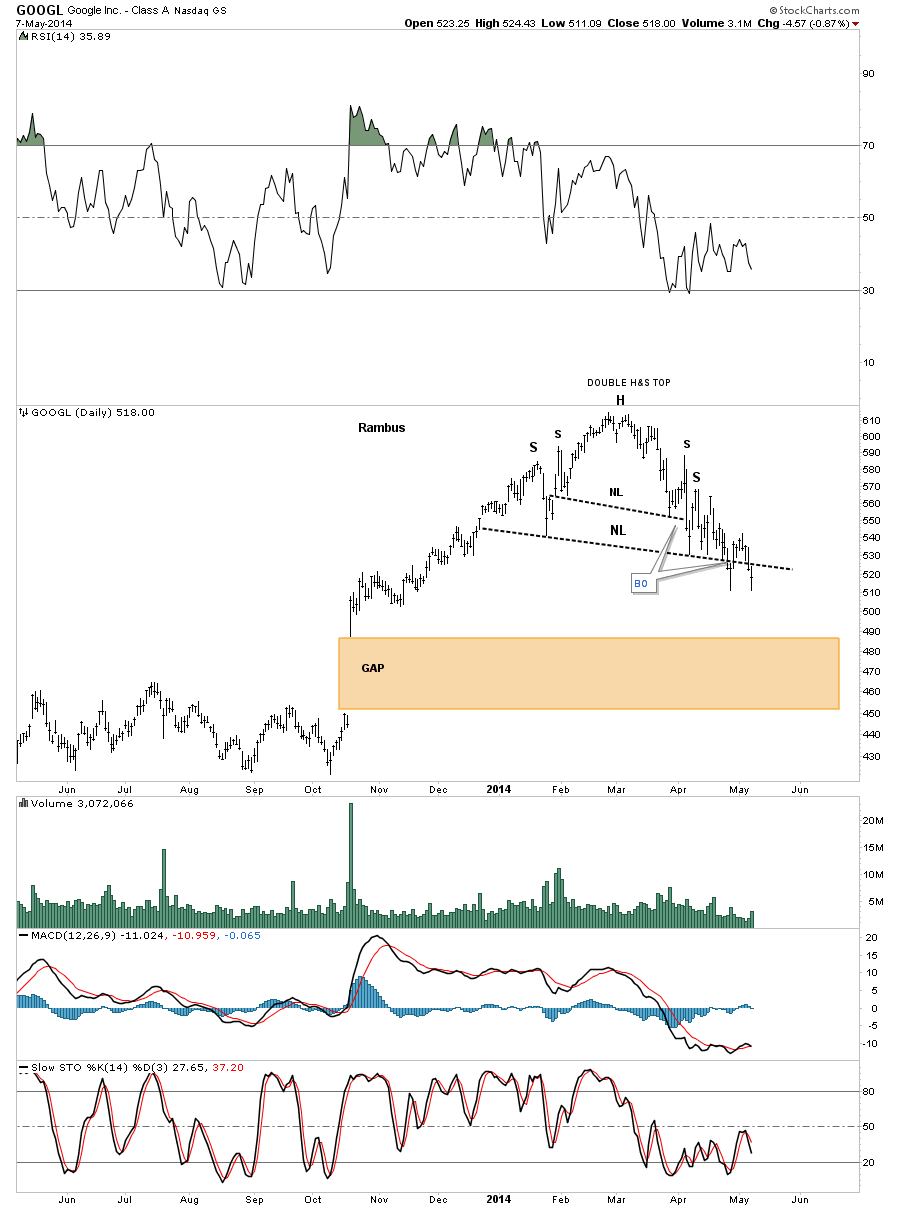
The daily chart for Google (NASDAQ:GOOGL) shows us a double H&S top that isn’t one of the prettiest H&S tops I’ve ever seen but it’s making lower highs and lower lows which is creating a downtrend. It will be interesting to see how GOOGL deals with that huge gap, brown shaded area.
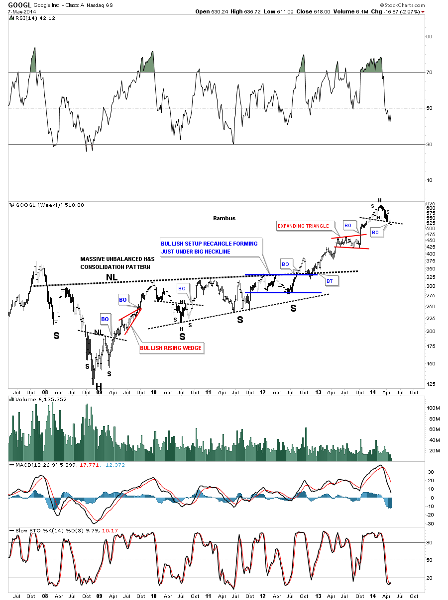
This long term weekly look at GOOGL shows how I’ve been following this stock through the years. The most important thing to understand is where the H&S top, which I showed you on the daily chart above, has formed on the weekly chart below. If there was ever a place to look for a H&S top reversal pattern, this chart shows that place in spades.
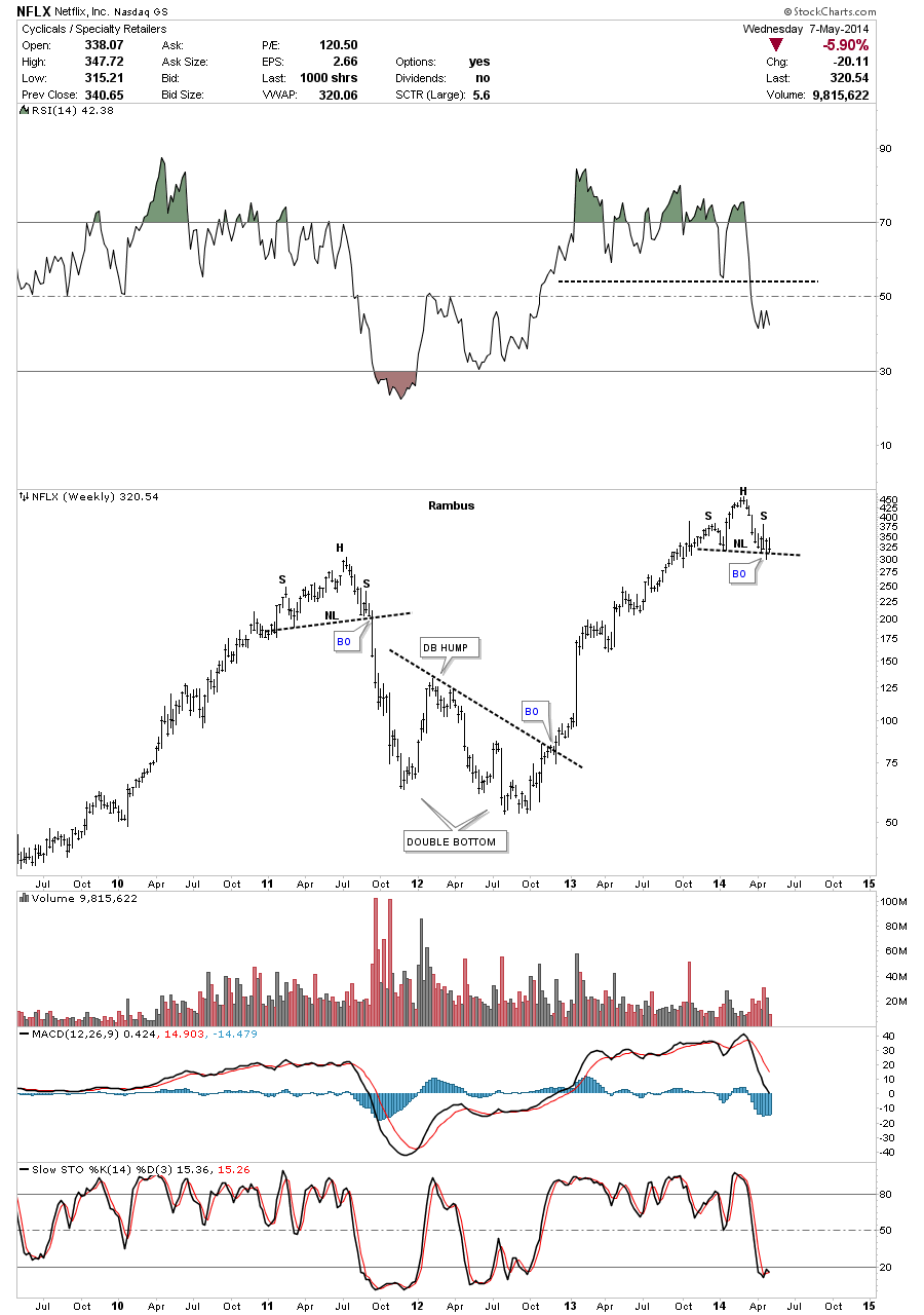
Netflix (NASDAQ:NFLX) has been a high flyer but it to looks like it’s building out a H&S topping pattern. Note the beautiful H&S top that was made in 2011 and the decline that followed.
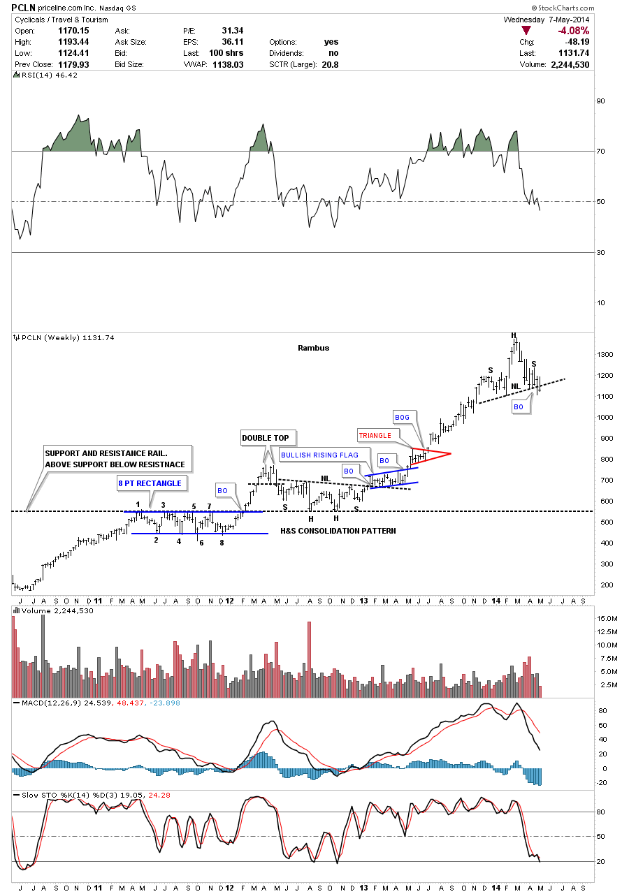
The last time I posted this chart for Priceline.com (NASDAQ:PCLN) was when it was breaking out from the H&S consolidation pattern back at the beginning of 2013. You never know what kind of price rise you’ll get, only that it should be a good one when a stock breaks out of a fairly large consolidation pattern.
This chart also shows you a perfect example of how support and resistance works. Notice the eight point blue rectangle that formed back in 2011. Once the price action broke above the top blue rail it then reversed its role, from what had been resistance to then support, as shown by the double headed H&S consolidation pattern. That is perfect Chartology 101.
I think some of these charts above are showing you why the Nasdaq 100 is trading way below the Dow and S&P 500. These big guys led on the way up and are now going to lead on the way down.
There are many more examples I could show you but I think these big cap tech stocks paints a pretty good picture of what is going on below the surface.
This is the why behind our recent addition of SQQQ , the 3X Bear Big Cap Tech ETF to our Model Portfolio