While the title of this post may be a little hyperbolic, I think there’s several charts we can focus on that can shed some light on the market right now.
The U.S. equity market has enjoyed an excellent bounce of the late-December low, giving a great start to the new year. I last wrote on the blog about the importance of the S&P 500 recovering its 200-day Moving Average, as historically the risks remained elevated for a test of the prior low until we got back above the long-term average. In mid-February the index accomplished its goal of clearing the 200-day and the SPX rallied another 50 or so points before experiencing a pullback last week, something I wrote was a strong possibility in my Thrasher Analytics letter on March 3.
From a macro standpoint I think it’s interesting to note the price action following the ECB’s announcement last Thursday. Typically, we see a ‘risk on’ rally when a Central Bank announces another jolt of stimulus but it seems a greater deal of focus was placed on the lowering of the growth estimates for the eurozone. This change in sentiment speaks to the idea that maybe we’ve become a little immune to the drumbeat of the global QE and the slowing of economic growth is being viewed as more important to the decision making of macro-oriented investors and portfolio managers. Now, this is just a single day’s price action/reaction but something to not get lost in the noise that populates the rest of the 24/7 of headlines and tweets.
Now that we’ve experienced a bit of a pullback, I want to share some of the important charts I think are critical for the market going forward over the next few weeks and could shed some light on the direction of the next leg in the market.
Cloud Technology
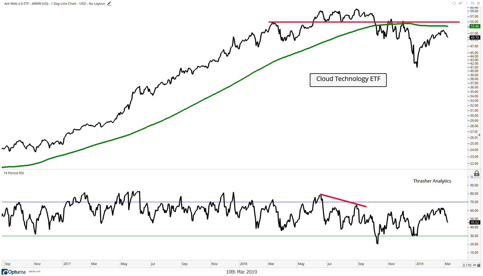
First up is the ever-popular cloud technology industry via the Ark Web X.0 ETF (NYSE:ARKW), which provides exposure to stocks like NVIDIA (NASDAQ:NVDA), Tesla (NASDAQ:TSLA), Square (NYSE:SQ), Twitter (NYSE:TWTR), Baidu (NASDAQ:BIDU), Tencent (OTC:TCEHY) and Netflix (NASDAQ:NFLX) among others. This is an industry that’s garnered a great deal of attention in the press and investors. Because of the spotlight given to cloud tech, it can be a good barometer for trader’s risk appetite – pushing the space higher when looking to gain more beta and equity exposure. However, ARKW still remains below its respective 200-day moving Average and prior March and November highs. I’d like to see these levels cleared as a positive development that the market has regained confidence in this budding industry.
Software
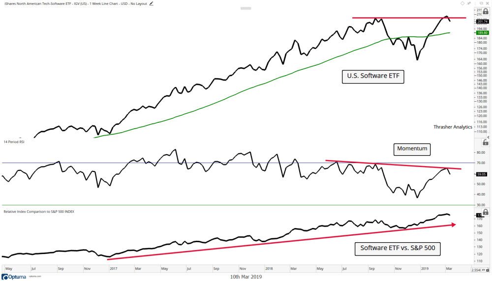
Next we have the Software industry via the iShares U.S. Software ETF (NYSE:IGV), which holds stocks such as Salesforce (NYSE:CRM), Oracle (NYSE:ORCL), Adobe (NASDAQ:ADBE), Microsoft (NASDAQ:MSFT), Intuit (NASDAQ:INTU) and ServiceNow (NYSE:NOW). Software is another pocket of the market that’s been red-hot, leading in relative performance to the S&P 500 for the last two years (bottom panel of chart). Software has been a clear market-leader so we want to see these stocks continue to do well as a bullish sign for investor sentiment. Unfortunately, with Salesforce’s (CRM) latest earnings announcement, IGV has been pushed back below its prior January high – setting up a potential false breakout situation along with a bearish divergence in momentum. CRM was able to bounce against its 50-day MA on Friday and close above its open, so that’s one positive sign for this space. But I’d like to see that January high taken back out and to the very least, have IGV remain above its 40-week/200-day moving average.
Financial And Technology Sectors
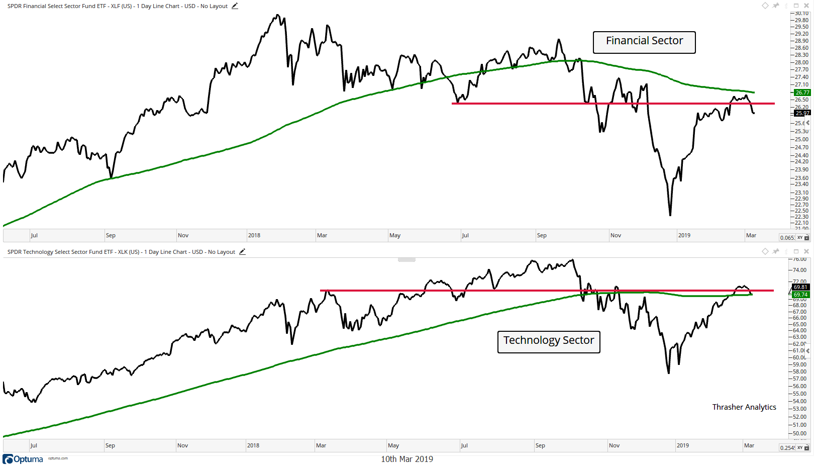
Obviously Cloud and software industry’s make up a large chunk of the tech sector (NYSE:XLK) but I want to take a broader view here and look at the entire sector along with financials (NYSE:XLF). Tech makes up 20.6% and Financials account for 13.3% of the S&P 500, two of the top three sectors (health care is the other).
As of Friday’s close, both XLF and XLK finished the week below their 200-day Moving Average. In fact, since the December low, XLF has still yet to close above its 200-MA. With last week’s weakness, financials have fallen back below their July low and tech has once again struggled with its March high. These levels of resistance are frustrating for tech and financial bulls and I’m watching them closely. I’ll address the 200-day MA issue for these two in the next section.
Tech And Financials Below Their 200-Day MA
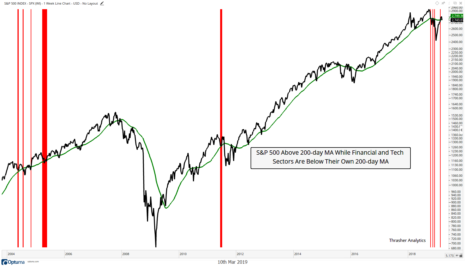
The reason it’s important for these two sectors to get back above their 200-day Moving Average is because it’s very tough for the broad market to trade above its own without them.
The chart study below shows red lines on the S&P 500 when XLF and XLK are below their 200-day MA and the S&P 500 is above its own (which is currently not the case since it broke below it last week). As you can see, there’s only been a handful of occasions when these two sectors were below their long-term average and the market was able to be above its own. Actually, the market didn’t see a great deal of short-term strength in these instances. Most recently we saw it occur during the brief rebounds in early and late November of last year before the market moved lower. Before that was in 2011 before the major decline that took place that year. Then we’d have to go back to 2004 and 2005 which saw brief dips in the index before reclaiming its 200-day MA. In 2004, financials showed strengthen and reclaimed its MA along w/ the index and in 2005 all three moved together in obtaining a close back above the 200-day.
So the point is, we need to see strength in both these sectors to have confidence that the broad market can continue to rally. Without participation by tech and financials, it’s going to be extremely difficult to get considerably higher from here in the SPX.
Offense Vs. Defense Relative Performance
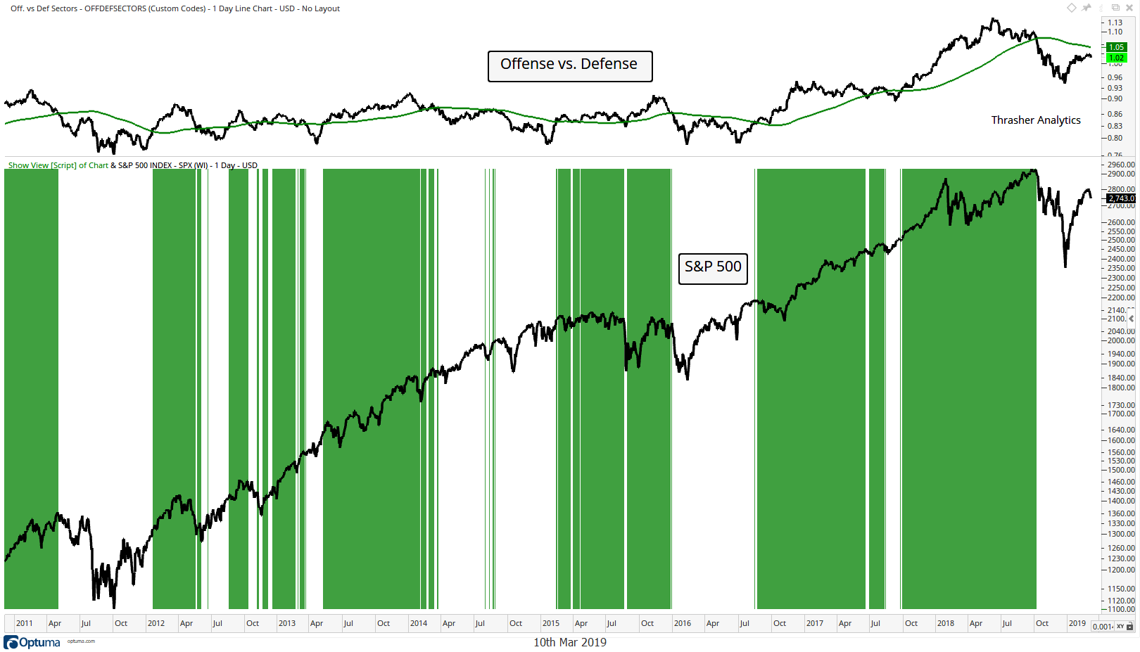
Next is a version of a chart I sent to Thrasher Analytics subscribers last Sunday as part of my reasoning why I thought some weakness could soon enter the market. The chart shows my custom index of offensive vs. defensive areas of the market with green shaded areas for when this index was above its 20-day Moving Average. When offensive areas of the market are leading and the index is moving high (and thus above its 200-day MA) then the environment for the broad market has been fairly bullish.
However, when defensive areas of the market are leading, pushing the index below its 200-MA, then we often see a poor environment for the S&P 500. We saw the last break of the 200-MA on October 4th, and the custom index has remained below ever sense. This tool is not meant for market timing but rather to give a better idea of the risk appetite of the market.
China
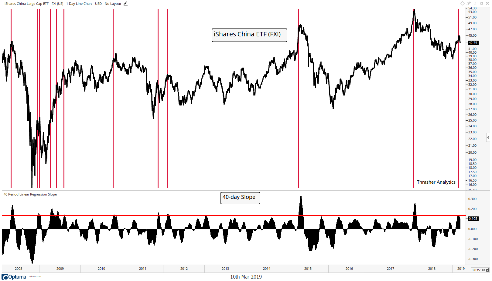
During an interview on TD Ameritrade Network last week I discussed volatility and international equities, specifically China. I mentioned that we had exited some of our China exposure in client accounts the day before as the slope of the trend began to reach parabolic-like levels that had historically led to pullbacks in the Chinese ETF (NYSE:FXI). Below is the chart I was referencing, which shows the 40-day slope of FXI. Since 2007, when the slope has reached its current level, shares of FXI have seen a varying degree of decline. Most recently January 2018 and April 2015, both marking significant highs for the Chinese equity market.
There are many charts that I deem “important” but the ones discussed above are a sampling of what I will be giving a great deal of attention to in the coming weeks, looking for some strength in these pockets of the market in order to get more confident that we could see another leg higher in broad U.S. equities. However, if we do not see these charts firm up and the levels I mentioned regained, then I think the risks of a continue slip lower increase.
This upcoming week has historically been bullish for equities as it’s option expiration for March. This strong short-term seasonality can give us another clue into the potential trend for the market – based on whether stocks follow the seasonal pattern of March OpEx or if they buck the trend and continue last week’s decline.

