If you Google (NASDAQ:GOOGL) “yield curve inversion” you get 204,000 results. The topic of an inverting yield curve is something that’s been written about in anticipation ad nauseam by strategists, traders, bloggers, journalists, bloggers who think their journalists and journalists who think their traders. The inversion that took place on Friday has been well documented and the focus has greatly been on the repercussions for the economy. It’s been shown that an economic recession has historically followed an inverted yield curve by 311 days based on the past six inversions according to Bianco Research. However, we trade markets not economy’s so while the impact on the economy is significant, I’m much more interested in the U.S. equity market’s reaction – which is what we’ll dive into today.
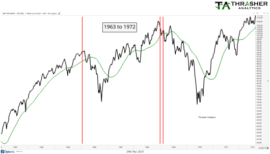
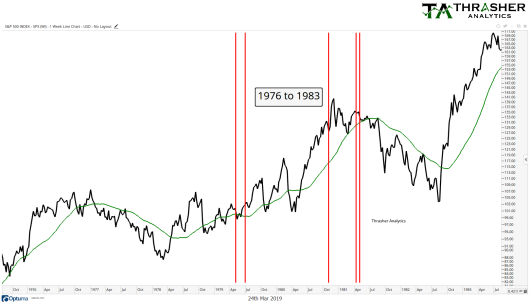
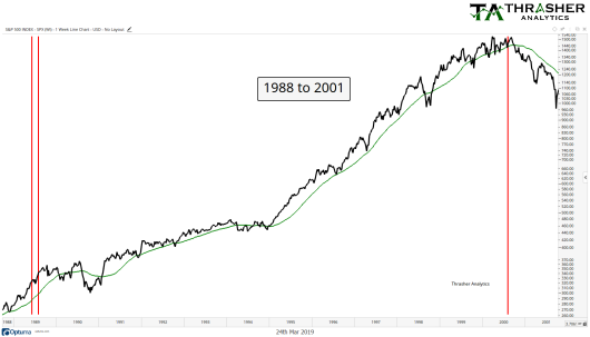
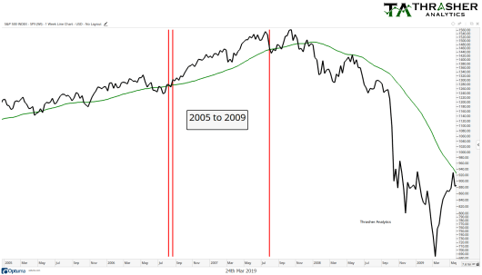
The charts that follow show when the yield curve (3 mo. vs. 10 yr.) inverts while the S&P 500 is trading above its 40-week moving average. I add the MA to help just show the results of an inversion during an equity up trend, similar to the market environment we’re in today.
In 1965 the S&P 500 bottomed in June after a short-term decline and rallied 13% into the early months of 1966 just as the difference between the 3-month and 10-year Treasury yield dipped below zero. Price rallied for a few more weeks, squeezing out roughly 0.5% before a final top was put in and declining by a little over 20%.
Next was the inversion in 1969. Looking back equities had already peaked by 3.5% by the time the curve inverted and began its down trend that resulted in a 33.5% decline.

The next inversion occurred in 1972 (not shown) after the S&P 500 had fallen more than 6% below its 40-week Moving Average, so we fast forward to the next inversion in 1979. The curve inverted early in the year while price whipsawed back and forward over the long-term Moving Average, seeing the first decline below zero for the 10 yr. minus 3mo in May. The S&P rallied another 9% before sellers took over and saw a pick up in downside pressure.
Next is the inversion in October ’80, which occurred after equities had dipped after its most recent new high. The inversion marked the short-term low as equities continued higher for another 10% before a final major high was set and price moved lower to test its 40-week MA, followed by another inversion in April ’81 that marked the first lower high during the multi-year down trend in equities.

Fast forwarding a few more years, traders dealt with Black Monday in 1987 and the eventual rebound in stocks, taking prices to within spitting distance of the prior 1987 high, just when the curve inverted. The SPX saw a minor pullback before moving higher by another 10% before price began to trade sideways for a little over a year.
U.S. equities then enjoyed one the strongest bull markets in its history as they moved into the eventual peak in 2000. The inversion occurred after a brief test of the 40-week MA and was followed by 4% advance as the index tested its prior high – setting up a double top that ended the bull market and sent prices lower by 47%.

Finally we have two inversions before the 2008 financial crisis. First, in 2006 which took place after stocks began to rebound after a 7% two-month dip. Equities shrugged off the inversion and continued higher by 21% before declining in July 2007 that led to the final inversion later that month. Equities declined a few percent more before moving higher to set the final peak in price.

While the sample size isn’t extensive, I think this peak at history gives us an idea of how historically the market has responded to initial inversions in the Treasury curve. It seems that when price has been below the multi-year high, it continues to to squeeze a few more percent out of the up trend before a major down trend ensued. However, the two periods that stand out the most to me are 1980 and 2006 when comparing prior inversions to today’s market. In ’80, price had declined about 15% then rallied roughly 27% before the curve inverted and then moved another 10% higher before a final high. In ’06 the inversion occurred during the rebound after a 7% decline in price and was followed a strong move higher. Both occurrences saw prices continue to move higher after the inversion, will we see a repeat this year?
I share these charts not to make a major market call but to put the spotlight directly on the price action leading up to and following this important development in the Treasury market. So much attention is given to the economic boom and bust cycles, but as market participants our focus should be on price action and let the economists fumble over themselves forecasting economic growth between revisions of backward looking variables. Many will surely begin to echo Greenspan with calls for today being “different this time” due to the impact of domestic and global central bank intervention. Historians will have the benefit of hindsight when writing about this Treasury yield curve inversion, its catalyst and eventual impact. We unfortunately don’t have such a pleasure and must respond to the market in front of us, hopefully with the benefit of understand market history.
Disclaimer: Do not construe anything written in this post or this blog in its entirety as a recommendation, research, or an offer to buy or sell any securities. Everything in this post is meant for educational and entertainment purposes only. I or my affiliates may hold positions in securities mentioned in the blog. Please see my Disclosure page for full disclaimer.
