OK, it’s possible I may have mixed a few things up here. It’s hard not to these days what with all of our electronics blaring information at us 24/7. The main point is that we MUST be extremely fearful at this moment. At least that is what I gather from all of the scary headlines shouting that the bull market is clearly over.
As a technical analyst who looks at charts I am quite concerned at the moment. A lot of stocks, indexes, sectors, etc. are showing signs of breaking down – i.e., below moving averages, taking out important support levels and so on. So, I do think it is important for investors to be 100% prepared to “play defense” with their portfolios.
Also, as a technical analyst I recognize that after long uptrends there is often a correction that involves A LOT of volatility and a lot of big price swings and that each and every swing MUST be accompanied by A LOT of “news” telling us that THIS SWING is the one that matters…right up until the very moment that it reverses again and no longer matters.
As a seasonal analyst I recognize that we are in what “should” be a very favorable period for the stock markets (more to follow).
So, let’s consider some “information”.
The Hindenburg Omen
This was a popular indicator at one time – until it gave one too many false signals and a lot of people tuned it out. Interestingly, it gave a decent signal this year of impending trouble – but only after about the 47th signal (so does that make it a “good” indicator or not?)
The Yield Curve
On any given day of late, roughly 8 bazillion articles are written about the “yield curve” – which measures the difference between interest rates of various lengths (i.e., 30-yr. versus 3-month T-bill, 10-year yield versus 2-year, etc.). Here is everything you need to know:
*An inverted yield curve – when short-term rates are higher than long-term rates – is a serious situation that can warning of impending economic and market trouble (which is pretty much what the 8 bazillion articles focus on).
But here is one other part that most people don’t seem to recognize:
*An inversion of the yield curve DOES NOT necessarily mean that Armageddon is immediately imminent. In fact, history suggests quite the opposite.
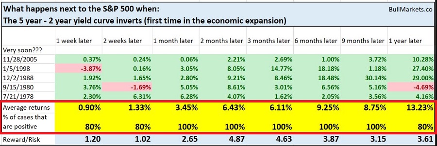
Rather than recreate the wheel I will simply refer you to a piece by www.BullMarket.co which includes the following table.

Here is the important paradox – a situation where the 2-year yield is above the 5-year yield IS a potential warning sign and signal an impending economic downturn. HOWEVER, as you can see in Figure 1, the stock market typically has some upside left before the party is over.
Keep these numbers in mind each time you see a headline blaring gloom and doom about the yield curve (also make a note to prepare to play defense about a year later).
The Death Cross
The other scary headline we see all the (freaking!) time now involves a stock index about to experience a “Death Cross”. A Death Cross is a really cool and scary name for a cross by the 50-day moving average below the 200-day moving average – which is intended to portend impending doom for that index.
Here is what you need to know:
*Sometimes a Death Cross is followed by a major – and I mean MAJOR – bear market. So it is important to be alert.
*Still, the reality is that more often than not selling at the time of “Death Cross” leads to buying back later at a higher price.
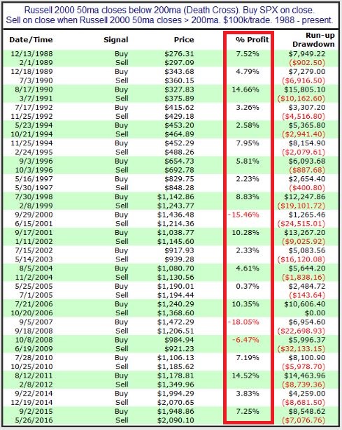
Once again I will defer to someone who has already done the work – in this case it’s Rob Hanna of www.QuantifableEdges.com. Figure 2 shows what’s happened to the S&P 500 Index after a “Death Cross” by the Russell 2000.

Also see this link for a very interesting piece (which also has a great title) titled “90 years of Death Crosses” which details the history of Death Crosses by the S&P 500 Index. My advice is to read this piece and eschew the other roughly 4 bazillion articles on the topic.
One Last Item: The Mid-Term Election
Don’t worry I am not going to delve into politics (for the record, prior to the mid-term I went to www.iSideWith.com to figure out my favored candidates. It told me that I hate all politicians). No matter your political affiliation, for most people there is nothing scarier these days than an election.
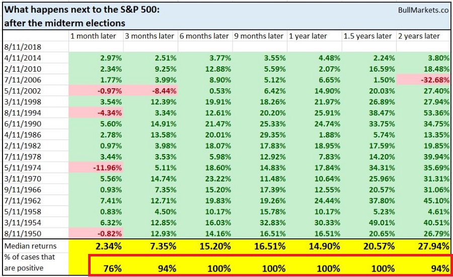
Now serious analysts can reasonably argue causality and correlation but based strictly on the numbers it would appear that one of the most consistently bullish “indicators” for the stock market is – the occurrence of a mid-term election.
Once again I defer to www.BullMarkets.co and the table they produced that appears in Figure 3.

Summary
Given all of the scary stuff going on right now it is absolutely possible that the market will decline in the year ahead. But for now, history suggests otherwise.
So, repeating now:
*An inverted yield curve IS a bad sign. Just not necessarily right away for the stock market.
*A Death Cross MIGHT be followed by a horrible bear market so it is OK to play defense or at least prepare to play defense when the major averages roll over. But don’t stick your head in the sand – and be prepared to jump back in if things improve.
Disclaimer: The data presented herein were obtained from various third-party sources. While I believe the data to be reliable, no representation is made as to, and no responsibility, warranty or liability is accepted for the accuracy or completeness of such information. The information, opinions and ideas expressed herein are for informational and educational purposes only and do not constitute and should not be construed as investment advice, an advertisement or offering of investment advisory services, or an offer to sell or a solicitation to buy any security.
