I have been touting a major top in stocks, especially in the Dow and the largest small-cap index, the Russell 2000.
With each new bubble, we reach higher highs, and then crash to lower lows. It’s such an obvious megaphone pattern that I’m not sure how anyone could miss it.
Central banks continue to stimulate us out of each downturn and crash with free money and zero interest rates. How could that not create a greater bubble and greater crash to follow… unless you really can get something for nothing?
Most economists miss this. It flies over Wall Street pundits’ heads. It’s beyond belief!
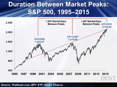
In addition to the two indices I’ve already mentioned, there’s another showing obvious signs of an impending collapse: The S&P 500.

First, notice the trend line. It follows the lows in corrections in the late 1990s bubble through the tops in early 2000 and late 2007. Looks like we already hit that trend line peak on April 27 at 2,126.
But even that isn’t the most important indicator here. The tops in early 2000, late 2007, and late April 2015… were exactly 1,897 trading days apart.
That just about sent a shiver down my spine!
We’ve been in an unprecedented period since late 2008 wherein central banks around the world have stepped in and printed whatever amount of money they deemed necessary. They’re desperately trying to stop the depression and deflation meltdown that started in the second half of that year.
But there is a limit to how much you can stimulate an economy pointing down… especially one already up to debt levels twice that of the last great bubble boom that peaked in 1929 — 4 times if you include unfunded entitlements.
Just how much more can you get people and companies to spend and borrow when they already way overdid that?
The answer is, you can’t.
It’s governments that have borrowed more to offset the slowing of spending and debt in the private sector. Consumers and the way-over-leveraged financial sectors have cut back.
But to make matters worse, student loans have soared, and corporations have upped the ante in their borrowing — not to increase capacity as much, but more to financially engineer their earnings through stock buybacks and mergers and acquisitions that are doubtful to bear fruit in the long term.
So, where do we go from here?
Maybe up a little higher. We don’t know exactly how an economy will react to QE, since we’ve never seen it before 2008, when we introduced it to stop the last bubble from crashing to its lowest levels.
But more likely, it’s all downhill from here… though perhaps that statement is misleading. More like, down a cliff.
As our four key cycles continue to point down together, I expect a 70% drop in line with that long-term megaphone pattern by early 2017. I see it hitting 80% or higher by early 2020.
It is still possible we could see a 15% to 20% correction this summer, to which central banks fire all cylinders before they fail even more miserably.
But this S&P chart would suggest we’ve already seen a major top.
And that means… the curtains are falling for the greatest bull market and bubble in history.
If you get out of high-risk investments and become more safe and liquid, you’ll be well positioned when the crash happens over the next two to five years. Because when we hit bottom, the world will be your oyster!
