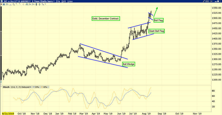
Another glorious day for gold investors is underway.
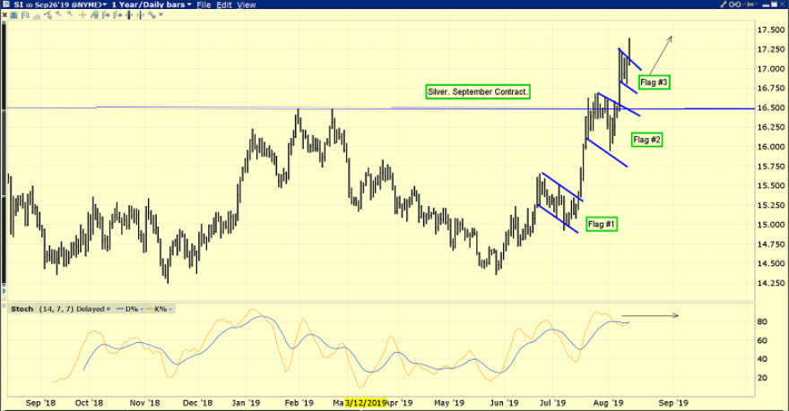
The only better-looking chart than gold right now is… silver.
Years ago, I coined the term “flagification” to describe the formation of multiple flags on the gold and silver charts.
This technical action is rare and outrageously bullish.
Because it happens with technical indicators overbought and the commercial traders adding seemingly overwhelming short positions on the COMEX, even the best top callers need to use caution in this type of market.
I’ve described the current events in America as resembling a hybrid of what occurred in 1929, 1937, 1968, and 2008.
Stagflation, tariff taxes, US-China empire transition, populist worship of debt-obsessed politicians, and a peaking global business cycle all appear to be in play… at the same time.
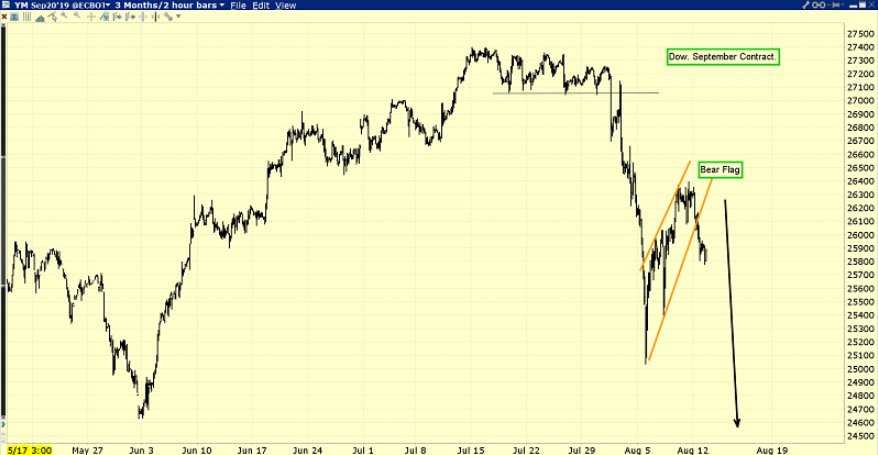
This is the horrifying US stock market chart.
Flagification may soon be in play, but not in a good way! A huge
bear flag has already formed on this short-term hourly chart.
I always recommend that US stock market investors go to the sidelines at the start of August with some of their capital. As the business cycle matures, the danger of a crash in September or October increases exponentially.
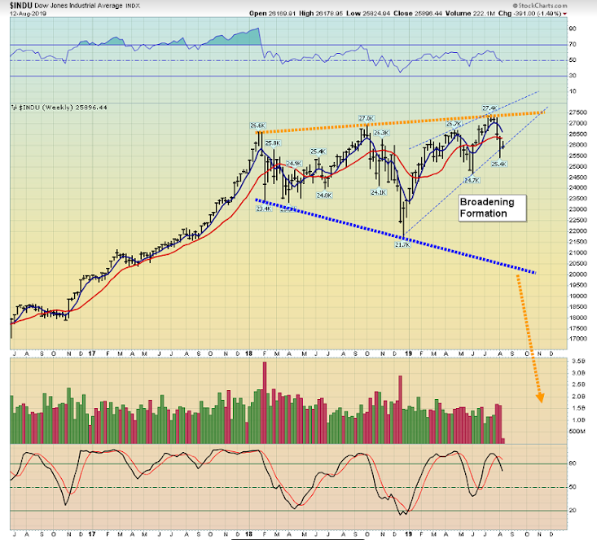
The weekly chart action of the Dow is ominous, while gold and silver accelerate their upside action.
What’s happening now in both gold and the stock market is reminiscent of the late 1960s when American stagflation began.
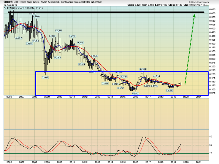
The gold stocks versus gold monthly ratio chart probably is the best illustration of the emerging stagflation theme.
In 2007 gold stocks were at a high price in relation to gold. Now they are very low and basing.
Mainstream analysts have suggested different interest rates that would represent “normalization”. Likewise, some gold stock analysts have suggested that GDX (NYSE:GDX) would be “normalized” at a price of about $40.
I would agree with that number if deflation was still the theme rather than emerging stagflation and empire transition. Looking at the long-term ratio chart, a case can be made that GDX (NYSE:GDX) would now only be “normalized” at a price somewhere between $100 and $300 a share.
Even after the huge rally in 2019, GDX (NYSE:GDX) is still trading below its 2008 lows on the GDX versus gold ratio chart. The bottom line:
In a stagflationary environment, the upside potential for gold is fabulous and for gold stocks versus gold it is mind boggling.
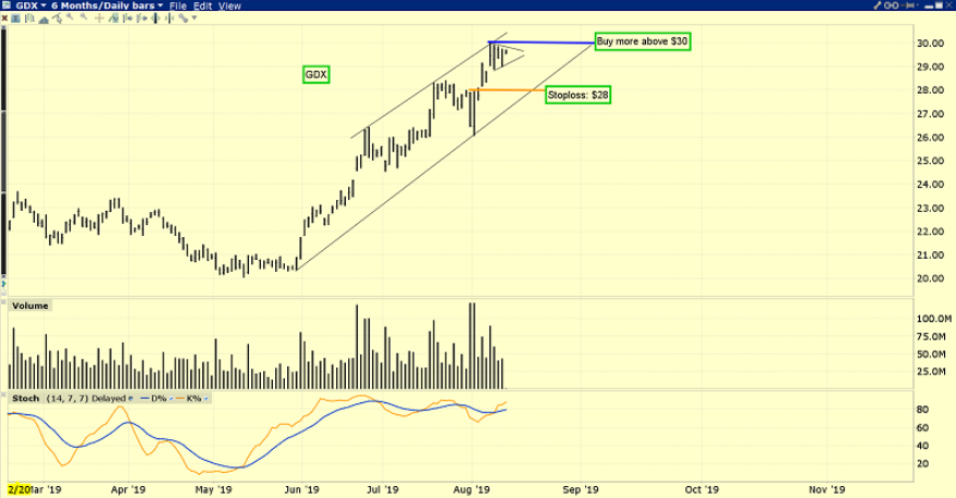
This is the key GDX (NYSE:GDX) daily chart.
The stoploss is set at $28 but if GDX (NYSE:GDX) moves above $30 (and it could happen today) eager accumulators can add to positions and raise the stop to about $27.70.
In a powerful market featuring such events as “flagification” and a US President who engages in regular QE worship, there’s no point in setting any target price at this early stage in the upside game. My suggestion is just to move stoplosses higher and higher as GDX (NYSE:GDX) makes one fresh and glorious minor trend high after another!
Stewart Thomson is a retired Merrill Lynch broker. Stewart writes the Graceland Updates daily between 4am-7am. They are sent out around 8am-9am. The newsletter is attractively priced and the format is a unique numbered point form. Giving clarity of each point and saving valuable reading time.
Risks, Disclaimers, Legal
Stewart Thomson is no longer an investment advisor. The information provided by Stewart and Graceland Updates is for general information purposes only. Before taking any action on any investment, it is imperative that you consult with multiple properly licensed, experienced and qualified investment advisors and get numerous opinions before taking any action. Your minimum risk on any investment in the world is: 100% loss of all your money. You may be taking or preparing to take leveraged positions in investments and not know it, exposing yourself to unlimited risks. This is highly concerning if you are an investor in any derivatives products. There is an approx $700 trillion OTC Derivatives Iceberg with a tiny portion written off officially. The bottom line:
Are You Prepared?
