The global capital markets are giving different messages wherever I look, although, instinctively I will turn to the bond market as my go-to source.
Equity markets march on, although the S&P 500 looks fatigued and needs some genuine clarity on trade, and not just the line of “talks have gone very, very well” that we have heard countless times. The cash on the sidelines is still there, and the equity bulls will point this out all day, but we have priced in a lot of ‘going very well’ now and the risk of a ‘buy the rumour, sell the fact’ scenario grows by the day. We now need real meat on the bone and genuine dialogue that shows that the $200b tranche of goods currently the subject of 10% tariffs will not be put up to 25%, or sellers will hit the equity market.
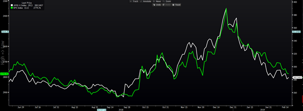
I continue to watch the high yield (HY)/investment-grade credit index spread (green) as a guide for the S&P 500 (white-inverted), and therefore the global equity markets more broadly. Right here, we can see signs HY spreads may widen, which will act a headwind for the S&P 500 but there are no glaring sell signals for equities, at this stage.
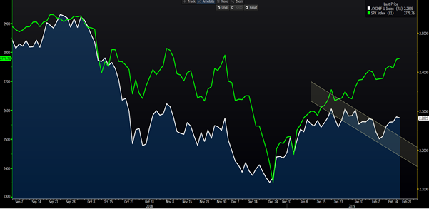
As we can see from the cyclical/defensive sector ratio (the white line), the market is not getting carried away with euphoria. Volumes have been ok through the last few days, but there is no real conviction to feel this is a reflection of better earnings and good-will towards economics. If this ratio heads lower, indicating defensive sectors are working better, it could be a red flag for the equity market to roll over.
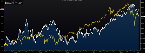
One aspect of support for the equity markets, globally, is the tailwind seen from falling ‘real’ (or inflation-adjusted) U.S. Treasury yields. Here, I have charted the 5-year real treasury yield, where falls (in yield) result in the income from dividends becoming relatively more attractive. However, falling yields also make future cash flows more appealing for investors and raise the Net Present Value of a business.
If we take a look at the ASX 200, the technicals look great on the daily chart. But, swing this to a weekly chart, and we see an ominous looking ‘doji’ candle, which highlights indecision from market participants. Weekly charts give us a great oversight around the rhythm and feel of the aggregated flow. So, if trading is largely about assessing probabilities, a weekly close through the 6106/10 area would increase the probability of a continued move into 6200 and would naturally be bullish.
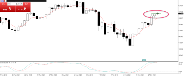
The higher the close above this zone the more powerful the message portrayed by markets.
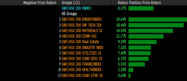
Interestingly, despite this rush for yield in so many asset classes, in Australia, it’s the energy and materials space that is on fire this year.
Commodities not painting an upbeat picture
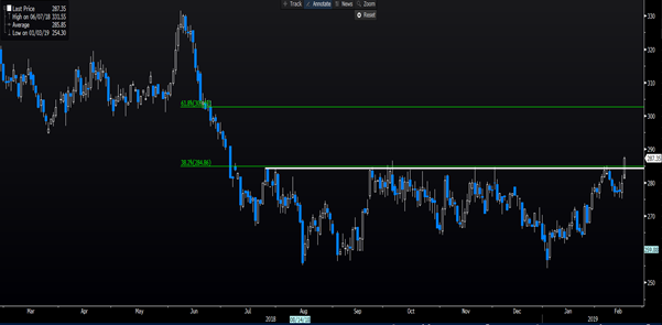
We could argue that the same bullish story seen in equities is true in copper, where we look at copper having broken out above the top of the multi-month range and 38.2% Fibonacci of the June to August sell-off. Now, on first blush, the price move would indicate the world is a happy and wonderful place, and if you are long of copper, it probably is. We could argue the credit expansion in China is undoubtedly helping, while overnight BoJ Governor Kuroda argued for additional stimulus should the JPY start to affect its inflation dynamic.
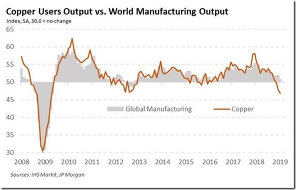
However, if we dig a little deeper, we see research from IHS Markit that details a rampant decline in copper output in January. This impact on supply is a function of ever falling demand and therefore while the price is going up the fundamental rationale is perhaps not as bullish as some had thought. Copper perhaps doesn’t have the PhD in economics we thought it did, or at least the meaning is not as immediately apparent as it once was.
Gold, silver and palladium have been giving off this sour message for some time, and traders and investors have used precious metals as a hedge against a rising pool of negative bond yields. As I have been promoting, gold is used as a hedge against economic fragility (hence the increasing pool of negative yields), but it is seen as a currency in its own right. It is the least bad-house in the neighborhood, and right now these metals are attracting a ton of trend-following capital.
Gold specifically is rallying in all G10 currencies and that, to me, is the sign of a genuinely bullish move. Even when priced in GBP, where sterling is looking far more bullish, with traders reducing shorts, with anticipation building ahead of tonight’s meet between Juncker and May. Harry Cole, a journalist at the Sun, describing the talks as going “surprisingly well”, although Juncker told reporters he is “losing my time with this Brexit”….aren’t we all! Still, the technical picture paints a story of one where traders see an increased probability of cable heading to 1.3210 and the recent highs.
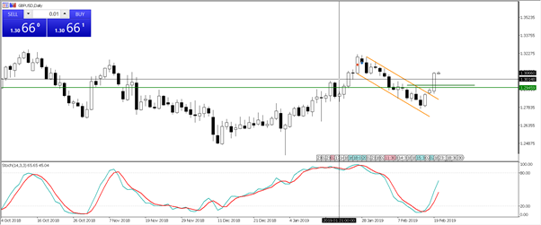
It is still a brave trade to be overly exposed on the long side of GBP, as too many have been burnt by a trend in the news flow, only for the flow of news to reverse (in sentiment) and GBP is subsequently smacked back down.
Anyhow, back to gold, where I like the move priced in AUD and Pepperstone clients have been solid buyers. Today’s Aussie wage data, which came in at a 0.5% quarterly clip won’t inspire the buyers and should keep Aussie gold (XAUAUD) eyeing a test of the all-time high. In USD terms, I see $1350/60 as my target and would expect a higher probability of profit takers into here, which will offer a new opportunity. The flow on the desk has certainly turned, and we see better selling emerge.
All eyes on the FOMC minutes (tomorrow at 6 am AEDT). It's hard to see these minutes as more dovish than the actual FOMC statement, especially with staff economists having an influence on the statement and they will be more upbeat. On balance, I see the risks to the USD as titled to the upside, but all the focus is on the balance sheet and clues on when which month the Fed is likely to signal an end to balance sheet normalisation.
Either way, the message from gold is not a positive one. Neither is the message I am hearing from the US bond market, where the spread between the UST 10 year and US 3-month Treasury (the curve the Fed look at most closely) is now eyeing new lows.
The negative undertone is something I am sensing in the interest rates market too. Here, I have overlapped the S&P 500 (white bar chart) vs the euro/dollar interest rate futures and specifically the contracts that show the rates pricing for March to December. This once strong correlation has broken down, and rates and fixed income are doing their own thing.
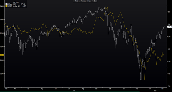
One to watch, but equity and credit are rejoicing at the coordinated change from price-maker central banks, while commodities and rates tell us their actions won't change what is coming ahead. One is right, one is wrong.
