
In 2014, I tried killing a cockroach in my crappy student dorm during undergrad. I was surprised—and slightly disgusted—by how resilient the thing was.
That’s actually where I first learned about the concept of anti-fragility—the idea that some things don’t just survive stress and volatility but actually get stronger from it. Sorry, Nassim Taleb, I never actually read The Black Swan
Anyway, this one incident gave me the inspiration for what I call “The Cockroach Portfolio”—a five-ETF combo that absolutely smokes both the S&P 500 and the 60/40 portfolio on a risk-adjusted basis.
Unlike many so-called defensive strategies, this portfolio doesn’t rely on expensive hedges with negative carry like put options or VIX futures. There’s no need to constantly bleed capital for protection—this allocation naturally mitigates downside risk through diversification across uncorrelated assets.
Here’s a look at each individual component, why I selected it, and how it all works together, using ETFs from State Street (NYSE:STT) Global Advisors and BlackRock (NYSE:BLK) iShares.
The 60% stock allocation
We’re not going broad-based equities for this. Instead, we’re splitting the 60% stock allocation three ways—20% each into these sector-specific ETFs, all of which charge a low 0.09% expense ratio:
- The Health Care Select Sector SPDR® Fund (NYSE:XLV)
- The Utilities Select Sector SPDR® Fund (NYSE:XLU)
- The Consumer Staples Select Sector SPDR® Fund (NYSE:XLP)
Each of these draws from the S&P 500, so you’re already benefiting from the index’s earnings quality, liquidity, and size screen. But I’ve picked them for a reason—they’re the three most defensive sectors.
Historically, during market downturns, recessions, and crashes, these sectors tend to have lower drawdowns than the broader market and, on average, lower volatility (standard deviation).
Health care, utilities, and consumer staples have structurally inelastic demand:
- People need healthcare, regardless of economic conditions.
- They need electricity, water, and gas to function.
- They need household essentials like soap, toothpaste, and food.
This means that even when the economy tanks, these companies keep making money, and their stocks tend to hold up better.
Beta confirms this. XLV has a beta of 0.64, XLP is at 0.57, and XLU is 0.74. A beta of 1.0 means a stock or ETF moves in sync with the overall market. A beta below 1.0 means it moves less than the market, reducing volatility. These ETFs, on average, fluctuate less than the S&P 500, which means smaller swings.
My goal here isn’t to chase big gains—it’s to minimize deep, prolonged losses that take years to recover from. If you can avoid huge drawdowns, you don’t need massive gains just to break even.
The 20% bond allocation
The 20% bond component is simple:iShares U.S. Treasury Bond ETF (NYSE:GOVT)with a 0.05% expense ratio. Bonds are here for one reason—diversification.
They have a low to negative correlation with stocks, meaning they tend to zig when equities zag. While stock returns are driven by earnings and market sentiment, bonds move based on credit and interest rates. That makes them a different risk-return driver, helping smooth out volatility.
Why GOVT? It offers straightforward exposure to U.S. Treasuries across maturities from 1 to 30 years by tracking the ICE U.S. Treasury Core Bond Index. I’m not looking to make a call on the yield curve or time interest rates—I just want exposure to Treasuries as a safety play.
GOVT sits in a Goldilocks zone with moderate rate sensitivity (5.76-year duration) and currently has a 4.42% average yield to maturity, which is the expected total return if the ETF holds all its bonds to maturity.
Why Treasury bonds specifically? I don’t want credit risk in this portfolio. Corporate bonds don’t offer the same flight-to-safety benefit during downturns, so I’m sticking with Treasuries. Unless the U.S. government defaults, Treasury bonds are as safe as it gets.
The 20% gold allocation
The last 20% of the portfolio is going into the shiny, heavy metal that Roman legionaries were paid with and that you can now buy at Costco—gold.
I know the usual arguments: it produces no cash flow, it’s all speculation, and so on. I don’t care. What matters is that gold has low correlation to both stocks and bonds, making it a third diversifier in those rare but painful moments when both asset classes fall together—like in 2022.
Gold also has structural characteristics that make it a great safe-haven asset. It can’t be debased like fiat currency, is hoarded by central banks, and has a long history as a store of value.
The problem with holding gold in a portfolio is that physical metal is hard to rebalance. Storage, dealer spreads, and security are all a hassle. That’s why I’m going with an ETF instead.
I like SPDR Gold MiniShares (NYSE:GLDM). It has a 0.1% expense ratio, is well-capitalized with $10.2 billion in AUM, and offers a simple, efficient way to own gold without the logistics headache.
Putting it together
This portfolio is very easy to manage. Just buy each of these five ETFs at 20% each, rebalance quarterly, and reinvest all dividends. That’s it.
I know some of you just look at the chart, so don’t glaze over the figures. Yes, in terms of total returns, from 1992-09-28 to 2025-02-06, the Cockroach Portfolio lags behind the S&P 500 (10.63%) and the 60/40 portfolio (8.36%), with an 8.28% CAGR.

The table presents key metrics like CAGR, max drawdown, volatility, Sharpe ratio, Sortino ratio, and Beta. The chart illustrates portfolio value growth from 1995 to 2025, showing the S&P 500’s higher returns but greater volatility, while the Cockroach Portfolio and 60/40 portfolio demonstrate more stable growth.
But on a risk-adjusted basis, it smokes both. The Sharpe ratio comes in at 0.65, well ahead of the S&P 500 at 0.51 and 60/40 at 0.57. Volatility was significantly lower, with an annualized 9.21% standard deviation—half that of the S&P 500 (18.32%) and lower than the 60/40 portfolio at 10.92%.
Most remarkable is the maximum drawdown during the height of the 2008 financial crisis. The Cockroach Portfolio lost 22.16%—less than half of the S&P 500’s -55.26% and well below the 60/40 portfolio’s -35.97%.
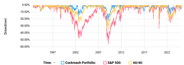
The graph highlights the S&P 500’s deeper drawdowns compared to the Cockroach Portfolio and the 60/40 allocation, demonstrating the latter two’s reduced volatility and better downside protection.
Younger investors with high risk tolerance will probably scoff at this. Older investors or those who truly understand risk will appreciate it.