There is a lot to be inferred from the relationship between Emerging Markets and the Developed Markets. Relative strength in Emerging Markets is seen by many as a sign of increased risk taking.
That is good for all equities. It can also be viewed as adding extreme breadth to participation in a trend. Whether either of these or any other relationship is true or not is tougher to prove.
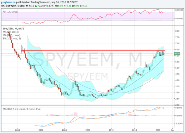
But reviewing this relationship can offer some insights into where to focus your investing: Developed Countries or Emerging Countries. The chart below is a good place to start. It shows the ratio of the S&P 500 (SPDR S&P 500 (NYSE:SPY)) to the Emerging Markets ETF (iShares MSCI Emerging Markets (NYSE:EEM)) on a monthly basis over the last 13 years. What is there to make of this?
There is a prominent “U” shape to the chart. Over the course of the “U” it represents a shift of strength from Emerging markets to neutral at the bottom to developed markets as it rises. There are two important points on the chart as well.
After the first year of the EEM trading it bounced to a interim high at a ratio of 6.45. The “U” followed and where did it stop? Right at that ratio of 6.45.
It has consolidated between 6.00 and 6.45 for 7 months. Some will look at this as a Cup and Handle building that would target a move to 10.50. This would show continued relative strength of Developed Markets over Emerging Markets. Others look at a top being set in the ratio and the next move lower.
Which will it be? I do not know, but which ever market wins out at this battleground level will likely set the stage for the major move. Keep your eyes on it.
DISCLAIMER: The information in this blog post represents my own opinions and does not contain a recommendation for any particular security or investment. I or my affiliates may hold positions or other interests in securities mentioned in the Blog, please see my Disclaimer page for my full disclaimer.

