- Stocks are in a bull market and are not overstretched from a long-term price perspective.
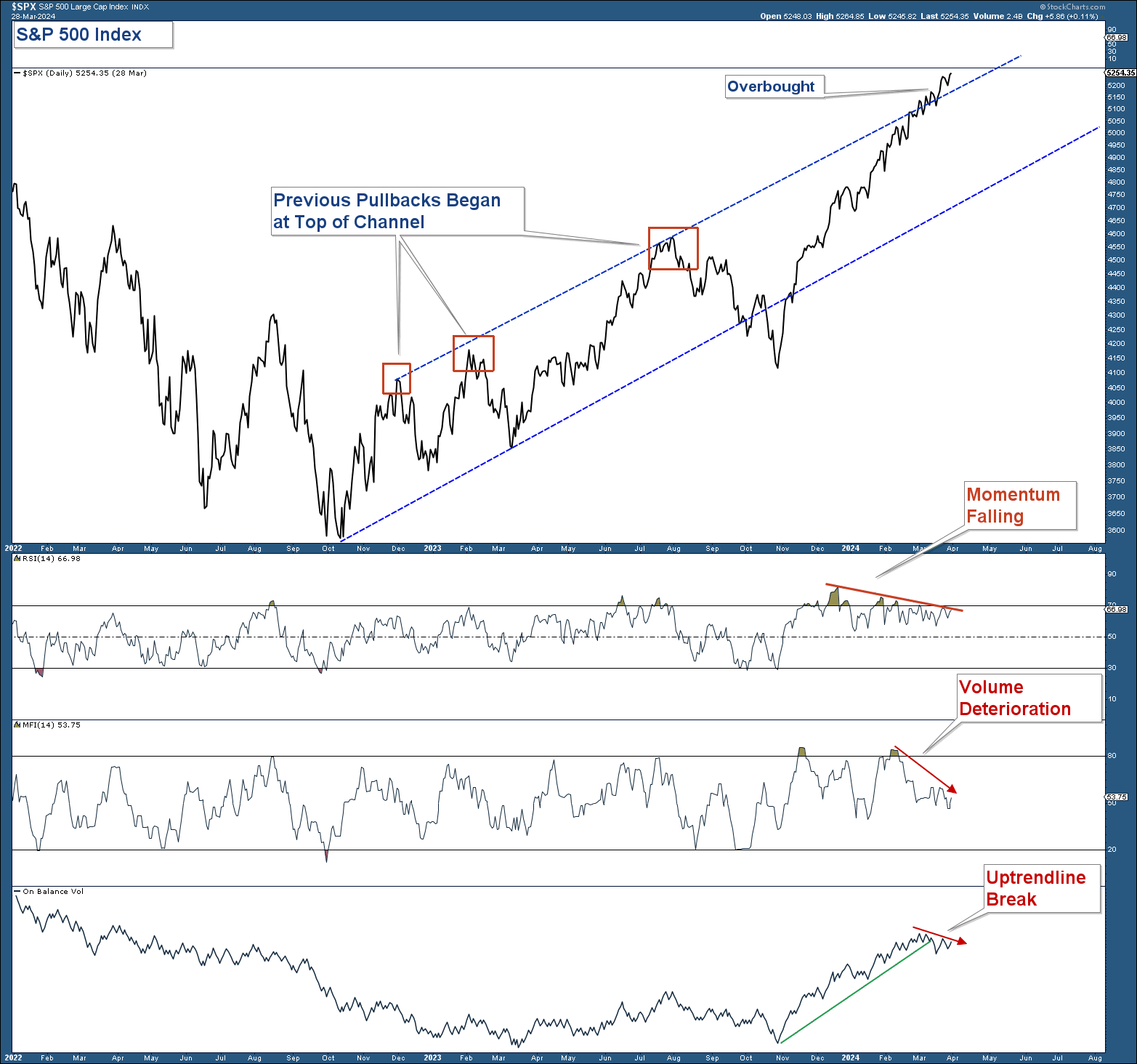
- In the short term, the stock market is overbought, momentum is waning, and volume indicators are falling. This is a warning (not a signal) that the market is ripe for a short-term pullback.
- Bond yields are no longer in a secular (20 – 40 year) bear market.
- Most investors believe the Fed will lower interest rates three times this year. Bond yields, commodities, and relative sector performance suggest that may not be as likely as most people believe.
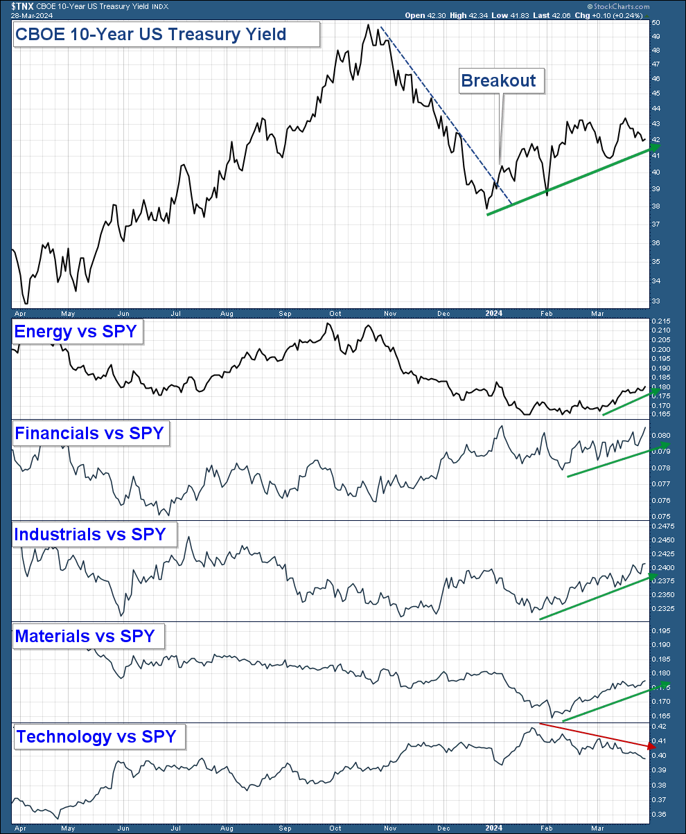
- Sectors/industry groups that tend to do well in a rising yield environment are outperforming. These sectors look strong on both a short and long-term basis.
- The S&P 500 has risen above the top of its rising price channel, signaling that the index is overbought.
- RSI has been falling over the past four months as the index has risen. Waning momentum suggests increased odds of a short-term pullback.
- Both volume indicators have recently fallen suggesting volume is not confirming the market’s recent advance.
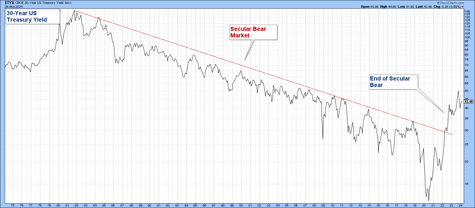
- From 1981 through 2021 bond yields steadily declined (secular bear market). Lower yields provided a tailwind for the economy and stocks.
- Bond yields advanced strongly above their downtrend line signaling an end to the secular bond yield bear.
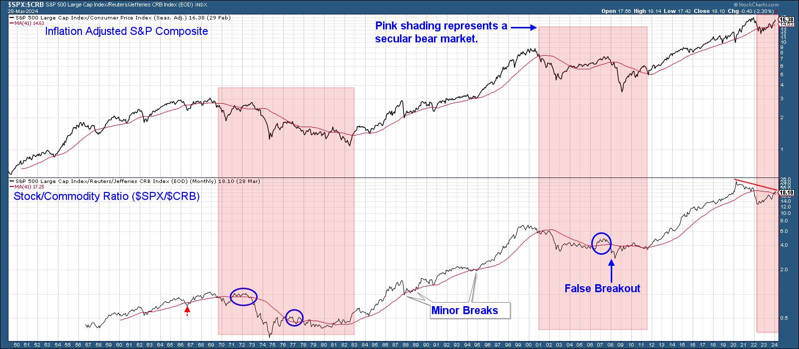
- The red-shaded areas are those periods where stocks underperformed commodities as determined by the relative strength line trending below its moving average.
- Commodity outperformance tends to last for long periods.
- The periods where commodities outperformed coincided with secular bear stock markets.
- In early 2022 the relative strength line decisively fell below its moving average signalling the outperformance of commodities over stocks.
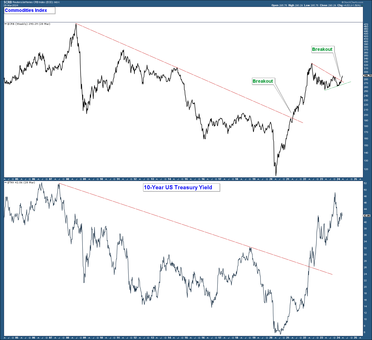
- The CRB Index advanced above its downtrend line about a year ahead of the 10-year US Treasury Yield breaking above its downtrend line.
- The CRB peaked in June 2022 after a strong advance. Since then the index has pulled back and now looks like it is breaking out of a consolidation pattern.
- Treasury yields peaked in October 2023 and fell strongly after inflationary data receded and investors became more confident of the Fed lowering rates.
- Yields bottomed in December and have been advancing for the past three months.
- Sectors that tend to do well in an inflationary environment (Energy, Financials, Industrials, and Materials) have all been outperforming the market recently confirming the move higher in bond yields.
- Technology is a sector that does not typically do well in a rising yield environment. Notice how the relative strength line has fallen recently confirming the headwind of higher yields.
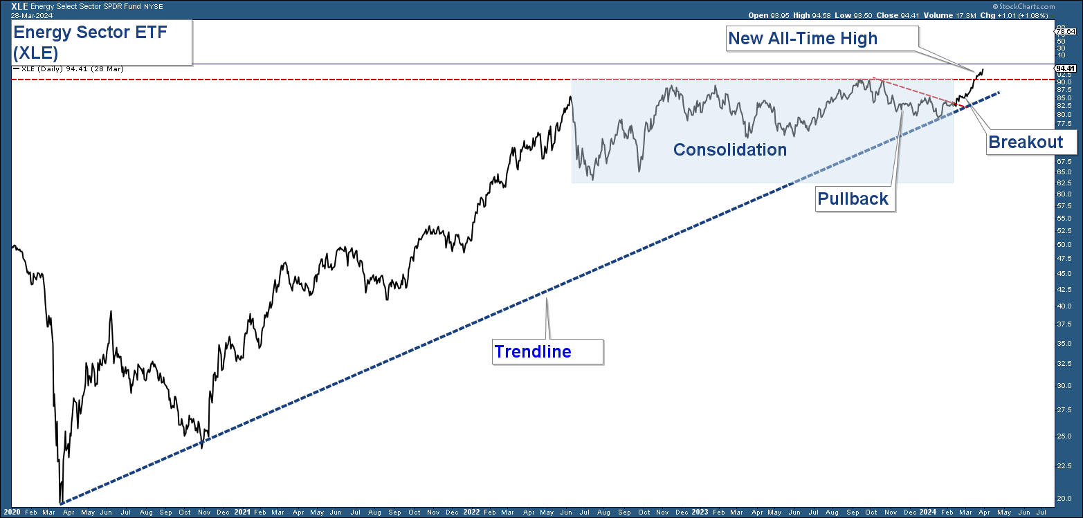
- Energy has been advancing since early 2020.
- After a strong advance, Energy has consolidated sideways since mid-2022.
- After pulling back recently, Energy has broken out to new all-time highs.
S&P 500 Long-Term
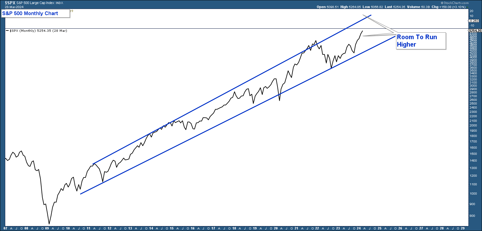
As mentioned in last month’s newsletter, the current bull market that began in the first half of 2009, has advanced within a price channel (see chart below). When the S&P 500 has risen to the top of the channel it’s usually a signal that the market is longer-term overbought and ripe for a size able pullback. You can see that the index still has some room to run before reaching that level.
S&P 500 Short-Term
Below is a daily chart of the S&P 500 in the top panel. In the lower panels are RSI (a momentum indicator), MFI (volume indicator), and On Balance Volume (volume indicator). Here are my takeaways:
Bond Yields
Inflation vs Deflation
Below is a long-term chart of the 30-year US Treasury Yield. Here are my takeaways.
Commodity Strength
A Long-Term View
Commodity prices are highly correlated with bond yields. Thus, if bond yields are poised to advance over the long term you would expect commodities to perform relatively well. In the chart below is the Inflation Adjusted S&P 500 Composite Index in the top panel and a relative strength chart of the S&P 500 Index relative to the Commodity Index in the lower panel. Here are my takeaways.
Commodity Strength Confirms Higher Yields And Inflation
A Short-Term View
In the chart below is the CRB (Commodity) Index in the upper panel and the 10-Year US Treasury Yield in the lower panel. Here are my takeaways.
Sectors Strength Confirms Inflationary Environment
Below is a one-year chart of the 10-year US Treasury Yield in the top panel. In the lower panels are relative strength charts of a select group of sectors relative to the S&P 500 ETF (SPY). Here are my takeaways.
Energy
Energy typically performs well in an inflationary environment. Below is a 4-year chart of the Energy Sector (NYSE:XLE). Here are my takeaways.
