Technically Speaking For July 17Summary
- Big tech is in Congress' regulatory cross hairs.
- Big cities are outgrowing small cities.
- The longer-term charts argue that the markets are topping in either the short or long-term.
Big tech is definitely in the regulatory spotlight. The EU is investigating Amazon (NASDAQ:AMZN) for potentially anti-competitive behavior. The FTC fined Facebook (NASDAQ:FB) $5 billion for network privacy violations. And yesterday, Congress hosted three separate hearings targeting big tech with the most important focusing on anti-trust issues (emphasis added):
House lawmakers grilled executives from Amazon, Apple (NASDAQ:AAPL), Facebook and Google (NASDAQ:GOOGL) in a hearing Tuesday as part of their wide-ranging investigation into big tech companies and the threats they may pose to competition.
.....
The internet has become “increasingly concentrated, less open, and growingly hostile to innovation and entrepreneurship,” adding to a perceived “kill zone” related to the tech giants that prevents new companies from competing, said Rep. David Cicilline (D-R.I.), chairman of the Subcommittee on Antitrust, Commercial and Administrative Law.
So far, tech has only been fined, which the individual companies probably consider a cost of doing business. But anti-trust allows Congress and the federal government to potentially argue for more regulation and potentially breaking-up the companies. While we're still a long way from that potential outcome, it's happened before.
Big cities are the clear winners in the new economy. The NY Times has a fascinating article on the US' urban growth trend, which is decisively skewed towards large areas.
What happened? The cheaper labor that smaller metropolitan areas offered, attracting investment when factories ruled, no longer has much pull. The companies now leading the economy gravitate toward big cities where they can find clusters of highly educated workers and attract more. Amenities — bars, yoga studios, restaurants — follow. So does venture capital. Housing costs rise, making it tougher for workers in lower-paying jobs to stay.
The cleanest way to read this trend is that post-recession growth has been very lumpy: some areas are in better shape than they were before the recession. But there are numerous areas that still haven't fully recovered and probably never will. This divergence of growth has very important ramifications for policy-making.
Why should we be more concerned about weaker international economic numbers? Because the US more inter-linked with other economies than ever before (emphasis added):
International trade’s share of U.S. GDP has shot upward to nearly 30% last year, up from 18% in 1980, and financial linkages have also skyrocketed. Overseas corporate income as a share of GDP has nearly doubled to over 20% from about 10% in 1980.
These are very direct linkages. More indirect transmissions can occur through financial markets (equities, bond, currencies, and commodities), sentiment (weaker international markets can depress corporate sentiment, lowering investment), and migration. However, there is no disputing that global economies are now more inter-related.
Let's take a look at today's performance table:
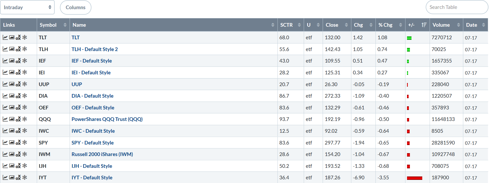
When the Treasury market leads the way higher, you know it's a bad day. The long-end of the Treasury curve led the markets followed by the belly of the curve. Large-caps were down modestly while smaller-caps had larger losses.
Let's check in on the longer-term charts, starting with the daily data combined with information on the percentage of issues above the 200 and 50-day EMAs.
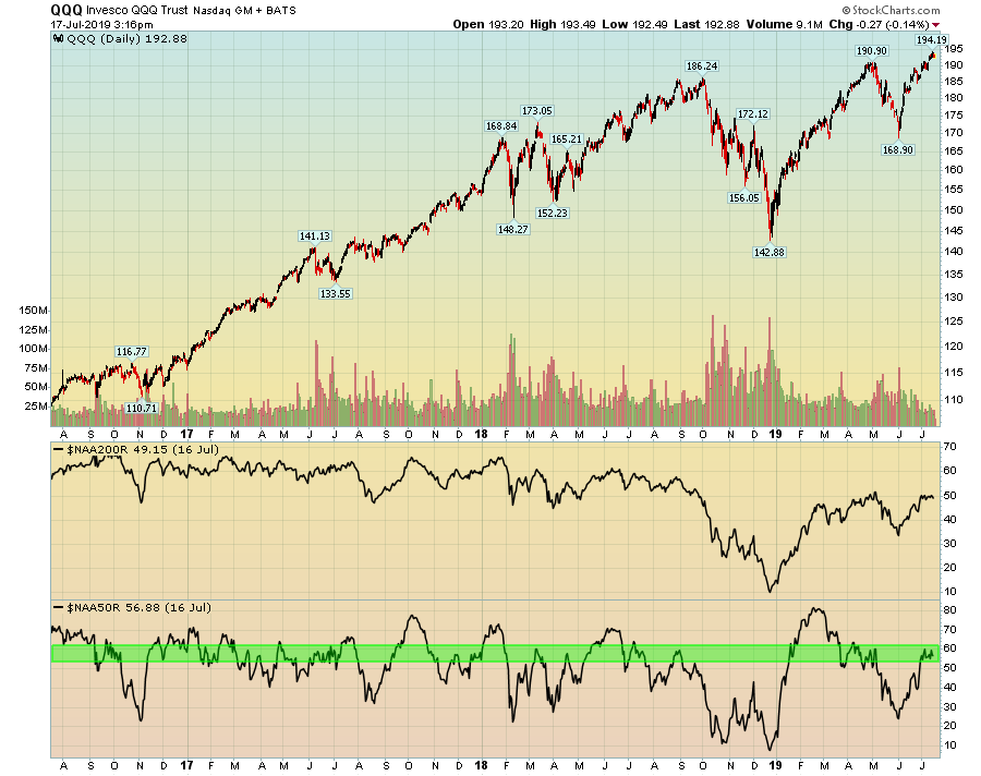
On the QQQ, the number of stocks above the 200-day EMA (the box second from the bottom) has been trending lower during 2018. However, the number of stocks above their respective 50-day EMAs (bottom box) is at levels seen at highs during 2017 and 2018. This tells us that either the number of issues above the 200-day EMA has to increase or we're more than likely near a shorter-term top.
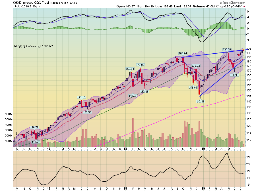
The weekly QQQ chart still appears to be forming a rising wedge pattern, which is a topping formation. Also note the declining volume, which is also a classic topping development.
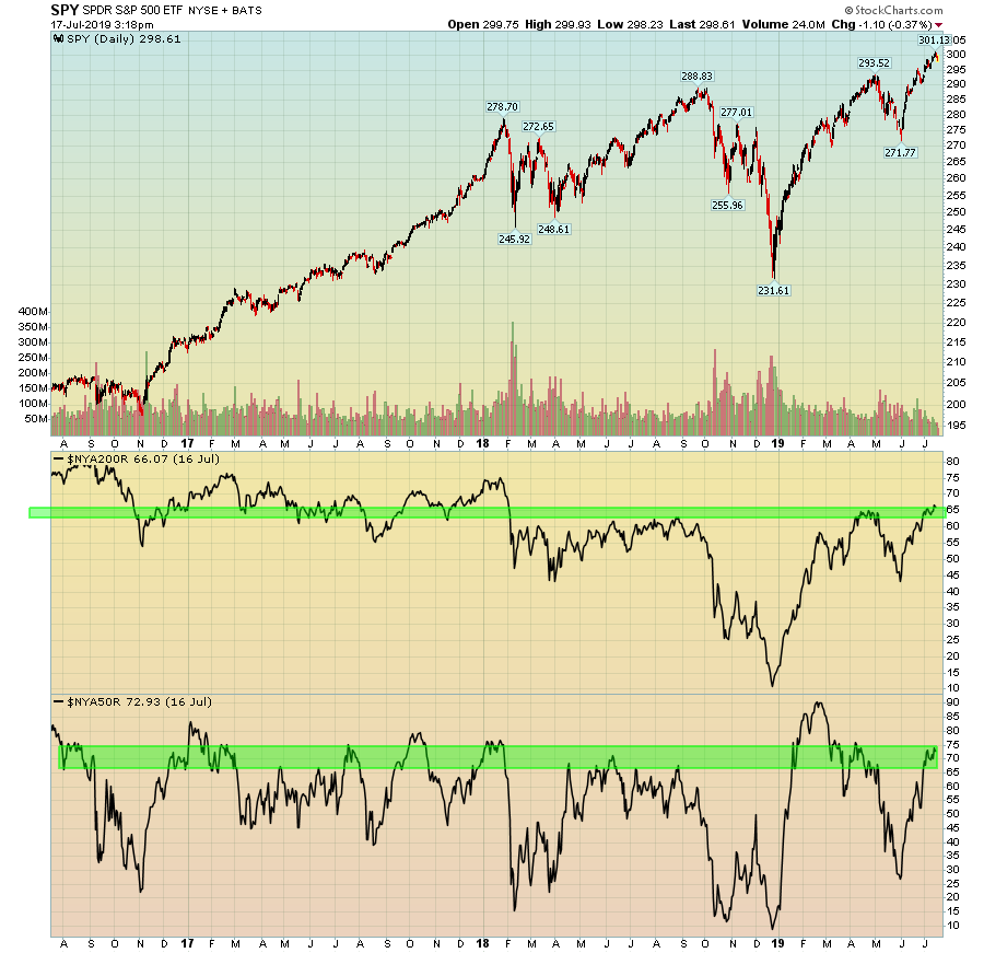
The SPY's percent of issues above 200 has topped in the mid-60s since the beginning of 2018 (panel second from the bottom). That doesn't mean it can't go higher, however. The percent of stocks above the 50-day EMA is approaching highs from the last three years.
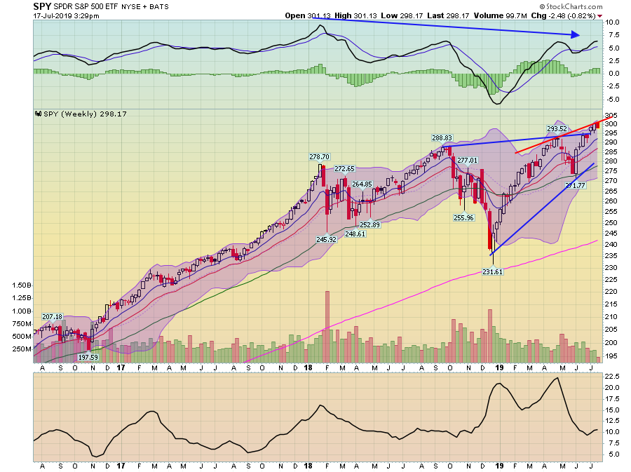
Notice the blue lines on the SPY chart which form a rising wedge pattern. Prices broke through the top line over the last few weeks but are now potentially linked by a second trendline. Like the QQQ, this chart also has declining volume.
The longer-term charts are all arguing that the markets are topping.
