In yesterday’s post on investor psychology, we discussed the issue of confirmation bias. To wit:
“As individuals, we tend to seek out information that conforms to our current beliefs. For instance, if one believes that the stock market is going to rise, they tend to heavily rely on news and information from sources that support that position. Confirmation bias is a primary driver of the psychological investing cycle.
To confront this bias, investors must seek data and research that they may not agree with. Confirming your bias may be comforting, but challenging your bias with different points of view will potentially have two valuable outcomes.
First, it may get you to rethink some key aspects of your bias, which in turn may result in modification, or even a complete change, of your view. Or, it may actually increase the confidence level in your view.”
A good example of this was a recent tweet, shown below, which stated the cumulative advance/decline (A/D) line of the NYSE Composite Index “bodes quite well for continued equity strength.” The argument is based on the lower graph which shows that the upward momentum in the cumulative A/D line has not shown any retreat despite the price consolidation of the S&P 500 (upper graph) since late January. The Tweet also points out, using red shaded bars, that the current behavior of the A/D line is not similar to how it behaved before the last three major drawdowns.
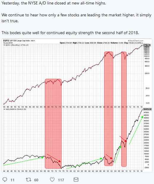
Before we analyze the tweet and graph, we think it may be helpful to provide a brief explanation of the A/D line.
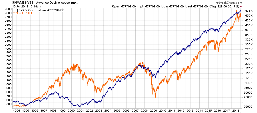
“The A/D line is simply the number of advancing stocks less the number of declining stocks for a given day. The daily A/D is typically positive on up days and negative on down days. The graph above showing the cumulative A/D is simply each daily A/D figure added to the net sum of the A/D’s that preceded it. Importantly, there are occasions when the A/D line falls (more stocks down than up) but the market continues to rise. This kind of divergence can serve as a warning of a potential market correction. Conversely, when the market is trending lower and the A/D line begins to rise, it can signal a bottom and eventual turn higher.”
Here is the chart of the Cumulative Advance/Decline Line versus the S&P 500 index for a bit clearer understanding.
While technical analysis is a great way for investors to gauge market sentiment, and hopefully make more informed investment decisions, there are thousands of technical studies which can easily be turned to promote a bullish or bearish narrative to support one’s market view.
However, this is where technical studies should be carefully analyzed to ensure we are not “feeding” our own “confirmation bias.”
Before crunching numbers and looking at historical instances, we must first ask a basic question; what stocks does the NYSE Composite Index (NYA) measure? The NYA is comprised of securities that trade on the NYSE. With a little research, you will find this is not just the equity of corporations such as IBM (NYSE:IBM), Google (NASDAQ:GOOGL) or McDonald’s Corporation (NYSE:MCD).
Per Paul Desmond, President of the Lowry Research Corporation:
“Since about 1990 the NYSE has allowed securities other than domestic common stocks to the trade on the NYSE. These include closed-end funds (that match the trends of bonds, not stocks) plus a proliferation of interest (rate) sensitive non-convertible preferred stocks and REITs (which mimic the movements of the bond market, rather than the stock market) plus ADRs of foreign stocks (that do not necessarily follow the trends of domestic common stocks).”
Based on his research, as of 2013, non-operating companies account for 52% of the issues trading on the NYA.
Simply put, the index, and by default, the daily or cumulative A/D of the index, does not provide a clear picture of the breadth of equities. In fact, one could argue it is every bit as much an indicator of the breadth of the fixed income markets.
Because of this composition problem we chose to analyze A/D data for the S&P 500. While the S&P 500 does include some REITs and possibly other non-operating companies, we believe that percentage to be significantly smaller than the NYA and therefore provides a clearer picture of equity breadth.
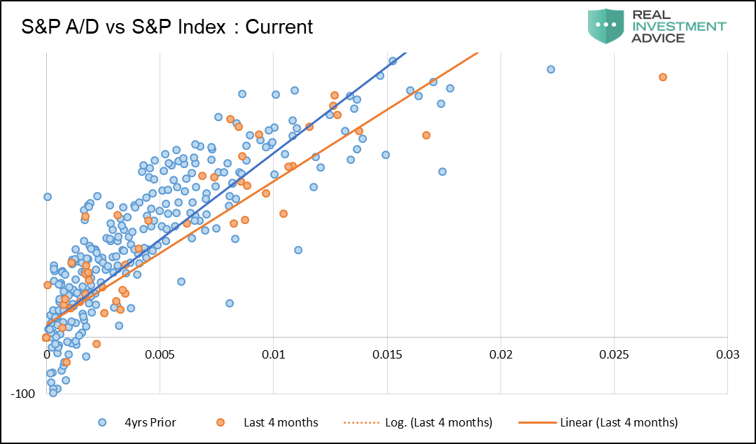
We take a different approach than the graph shown above. We plotted daily instances of the change in the S&P 500 and the associated net A/D for that day. Further, we only included instances when the S&P 500 was higher on the day. In a strong bull market, one would expect a larger than normal Net A/D on up days.
The graphs below isolate the daily instances occurring four months prior to the market peaks of 2000 and 2007 to the longer term trend occurring two years prior to each peak. Given the large number of data points, we make trend spotting easier by adding darker trend lines. The steeper the slope of the trend line, the higher the net A/D figure per percentage gain, and therefore the better the breadth. Conversely, a flatter line denotes not as many net stocks advanced on days the market rose and subsequently breadth is worse.
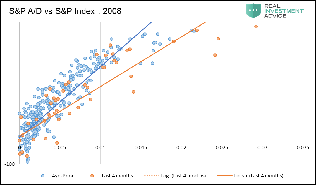
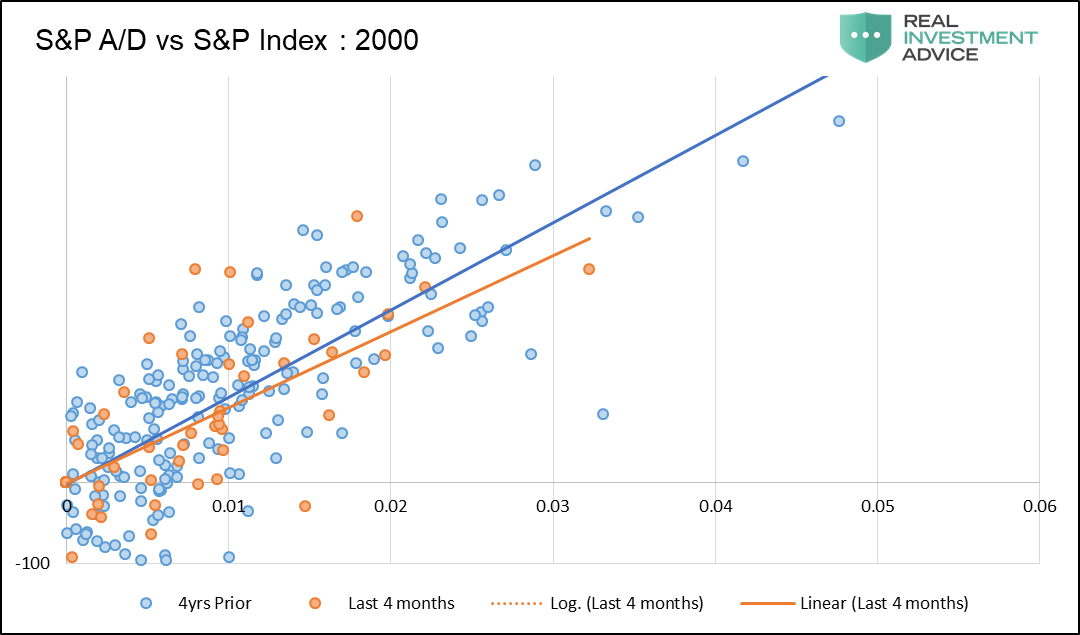
In the four months leading the market peaks of 2007 and 2000 the recent A/D trend line (orange) flattened versus the slope of the prior two years.
The graph below showing current data tells a similar story.
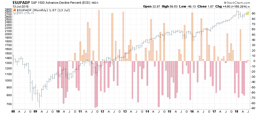
Here is another take on similar data. The chart below is the S&P 1500 Advance-Decline percent. The difference here is that instead of just the 500-largest capitalization companies in the S&P 500, it also includes 600 small-capitalization and 400 mid-capitalization companies as well. This analysis provides a much broader sense of the markets true underlying strength.
Again, we see that with roughly an equal split in participation, the overall strength of the market heading into the last half of the year may not be as robust as currently perceived.
While the “bulls” tend to take the data at face value, and extrapolate current trends into the future, investors should also consider the opposing view which suggests the outlook for the next few months is inconclusive at best.
Battling “confirmation bias” is a difficult challenge because it forces us to consider views we absolutely disagree with. However, it also leads us into making much better decisions, not only in our portfolios, but in life.
“One of the funny things about the stock market is that every time one person buys, another sells, and both think they are astute.” – William Feather
