Brief note this week as a lull between Christmas feasting and family time fun presents an opportunity to share what I reckon might be one of the most interesting charts of the year.
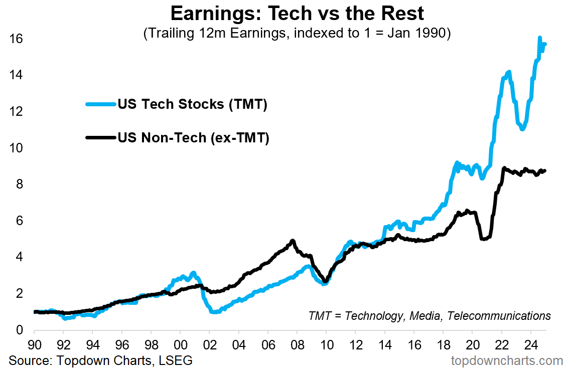
The blue line is probably no surprise — US tech stock prices have been powering ahead driven by a mix of hype and fundamentals (earnings).
We probably all know by now how much of the strength in the S&P 500 index has been driven by big tech, but this also carries across to earnings.
On the other hand, non-tech stock earnings have seen almost a 3-year period of stagnation. In real CPI adjusted terms it’s a full-on earnings recession (the below chart is in nominal terms). No wonder ex-tech have been lagging behind. And no wonder tech have been leading the charge.
But I’ll leave you with an open question before I get interrupted by little footsteps scurrying down the stairs — which of the lines in the chart below has the biggest scope to surprise? (up or down)
Key point: It’s a tale of both boom and bust in US corporate earnings.
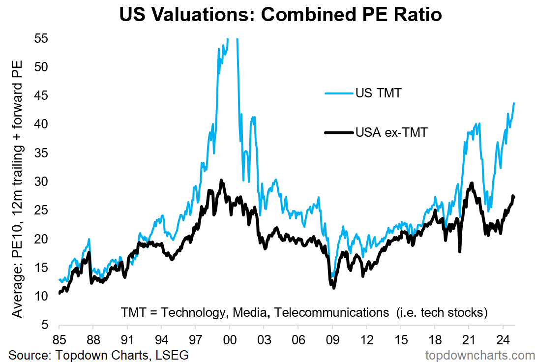
UPDATED: here’s an update to that Tech vs non-tech *valuations* chart — as you might guess from the chart above, tech stocks trade at a significant premium vs non-tech and vs history.
While some of this may well be justified given the extraordinary path of earnings, these things move in cycles.
Valuations in this context are more of a measure of confidence, and a barometer of speculative appetite — a guide point for where we are at in the market cycle. In this respect I would say we are at the overconfidence phase as folk extrapolate past trends infinitely into the future, spurred on by easy monetary/fiscal policy, and emboldened by a procession of bull markets. This is the part where price begins to overshoot against even the best of fundamentals.
