Source: Stock Charts (edited by Short Side of Long)
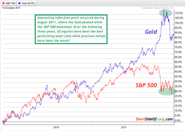
With only two weeks left in August 2014, I thought it was appropriate to revisit an interesting inflection point that occurred exactly three years ago. During August 2011, US default worries and the ongoing Eurozone Crisis sparked a panic sell off in the S&P 500 and many other stock markets around the world.
Interestingly, Gold acted as a safe haven at the time, moving in an opposite correlation to global equities (refer to Chart 1). As the mini-crisis played out by month's end, just about all traders were extremely bullish on Gold and overly bearish on stocks. It was back during those market conditions that I initially shorted Gold and later Silver as well, while calling a potential bottom in the stock market (sentiment posts here and here).
Side note: all the links go back to the old blog.
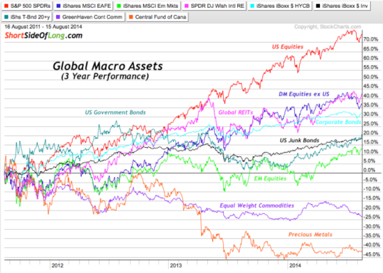
Chart 2: Over the last three years Precious Metals have under-performed

Source: Stock Charts (edited by Short Side of Long)
Three years have now passed and precious metals have dramatically under-performed, while US equities have been the best major performing asset class. In Chart 2 we can clearly see what a powerful bull market the S&P 500 has been in, posting gains of over 75% in the last three years. At the same time, the Central Fund of Canada ETF (ARCA:CEF) which is 50% Gold and 50% Silver has pretty much halved in value.
Obviously, traders who focus on shorter term horizons and follow trends will not give this post all that much attention. However, investors who tend to chase out-of- favour assets in a contrarian manner and purchase value at cheaper prices as longer term bets, should be looking at Chart 2 with an understanding that sooner rather than later, US equities will stop outperforming the overall global macro space. At that point, the question will arise as to where would some of the money flow towards? Which asset classes might next be favoured by liquidity?
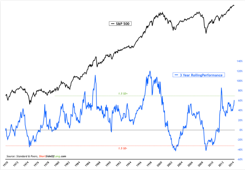
Chart 3: Historically, the S&P 500 rarely offers better returns over 3 years…

Source: Short Side of Long
When we look at the 3 year holding investment history over the last five decades for both S&P 500 and Gold, I could come to a plethora of observations. I’m sure you could come up with many more. Right now, I will focus on what some investors are currently saying as the conventional wisdom.
Stock bulls, and there are an abundance of them, would claim that the US equity market has broken out to new highs, indicating the start of a new secular bull market such as the one in the 1980s. These same investors also claim that Gold’s magic ten year period has now ended and the best case scenario for the yellow metal is to move sideways (like it did during 1980s and 1990s).
While I do not share the same enthusiasm toward stocks and pessimism toward Gold, I do admit that these investors could very easily be correct. Nevertheless, to them I say that rarely does the S&P 500 offer better 3 year rolling returns then we have witnessed in the last few years; and at the same time rarely does the price of Gold offer such awful returns as we have witnessed in that same period.
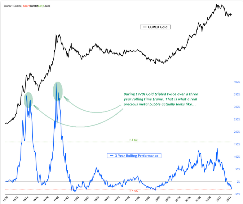
Chart 4: …while Gold rarely becomes more oversold then it currently is

Source: Short Side of Long
To play devil’s advocate, I could just as easily make a case that according to various valuation metrics, US stocks are currently very overvalued. Certain metrics even argue that future projected returns over the next several years and even up to a decade from now could very well be flat.
With that in mind, one could also make a strong case that the current sell-off in Gold usually does not get too much worse relative to its historical periods of underperformance. In other words, while it is possible for price to go lower, the downside should be rather limited as this asset is already extremely oversold.
I also do not see a reason why one could not entertain the idea that the recent Gold sell-off is just a correction within a secular bull market, with higher highs and higher lows still intact. If we study Chart 4 very closely, we should be able to notice that during the 1970s, Gold tripled in value twice over a three year rolling time frame. Now that is what a true bubble looks like! Even though Gold bears have called the recent 2011 peak a bubble, according to this historical chart it would not qualify as one.

