Red Flags Coming From This Breadth Indicator?Volume-Based Indicator Still Constructive
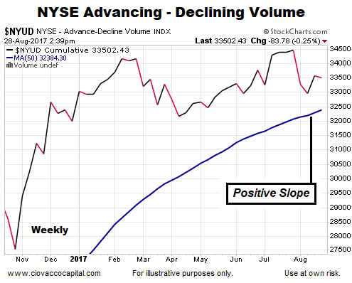
The chart below shows up/down volume for the NYSE Composite Stock Index, along with its 50-week moving average (thick blue line). The chart is dated August 28, 2017.

Some Historical Perspective
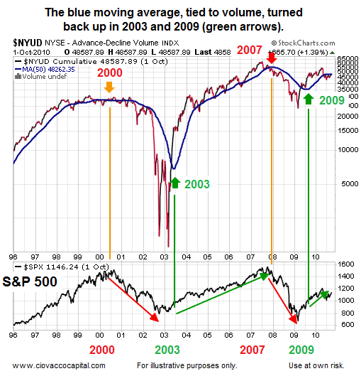
Notice how all-things-being equal, the probability of bad things happening increases when the 50-week moving average is flat or negative (see orange and red arrows below). Conversely, the probability of good things happening increases when the 50-week moving average turns back up in a bullish manner (see green arrows below). The S&P 500 is shown at the bottom of the image below for reference purposes.

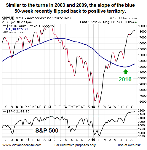
Trend Flipped In Favor Of The Bulls In 2016
In simplified terms, volume patterns shifted from favoring declining issues in early 2016 to favoring rising issues in the second half of 2016 (see green arrow below). The constructive look of the chart is still in place as of August 28, 2017.

Long-Term Stock Outlook
This week’s video updates numerous long-term signals covered over the past year. The video covers facts rather than opinions or fears of what may or may not happen in the future.
A Foolproof Signal?
Since there is no such thing as a foolproof indicator or signal in the financial markets, the recent bullish shift in up/down volume assists us with probabilities. As long as the slope of the 50-week remains positive, the odds of good things happening will be higher.
Long-Term Means Long-Term
These facts relate to longer-term outcomes, which means weeks, months and years. For this data to be used effectively, we must have realistic expectations about normal volatility within the context of a rising trend.
