- The US stock market appears to be in transition toward a significant top
- Several key market top indicators are flashing caution (but they are still mixed)
- Greater selectivity toward higher quality and larger-capitalization is in order
- Above average cash levels may be appropriate
The stock market is in a tender condition. Caution and selectivity, and possibly reduced allocation to equities with above average cash, is a reasonable approach for investors, particularly those who have accumulated most of the assets they are going to accumulate in their lifetime.
Investors who are relying, or may soon rely on, their portfolio to support lifestyle, and who do not have excess assets, have reasons to err on the side of caution; because portfolio value declines during fixed dollar withdrawals shorten the “life expectancy” of the portfolio. It is important for those investors that their portfolio live at least as long as they do – to avoid the “risk of ruin”.
Market timing is not a good idea for almost everybody. It more often than not results in long-term under-performance, as a result of getting out late and re-entering late – thus leaving performance on the table. Most peaks and troughs are too close together in price for most people to extract value by timing. However, in the case of infrequent major marker reversals, exiting and re-entering, even if a bit late, can result in outperformance (the DotCom crash and the 2008 crash being recent examples).
We certainly face a market decline of some sort sooner than later, but the question is whether it will be garden variety (stick to your allocation) or major (get out of the way). So what are the typical signs of a developing major market top? A major top tends to develop when SEVERAL of the 12 factors listed below manifest themselves and CONFIRM each other in trends within broad market indexes. The Treasury yield curve indicators are perhaps the most powerful and most important of the indicators.
Treasury Yield Curve
- 2-Year Treasury Yield / 10-Year Treasury Yield Ratio
- 3-Month Treasury Yield / 10-Year Treasury Yield Ratio
Earnings
- Reported Earnings Direction
- Forward Earnings Estimates Direction
Market Breadth
- Cumulative Net New Highs (new highs less new lows)
- Cumulative Net Advances (advanced less declines)
- Cumulative Net Advancing Volume (advancing volume less declining volume)
- % Issues Above 200-Day Average
- % Issues With Bullish Chart Patterns
Simple Chart Conditions
- Index Price Position vs 200-Day Average
- 200-Day Average Recent Direction
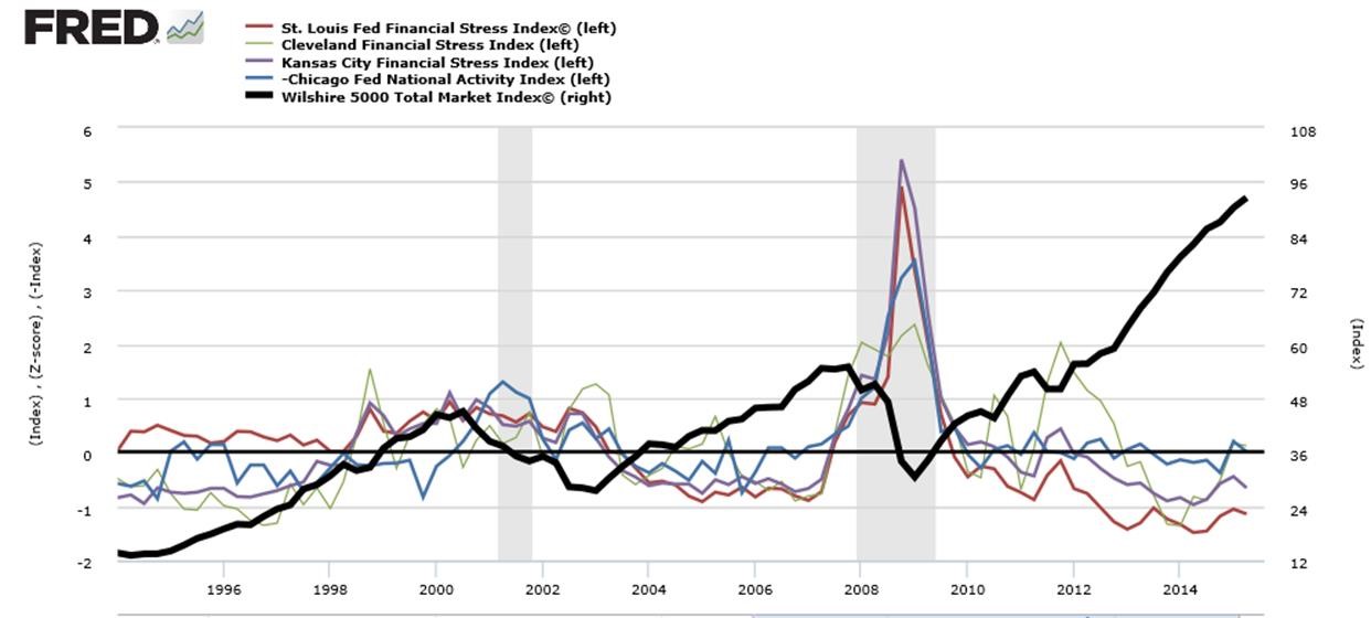
Federal Reserve Multi-Factor Indexes
- Z-Scores vs Total Stock Market
These factors do not call exact tops, but as more of them blink caution, and as their state becomes more severe or prolonged, the major top becomes closer or more likely.
Of course, big macro surprises and “fat tail” events can preempt all of that and disrupt a market in a major way. There are no quantitative methods to anticipate those events. Valuation in and of itself probably can’t be shown to predict tops — valuation can go much higher and much longer than ever anticipated.
These 12 factors, however, provide a pretty good warning or confirmation of a major trend reversal. Here what those indicators are saying now – not calling a top, but more substantial reasons for caution.
(Click Images To Enlarge)
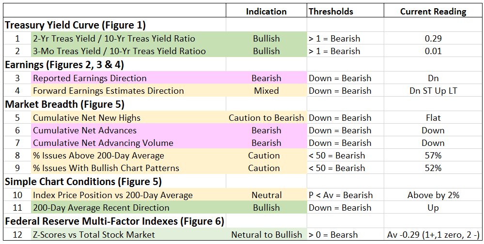
FIGURE 1:
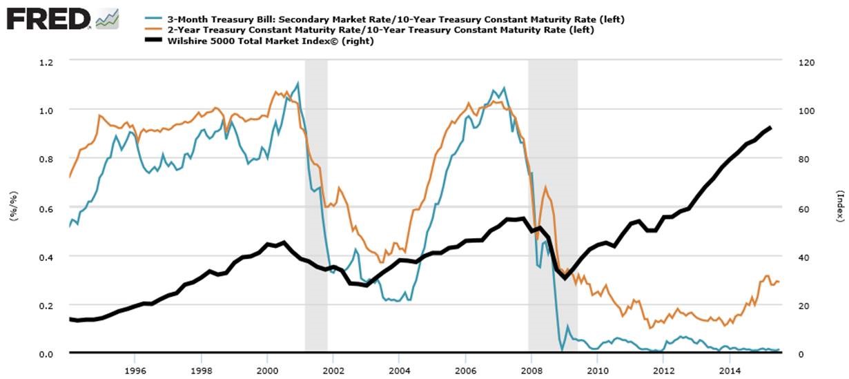
FIGURE 2:
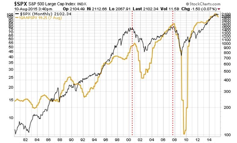
FIGURE 3:
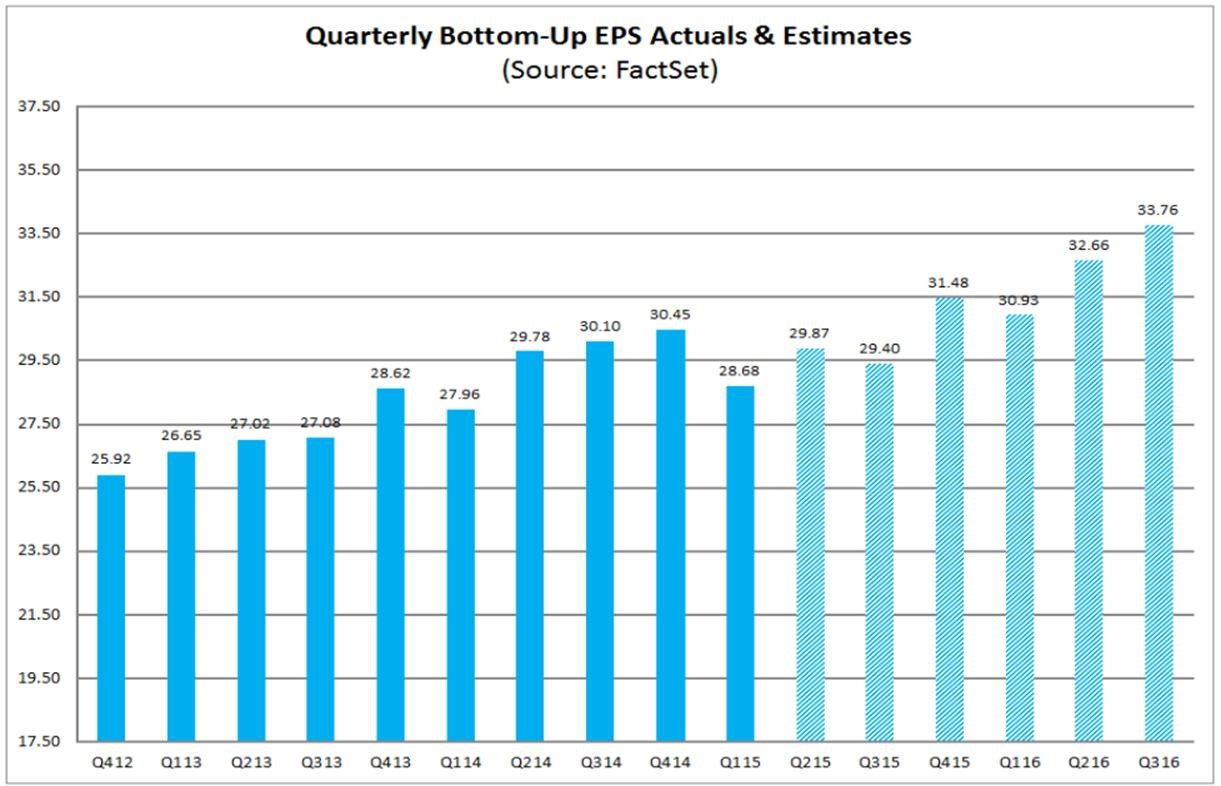
FIGURE 4:
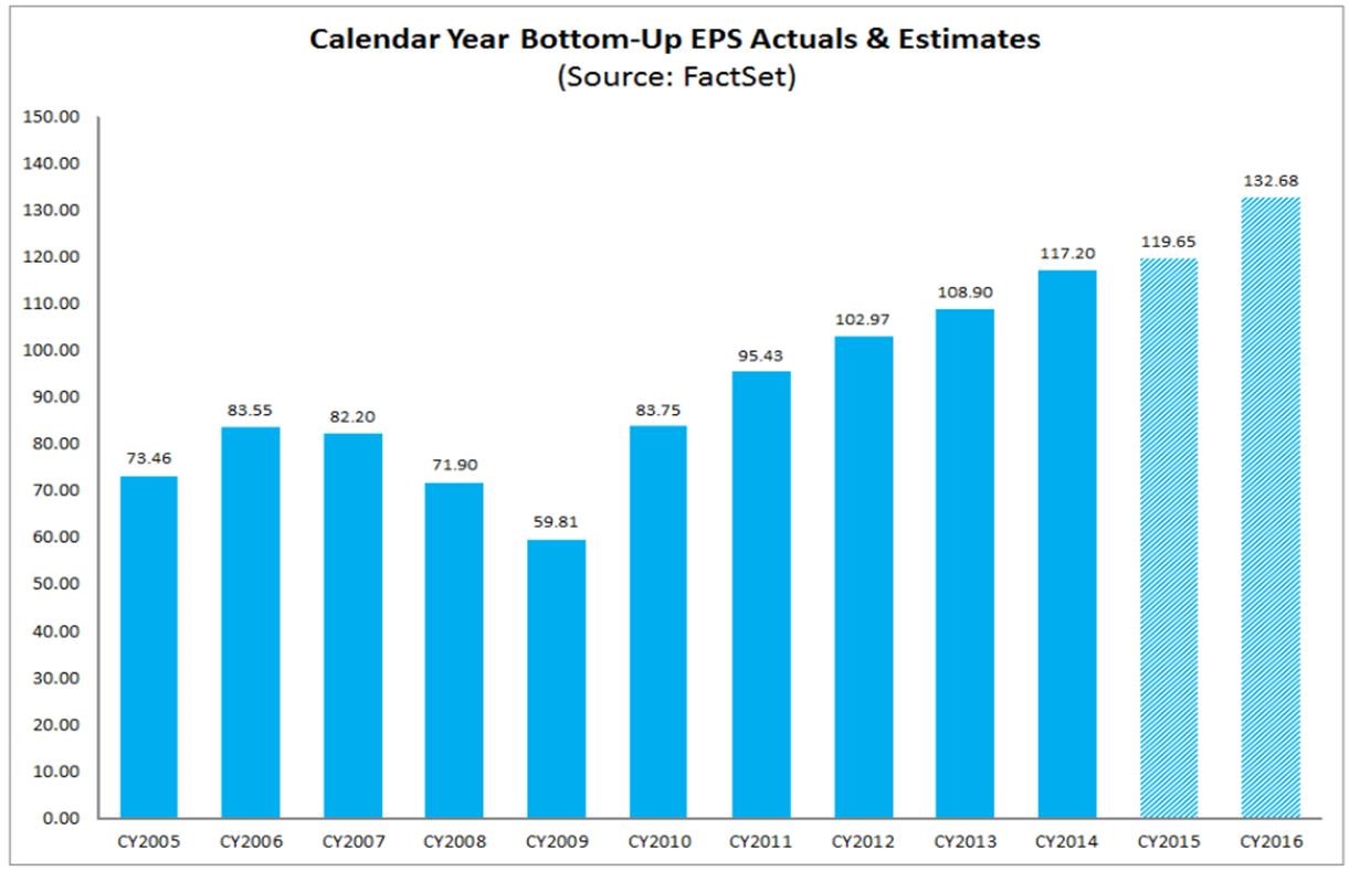
FIGURE 5:
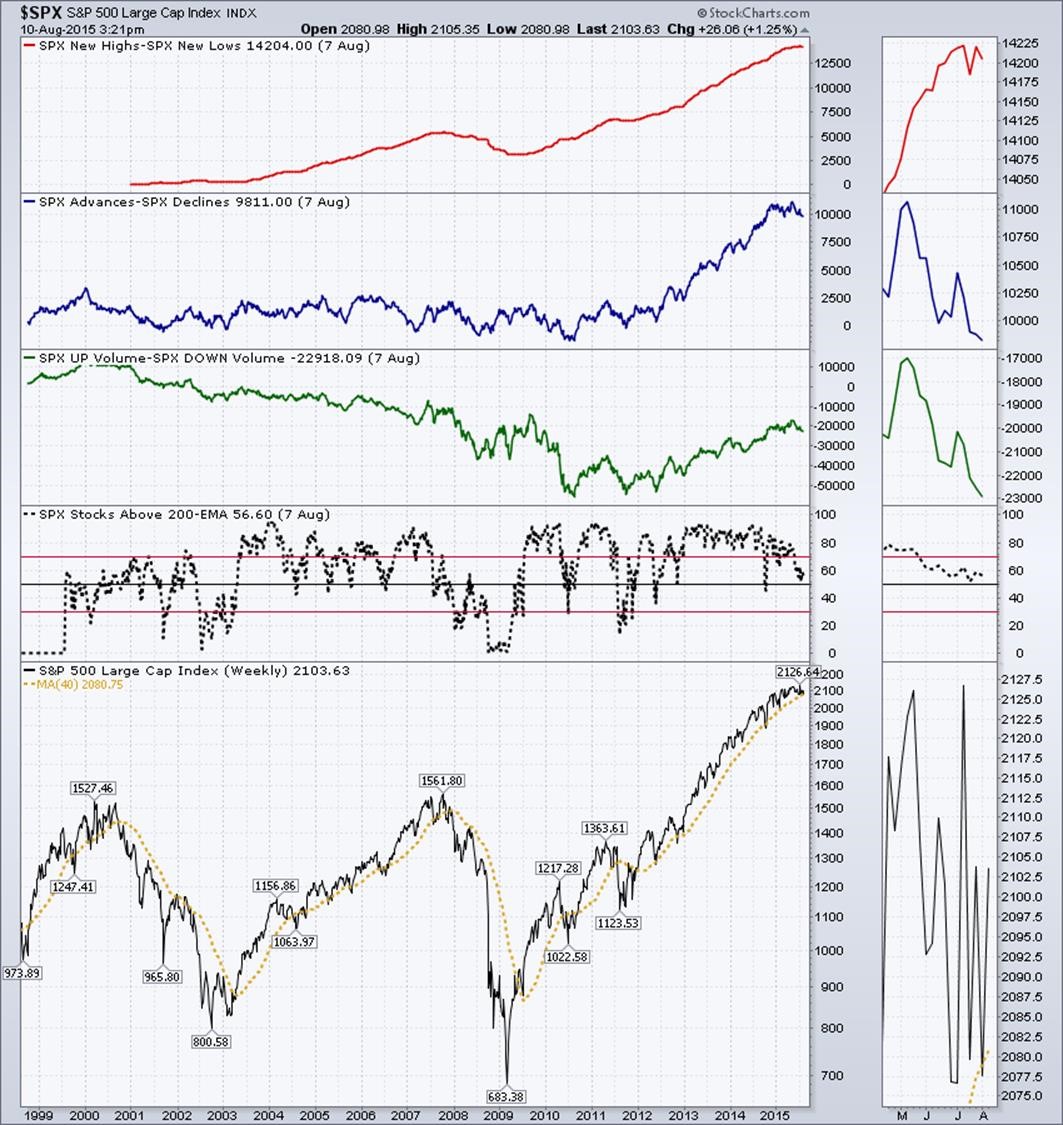
FIGURE 6:
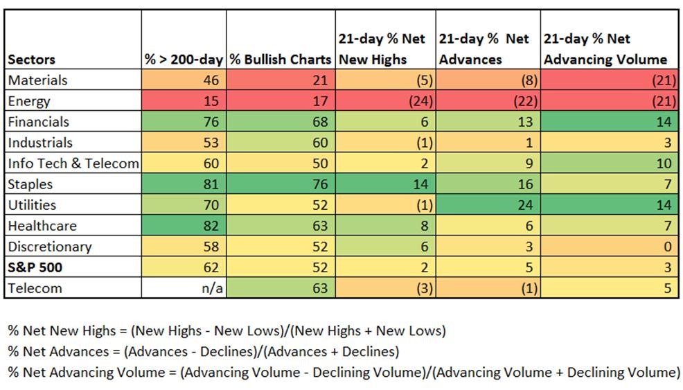
Let’s look at the sectors of the S&P 500, breadth indicators similar to those we used for the S&P 500 overall.
Materials and Energy are in the worst shape. Financials, Staples, Utilities and Healthcare are in the best shape.
FIGURE 7:
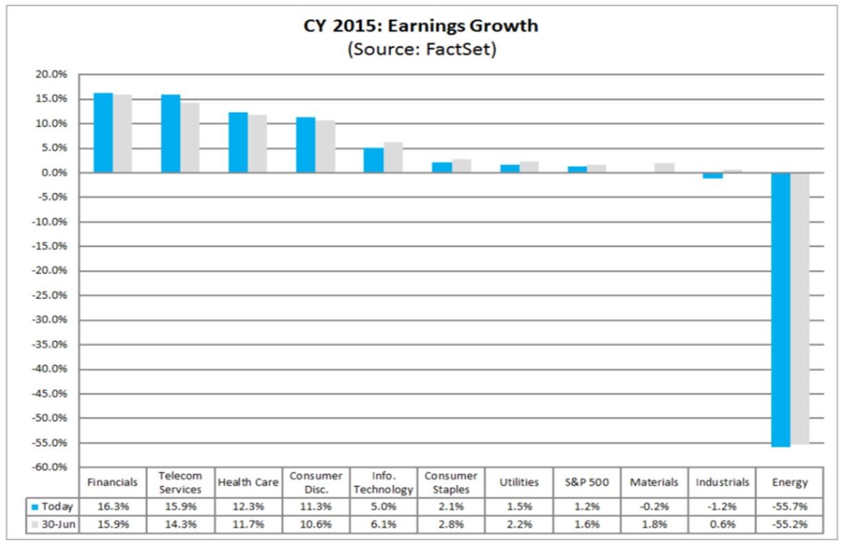
Here are the 2105 calendar year earnings growth rate estimates for each sector and the S&P 500 index:
FIGURE 8:
And, here are the estimates for 2016:
FIGURE 9:
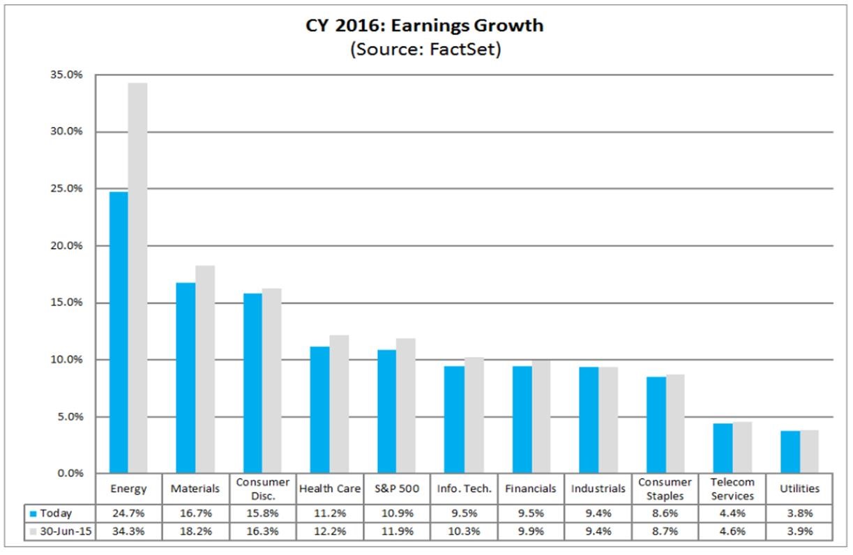
The expected reversal from negative to positive growth, particularly for energy and materials, is the major notation between 2015 and 2016.
Just a quick note about possible rising interest rates:
These charts show the reaction of the S&P 500 to the last three Fed Fund increase cycles. The reaction is not consistent, and shows stocks marching to more than one drummer, not just the Fed rates. Overall, the stock market went its own way, and tolerated the rising Fed Funds rate fairly well over time (up to the point that if forced the yield curve to flatten as we saw at the beginning of this report.
FIGURE 10:

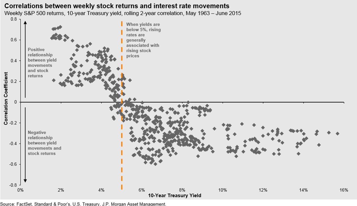
For intermediate-term interest rates as expressed in the 10-year bond, stocks showed positive correlation to interest rates (meaning stock prices rose as interest rates rose) up to a 10-year yield of about 5%. Above 5%, stocks began to have a negative correlations (higher interest rates tended to force stocks down). We are in the good part of that chart now.
FIGURE 11:
In terms of 5-year US stock market return expectations, this chart from JP Morgan Asset Management (vertical red line and current forward P/E added by us) indicates that we should expect a lower pattern of return over the next five years than we have experienced over the las 5 or so years. We had lower P/E ratios in years past, and this shows that the higher the current forward P/E, the lower the 5 year returns that are realized.
FIGURE 12:
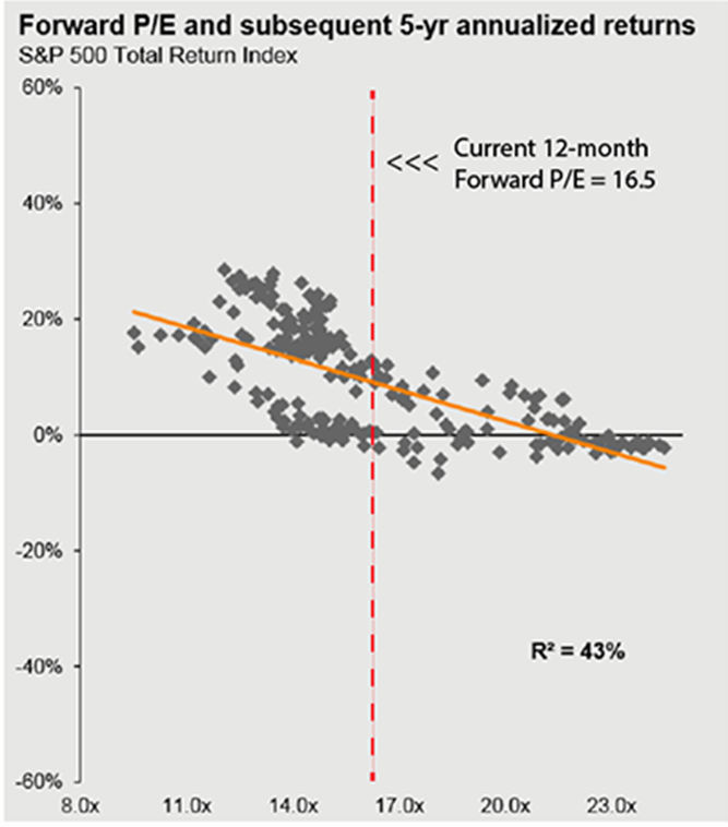
JP Morgan points out that the data is from 1990 to the present, and that the R-squared number indicates the portion of 5-year future returns that were explained by the forward P/E (43%) – so there are other factors that explain 57% of the future returns.
SUMMARY
Overall, it is hard to make a strong Bullish or strong Bearish case at the moment. However, in the net I believe a cautious approach is appropriate and prudent at this time; with above average cash allocation, and an emphasis on large-cap, established, high quality stocks with strong business models and enduring prospects; and/or domestic large-cap fund core positions with selected domestic sector or industrial satellite positions.
There is no question that such caution could have opportunity costs, but for those at or near retirement the relative risk and return balance suggests less than a full equity allocation.
As is always the case, individual suitability varies. It is important to manage to your objectives, limits and circumstances, not to a hypothetical investor. Think about how these market status data relate to you and your specific portfolio.
Credits:
Figures 1 and 6 are from the Federal Reserve Bank of St Louis
Figures 3, 4, 8 and 9 are from FactSet Earnings Insight
Figures 10,11 and 12 are from JP Morgan Asset Management
Figures 2 and 5 are generated with StockCharts.com
While many US large-cap stocks are effectively relevant to this post, three specifically relevant as S&P 500 funds are: SPY, IVV and VFINX.
Similarly, various US large-cap sector funds are effectively relevant to this post, but these are specifically relevant as S&P 500 sector ETFs: XLB, XLE, XLF, XLI, XLK, XLP, XLU, XLV, XLY, XTL
