We often hear about what's happening with the S&P 500; for the smarter people you hear the S&P 500 is up or down X%, for the not so smart ones you hear the S&P 500 is up or down XXX points (usually with some added hyperbole, etc). But what's often not talked about as much is what's going on below the surface. Not down to stock level, but at the sector level. This article sheds light on trends in sector performance and weightings that have meaningful implications for investors.
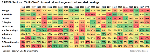
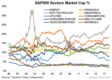
Aside from the observations around winning vs losing streaks on the sectoral performance rankings (it's rare to see a certain sector at the top or bottom of the performance ranking table for more than a year or two—contrarians take note!), the change in market capitalization rankings is profound. Around 1995, the sector weightings of the S&P 500 were fairly evenly disbursed, with the top sector at the time (Consumer Discretionary) at 15% and the bottom (Utilities) at 5%... this contrasts to now with IT at the top with 25% and Telecoms at the bottom with 2%.
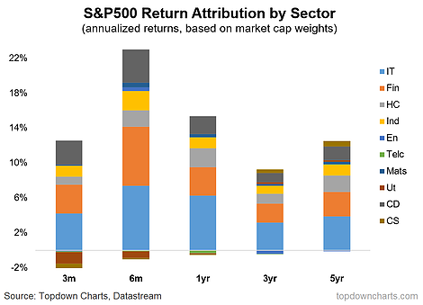
Basically there has been a fairly steady and systematic shift in the make up of the market. You can see this in the performance attribution chart, where the bulk of returns in the last few years has been accounted for by Financials and IT. Most people will dismiss this as just a feature of the markets, but for the passive investor, or the active allocator who opts for passive exposure, investing in equities today has become a different bet.
The key takeaways from this analysis are:
- It's rare for a sector to spend more than 1-2 years at the top or bottom of the annual performance rankings (take note Tech, Financials, and Energy).
- IT remains the top sector, and has grown to 25% (similar to levels seen in 1999).
- Sector weightings have become a lot more dispersed (a few very large, and a few very small) versus back in 1995.
- With the bulk of returns being driven by a few large sectors, it's important that passive investors understand the changing nature of the S&P 500 beast.
1. S&P 500 Sector Returns: The "quilt chart" shows the color-coded ranked annual performance across the major S&P 500 sectors, and there are a couple of interesting takeaways and standouts. For one, the top performing sector usually, at most, can only get away with two really outstanding years, and a similar observation can be made for the worst performing. Certainly food for thought when you look at say energy vs IT.

2. S&P 500 Sector Market Cap Weights: One impact of price performance is changes in market capitalization representation, or sector weights. There's a few really interesting standouts on this chart, the obvious is the domination of IT - which may bring back memories of 2000 for some. What may be less obvious is the starkly different landscape now vs back in 1995, where the index has become much more concentrated in a few dominant sectors e.g. financials and technology.

3. S&P 500 Sector Performance Attribution: The final chart combines the types of data seen in the first two charts to give a breakdown by sector of S&P 500 performance across various timeframes. Perhaps unsurprisingly given the previous chart, financials and IT accounted for the majority of returns ... #FinTech anyone? Again it goes to highlight how concentrated the market has become, and while this has implications for sector rotation, it's also a critical point for those taking passive equity exposure - today's S&P 500 is not the same as that of 1995.

