Four weeks ago, see here, I shared with you a periodic signal on the S&P 500:
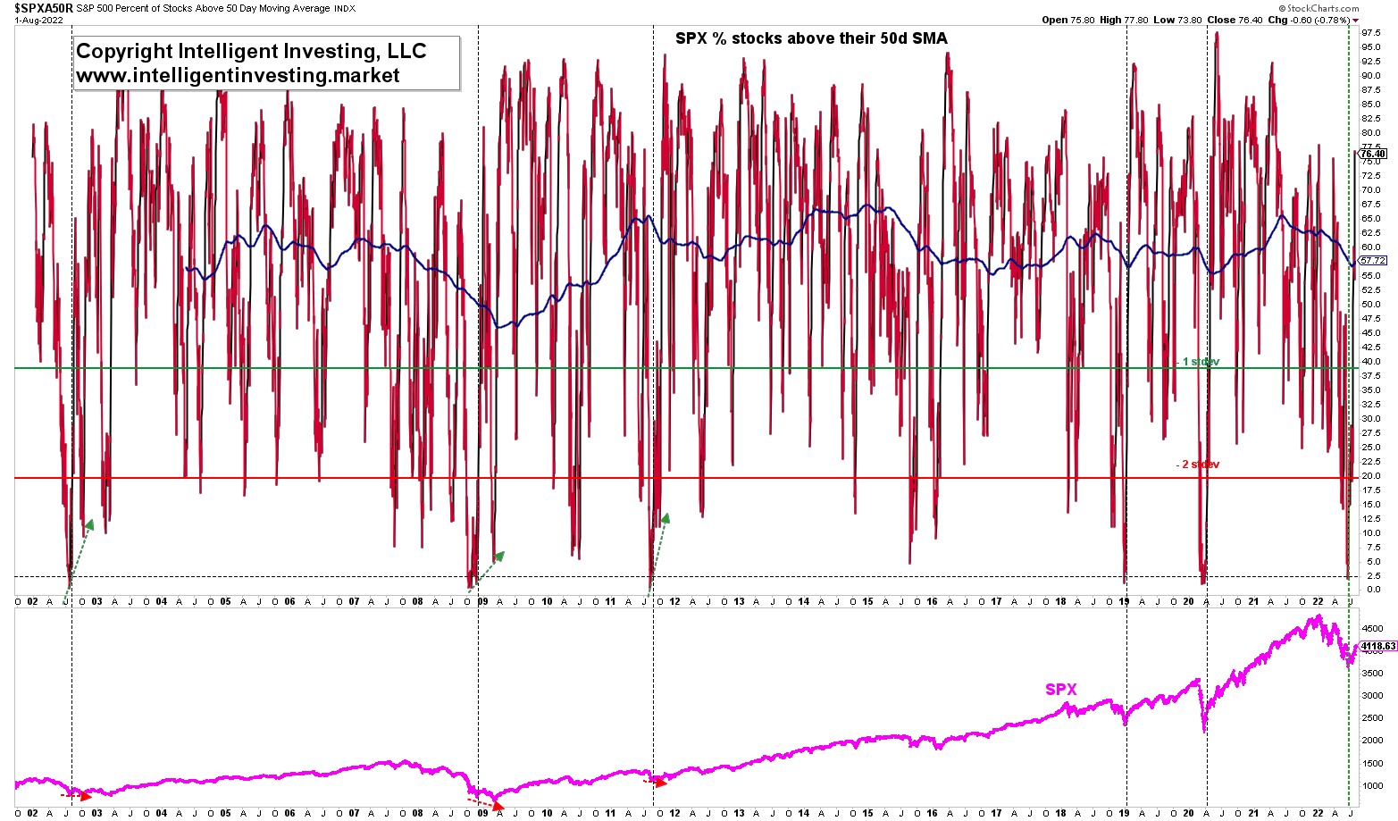
“the percent of stocks in the S&P 500 [SPX] above their 50-day simple moving average (50-d SMA SPXAR50) … went from below 2.5% to above 20% by June 24.”
Since data became available on this indicator in 2002, such signal only flashed five times. I also found that:
“Three of these conditions led to a shorter-term relief rally, followed by one last lower low several months later (2002, 2008-2009, 2011), whereas to were after immediate bottoms (2019 and 2020). Regardless, in all five cases, the SPX rallied for at least one year before the subsequent more considerable decline would set in and result in a new signal.”
Since the signal occurred on June 24, let’s check the index’s performance.
- Down 3.1% on a closing basis by July 14 and up 5.3% on a closing basis until yesterday.
Since I shared the signal with you on July 6, let’s check the index’s performance.
- Down 1.4% on a closing basis by July 14 and up 7.8% on a closing basis until yesterday.
Thus, while back then, many were caught up in the bearish sentiment hype du jour, armageddon and the end of the world were a certainty, the index has--contrarily--rallied both since June 24 and July 6, and the upside reward has outperformed the downside risk. Meanwhile, the SPXAR50 breadth indicator now sits at a healthy 76%. See Figure 1 below.

Figure 1. The percent of stocks in the S&P 500 above their 50-d SMA
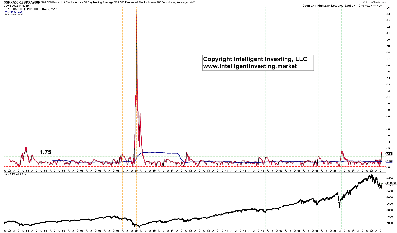
In other words, the percentage of stocks in the S&P 500 above their 50d SMA has increased thirty-fold since mid-June. To put that into perspective, one can divide the SPXAR50 by the SPXAR200. The latter is the percent of stocks in the S&P 500 above their 200-d SMA. This ratio is shown in Figure 2 below, and it went from 0.15 around mid-June to 2.5 by July 21: dotted blue vertical line.

Figure 2. The percent of stocks in the S&P 500 above their 50-d SMA divided by those above their 200-d SMA
Also, this can be considered a breadth thrust as data since 2002 shows that readings from around 0 to over 1.75 are pretty rare (only nine occasions; green and orange dotted vertical lines).
Except for the signal in 2008, all other occasions meant the index was close to or had already passed a significant low and entering a multi-month to a multi-year bull. Please note the extremely high reading in 2009, which signals the start of generational Bull (Cycle 5 of Super Cycle III per my EWP count I shared with you here).
Thus, so far, one could have and can trust the thrust signal I shared with you a month ago. Besides, additional data shows that another breadth thrust signal can back up the thrust. Maybe putting the bearish hat aside and donning a bull cap is prudent? Oh, and don’t shoot the messenger. I am merely communicating what the data shows: Just the facts, ma’am.
