Those that follow my personal account on Twitter will be familiar with my weekly S&P 500 #ChartStorm in which I pick out 10 charts on the S&P 500 to tweet. Typically I'll pick a couple of themes to explore with the charts, but sometimes it's just a selection of charts that will add to your perspective and help inform your own view - whether its bearish, bullish, or something else!
The purpose of this note is to add some extra context and color. It's worth noting that the aim of the #ChartStorm isn't necessarily to arrive at a certain view but to highlight charts and themes worth paying attention to. But inevitably if you keep an eye on the charts they tend to help tell the story, as you will see below.
So here's another S&P 500 #ChartStorm write-up!!
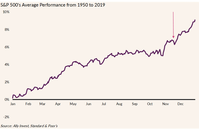
1. Tis the season... @callieabost starts things off with a look at S&P 500 seasonality since 1950. The November through April period is known to be the time for the bulls to shine, and we have seen that play out in a major way so far this month with a 9% advance. It’s important to consider seasonality a secondary indicator at best. Traders should consider all of the fundamental and technical variables, come to a core thesis, then glance at seasonality. With that caveat in place, how has 2020 performed versus typical seasonal trends? It started very differently.
The January to mid-February timeframe played out as you might expect, but then came the COVID-crash – a rare Q1 bear market. Stocks rallied from April through August despite many pundits having called for a summertime dip due to bearish seasonal trends. The last several months, however, have unfolded as history suggested. September and October were rocky, and each month featured a mini-correction for the S&P 500 The elephant in the room of course was the election. Once that uncertainty faded, buyers poured back into stocks.
Bottom line: Sentiment is now very high, and many investors are feeling cheery heading into year-end. How will things resolve? Is the majority right? Will positive seasonal trends persist for the next 5+ months?
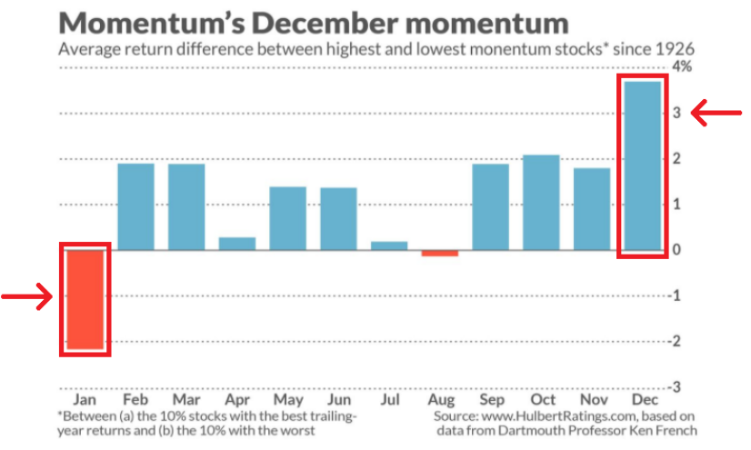
2. Also on seasonality, a very interesting pattern for momentum - particularly given the violent rotations seen there in recent weeks... @MacroCharts digs deeper into the seasonal play. The momentum factor has been all over the place recently with volatility in large cap growth stocks. The latest 3 months have seen momentum underperform the S&P 500 with particular underperformance in the last two weeks. December tends to feature a surge in the best momentum stocks, however.
The relative gains don’t last long as January often sees beaten-down names perform well. If you are looking for a fundamental narrative that might drive this trend, perhaps you can look to tax-loss selling. Investors in taxable accounts sometimes dump the year’s losers in December for that ‘lucrative’ $3,000 tax deduction, then some of those left for dead stocks are bought back in January. Also, the famed “January Effect” suggests small-cap names do well to start the year, perhaps at odds with what performed well over the prior year. It will be interesting to watch how year-end shapes up this time with a broad divergence in style and market cap performances this year.
Bottom line: Momentum has struggled mightily this month with the rally in value and small-cap stocks. Since 1926, the momentum factor tends to attract buyers into year-end. Call it tax-loss selling and window-dressing, maybe, but December is the most wonderful time of the year for momentum stocks. Buyers-beware – January often reverses those year-end gains.
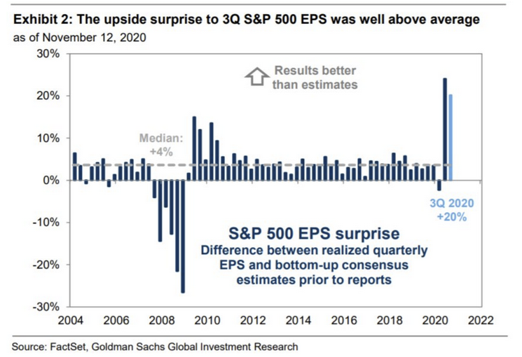
3. Earnings have been handily beating expectations... Thanks to @PriapusIQ for this chart of earnings results relative to analyst expectations. FactSet tracks how earnings season progresses each quarter. The chart from Goldman Sachs (NYSE:GS) highlights just how strong the past 2 quarters have been for S&P 500 earnings versus street estimates. Q2’s record-shattering figures were buttressed by a very strong Q3 reporting season. 84% of S&P 500 companies reported actual earnings per share amounts above estimates.
It ties for the strongest beat rate since FactSet has been tracking the data (2008). That’s the positive spin on the earnings picture. The not so rosy picture is the year-on-year comparison which shows Q3 2020 having the 4th largest decline in annual EPS at -6.3% since Q3 2009 according to FactSet. In terms of sectors, Energy and Industrials have led the declines while Health Care, Communication Services, Consumer Discretionary, and Technology have posted y/y jumps in profits. What’s unusual about this past reporting period is just how many companies beat on revenue & EPS, then guided higher, only to see their share price fall. Things turned around after the election with more positive stock price reactions.
Bottom line: Corporations have been resilient in the past quarters, easily topping analysts’ EPS expectations. Q4 is often the ‘show-me’ quarter for firms due to the holiday selling season. It will be a different shopping experience this year, but more of the same for 2020 with online retail doing well and brick & mortar businesses struggling.
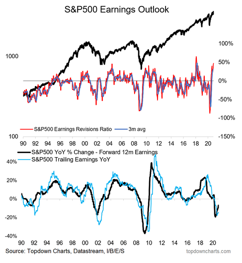
4. ...and earnings expectations are steadily being ratcheted back up --> V-shaped recovery in earnings? Often the case, as the earnings landscape turns brighter, analysts are ramping up expectations. The S&P 500 Earnings Revision Ratio has climbed to multi-year highs following the last two quarters’ stellar EPS beat rate. Much has been priced in with the S&P 500 up 9% already this month and up 20% over the last 6 months.
Analysts have also turned more positive on the coming 12-months of S&P 500 earnings. Expectations had hit a low back in the spring when massive losses were expected, but never under-estimate the power of the American consumer who will spend no matter what the consequences. While trailing earnings are in the dumps care of the record Q2 contraction, trailing 12-month losses were held in check due to the quick recovery in consumer spending. The dot-com bubble and GFC each had worse annual S&P EPS declines than the COVID crash.
Bottom line: Wall Street analysts have had to scramble to play catch up to the quickly improving earnings situation. The Earnings Revision Ratio has climbed to the second-highest level since 1990 – topped only by the fundamental reaction to the late 2017 Tax Cuts & Jobs Act changes that were quite beneficial to corporate profits.
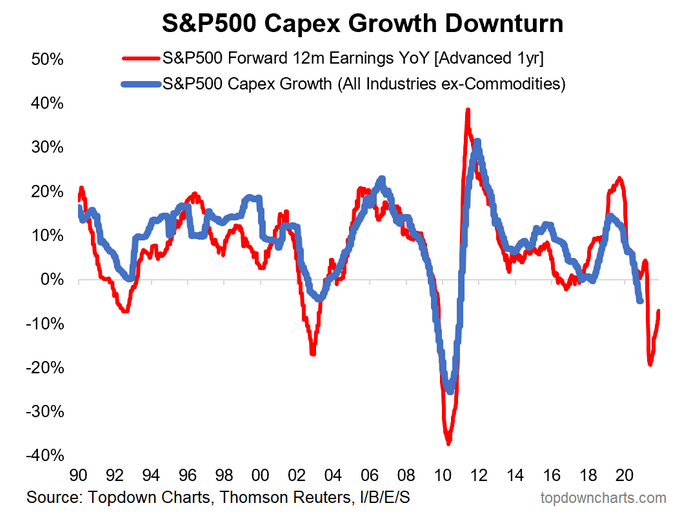
5. Capex Crunch. This chart from @topdowncharts demonstrates the relationship between S&P 500 forecast earnings and growth in capex. The two time series are related as firms will be more likely to invest in growth opportunities when the fundamental earnings backdrop is positive. History shows that capex aligns closely with S&P 500’s forward 12-month earnings expectation pushed forward one year. The presumption is that there will be a continued decline in capex for several months before a recovery.
Companies are likely to remain conservative with short-term assets on their balance sheets. Investing in long-term projects is just too risky right now (or recency bias is just too strong for corporate executives). According to the latest Bank of America (NYSE:BAC) Fund Manager Survey, portfolio managers feel the same way. They would rather see corporate America use cash flow to improve balance sheets rather than increase capital spending. Interestingly though, the survey found that CIOs are increasingly itching to see CEOs use liquidity to invest in capex versus the last several months.
Bottom line: Risk appetite is slowly returning, but ultimately company executives will be cautious about capital projects for a while. Capex will continue to be weak according to historical trends.
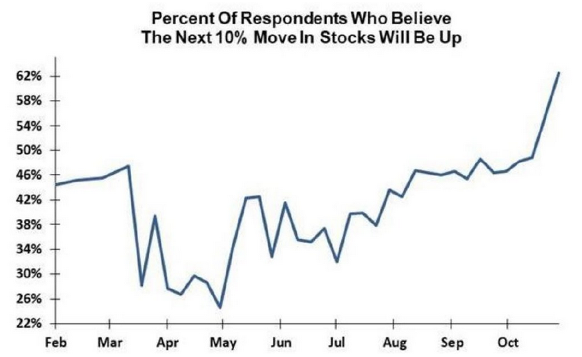
6. Most institutional investors expect stocks to go higher ...big turnaround in sentiment vs earlier in the year. (Evercore ISI survey of 303 institutional investors) @matthew_miskin brings us a chart from Evercore ISI showing expectations for the next big market move. Investors are feeling optimistic after a 9% surge so far this month and a 20% advance in the last 6 months. Funny how that works. We featured a few sentiment charts last week that displayed an uptick in frothiness. Optimism persists. More institutional investors feel bullish about the next 10% change in the S&P 500 than at any other time this year.
The survey is conducted each week. It hit a low in late April following the swift bounce in stocks after the March 23 low. Respondents felt the market had come too far, too fast, and a Q2 drop was likely. There were indeed brief pauses in the uptrend, but stocks generally climbed from late March through August. It’s was a tough slog of it from Labor Day through October with large-cap growth losing leadership, and that sentiment carried over into the survey results. The uptrend in the chart below halted in mid-August. Institutional investors, like so many of us, were on-edge in advance of the election. Like 2016, once the big day came and went, bullishness jumped. COVID-19 vaccine headlines helped fuel frothiness, too. Are investors feeling too optimistic now?
Bottom line: Stocks have been in recovery mode for many months, but only recently have we seen a jump in sentiment. Price-action likely turns more choppy with cash being deployed into the stock market and investors expecting more gains ahead.
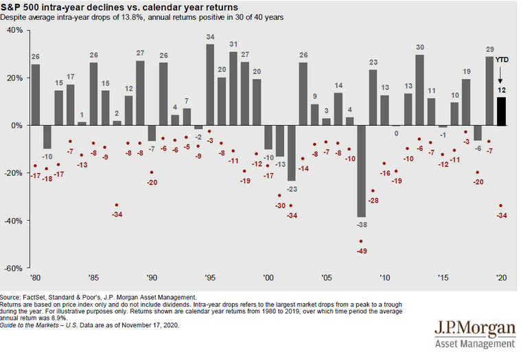
7. What a year... Thanks to @NateGeraci for this updated JP Morgan chart of S&P 500 annual changes and intra-year declines. It’s featured each quarter in the Guide to the Markets. This year’s data points are ones to behold. The 34% drawdown is matched only a few times since 1980. Take a look at 1987, 2001, 2002, 2008 – each of those years had a drop of 30% or more, and the average annual price-change for the S&P 500 was -18%. 2020 has been a year like no other, and we are on track for a double-digit gain.
This year’s bounce-back has been better than even 1987’s swift recovery off the October crash (we had more time to recover this year since the COVID crash occurred early in the year). You might say 2009 has a similar look to 2020, but the market had already declined sharply before the March 2009 low. Every bear market is different. 2017 seems like ages ago, doesn’t it? Market pundits were remarking on just how unusual that year was in terms of the climb in stocks on seemingly no volatility. The stellar 19% price-return featured just a 3% max drawdown that year.
Bottom line: 2020 will be one for the books. We might not see this kind of price-action again for decades. It’s rare to see intra-year drops of 30% or more, but what’s more unusual is for the calendar year to see above-average gains. That could happen this time.
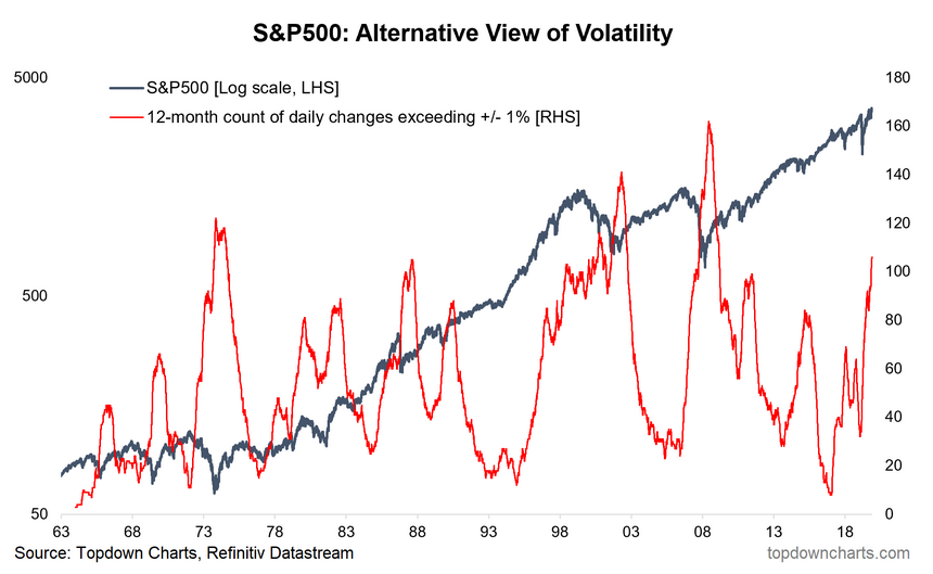
8. Alternative view of volatility for the S&P500. The count of 1% up or down days over the last year is at the highest mark since 2009. Realized volatility remains very high. Couple the COVID-crash in March and the election a few weeks ago, and volatility has just seemed to persist. There are slightly more than 250 trading days in a year, and the 1% up or down day count has topped 100. It’s likely to keep rising since the end of 2019 and the start to 2020 was not too volatile.
The chart below overlays the daily change data with the S&P 500 (log scale). Another unique feature to 2020 is this spike in historical volatility is happening at all-time highs for the stock market. Maybe there is another shoe to drop in the next few months, and stocks indeed head lower, but back at the lows for the S&P 500 during the dot-com bubble and GFC, the spike in 1% up or down days came just slightly after market bottoms. You can take the historical analysis back further to see similar occurrences in other bear markets.
Bottom line: Stocks usually fall as volatility rises and climb when volatility drops. Not so much in 2020. Sure stocks fell off a cliff when the VIX soared to 80+ in March, but the VIX has remained high as equities advanced. An alternative view of volatility shows that the number of 1% or down days continues to rise along with the S&P 500 – something rarely seen since the 1960s.
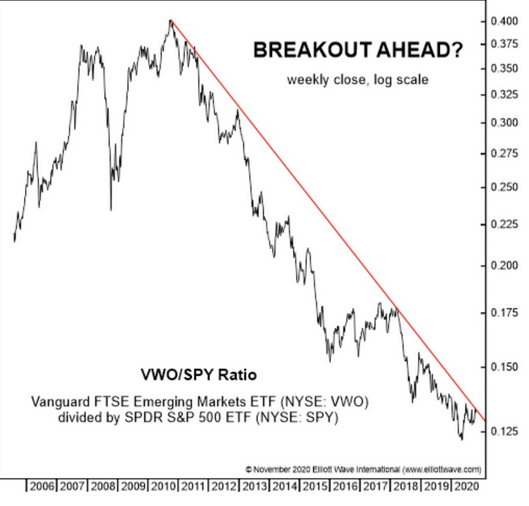
9. Emerging Markets vs S&P500 -- turning point time? @TihoBrkan brings us a relative chart of emerging market stocks versus the S&P 500. Is this finally when EM outperforms? It seems like every year about this time we start to hear the prognostications for EM to be the winner for the ensuing year. Then it never really pans out. Sort of like how economists always preach that interest rates are set to climb ‘next year’. Rather than making blanket predictions to fit some narrative, it’s best to investigate what is happening with valuations, monetary conditions, earnings & macro changes, sentiment, technicals, and overall market breadth.
Emerging markets have underperformed US stocks for 10 years. Remember the reflation trade following the GFC? So many pundits came on TV to call for emerging market outperformance in the cycle ahead, but the chart below proves that was among the worst positions to take on during the 2010s. Flipping forward to 2020, valuations in the USA are stretched (particularly for large caps) and the PE10 for emerging markets is depressed. The breakout on the chart could be the catalyst for a change.
The chart indicates a possible breakout is on the way. Any good technician will wait for the breakout to prove itself before jumping on board, but the relative low earlier this year looks solid. Now it’s all about the breakout. Interestingly, EM has changed from a decade ago. It’s now a tech & consumer-driven arena with Alibaba (NYSE:BABA), Tencent, and Taiwan Semi making up about 20% of Vanguard FTSE Emerging Markets Index Fund ETF Shares (NYSE:VWO).
Bottom line: VWO could be on the verge of a breakout, but we still need to monitor the charts for the definitive move. We favor EM versus developed markets, particularly versus large cap US stocks in our latest Capital Market Assumptions not just from a technical point of view, but valuations are also much more attractive in EM vs. the USA.
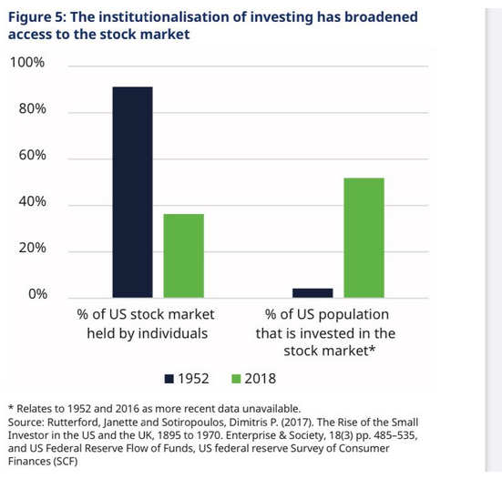
10. The rise of the fund management industry has seen much broader participation in the stock market by the populace. (and I would imagine this figure might be higher now with the likes of Robinhood, fractional ownership, free trading, etc.) @DuncanLamont2 brings this week’s ChartStorm to a close with a view of how many more investors are getting in on the stock market action. This chart compares the ownership situation in 2018 versus 1952. Of course, Robinhood & other apps, free trading, government stimulus, social media all probably induce even more market participants, so it will be interesting to see similar data for 2020.
It might take you a moment to figure out the narrative this chart is telling, but let me explain. In 1952, there was more public ownership by a smaller group of investors. In 2020, while there is less aggregate individual ownership, more people are participating through institutions. So there are more ‘small investors’ today than in 1952. What’s driving this? Mutual funds, ETFs, 401ks, IRAs all help to allow more regular folks (ma & pa investors, there I had to say it) to invest in the stock market. The days of owning a huge chunk of company stock in a defined benefit pension are on the decline if not nearly gone.
Bottom line: About half of the US population owns stocks, which is up from the single-digits during the 1950s. Big institutional investors and funds allow small investors to participate in capitalism. It’s a great thing, but it also creates risks. Investors need guidance and an overall risk management plan if they are going to participate in these volatile markets.
So where does all this leave us?
1. Seasonality & Sentiment
September and October were topsy-turvy while November is off to one of the hottest starts ever. The famed Stock Traders Almanac study showing the bulk of equity market gains coming from the November through April timeframe could be getting investors a little too cheery. Or maybe everyone is just getting excited about a possible vaccine and putting 2020 in the rearview mirror. Regardless, investors expect the next 10% move to be to the upside after the SPX has risen 10% off the October lows already. Too far, too fast? Factor-investors should monitor the year’s winners (large cap growth stocks) as momentum tends to do well in December, but then decline in January.
2. Earnings and Cash Flow
A major 2020 narrative has to be the resiliency of corporate America. Two quarters in a row have featured enormous EPS beat rates and aggregate earnings that have verified way ahead of Wall Street analyst forecasts. It all comes down to the consumer who continues to spend, albeit via the online retail route versus getting in the car to travel to a department store. Home improvement retail, online shopping (not just at Amazon (NASDAQ:AMZN)), and in-home technology plays have soared. What is the corporate world going to do with the cash flow? Capex is likely not going to be on the mend for several months, so balance sheets should be improving in terms of rising liquidity positions. Forget about share buybacks, but perhaps dividend increases will be on the way before long. Meanwhile, earnings expectations are on the rise as stocks climb.. that’s usually how it works. S&P 500 earnings are on pace for a V-shaped recovery, but there are whispers that Q1 2021 could feature a double-dip recession if there is no imminent stimulus.
3. Volatility and Trends
Stocks are up 12% this year. Ho-hum. It’s remarkable the intra-year 34% S&P 500 drop being a blip on the radar. What seemed so frightful at the time lasted only a few weeks. Volatility has still been high throughout 2020, though. The VIX hasn’t dropped below 20% since the COVID crash and the number of 1% up or down days has surged to more than 100 over the last year (and it will likely keep climbing through mid-February). The market shifts whenever volatility perks up for an extended period. Would you believe that emerging markets are outperforming the S&P 500 over the last year? Sure, it’s only by 5 basis points, but we could be near a long-term inflection in for EM vs. SPX. We are watching not only the charts but broader macro themes and the fundamentals. Topdown Charts Capital Market Assumptions favor EM versus US stocks over the coming 5-10 years for a host of reasons that we detail to clients. Finally, if people seem more emotional than usual, maybe it’s due to whipsawing net worth changes – more people are invested in the stock market today than in decades’ past care of so many avenues to get in on the action.
Summary
There’s light at the end of the tunnel. A vaccine is on the way, cases are dropping in Europe, but tough times are likely in the near-term for the States. Instead of focusing on the New York Times headlines, we look at the macro themes across the financial markets. Volatility is still high, but investors are feeling a heck of a lot better than a few months ago. Has sentiment run too hot? It's hard to say because there are genuine reasons for optimism, but expectations are certainly higher headed into year-end. One thing I keep coming back to is the possibility that headline the S&P 500 ranges sideways, but under the surface we see turbulent rotation... perhaps the big theme for 2021.
